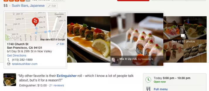
Just two days after it emerged Yahoo was reportedly tapping its data to boost search engine results, business review site Yelp is giving its own site a bit of a spit-shine.
Though the fresh look is yet to be pushed live, it will better emphasize the community-contributed content, while also pushing photos of businesses “front and center”, as Yelp puts it. This means that rather than being greeted by a small thumbnail at first, you can choose from six large images instead.
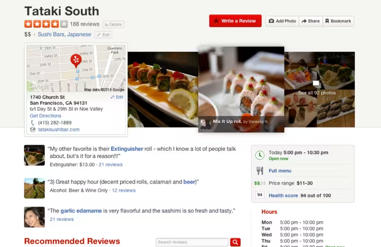
Moreover, the user review highlights feature now surfaces the best menu items, prices and other key information, such as whether a bar only sells wine. Finally, the user reviews’ column width has been reduced and font size has also been given a tweak to make it easier to read, while displaying larger photos and pushing them in-line underneath the text.
Get the TNW newsletter
Get the most important tech news in your inbox each week.
