The Samsung Galaxy S7 is one of the hottest and most anticipated phones of 2016 (despite it only being March), like the rest of the world, we were keen to get our hands on the device for a more prolonged test than its unveiling at MWC would allow.
With a host of crowd-pleasing features, on paper it looks like the whole package and pre-order handsets will soon be shipped out to buyers. It officially goes on sale in the US on March 11.
Can it live up to that in real life though, with other interesting handsets like the LG G5, Sony’s new flagship range and next iPhone all set to go on sale this year? There’s even left-field options like OnePlus or Nextbit to consider for curious buyers, at a far lower price point.
Design and hardware
The S7 Edge does what few other large handsets achieve in its design – it doesn’t look or feel unwieldy.
This year’s 5.5-inch Quad HD (2,560 x 1,440 pixels) model is larger than the 5.1-inch display of the S6 Edge, but the handset still feels considerably smaller than something like a OnePlus 2, LG G Series or Huawei Mate 8.
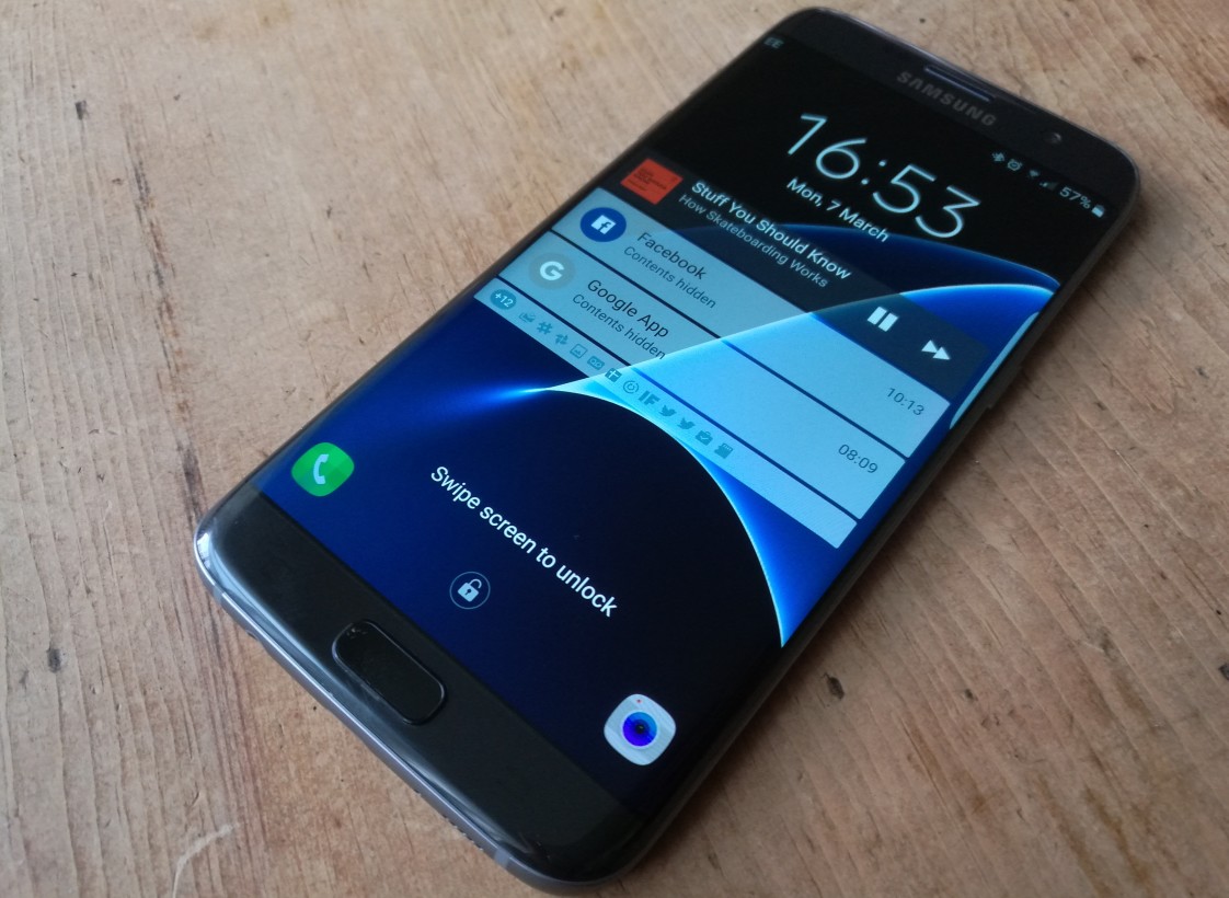
The overall feel of the phone is one of class – the rear glass panel might feel a little like plastic, but it’s not – it’s just smoothed and comfortable. The changes from last year are subtle, but totally worthwhile – it’s easier to hold, though still just as easy to drop.
The speaker and headphone socket placement in the bottom of the device, the volume controls on the left and the power button on the right remain unchanged from previous incarnations.
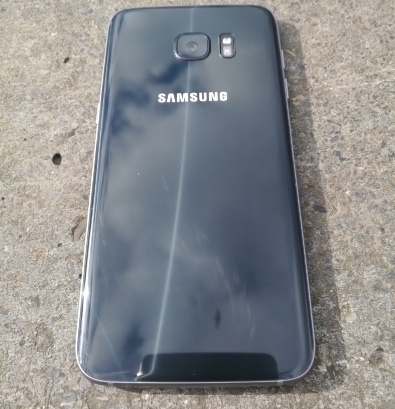
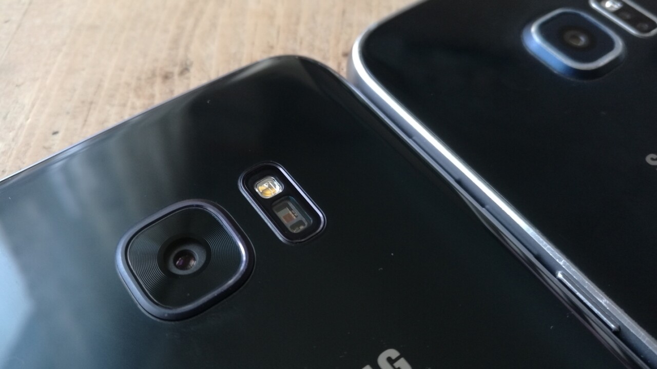
On the rear of the phone, the overhang of the camera has been almost eliminated. It isn’t perfectly flat, but it’s not going to sit at a slightly unnerving angle when you put it on a table any more either.
Next to the 12-megapixel, dual pixel sensor, there’s a heartrate scanner and flash.
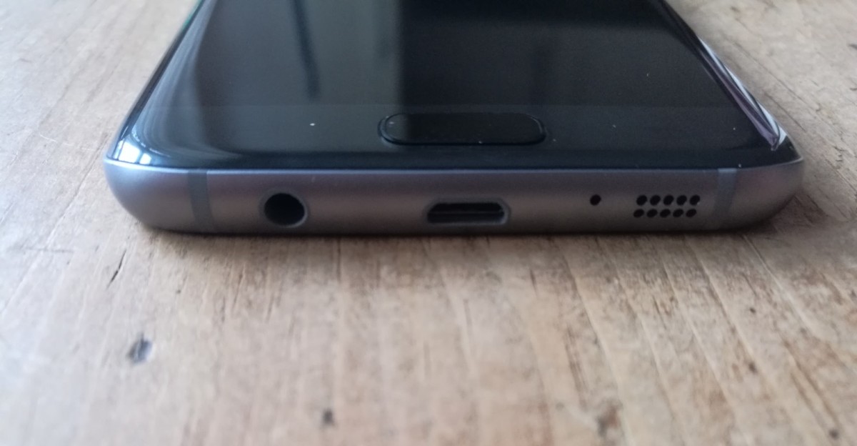
Also on the bottom of the device is a standard microUSB input for charging and connection to a computer, rather than the USB-C standard that Google’s chosen to adopt, which I for one am happy about.
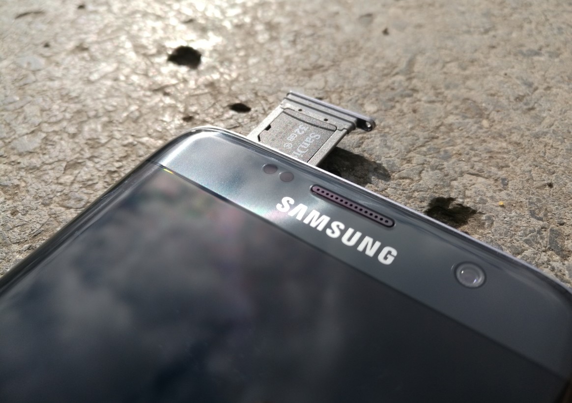
On the top is the combined SIM and microSD card port.
Under-the-bonnet, there’s 4GB of RAM to keep things ticking over – and, depending on region, it also includes an Exynos or Snapdragon 820 processor.
In use
I’d be concerned if a brand new flagship phone wasn’t responsive and sprightly, and on this front I have no qualms with the Galaxy S7. And that screen is glorious – providing enough brightness to remain visible on the sunniest of days in the UK.
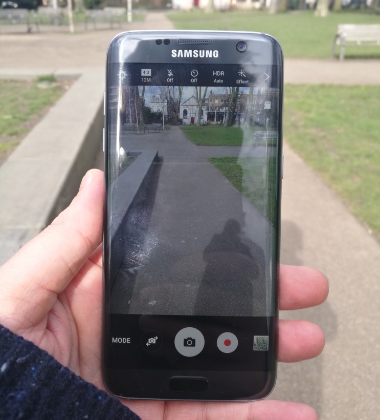
Switching between apps didn’t leave me hanging and there were no frame rate issues or other jitteriness when playing games.
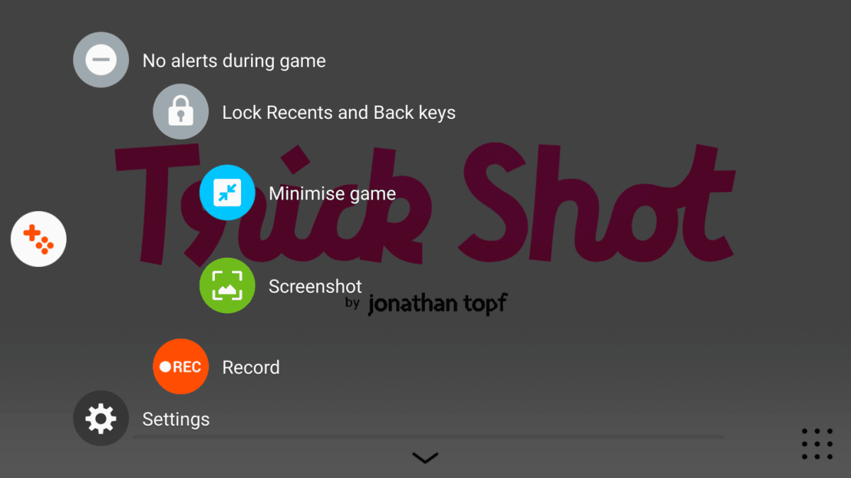
New for the S7 Edge is the Game Launcher and the few options it provides. From the home screen widget, you can open any of the installed games or select to switch off all alerts while playing games – so that you’re not in the middle of a high-score run and are interrupted by a pointless WhatsApp message from your friends.
It also provides quick access to the ‘Game Tools’ and power saving settings. When enabled, Game Tools lets you lock the recent and back keys, record your gameplay, capture a screenshot and more. In reality, I haven’t had the urge to share a video of my gameplay just yet, but it’s good to know I can if the urge strikes – and switching off interruptions will definitely appeal to some, though not really me.
While the zippy performance was re-assuring, the first S6 Edge didn’t present too many problems in the short term either. After a few months, it showed a huge drop off in performance, so I can only wait and see if that happens again.
Anyone familiar with Android will feel at home on the S7, with many of the tweaks managing to add to the experience, rather than detract from it. When batch uploading images for this review, for example, it suggested a previous location to save them that I’d just created for an earlier set.
It’s a small thing, but not having to navigate to the specific sub-folder in my Google Drive saved me a few seconds and was convenient – it’s this feeling that the S7 manages to achieve best. That things are just there when you need them, and if you don’t need them, it’s just another option that awaits you one day.
The first Edge lacked a raison d’etre – it was beautiful, but that was about it. There was no real use for the screen real-estate, beyond showing the time and a few other limited bits of info.
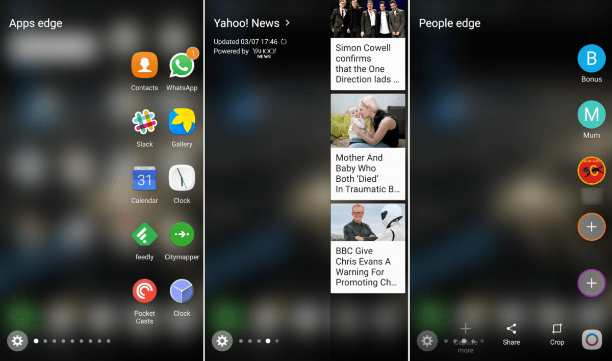
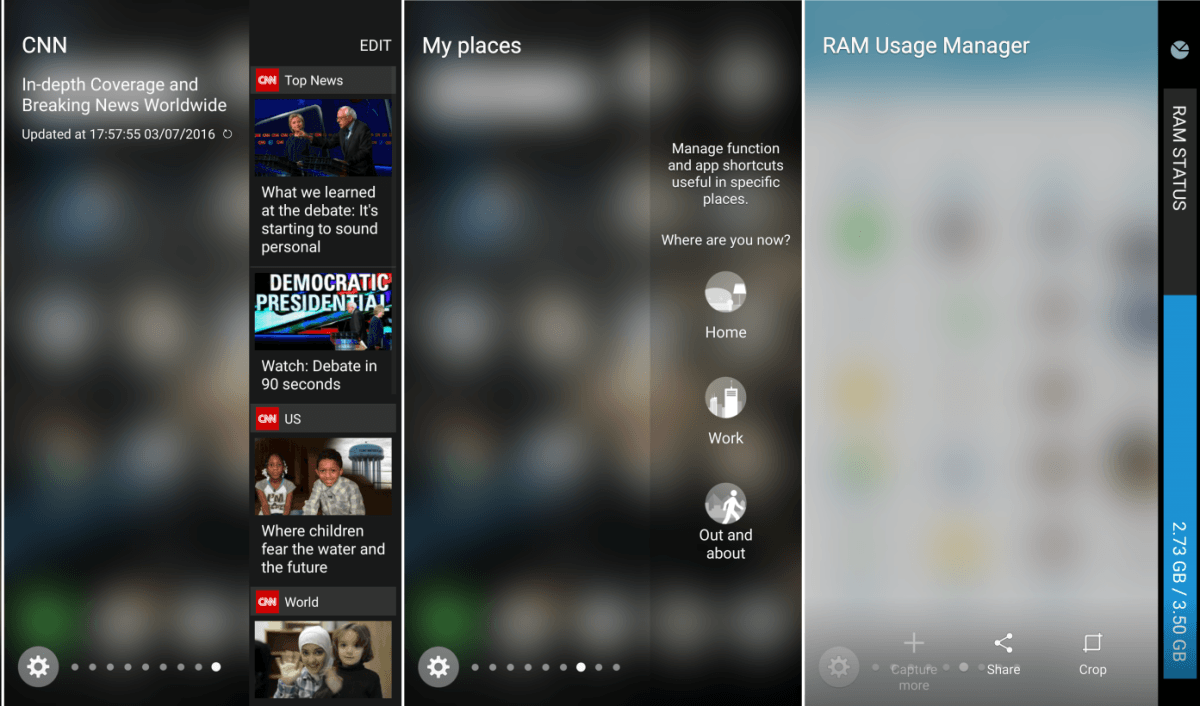
Now, however, it’s altogether more useful – and there are third (and first)-party addons you can download to bring additional functionality (like the RAM status ‘edge’ shown above) or info at a glance. You can also now customize the launching of certain actions from the edge panels, as well as swap out the apps that you want to see displayed here. And of course, if you don’t want to see a particular panel (or want to re-order the sequence in which they appear) you can always change that in the settings.
Samsung’s come under fire in the past for not supporting the standard Android approach to moving apps to a micro SD card (even on handsets where external microSD was supported) but now it’s implemented its own system for allowing you to move your apps from internal storage onto a microSD. This, of course, allows you to free up more room on your handset.
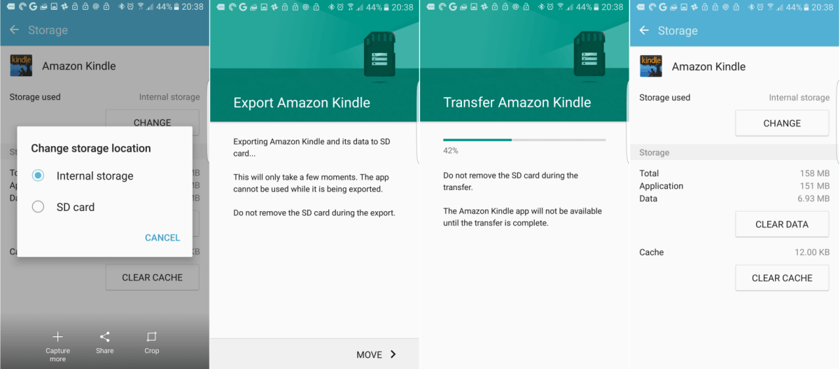
The 32GB version arrived with around 25GB of usable space, and had moving apps to external storage not been supported, it would have likely caused a problem for many users – Samsung’s given no indications of a larger capacity model yet to be launched.
In testing, moving the apps works fine – you need to do it individually in the app settings menu for each item you want to move – but the transfer of each does take a minute or two, so if you want to transfer lots of huge apps, be prepared to wait.
Unlike the Galaxy S5’s water-resistance credentials, the S7 Edge is fully IP68-rated, meaning protected against dust and safe in water of up to 1m for 30 minutes. That makes it a ‘peace of mind’ feature, rather than anything else, but it’s still nice to have, and you don’t need to remember to close off any caps to make it waterproof, which sort of defeated the point with the S5.
It’s worth bearing in mind that in my testing, you’ll still probably want to leave the phone on the outside of the shower, as getting the speaker wet immediately cuts audio output down to a barely audible level. The screen does remain just about usable when completely wet though, which is rare.
The camera
Samsung’s launch loudly touted the handset as the first to use a dual pixel sensor in a smartphone. It’s the sort of tech that you’re more likely to find in a proper DSLR, and beneath all the tech terms or marketing slang, what it means is that the S7 should be quicker to focus and take a snap, which is sort of essential for a smartphone.
Happily, the changes work a treat – and significantly improve the amount of time it takes the phone to focus before taking a shot, thereby reducing the likelihood you’ll miss the action.
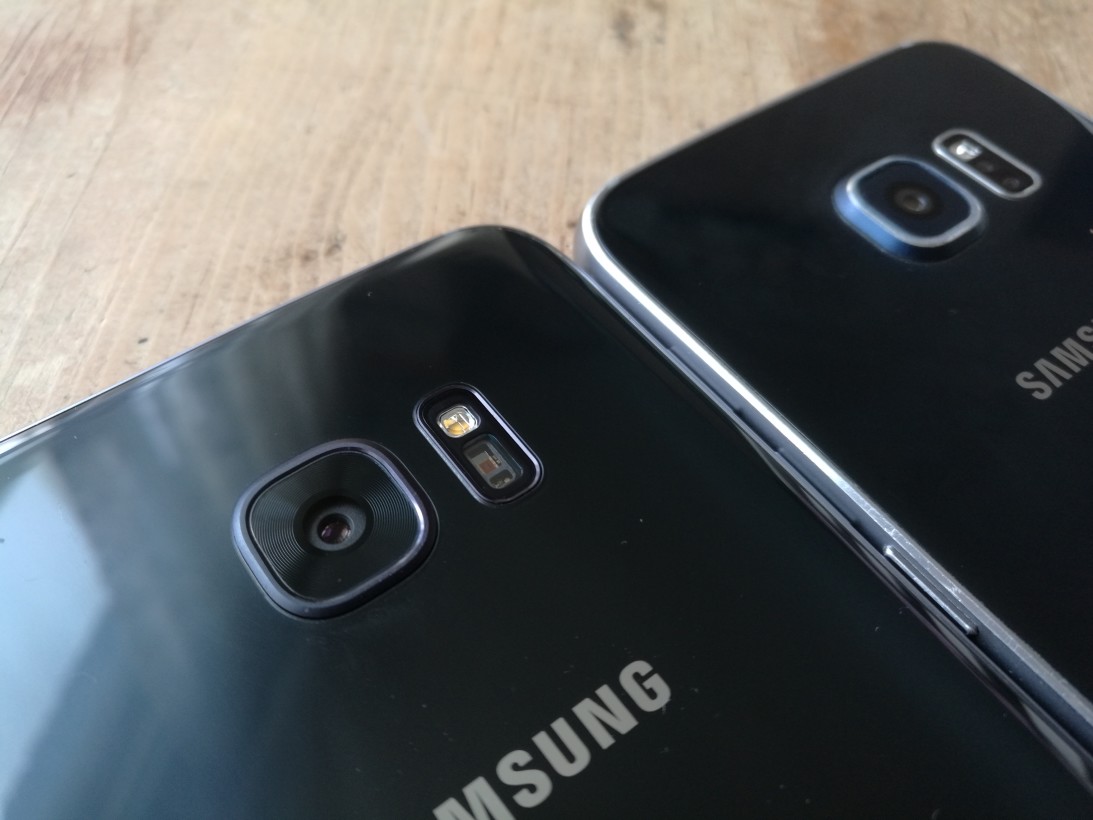
Testing out the burst mode resulted in (mostly) sharp shots with no preparation too, and reduction of the overhang is welcomed.
In addition to improving the autofocus speed, Samsung has made changes designed to improve images shot in low-light – and again, it seems to work really well.
By using a sensor with larger pixels (1.4 microns) and a wider aperture (f1.7) lens, more light floods into the picture, reducing the grainy look (though not eliminating it completely, of course) and making the autofocus system work more reliably.
Very few smartphones take good pictures in dull conditions, but the S7 Edge can – as long as your expectations are realistic.
If it’s totally dark, it’s still going to be a really ‘noisy’ shot, but if it’s just duller than you’d like outside, it shouldn’t be much of a problem. Some of the sample shots below were taking in deliberately grey conditions.
Beyond the capture, you get the usual sort of pre- and post-capture processing options, but I particularly like the live filters that let you see what an image will look like before you even snap it. You can also control the strength of the effect before you take the photo.
Righting wrongs
I’m going to let you into a little (non-)secret, I’ve not really liked the last few Samsung flagship handsets. In fact, I think the last one I really liked was the Galaxy S3 – it came at just the right time and brought enough new features to the table to challenge virtually any other phone at the time.
Unfortunately that also came with a whole load of bloatware and the overall software experience just wasn’t that good. On the plus side, the design hadn’t been hammered to death – as is later would be by successive Galaxy models.
The result of this for me was a company making flagship phones that were strong performers, but also a bit soulless.
The S7, by contrast, is the end result of something it feels like Samsung didn’t quite manage with previous iterations – listening to its customers.
The return of crowd-pleasing features like microSD means you’re not forced to delete photos or apps to make space (and don’t miss that critical shot because you’re out of storage) and making it IP68 rated is a smart way to deliver a sort of peace of mind that iPhone owners don’t have.
One of my criticisms of the original S6 Edge was that the there was no ‘killer feature’ for the edge actions. There’s still not – but it’s now a worthwhile option to have. It might not be how you choose to access your apps or launch an action but it’s another additional way to achieve those things that some people will definitely appreciate.
On reflection, it’s not just that the Samsung Galaxy S7 Edge is striking to look at and performs well, it’s that it also offers software tweaks that manage to offer up a convenient option when you need it most. That’s value and convenience, and you can’t really put a price on that.
Or, you can, and it’s just under $800 in the US.
Read next: Samsung’s Galaxy S7 Edge: 9 things I love and 4 things I don’t
Get the TNW newsletter
Get the most important tech news in your inbox each week.

