Elbows in the ribs, jostling crowds, too few handsets. My first impressions of the Samsung Galaxy S6 at Mobile World Congress weren’t great. And even without the seething throng of the launch event, I’ve never really been bowled over by Samsung’s flagship smartphones.
On the day, we weren’t really allowed to hold the devices for more than a few minutes, at best. Instead, attendees were relegated to being guided around a demo of the devices and asking a few questions of the hired help, none of whom seemed particularly well-informed. It’s a slightly bizarre way to introduce new devices to the world’s press – and one that didn’t allow for any real testing.
Having now spent some proper time with the devices, those frustrating first impressions have been washed away and both handsets are incredibly capable smartphones with a well thought out set of features.
Is that enough though? HTC’s One M9 has class-leading audio. The iPhone 6 has a shiny new counterpart accessory in the form of the Apple Watch. Does Samsung’s S6 deliver? Is the S6 Edge worth the (not inconsiderable) price difference? Would you be better off with a slightly cheaper Huawei P8?
Design and hardware
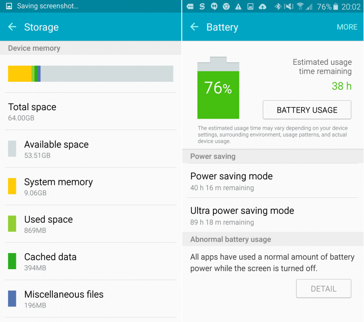
The first thing you need to know about the S6 and S6 Edge is that the plasticky chassis has finally gone. With it went the removable battery (Samsung thinks battery tech is now sufficiently good that you shouldn’t need to change it yourself) and support for microSD cards.
While a section of readers will have closed this article at that point, and yet more may be howling how unfair or silly this decision is, it’s actually not such a bad move. If that’s what it takes to lose the crappy plastic chassis, then I’m on board.
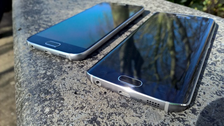
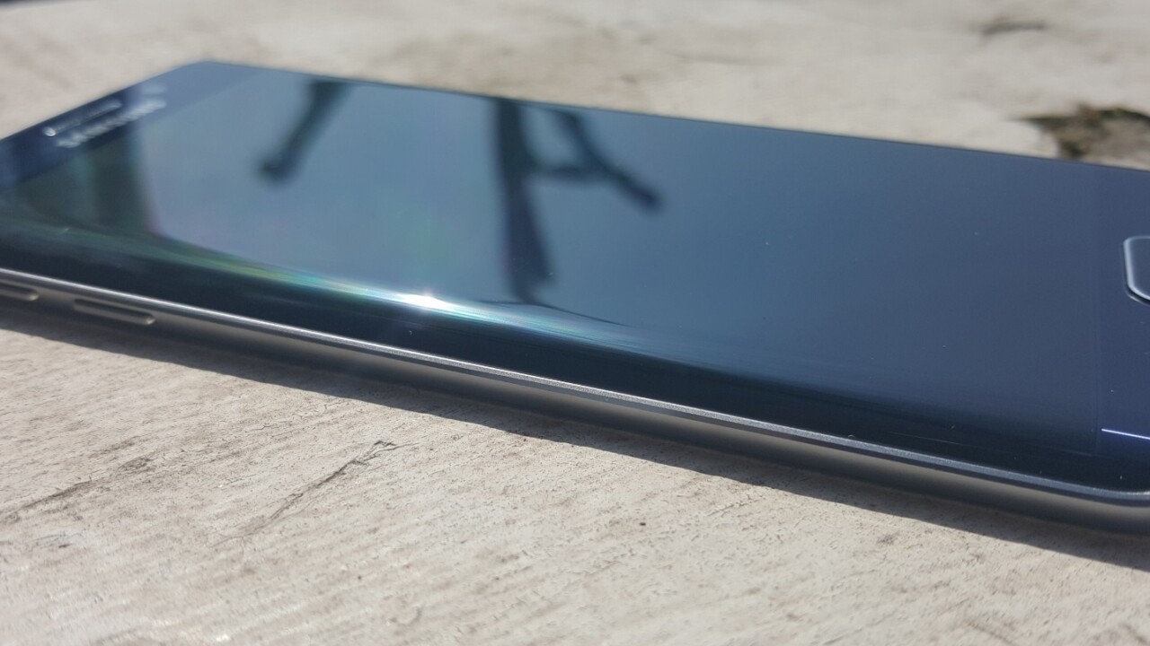
And no one could say the striking S6 Edge was dull by design, even if the straight up S6 model does smack a little of Apple’s latest flagship.
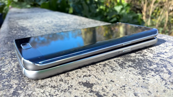
Officially, the S6 measures up at 143.4 x 70.5 x 6.8mm and weighs 138 grams. Similarly, the S6 Edge measures 142.1 x 70.5 x 7.0mm and weighs 132 grams.
What this means is that the S6 and Edge are both comfortable and easy to operate with one hand and not so large that they feel odd when you take a call and hold it to your head. They’re light enough to be easily pocketable too, as you’d expect of a flagship.
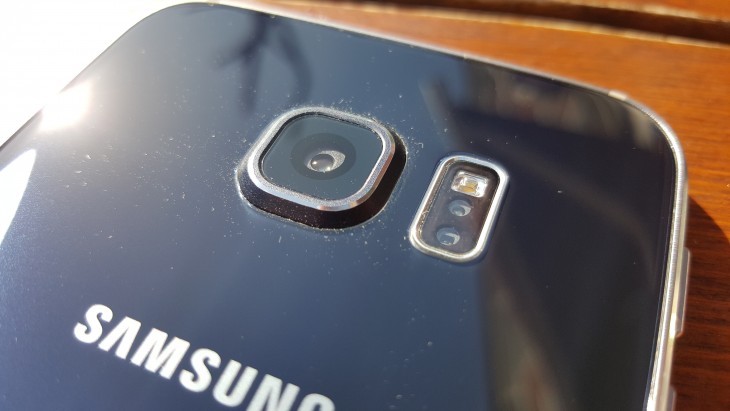
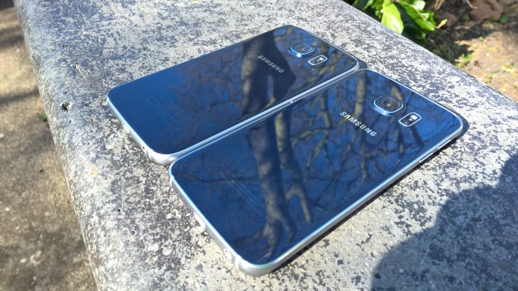
There’s no shape to the rear of the device, so it’s all flat, which could make it a bit awkward for people with particularly small hands to reach across comfortably. As it’s so flat, the metal banding around the edge of the glass front and back on the S6 model does make it a little ‘square’ feeling, although it’s not actually square-edged. As you can see from the image below, the Gorilla Glass rear panels are pretty reflective too.
The S6 Edge version obviously feels a little different, with the curved screen making it feel a little narrower in the hand and easier to reach around.
I have to confess though, while I easily prefer the looks of the Edge, the curved screen does make it feel like it would be easier to drop. I did on one occasion, but no damage was done, thankfully.
Nonetheless, I know from experience that the edges of my phones tend to finish their lives pretty beaten up, so I’d be a little worried about dropping the Edge and it cracking at the side. Conversely, putting it in a case feels perverse given the effort that went into the design.
Under the bonnet, both devices are stocked with same hardware, largely. This means that both have a 5.1-inch quad HD display (2,560 x 1,440 pixels) with 577 pixels-per-inch (ppi), which compares pretty favourably to the iPhone 6’s 1,334 x 750 pixel resolution and 326ppi. Even the 6 Plus’ 5.7-inch display only manages 1,020 x 1,980 pixels and 401ppi.
That’s a whole lot of numbers, but in reality, what that means is that the screen is gorgeous. images look amazing, videos are stunning and it’s easily bright enough to remain visible in direct sunlight. While it might not be very smart for the sake of the battery life, the screen looks so good that I left it on maximum brightness most of the time during testing.
It’s also responsive too – no frustrating double or triple taps to try and open and app or a letter on the keyboard.
On the rear, there’s a 16-megapixel camera, flash and fingerprint sensor, the latter of which works far better than previous incarnations.
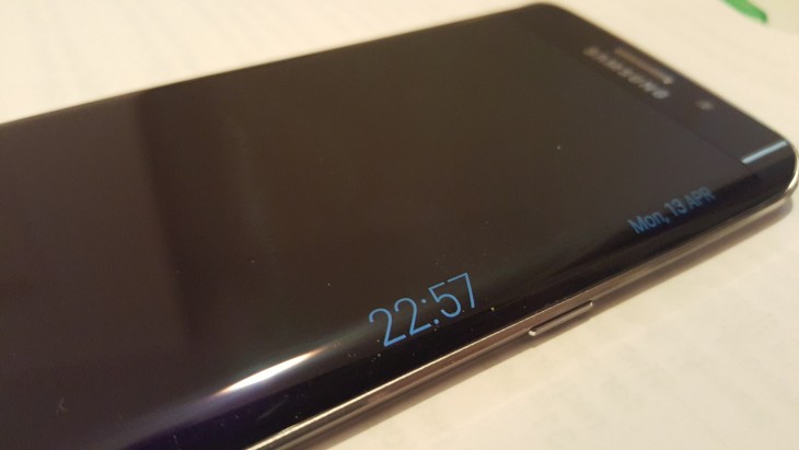
While the curved screen of the Edge serve to give the handset a slightly different look, it doesn’t make a huge amount of difference to the functionality of the device. Sure, it can be used to show the time, or even to get notifications about certain subjects scrolling by, but in my testing, anything except having the clock there proved superfluous. If you’re buying the Edge version, it’s because of how it looks, not the extra functionality it offers.
Both devices also have octa-core processing – made up of a combination of a quad-core 2.1GHz and a quad-core 1.5Ghz processor – which help to keep it all ticking over nicely, even when multi-tasking or quickly switching between apps.
Having applied my defacto gaming (graphics and processing) test, neither of the Galaxy handsets had any trouble whatsoever. Graphics were smooth, and controls were predictable and dependable – everything you’d need for a quick session.
Most flagships nowadays can handle demanding tasks, but I’ve noticed that otherwise well-specced devices can still falter when you’re continually switching between numerous open apps. This wasn’t the case here, but I did have a few ‘this app has unexpectedly stopped’ notifications, particularly around S Health.
Software and performance
As well as finally removing plastic from the chassis, the other truly smart move from Samsung is on the software side of things.
In the past, manufacturers have tried to distinguish themselves from rivals (and lock customers into their brands) by overdosing on the customized services. Samsung certainly has been guilty of this and once regularly introduced features almost no one used In this instance though, the company has walked the fine line between providing added-value and not adding too much bloatware to your new phone well.
As such, you’ll find a refreshingly clean feeling version of Android Lollipop out of the box, and just a few of Samsung’s own services prominently displayed. Icons in Samsung’s TouchWiz UI are now flatter and larger than they were previously, too.
If you want more Samsung apps (like S Translator, for example), or any of the promotional offers associated with buying a new S6 or S6 Edge, you just need to pop open the Galaxy Essentials/Galaxy Gifts widget and download each individually. One of the offers Samsung is currently giving S6 owners is three months’ free Deezer Premium usage and buyers can also get up to 100GB of Microsoft OneDrive storage too.
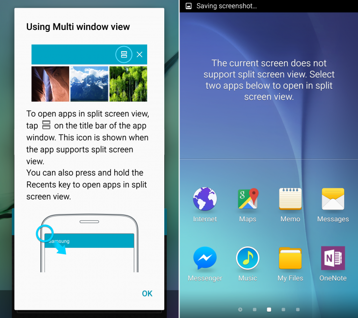
You also get a neat suite of pre-installed Microsoft apps arranged (OneDrive, OneNote, Skype) in their own folder out of the box too – this always feels a little strange on an Android phone, but they’re certainly welcomed by me.
As a non-Flipboard user, I wouldn’t really choose to have an entire home screen dedicated to it from first start, but it’s no big deal. It’s also not the full app – if you look at the settings, it prompts you to install it. You can disable it by choosing to not show that home screen, but you can’t delete it.
The S Health app, if you’re into tracking your activity, food, sleep and everything else, is much improved this year too – with a more easily navigable and simpler display. It helps that the fingerprint sensor actually works this time too. As already mentioned though, it did crash a couple of times.
While it’s all well and good having endless features to play with, they’re not a lot of use if the battery won’t hold out.
Unfortunately, while not terrible, this is one area that the S6 (or Edge) actually isn’t so strong in. Yes, it will get you through a working day, but if you’re a really heavy user, you’ll probably still need to slow down a bit if you need it to last all night long too.
In 2.5 hours of Netflix playback (in full screen) while watching on full brightness and listening through connected Bluetooth headphones, the battery dropped from 97 percent to 61 percent, so if you do a lot of video bingeing, you’ll need to keep a charger pretty close to hand. Naturally, with more careful usage, you could use your battery a lot more sparingly than that.
Camera and audio
The camera on the Samsung range has been hit and miss over the last few years. While generally reliable, it often struggled to produce really outstanding images unless in perfect conditions.
In my testing of the S6’s (and Edge’s identical) camera, however, there’s not too much to complain about.
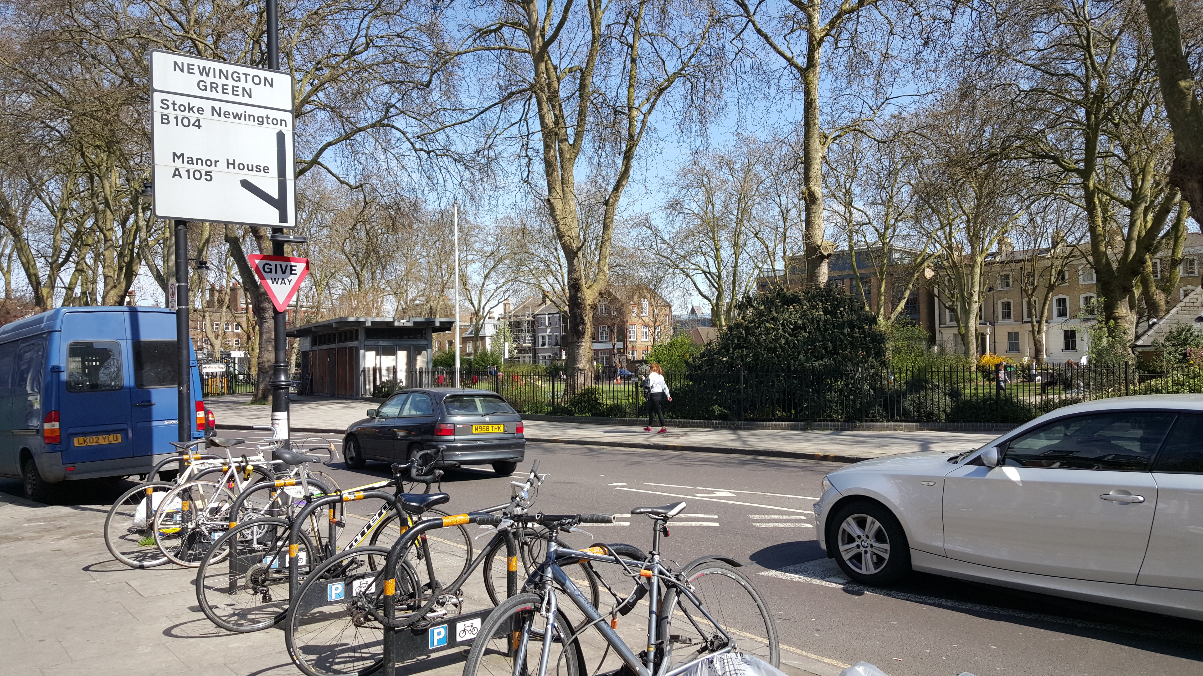
The actual image capture happens in just a split-second, which means you shouldn’t struggle too much with a fast-moving subject, and provided the subject is reasonably well-lit, the photos from its 16-megapixel sensor come out beautifully.
16-megapixels isn’t the highest-spec among its smartphone rivals, but good pictures are made up of more than just megapixels – Samsung’s S6 snapper produces amazing images, so you shouldn’t let the megapixel count put you off. What seems to have made a significant difference is the switch to an f1.9 aperture lens, which allows more light in than previously.
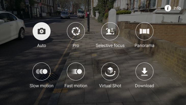
There are plenty of features and filters to play around with too, and the overall on-screen UI has been simplified to allow you to focus (ahem) on taking the shot. I primarily used the S6 in auto mode, but there’s a full pro mode if you want more granular control over white balance, exposure, ISO, etc.
Check out the demo images below.
I particularly like the inclusion of Samsung’s ‘virtual shot’ option, which allows you to take a series of images around an object to create a full 360 3D image of it, which can then be navigated by tilting the phone one way or the other.
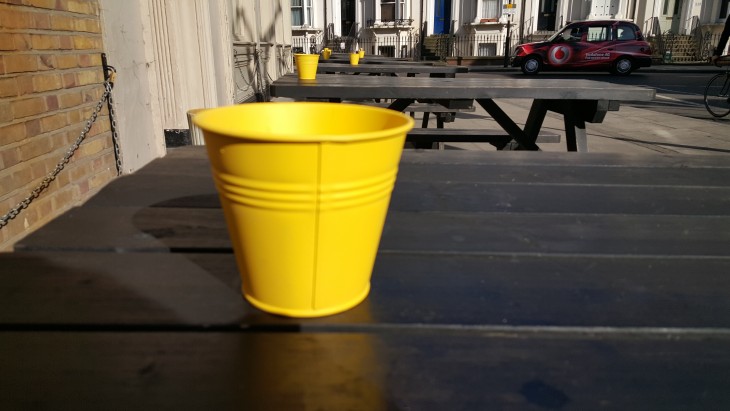
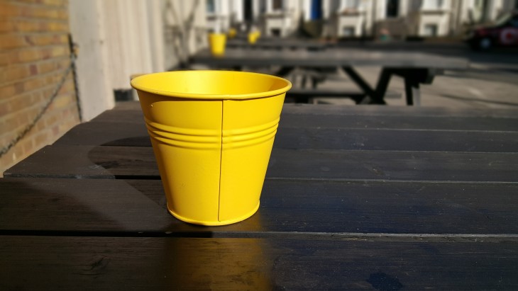
The ‘selective focus’ option that allows you to retrospectively play with the focus of the image is worth getting to grips with too. Below, you can see the difference between a far-focused and near-focus image set using this option.
The only thing both handsets are potentially missing for mobile photographers is a dedicated shutter button in the hardware, but that’s the case for many devices nowadays – whether the sacrifice in convenience is worth the slightly sleeker lines in your pocket is up to you.
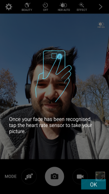
There’s also a 5-megapixel front-facing camera on both the S6 and Edge. I’m not much of a selfie lover, I confess, but it’s pretty neat to be able to tap the fingerprint sensor to take a forward-facing shot.
One the audio side of things, as you might expect due to the different chassis, there’s a tiny difference in how both sound when playing back music at full volume – both were about as loud as each other, but the S6 model had a slightly ’rounder’, less tinny output than the Edge model.
It’s only a tiny difference, but if you’re prioritizing audio above all else, then it’s worth keeping in mind. Then again, if you’re prioritizing audio output above all else, you’d probably have bought an HTC One M9 by now.
The wrap
While I’ve never really liked the Galaxy flagship devices, Samsung has really listened to customer, reviewer and market feedback for the S6 and Edge.
Yes, the edge of the Edge doesn’t really provide the sort of essential functionality that would push anyone to buy the device for that reason alone, but it does make it stand out in a crowd, and to my eye, it’s easily the better looking of the two handsets.
That said, both are outstanding devices that any competitors will have a hard job to beat. Acceptable audio, a reliable camera, worthwhile tweaks to the TouchWiz UI and a stripped back OS all make for an incredibly compelling purchase for anyone looking to upgrade to a new Android phone.
If anything, it’s the Edge’s price that will work against it, as it’s only available in 64GB and 128GB configurations, which makes the cheapest model $949 (£760). For comparison, the cheapest version S6 (the 32GB model) costs around $799 (£599).
On reflection, while I much prefer the look of the Edge version, I’d probably end up purchasing the straight S6 – I just know that I’m going to drop the Edge sooner or later, and it doesn’t quite offer a compelling enough reason to justify the price difference (around £100/$150) when comparing like-for-like storage capacities.
If the price doesn’t bother you though, neither the Samsung Galaxy S6 nor the Edge should disappoint.
Get the TNW newsletter
Get the most important tech news in your inbox each week.

