Sophomore efforts are hard for musicians and phone makers alike. Once you’ve set the bar fairly high, following up a splendid debut release becomes more of a challenge than anyone might expect.
With the OnePlus 2, it seemed like the fledgling Chinese manufacturer had it all figured out, drip–feeding specs to build hype until the day of the dramatic VR launch event broadcast.
But what came of all the noise? I took the ‘2016 flagship killer’ for a three-week-long test drive to find out whether it’s worth waiting for an invite.
Design and hardware
Remember when phones larger than five inches were called phablets? 5.5 inches is now the de-facto size for handsets at every price point. And the OnePlus 2 is no exception.
Although it’s only about half an ounce (13g, to be precise) heavier than the One, it feels chunky. It is a tiny bit smaller than its predecessor though.
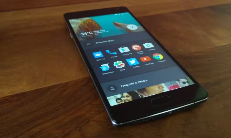
It also has the same handling issues as most other 5.5-inch phones: the pad of my thumb was constantly in contact with the screen when I used it with one hand, which meant that I couldn’t tap buttons or scroll without absurdly stretching my palm.
The large screen also makes it difficult to reach the corners of the display, and holding it horizontally to watch videos isn’t comfortable past a couple of minutes.
The front fascia is as bland and unremarkable as phones get. By contrast, the One, with its metal-finish outer bezel, never fails to grab people’s attention, even long after its release.
However, the OnePlus 2 feels pretty solid. It has a nice bit of heft to it, and it looks like it could take a fall without getting too scuffed up.
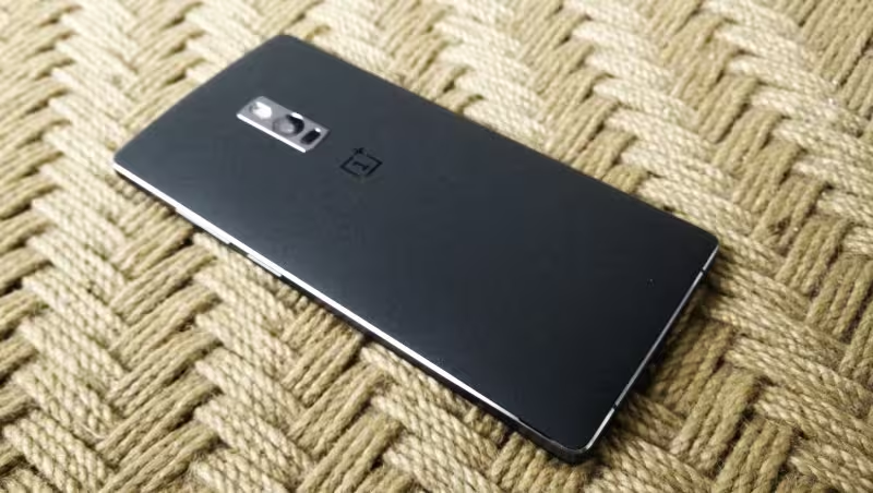
The back has a gritty ‘sandstone’ finish that I quite enjoy. It’s grippy but not rough to the touch and has a distinctive look. It’s also easier to remove, thanks to a small notch that your fingernail can get under.
On the right, you’ll find a volume rocker as well as the power button. I’m not sure why OnePlus didn’t think to make these easier to differentiate by feel: adding a bit of texture to either button would certainly have helped me avoid turning it on every time I wanted to adjust the volume.
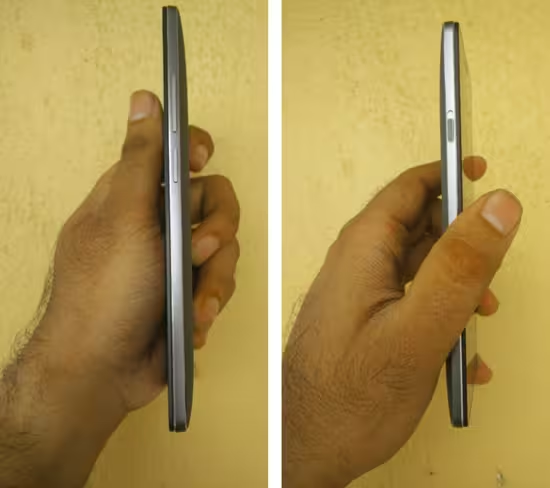
On the left is a mute switch with three positions: alarms only, priority interruptions and all notifications. It’s a neat throwback to older devices, but it doesn’t work as well as you’d expect — you can override its setting with software controls, which means that you can’t always tell what notifications will sound based on the switch’s position alone.
I would’ve liked an option to customize the switch’s functions. I couldn’t get behind the notification handling feature, so I’d rather use it to enable ‘hold’, which prevents the phone from turning on with a button press or double-tap on the screen. Or perhaps adjust the brightness, as I find myself doing that fairly often.
Display and sound
The 1080p screen is bright and sharp enough for text, games, video and reading in sunlight. Colors are more natural than on the One, which has a slight bluish tinge in comparison.
While it’s not something like the 4K display of the Xperia Z5 Premium, is that really necessary for screens of this size? I don’t think so. 1080p is plenty sharp for just about every application, and if it means better battery life and performance compared to a higher-res screen, I’m all for it.
The phone’s speaker fires from the bottom of the device and doesn’t get very loud. I’ve never been impressed by phone speakers, so I won’t deduct too many points — but the OnePlus 2 would certainly have been served better by front-facing speakers.
Features
The phone has a fingerprint reader in place of the home button. The flat surface feels just like the hardware buttons, in that you can’t actually depress them to activate them.
OnePlus made a big deal about this feature, but given that there’s not a lot you can do with it besides unlock your phone, I don’t particularly care much for it. It worked well most of the time, but the few instances where it didn’t caused to me to lose some trust in it.
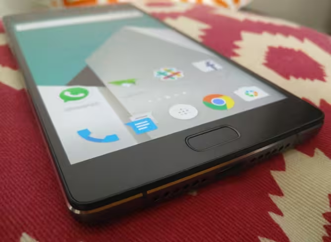
The hardware buttons on either side of the fingerprint reader are unlabeled so you can switch their functions around in Settings, depending on what you’re used to. I liked being able to set up the buttons to work just like they do on the One: ‘Menu’ on the left, ‘Back’ on the right.
The 2 supports dual SIMs, and has a slot that you can access by removing the back cover. It’s nice that you don’t need tools to do either of these things.
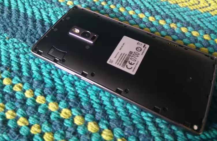
OnePlus has again gone with a non-removable battery, which I take issue with. It’s not easy to replace in case it begins to perform poorly (as is the case with my One, after just six months of use), and it clearly didn’t help cut down on bulk either.
However, the battery held up fine throughout my testing and allowed for a little over a full day’s use on a single charge. It doesn’t succumb easily to poor LTE and 3G connectivity or extended GPS usage with apps like Google Maps.
The USB-C charging port is neat, because you can plug in the cable without worrying if it’s right side up or not. However, it doesn’t work with all the micro USB cables you have lying around, so you’ll have to be prepared to buy a couple more for your office, car and go bag.
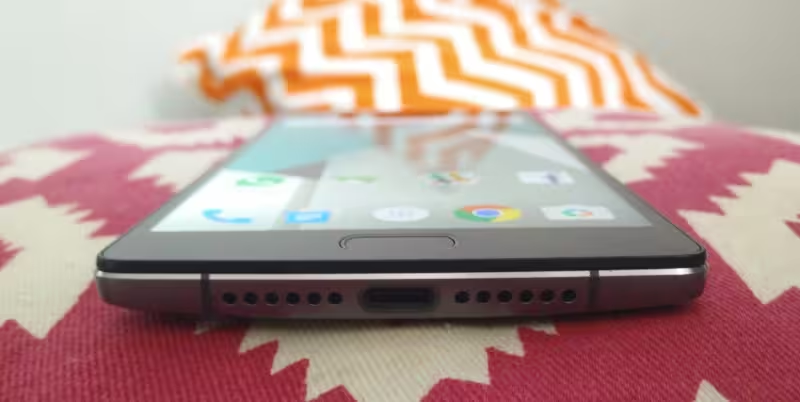
I had a spot of trouble fitting the supplied cable into my OnePlus One charger, but it could just be me, as the standard USB end is indeed a USB Type A connector.
It’s also worth noting that the 2 does not have NFC, which means you won’t be able to use Android Pay when it’s available, and you can’t use the feature to pair with speakers or transfer content to other devices. It doesn’t yet feel like a deal-breaker, but it’s hard to fathom why OnePlus failed to include it.
Software
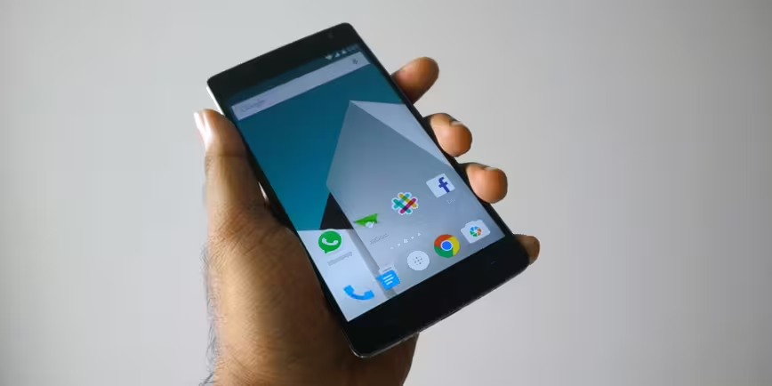
Compared to Cyanogen OS on the One, OnePlus’ own based OxygenOS feels just like stock Android Lollipop — which isn’t really a good thing. It’s missing lots of useful features and customization options that the original had, and so it feels like just about any other phone you can lay your hands on.
For example, you can’t swipe sideways at the top of the screen to adjust brightness, and you don’t have nearly as many functions available to add to the toggles section in the notification panel.
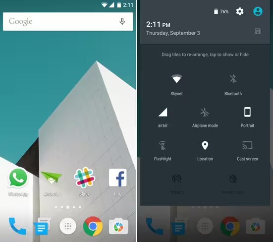
However, it does support gestures for functions like waking the screen, turning on your flashlight and adjusting volume.
The most glaring omission in OnePlus’ software layer: themes. All you can do on OxygenOS is switch between light and dark menus and choose an accent color from a limited palette. Pfft. Cyanogen OS’ theme store lets you change up fonts, button styles, sounds and icons all with a couple of taps.
Even the launcher is basic. If you’re coming off something more powerful like Nova Launcher, you’ll sorely miss the ability to set up your home screen’s look and behavior the way you like.
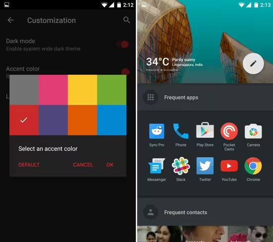
One thing that’s notable is the shelf, which you can access by swiping right from the primary home screen to find recently used apps and frequent contacts. It’s a nice feature, but it doesn’t nearly do enough to get you to fall in love with the launcher.
Camera
The OnePlus 2’s camera is a major improvement over the One. The 13-megapixel sensor is coupled with a laser focus system, wide f/2.0 aperture and Optical Image Stabilization (OIS).
The combination allows for great shots with accurate colors and white balance, and sharp details. Plus, it’s easy to get a decent amount of depth of field for separating your subject from the background in good lighting conditions.

In low light, the 2 isn’t so hot. Colors are dull and images can get fairly noisy. And overall, the camera is slower than many other handsets, which means that even with OIS, you’ll need to stay still for a bit to get a sharp photo.
The camera app is fairly basic and reminds me of the default iOS app. You can tap and swipe to set focus and adjust exposure, and switch between shooting photos and 4K video, as well as capture time lapses and slow-motion clips.

The front camera works pretty well if you’re in a well lit area. It manages to capture a good amount of detail with natural colors, but struggles in low light.
Performance
The 2 handles just about anything you can throw it with aplomb thanks to its powerful Snapdragon 810 1.8GHz octa-core processor and 4GB of RAM, paired with an Adreno 430 GPU. If you’re into graphics-intensive games, this is a great device to play on.
Having said that, I haven’t really seen my Snapdragon 801-powered One stutter much either. Rather than a major difference in speed, the 2’s configuration allows for a longer battery life and fewer heating issues.
Should you wait for an invite?
At $389 for the 4GB RAM/64GB storage option, you’d be hard-pressed to find better specs on a phone in this price range. The 2 has a lot going for it: it’s wicked fast, has a good camera and comes with a bloat-free version of Android (for those who like that sort of thing).
However, it makes a fair number of compromises: there’s no NFC, it’s more bulky than rivals and it doesn’t support quick or wireless charging.
I also don’t care for its looks, but at the same time, I’m not wowed by the latest handsets from Motorola or Samsung either.
My real issue with this phone is that, once you get past the specs and the price, there’s nothing special about it, no thoughtful design detail or software feature that will make you fondly remember using it after it’s long gone.
There is no such thing as the perfect phone, but the OnePlus 2 comes reasonably close, considering its price point. If you do get an invite around the time you actually want to buy a new device, the 2 offers tremendous value and top-notch performance — albeit with a few quirks that you’ll have to learn to live with.
➤ OnePlus 2
Get the TNW newsletter
Get the most important tech news in your inbox each week.

