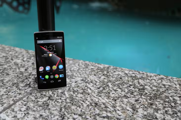
OnePlus wants to enter the smartphone battlefield with a bang, not a whimper. Its motto “never settle” suggests a smartphone free of compromises and sacrifices. The best handset, both in terms of the hardware and software experience.
The startup, born out of fellow Chinese manufacturer Oppo, is raising the stakes even higher with its pricing. Its first smartphone, simply called the One, will be sold for $299 (16GB) and $349 (64GB) later this year. That’s significantly cheaper than the Nexus 5, which is currently available for $349 (16GB) and $399 (32GB) from the Google Play store.
It’s hard not to be sceptical about the OnePlus One. On paper, the handset looks too good to be true; performance that can rival the best Android flagships, as well as customizable software courtesy of the folks at Cyanogen Inc.
But, I’m happy to report, the One lives up to its potential. There are some drawbacks that you need to be aware of, but overall this is a stellar handset and proof that OnePlus is a company to be reckoned with.
Design
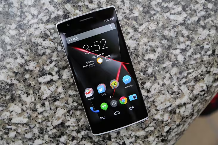
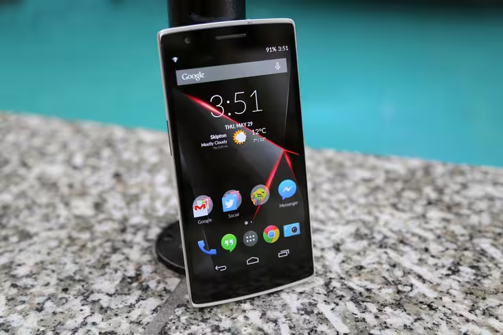
At first glance, the OnePlus One isn’t particularly memorable. It’s a solid design for a first-gen smartphone, but it doesn’t stand out like the Moto X, with its stylish customization options, or the HTC One (M8)‘s luxurious metal body.
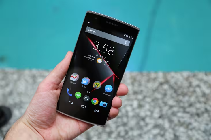
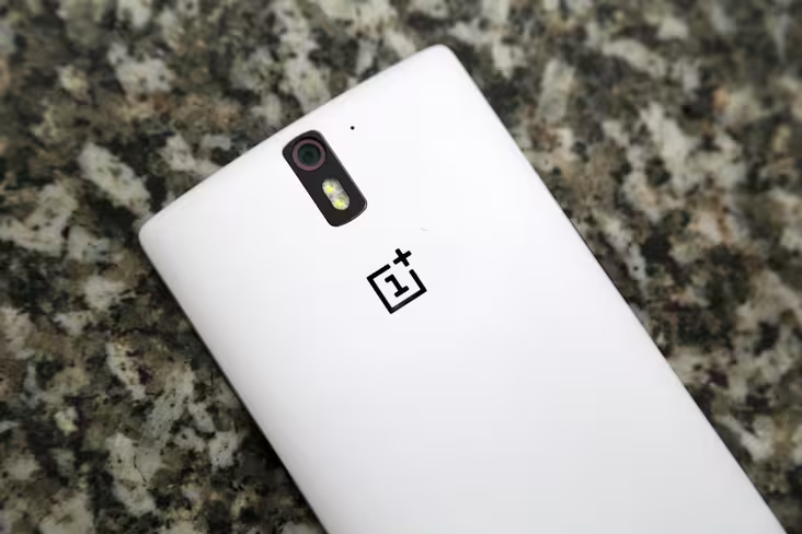
But for $299, you can’t help but gawp at what OnePlus has managed to achieve here. The curved, plastic back sits nicely in the hand and the slightly harsh, angled edges give your digits something to grip. Both of those features are important when you consider the 5.5-inch display that dominates the front; this is a large smartphone, so anything that makes it secure and comfortable in one-handed use should be appreciated.
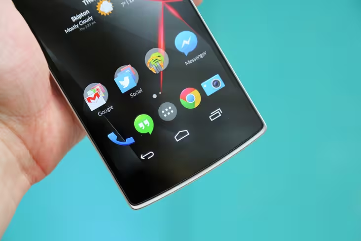
The metal-effect plastic rim sandwiched between the display and rear cover adds a certain panache, but otherwise the One is a fairly by-the-numbers design. It bears more than a passing resemblance to the Oppo Find 7a, with its three capacitive buttons and almost identical physical footprint.
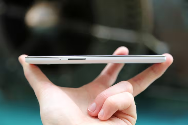
The One looks the part though. The bezels aren’t too large and, at 162 grams, it’s only a fraction lighter than the smaller Sony Xperia Z2. The button placement – volume rocker on the left and power button on the right – is also sensible and easy to reach. I was testing the Silk White edition and the black coloring meant they were easily distinguishable, although I found the volume buttons to be quite mushy and difficult to press.
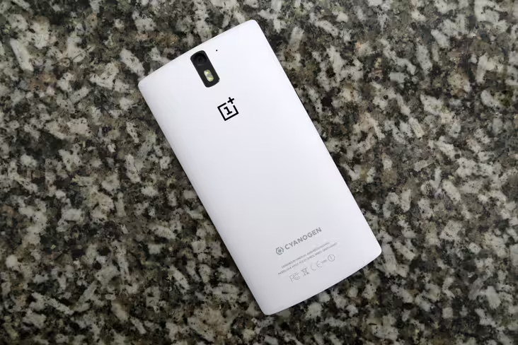
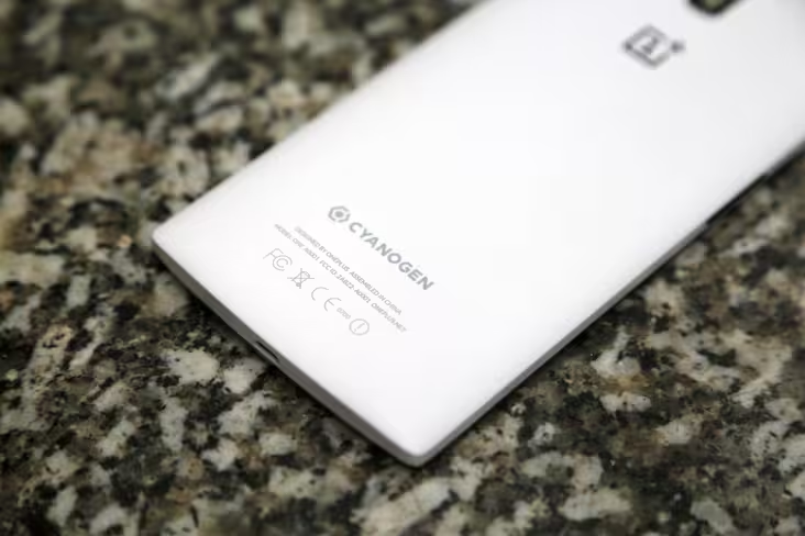
The high-contrast color scheme extends to the back of the device, where you can see the OnePlus logo and Cyanogen branding underneath. The small print and regulatory logos are a little distracting, but it’s a small nick on an otherwise polished design. The camera module is reserved and practically flush with the rear cover, so it doesn’t unbalance the device when you place it on a table.
For a first effort, it’s difficult to criticise. Such a large smartphone won’t be to everyone’s tastes – particularly those who prefer smaller handsets such as the Xperia Z1 Compact and HTC One Mini 2. I would’ve liked OnePlus to go with a bolder design, but even in its current form the One is a looker.
Display
With the Oppo Find 7 and LG G3, it seems the market is ready to move toward Quad HD displays. While the higher resolution is certainly beneficial, there isn’t much in the way of content and apps that take advantage of it. Of course, that’ll change in the coming months, but for now 1080p is the norm.
OnePlus, similar to Samsung, HTC and Sony, has opted to stick with the trusted 1080p display for its first Android flagship. If you’re passionate about pixels you might want to look elsewhere – the LG G3 is a great choice – but for its price the One still offers a lustrous 5.5-inch display.
The IPS panel comes in at 401 pixels-per-inch (ppi) which is, inevitably, lower than smaller devices such as the Sony Xperia Z2, HTC One (M8) and Samsung Galaxy S5. Look beyond the numbers though and you’ll find a screen that is just as good, if not better than its closest competition. The viewing angles are top-notch and the clarity is superb.
When you’re using the One outdoors, the handset rarely suffers from glare or reflections either, even on its lower brightness settings. Color reproduction is also fantastic, with dazzling whites and blacks that are suitably deep and penetrating. Whether you’re reading an ebook, browsing the Web or checking Facebook, the One really is a stellar viewing experience – especially on such a large, well-built display.
If the colors aren’t quite to your liking, you can adjust them in the handset’s firmware. Standard and Vivid are pre-configured, but you can also create your own with varying levels of contrast, saturation, intensity and hue. It works as advertised and should keep everyone happy, regardless of their preferences.
Sound
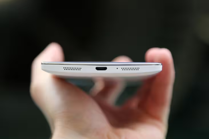
For belting out tunes and taking calls on loudspeaker, the One comes with bottom-facing stereo speakers. The placement is similar to the iPhone and Nexus 5 which, while better than a single rear-facing speaker, still pales in comparison to HTC’s front-facing BoomSound offerings.
The One’s speakers are loud and punchy, especially at higher volumes – this was reportedly an issue with the first pre-release handsets, but OnePlus appears to have fixed the problem with a recent firmware update. While the device isn’t lacking in power anymore, the audio experience is still underwhelming.
Vocals are crisp enough, but distortion plagues the device across the mids and highs. Sound is often muddy and instrumentals rarely punctuate the track with the force and clarity you would expect. At lower volumes it’s less noticeable, but the problem is difficult to ignore when you increase the amplification anywhere above 50 percent.
Throw in a pair of headphones, however, and the device transforms into an altogether different beast. The quality will, of course, vary depending on your choice of cans, as well as the file format and bitrate of your music library. Even so, I was impressed with the One in this regard – whenever I changed one of the aforementioned variables, the smartphone still delivered a clear, natural and immersive sound.
Audiophiles will also appreciate the AudioFX app that comes pre-installed with the One. You can switch between different sound profiles – such as jazz, rock, electronic and dance – and, if you have some music playing, you’ll be able to hear the difference in real-time. The changes are substantial and you can also boost the bass if needed.
Software
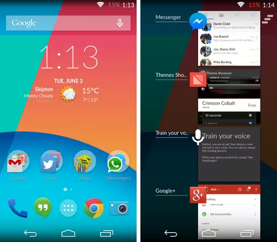
Before buying the One, you’ll need to ask yourself an important question. Am I on board with CyanogenMod? Although it looks awfully similar to “stock” Android, it’s unlikely that you’ll receive firmware updates ahead of the Nexus portfolio. CyanogenMod is also known for its bugs and generally lacks some of the stability you would expect from a traditional Android build.
In return though, you get heaps of customization options. If you’re like me and love to tinker with custom launchers, icon packs and widgets, you’ll love the freedom and tweaks that CyanogenMod offers.
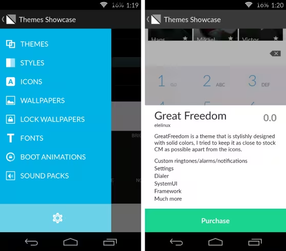
It all starts with the Themes Showcase, which lets you download custom packs to overhaul the look and feel of the UI. Some are better than others, but you can dial down into wallpapers, sound icons and boot animations if you’re after something specific. I’m happy with the Holo theme (which follows “stock” Android to a tee) but it’s great to know the option is there.
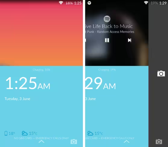
After configuring your preferred “style,” sound packs, fonts and more, you can customize the One’s unique lock screen experience. By default, it shows a light blue panel at the bottom where the time, date and other useful information is displayed. The wallpaper is lightly blurred up top and to unlock the device, you simply drag the blue area towards the bottom of the screen.
It’s intuitive and because you can drag down from any part of the panel, it’s easier to execute than the traditional Android lock screen. You can also access the camera by swiping in from the right-hand side of the display; a small gesture, but an invaluable one for capturing those spur-of-the-moment events.
OnePlus also lets you customise the status bar, quick settings panel and notification panel. My favorite feature by far, however, is the option to replace the capacitive keys with a virtual bar of soft buttons. Obviously this eats into the device’s screen estate, but it’s a nice option for those who prefer this setup. Furthermore, you can tweak the virtual bar by switching the icons around and also adding new ones, such as a search and permanent menu button.
To mix up your interactions with the device, OnePlus supports a number of gesture shortcuts while the screen is turned off. Drawing a circle activates the camera, while a “V” toggles the flashlight and an array of directional swipes control your music. They’re a bit gimmicky, but if you want to conserve battery life some of these could prove useful.
A far more useful and impressive feature, in my view, is the ability to use hands-free voice commands. With the phrase “Okay Snapdragon” you can train the device to launch Google Now or any task of your choice. This could be launching an app, grabbing directions from Google Maps or calling someone in your address book. I found the voice recognition to be very unreliable, but who knows, perhaps OnePlus can remedy this in a future update.
Update: OnePlus says the current voice-enabled wake-up call isn’t final and will be improved before its public release. “Okay Snapdragon” is a holding phrase and will be updated with the phrase “Okay OnePlus” in the near future.
Next Page: We look at the OnePlus One’s camera
Camera
I’ve written in the past about the importance of cameras in Android flagships this year. As the difference in specs and performance continues to narrow, this is an area where handsets can truly differentiate.
The One sports a 13-megapixel rear-facing camera, powered by a Sony Exmor IMX14 sensor. It’s a perfectly capable shooter, but falls short of matching the iPhone or a high-end Lumia smartphone. Although I’ve only tested the Samsung Galaxy S5 and Sony Xperia Z2 briefly, I suspect that both of those devices also best the One by a small margin.
Still, there’s a lot to like here. The images produced by the One are always sharp, bright and with a suitable level of vibrance and saturation. Living in the often overcast and dreek city of London, there’s a tendency for smartphone cameras to wash scenes out completely, or overcompensate with unnatural colors.
Not so with the One. It strikes a fine balance between richness and realism, never straying too far into the murky waters of post-processing and software tinkering. While my images aren’t quite as detailed as I would like, they’re always correctly exposed, in focus and with a lovely level of contrast. Those three elements create a solid foundation for the One’s camera and the rest can usually be salvaged in your preferred photo-editing app.
The camera isnt without some minor issues: the placement of the module means you need a delicate grip to avoid obstructing shots with one of your fingers. The device often defaults to a shallow depth of field too; your subject matter is perfectly in focus but anything in front or behind is lost in a soft blur. This can be dramatic for portraits and macro shots, but unhelpful when you want all of the scene to be in focus.
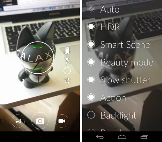
CyanogenMod comes with its own camera app that prioritises simplicity and speed over a bevy of shooting modes and options. It’s not as stripped back as Motorola’s camera app, but the on-screen buttons have been kept to a strict minimum. There are different shooting modes to choose from, including HDR, Action and Night, which tweak the camera’s performance in a subtle manner.
Most of the time though, you’ll probably be keeping the camera locked on Auto. There are three buttons on the right-hand side for recording video, taking a still or starting a Photo Sphere, and they’re all clearly defined and accessible. Tap-to-focus is responsive and the shutter itself is nippy, but not lightning-quick.
Video can be shot at up to 4K resolution, although there’s also the option to shoot at a more storage-friendly 720p and 1080p. While the footage will never compete with a dedicated camera, it’s a surprisingly versatile camcorder in the wild. Footage is crisp and detailed, with minimal focus hunting as you pan or move the handset. The audio is shallow and pretty lacklustre, but that’s to be expected from a smartphone’s onboard microphone.
Sample images
Sample video
Performance and build quality
In previous reviews, I’ve highlighted the shrinking gap in performance between low-end and high-end smartphones. After using the low-cost Lumia 630 and Moto E, I’ve begun to reconsider the value proposition of a $600 flagship.
But moving to the One has reaffirmed my passion for bleeding-edge components. With a quad-core 2.5GHz Snapdragon 801 processor and 3GB of RAM, this handset is ferociously fast. On a number of occasions, I was taken aback by the pace and sheer fluidity of CyanogenMod. Swiping between home screens and digging through the settings is a pleasure, rather than a chore, with the handset never letting up for even a single second.
The 16GB model I’ve been testing can happily store all of my favorite apps and intensive software, such as Asphalt 8: Airborne and Riptide GP2, rarely pose a challenge. Switching between multiple apps is silky-smooth and there’s no discernable slowdown when you have a handful open at once. In short, this is a beast with plenty of horsepower to spare.
It’s an impressive technical achievement, although its construction does come with some downsides. The One doesn’t have a microSD slot and the 3100 mAh battery is non-removable. The latter isn’t uncommon for Android flagships, but the 64GB variant is definitely worth considering if you store plenty of apps, music, photos, movies, ebooks and more.
The aforementioned internal powerpack is also larger than the equivalent found in some of the One’s competitors. It beats the LG G3, Samsung Galaxy S5 and HTC One (M8), before falling just a fraction short of the Sony Xperia Z2 – which sports a beefy 3200 mAh battery.
As a result, the One offers plenty of stamina. In general use, I’m able to get at least 24 hours out of the One without too much difficulty. Sometimes I can eke out a day and a half, although performance will clearly varies depending on your usage. Broadly speaking, the handset’s battery life will rival most Android flagships – despite the device not shipping with a battery saver mode.
The bottom line
For $299, this handset really delivers. The performance is incredible and rivals anything else I’ve tested – both the processor and RAM combine for a blazingly fast experience. CyanogenMod is also delightful; modders should get a real kick out of the customization options and, even if you ignore those features, the default “stock” Android experience can rival a Nexus device.
There are some downsides though. The One is an enormous smartphone (152.9 x 75.9 x 8.9 mm) and the capacitive keys don’t exactly help matters. The industrial design isn’t very exciting – although some of the customizable cases might help – and the twin speakers at the bottom are pretty poor.
Still, it’s difficult to criticise the One. The value proposition is fantastic and beats the Nexus 5 – the closest competitor for its price-tag – in terms of sheer hardware. You might prefer the build quality of the HTC One (M8) or the camera in the Sony Xperia Z2, but in return you’ll need to pay extra.
The One should be available in June and, provided OnePlus can keep up with demand, it’s certainly a contender for the best Android flagship. With its debut smartphone, the Chinese startup has certainly made its mark.
Gallery
Get the TNW newsletter
Get the most important tech news in your inbox each week.

