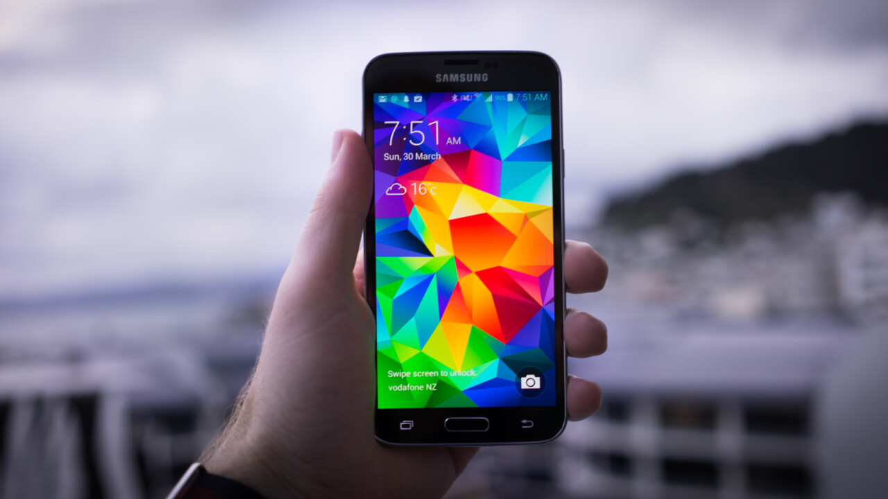
Apple is under siege. Samsung is moving from strength to strength with every new version of its flagship Galaxy phones and this year is likely to be no exception, with the S5 on the horizon.
What started out as a poor alternative to the iPhone is quickly becoming a powerful adversary; Samsung is quickly matching or outpacing features on the iPhone, desperate to keep up in the race, to make sure that it can always be directly compared to Apple’s flagship.
Not only does Samsung directly target Apple, it’s also got the most popular Android based handset and most of the platform’s market share. While others, such as HTC flounder and fail to gather large crowds, Samsung sells more and more devices.
We’ve taken a look at an almost finished version of the S5 for this review — Samsung says the software isn’t quite ready yet — so read on to find out just what the company is bringing to the fight this year.
The hardware
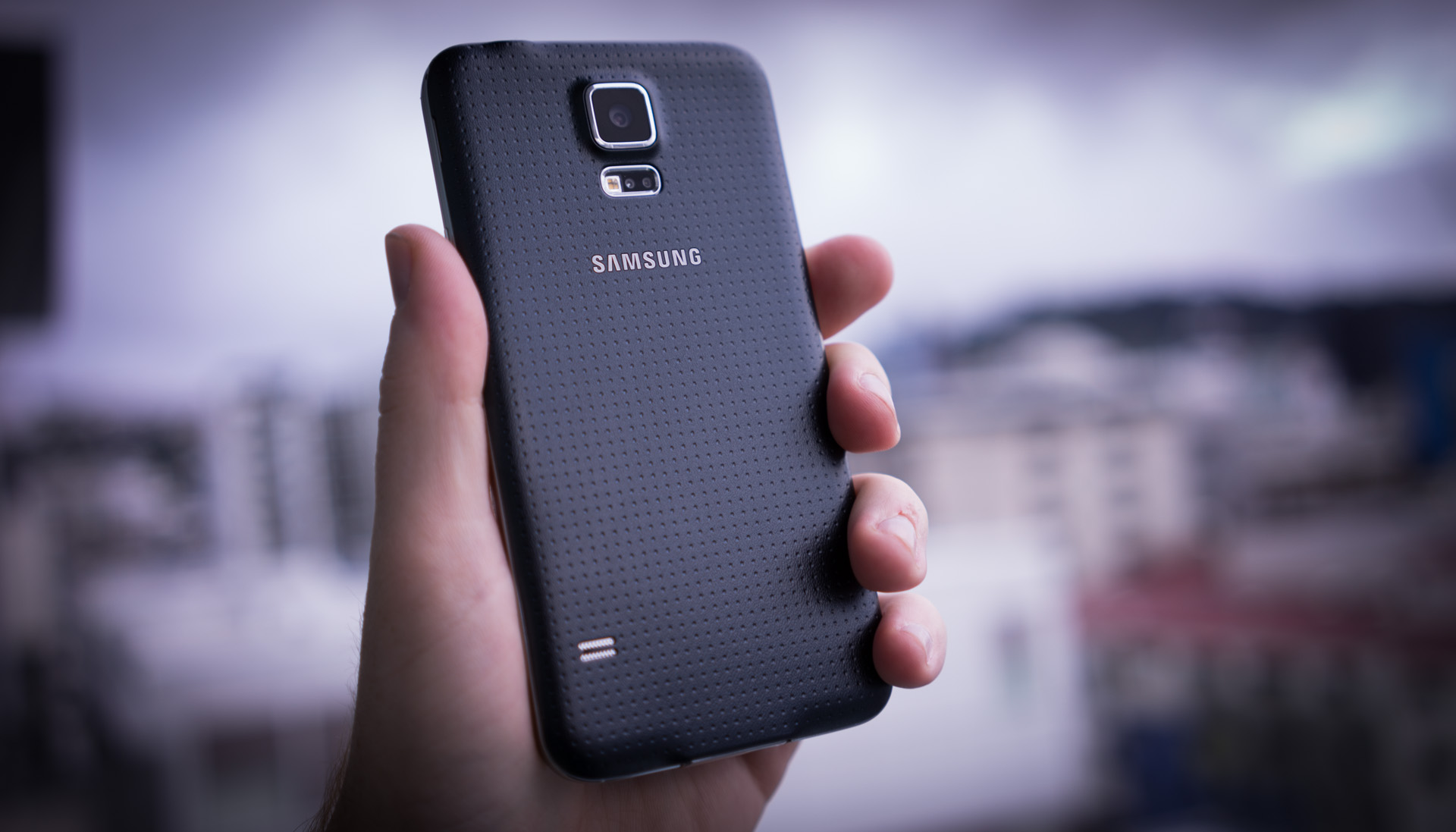
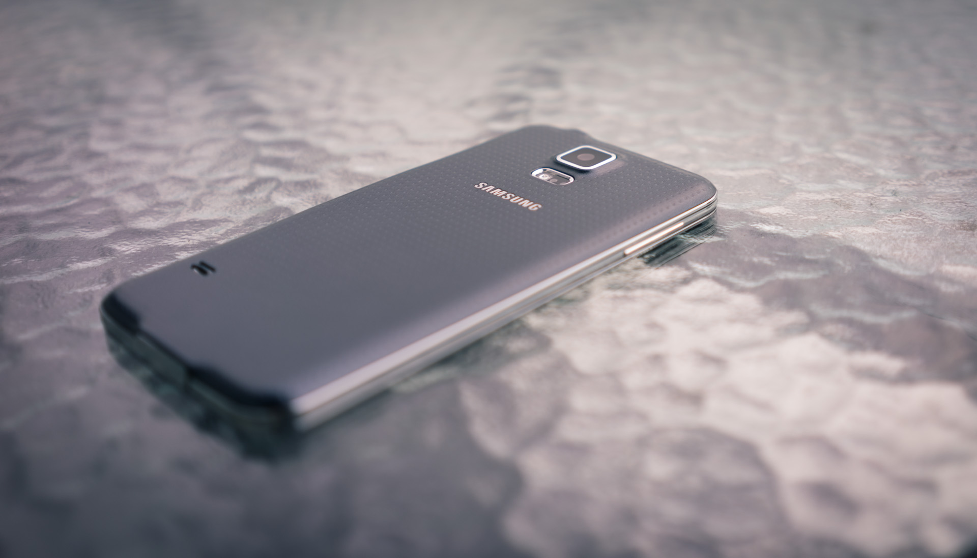
When Samsung announced the Galaxy S5, I thought it was a big joke. The renders looked awful; in gold the device was reminiscent of a band aid and I was loudly disappointed with what Samsung had done. I’ll be honest here; my first impressions were wrong. The S5 is actually an attractive device — a significant improvement over the S4 — in many ways.
The S5 is still not the prettiest girl at the party; it’s up against two all-metal phones that just can’t be matched with plastic, but Samsung has done a good job of making this plastic phone feel well built. If you directly compared the S5 to the S4, it makes last year’s device feel like slippery, cheap, plastic junk. Samsung has realised that how it feels in your hand matters more than almost anything else.
The dimpled back is one of the most contentious points of the phone amongst those online, though, and looks somewhat unattractive in photos. I was won over when I actually held the device for the first time, as opposed to seeing it in photos and renders; it’s attractive and feels nice. By adding these dimples and a rubbery texture to the back, Samsung manages to distract you from the fact that it’s actually just plastic.
On the front, it’s that classic Samsung look. So similar, in fact, that unless you knew what you were looking at then you likely
wouldn’t guess it’s a new device at first glance. There’s Samsung’s classic giant home button down the bottom, flanked by two capacitive buttons for application switching/going back in menus and the camera and other sensors up the top.
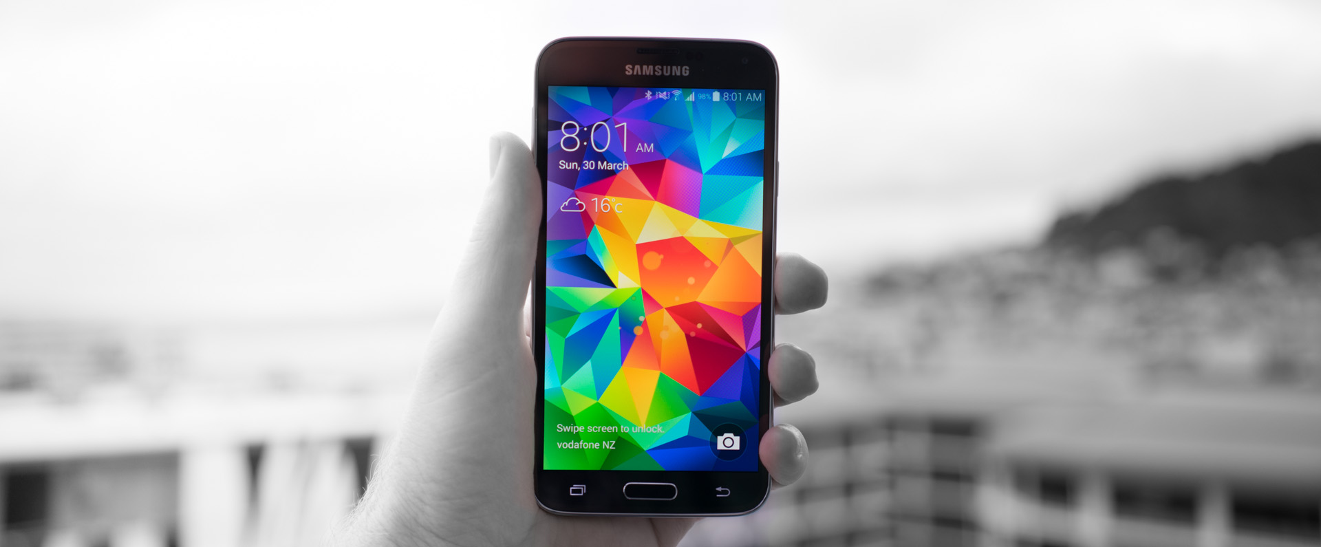
The design has been tweaked slightly, though, with the camera a little less obvious and off slightly further to the right and a slightly larger 5.1″, 1080 x 1920 display than last year.
The lack of change in this area is on purpose; this is probably the most consistent part of Samsung’s design across the last few generations of these devices and is instantly recognisable to almost anyone.
It’s not the most beautiful phone (that’s reserved for the HTC One or the iPhone), but this year’s Galaxy flagship actually looks and feels less plasticy and is more attractive than any other that’s come before it.
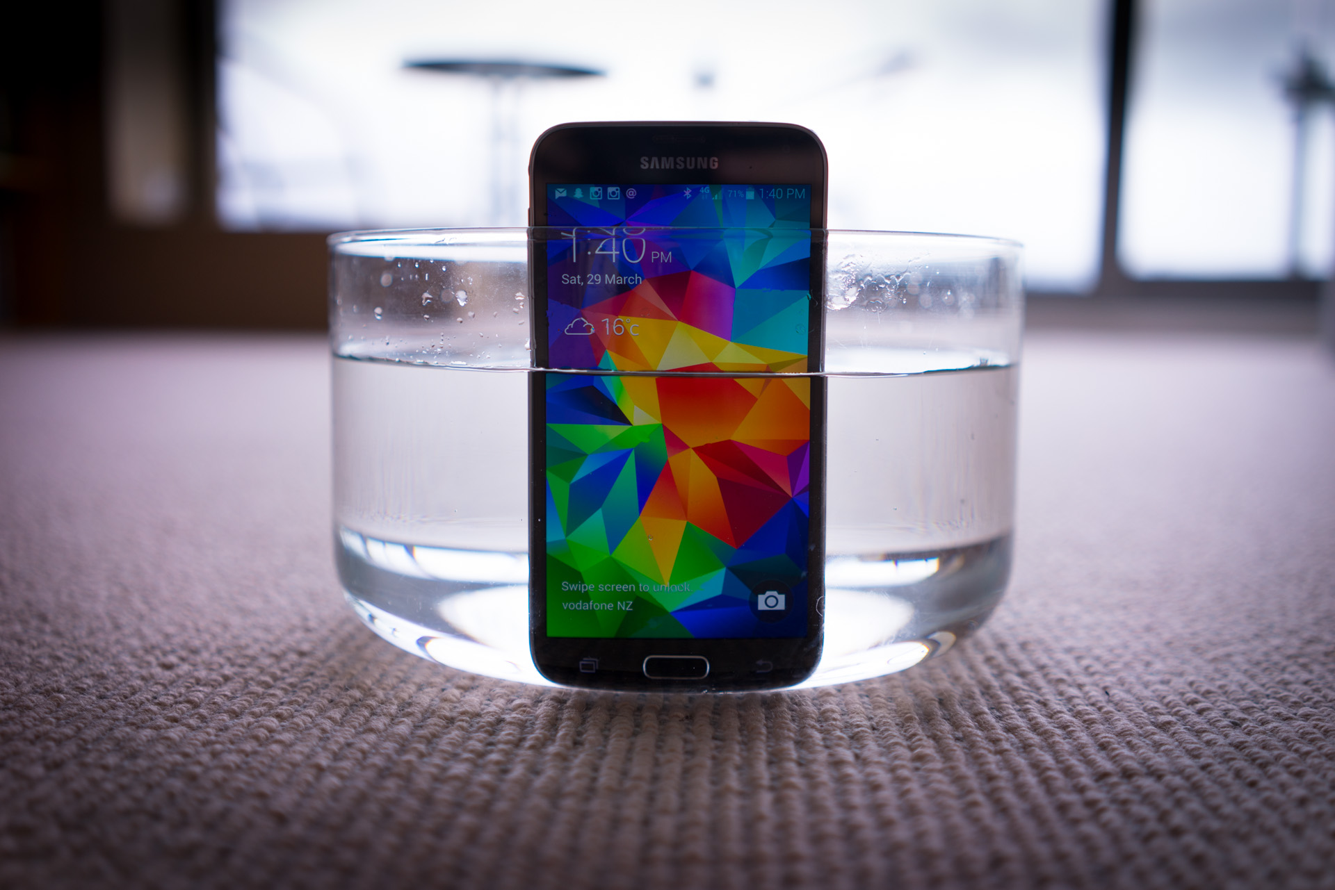
What’s probably most surprising about this design is it’s dust-proof/waterproof up to an IP67 rating. If you’re not sure what that actually means, the numbers reflect how much the phone can keep out without failure; this means the S5 is ‘totally’ dust-proof and able to be submerged for brief periods up to 1m deep.
For such a ‘normal’ looking phone, the waterproofing is extremely compelling. I can see it saving me from my clumsy self on a regular basis, although for the purpose of this review the usefulness didn’t extend past submerging the phone in jugs of water at dinner to impress friends.
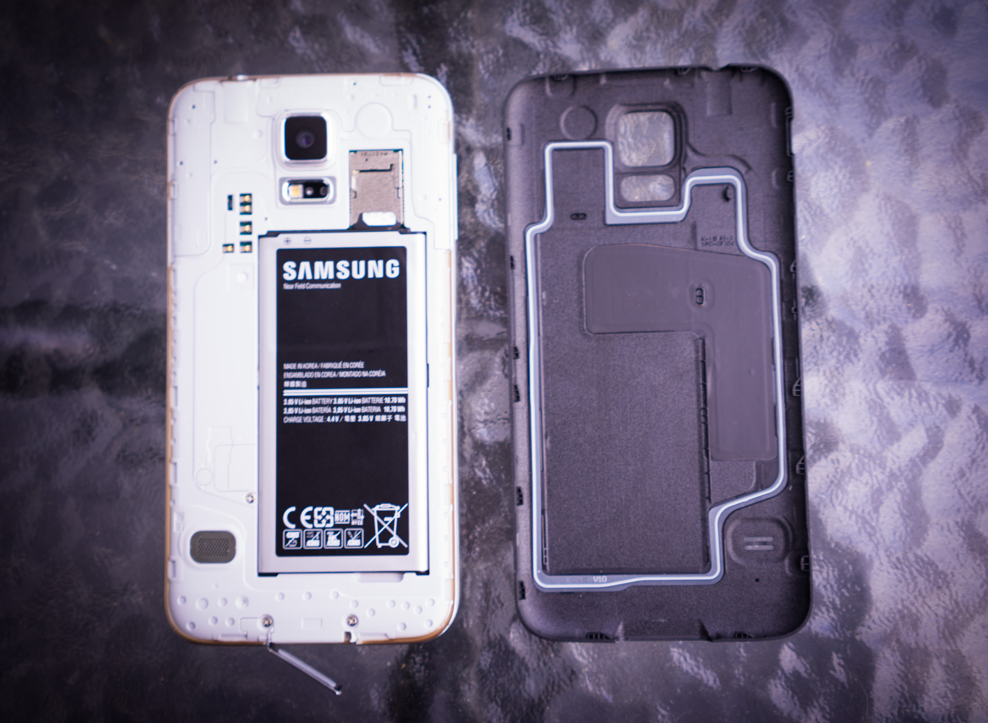
It’s nice to be able to know that a bit of water won’t wreck your phone and somehow, Samsung has pulled this off without having to cover the phone with flaps (aside from the charger port) like Sony did on the Xperia Z.
I’m not entirely sure how the company made the headphone jack waterproof without a flap, but it still works great even after a pretty significant dunking. In fact, you can submerge the entire phone and it’ll be fine, as long as you don’t do it for too long or go too deep with it which is good enough to survive being you being thrown in a pool with it.
There’s also a fingerprint sensor built into the home button, just like on Apple’s iPhone. It’s not obvious that it’s there, but it works very differently to Touch ID found on the iPhone 5s, which is unfortunately not a good thing.
Rather than simply placing your finger, it requires a swiping motion like traditional biometric sensors found on laptops, which can be a little harder to use. I tried to get in the hang of using it but found it more of a barrier to unlocking the phone than anything else; it feels like it adds a layer of complexity and almost always took more than one attempt to work.
Maybe the software just needs tweaking, but it’s nowhere near as good as Touch ID just yet. It rarely works and doesn’t quite have the same magical feel as using Touch ID. I don’t think fingerprint swiping is here to stay on mobile phones.
The S5 will be available in all the markets that the S4 reached, with the same 850 / 900 / 1900 / 2100 network support as well as Category 4 LTE for ridiculously fast speeds where supported.
Display
First impressions start with the display. The S5’s display is a stunning 5.1″, 1080 x 1920 Super AMOLED display, with colours that pop and the ability to go impressively bright. On paper, the screen is almost exactly the same as last year’s Galaxy S4, but to me it appears brighter, more vibrant and seemingly better at color reproduction than last year’s device.
My only qualm is that comparing the display with the iPhone 5s, the S5 seems to have a very slight blue tint when whites are displayed on screen. Past experience has shown that this can vary from phone to phone and I didn’t find this to be an issue unless I was actually comparing the two directly.
I haven’t had the opportunity to compare the S5’s display to the new HTC One yet, but I think this year Samsung is going to give the company a run for its money with this screen; colours are better than previously and the display is incredibly crisp. It draws you in.
The size is only a measly 0.1″ difference over the S4 but after using it for a while, picking up an iPhone makes Apple’s devices feel trivially small. The screen real estate is freeing, making iOS feel cramped and strapped for space.
I didn’t actually want a larger phone and had never considered something above 5″, but spending time with the S5 after using a 4″ display for over a year makes it seem like Apple’s falling behind. When picking up an iPhone after using the S5 for a day or two, it just feels ridiculously small.
We spend so much time on our phones; surfing the Internet, reading documents, browsing pictures and creating content, so does it make sense to keep using a cramped screen? Maybe not.
The constant push for larger and larger devices is putting pressure on Apple to release a larger iPhone and I think if the company doesn’t actually do it this year, they could have trouble on their hands as users look for larger devices after seeing the alternative. Not everyone will feel this way, but Samsung is certainly prepared for a shift to larger phones if consumers begin move that way.
Camera
This is the area that matters the most to a good amount of people and Samsung hasn’t disappointed. The camera this year is good. Really good. The camera you have with you is often best one for the job, despite how good or bad it might be, but Samsung’s made a camera that’s extremely versatile in a range of conditions.
In normal, well-lit conditions the 16-megapixel shooter performs well, capturing colors beautifully and reproducing the scene extremely well. Using the camera day to day was delightful; it literally ‘just’ works and takes incredible shots for a phone. My only complaint here is that sometimes the camera’s compression seems to make photos seem a little over-sharpened, but hopefully this can be fixed in a software update.
The company touted that the camera is able to focus in <250 milliseconds; I initially thought this was just marketing speak but you can feel just how fast this focus is in action. You tap the screen and it’s focussed. That’s it – dead simple and blazing fast. It focuses even faster than the iPhone 5s and I love it.
Low light performance is pretty good too, although at times it can end up a little noisy even when there’s a decent amount of light available. Pictures in these situations are generally pretty good, though, and about on par with how I find the iPhone 5s to perform. Not bad but certainly not Nokia Lumia 1020 kind of good.
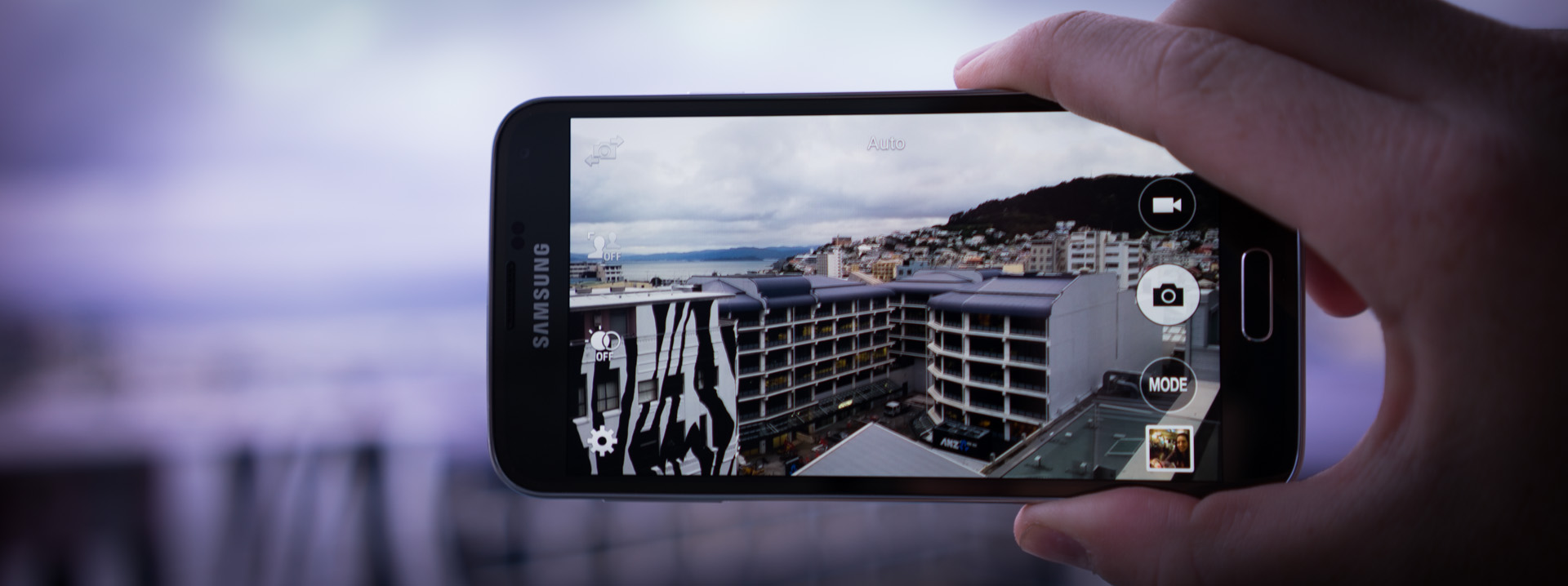
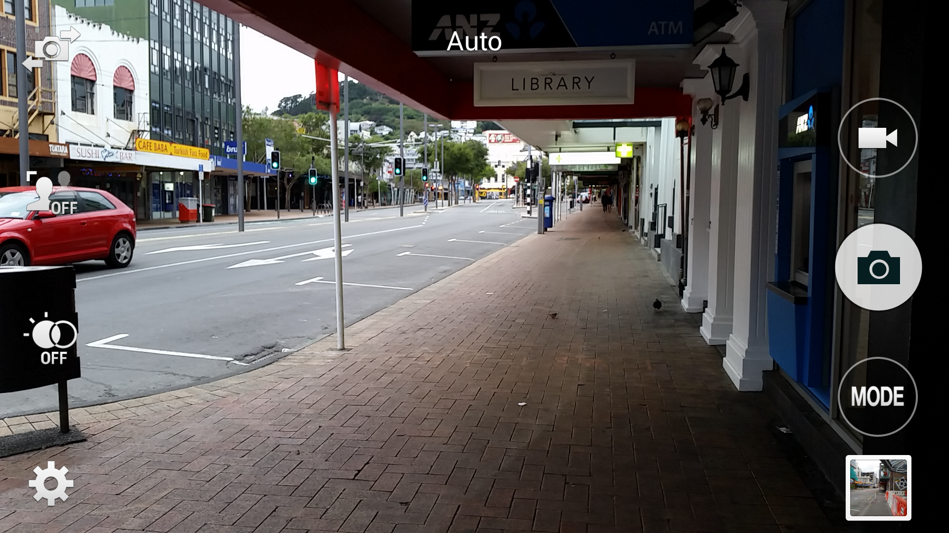
In the camera application itself, there are hundreds of options for camera nerds. The choice can feel like a little too much — especially having come from the iPhone where there’s very few options — but many of these features are incredibly powerful. It’s a far better layout than previous versions of the camera application have been and keeps many of the core shooting options simple and one tap away.
A new ‘selective focus’ mode takes macro mode and pushes it to the extreme for a phone; making great shots with incredible depth of field for a mobile device. It takes a bit of practice, as you have to hold it steady while it samples a range of different focus points to create the photo, but makes for a great photo.
Another mode helps to create virtual walk-throughs, similar to Google Streetview, so that you can send a smooth video to friends and show off your street or house. It’s easy to use too, you just have to take a photo with the dot in the centre of a circle, move a few steps forward and repeat.
Overall, the camera impressed me this year. I love using it and the blazing fast autofocus on this is second to none, Samsung has really nailed it in this area and avoided making it too over-complicated. There’s a plethora of options, as always, but they’re hidden away under settings menus so you don’t have to see them unless you want to.
The S5 takes impressive photos with very little effort, which is a feat that only Apple has pulled off flawlessly previously. Having a huge screen for taking shots means you’re able to get a great idea of what the end result is going to look like and it’s almost always satisfying.
We’ve included a range of test shots in the gallery below; these are unaltered shots taken straight from the camera so you’re able to judge for yourself how it performed. Since we’ve only been able to take shots outside on particularly grey days so far, we’ll be adding more over the next few days.
Next: Software
Software
Samsung’s software has always been a major point of contention for most potential phone buyers. Touchwiz has historically been branded as “total overkill” and “obtrusive” but this year, Samsung has been forced to dial it back.
A report by Recode shed light on secret talks with Google where the company expressed concerns about the fact that Samsung was changing Android beyond recognition. As a result, Samsung was forced to sign an agreement with Google to ‘dial back’ its skinning of Android, so that Google’s improvements to the OS were able to shine through.
The S5 assumably marks the beginning of that deal and has shipped with what I could only describe as a slightly less offensive version of Touchwiz, but it’s not all that different. It’s not stock Android — which most would prefer (luckily there is likely to be a Google Play edition of the S5) — but it’s as close as you’re likely to get with a company like Samsung at this point in time.
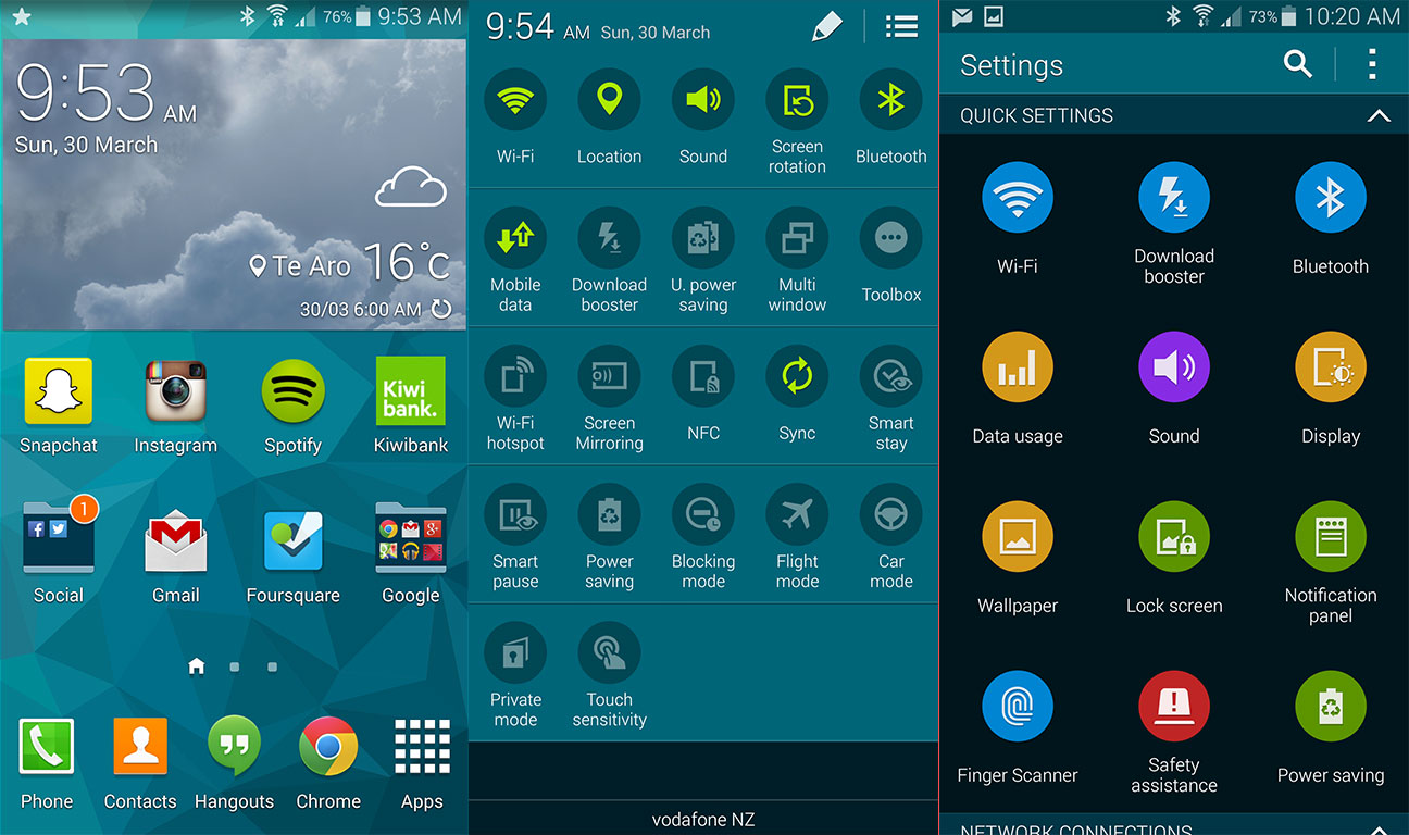
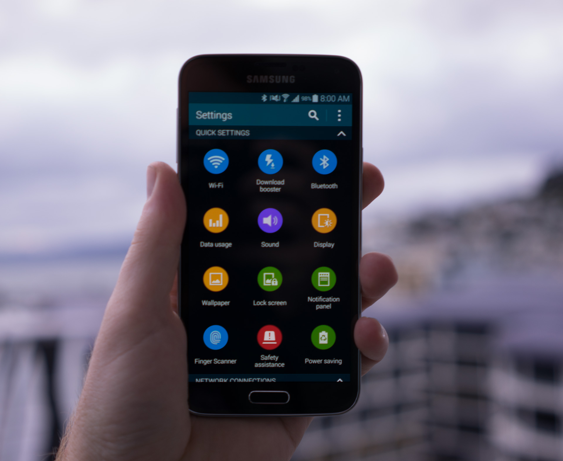 Designs across the OS have been tweaked to be less garish in places but mostly still resembles the S4’s version of Touchwiz. The notification centre is filled with a plethora of options to tweak features from across the phone but it remains largely unchanged; it’s still cluttered and overwhelming, with options galore.
Where Touchwiz has been dialled back is in the core ‘AOSP’ applications that users rely on, such as the Calendar application which was formerly a horrible brown abomination that was almost unusable but now resembles a slightly tweaked version of Google’s official app. It’s not perfect, but it’s better than before.
Part of this may be attributed to Google’s push with KitKat to add consistency to all of it’s own applications and allow users to choose which to use as default for core applications such as SMS (one of the first choices you make with the S5 is if you want to use the ‘messages’ app by Samsung or Google’s Hangouts app) but Samsung is seemingly getting better at taming its designs.
The home screen is largely the same as that of the S4, with some better looking widgets but with a strange replacement for Google Now when you swipe to the left. Instead of being presented with Google Now, like in stock Android, you’re shown your ‘magazine.’
 What’s actually under the hood here is Flipboard — which is a huge win for the company — but it doesn’t make any sense as a Google Now replacement. Google’s vision for Now is providing access to contextual information quickly and easily, so it’s now integrated with the official home screen but for some reason Samsung decided to replace this with a feed of news.
It could be in response to HTC’s Blinkfeed, but I actually hate this change that Samsung has made. If you like news, it might be useful for you, but I find Google Now much more useful as it provides information I might find relevant (including news) as opposed to just a feed of the latest happenings online.
The most disappointing part is that Samsung hasn’t given any way for the user to bring back the Google Now integration. You can disable the ‘magazine’ feature but you can’t choose to use Google Now instead. It’s not a deal breaker since you can access Google Now through holding the home button or replacing the home screen altogether with the Google launcher yourself, but it is a shame that Samsung doesn’t share Google’s vision.
There’s a lot of applications that Samsung adds to the Android experience out of the box, but it’s much less preloaded junk than in previous years. The applications that are there actually have legitimate uses and those that are interested in more free apps from Samsung can download them directly from a special Samsung apps store.
This reduction in preloaded applications is nice as it makes it less overwhelming for a new user to onboard to the phone. The applications that are here, such as S Health and Smart Remote are useful too.
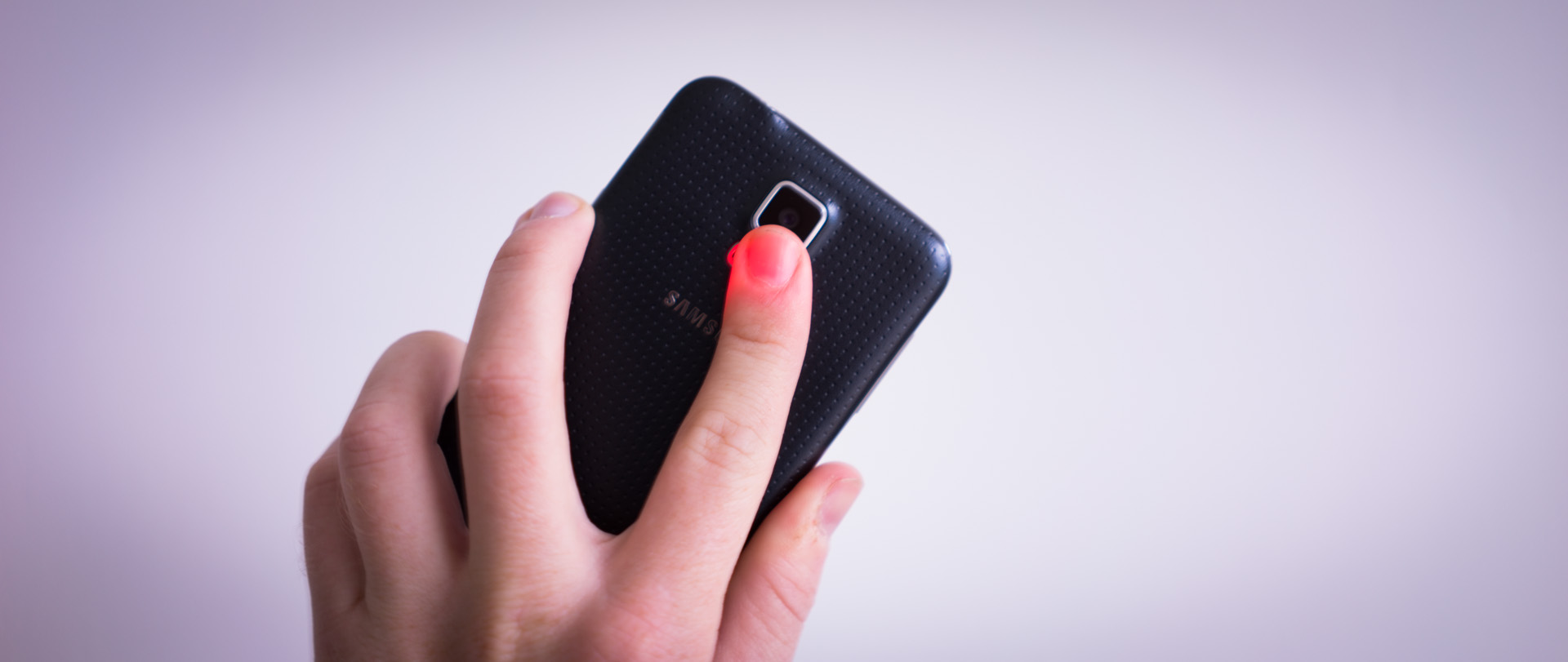
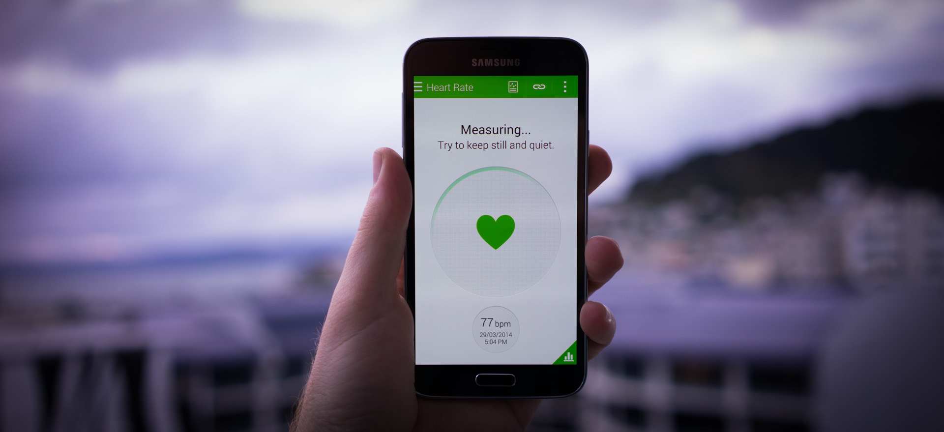
Samsung’s already trying to get the jump on Apple’s rumored foray into health data by building a heart rate monitor right into the phone with the S Health application. You just hold your finger against a small sensor on the back of the phone and it lights up your finger like E.T. while it reads your pulse.
After 10-15 seconds, you’ll get a pretty accurate readout; it’s actually pretty nifty to be able to measure your BPM at any time. It’s actually quite useful for keeping track of just how intense a workout has been over time as it graphs each recording on a daily chart, so gym go-ers could find this useful.
Another new application called ‘Geo News’ tells the user if there’s any natural disasters or significant events in their region that could be dangerous. The information is sourced from a number of services and offers a way for users to alert a nominated emergency contact of their status and location if affected by a disaster. My home country of New Zealand is an extremely active earthquake region and I could imagine this feature being extremely useful in a large disaster.
There are a plethora of other features built into the phone itself that did exist in the S4 too, such as the ability to use the phone without touching it via ‘air gestures’ or another that keeps the screen on while you’re looking at it.
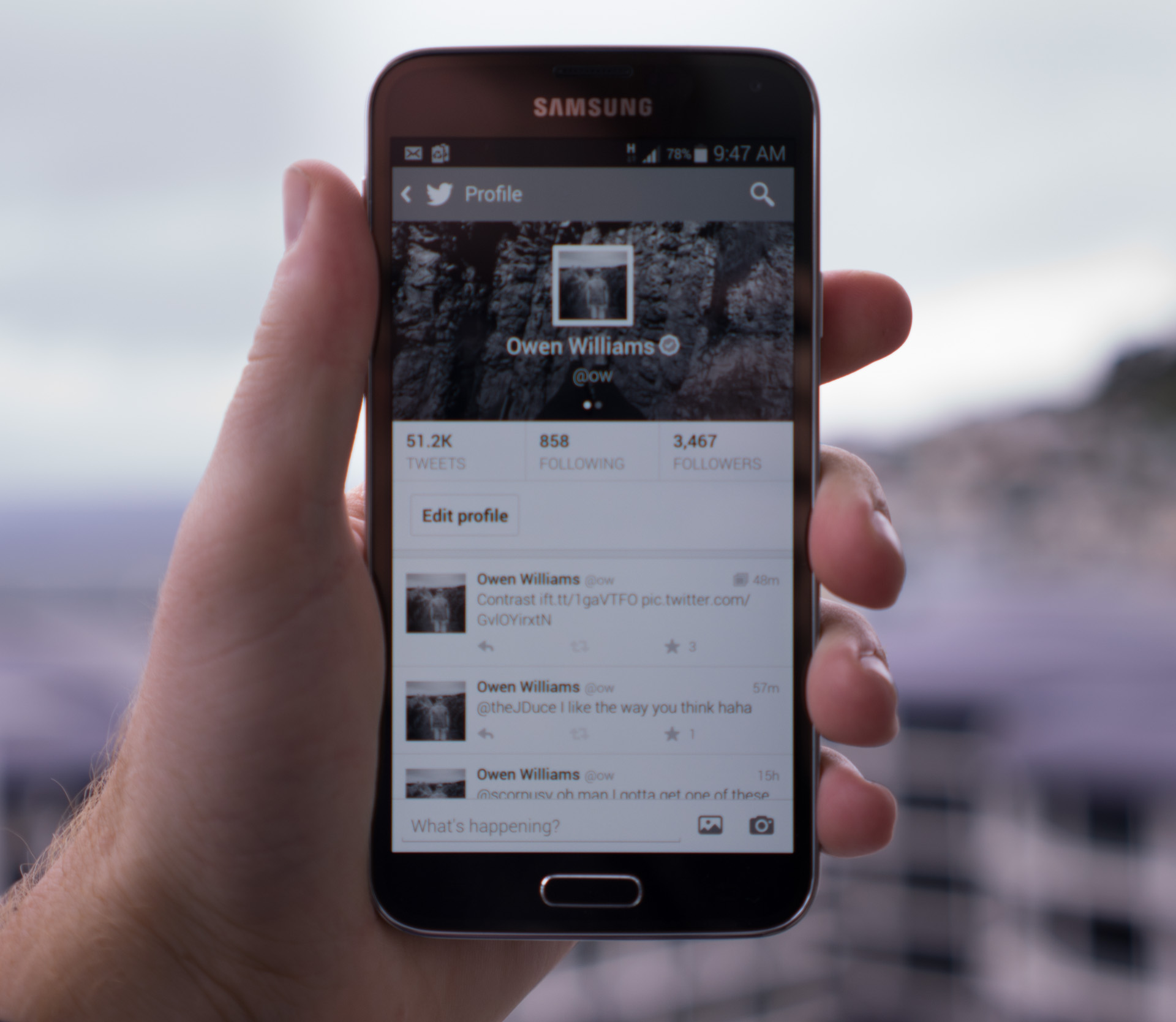 Others are new and impressive; a new ‘ultra power saving’ mode puts the display into greyscale, turns off some connectivity features, spins down the CPU and restricts the user to using only a handful of apps to preserve the battery. This is legitimately useful, too, with the phone reporting a whopping 10+ days of standby time in this mode, meaning you could go on a long tramp into the bush and not need to turn it off to preserve the battery.
Another new feature called “download booster” promises to speed up downloads when on WiFi by combining the 4G data connection with the WiFi to download large files faster, which is impressive to say the least.
The beauty of Samsung’s flagship devices has always been the sheer amount of choice for users and the S5 doesn’t disappoint, but it doesn’t overwhelm the user by throwing features in their face at every turn.
There’s something here for everyone; those who like having crazy features to show off to their friends might appreciate even the ones that are gimmicky, which ultimately could result in more sales for Samsung.
In terms of performance, the S5 does well with everything that’s thrown at it. When reviewing the S4, I found that the software often froze or was unresponsive but on the S5, I never got the impression that it was struggling. It’s alway snappy and responsive, there’s no scrolling lag or weird transitions anywhere. It’s nice that this isn’t something that needs to be worried about anymore.
Taking aim at the iPhone
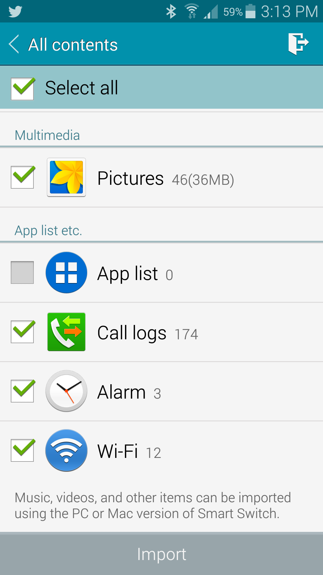 One of the most interesting new features of the Galaxy S5 is an application called ‘Smart Switch’ that helps those moving from other devices jump into the S5 head-first with their contacts, messages and other information.
What’s amazing about this application is that Samsung can import almost anything that’s backed up in iCloud to the S5. Once you sign in with your Apple ID (which I was nervous about handing over to a third party but did anyway), the phone can import contacts, calendar appointments, which applications you have installed, notes, reminders, alarms, messages, call logs, photos and other items stored in iCloud.
That’s right, you can bring your entire history of iMessage conversations across with little effort. And your alarms. And even your saved wifi passwords. You just check the boxes of what you want, then it’s quickly imported to your S5. I couldn’t believe how easy it is to get everything that mattered to me across.
Samsung must have spent a large amount of time reverse engineering Apple’s iCloud backups to perform this feat and it’s so good that it makes me wonder just how long it will take for Apple to try and cut it off.
It’s the first time I’ve seen a feature that makes it so easy to switch, which shows just how serious Samsung is about converting iPhone users to its devices.
Wrap-up
The S5 is finally running a less-grotesque version of Android than ever before, with an attractive hardware design and one of the most beautiful screens on the market and the surprising ability to survive being entirely submerged without concern. There are a number of features with questionable real-world application but there’s also a number that are legitimately useful, such as the extreme battery saving mode
What I’m not sure about is if there’s enough here to lure users of the S4 to upgrade; overall the phone isn’t that different from last year’s other than an improved camera, slightly larger screen and the addition of a fingerprint sensor and a number of software features. It does look and feel better, though, which could be enough to lure over those users.
Where I think Samsung is really focusing now is on luring iPhone and other Android users away; Samsung has made it almost seamless to jump from an iPhone or other Android device to the S5. It’s an impressive feat, showing just how serious the company is about winning over the mass market.
This tactic might work too – I’m firmly entrenched in Apple’s ecosystem, using a Mac, iPad and iPhone on a daily basis, but the freedom of Android, the larger screen, the rich camera options and the waterproofing are all compelling features that I just can’t get on an iPhone.
The S5 could be the first time I’ve ever felt the desire to seriously consider switching to a Samsung device full time because Apple refuses to break into larger devices just yet. Samsung has managed to build a flagship that’s still made of plastic but doesn’t feel particularly cheap like previous generations and is simple enough to use without being assaulted by options around every corner.
I’ve gone this entire review without mentioning specifications because I believe we’re finally at the point where these don’t matter as much to both users and phone builders. This means that companies like Samsung have moved on from worrying about the phone with the most cores or RAM, to focusing on creating experiences that enhance or delight the user.
Samsung demonstrated this during its event,;choosing to spend more time talking about what the can phone can do as opposed to what’s inside. Provided the phone is quick and able to perform it’s tasks with ease, there’s no use focusing on these specifics anymore. It’s just not as relevant as it used to be, and the way that users will ultimately be using the phone is more important to them over the long run.
With the S5, Samsung has finally started achieving a level of polish that was not attained previously. Critics have always been disappointed in Samsung’s attention to detail, but the company is starting to focus on creating an end-to-end experience that users love as opposed to just jamming in features all over the place. There’s still lots to see, but there’s less thrown in the user’s face than ever before.
It’s hard to say what users will choose this year, but with HTC failing to significantly improve the One’s major flaws, Samsung will likely continue to win the Android smartphone war. This may all change if Apple releases a larger smartphone with groundbreaking new features in September but all we know is rumours at this point.
I really like what Samsung has done. It’s finally refined things and made the experience less grating. It’s built a phone with a beautiful display, added some fairly compelling features and built a fantastic, almost perfect camera for Android. The S5 is a breath of fresh air for Samsung and those who use the iPhone may be tempted away as the company makes it easier to switch.
Revolutionary phones were a regular occurrence when smartphones were in their infancy, but now that they’ve grown up, we’re seeing almost-perfect devices getting tweaked and incrementally changed every year. Samsung’s taken last year’s hit phone and made it even better. Incremental is the new cool, because it means that the best phones get even better as time goes on.
If I were to have to choose a phone to buy right now, it might just be the S5.
Get the TNW newsletter
Get the most important tech news in your inbox each week.
