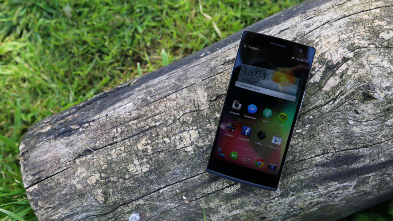
In Europe and the US, Oppo is an underdog. You won’t find its smartphones in a carrier store, or promoted with big-budget ads on TV. The Chinese firm just doesn’t command the same influence as Android rivals Samsung, Sony and HTC in these markets.
Yet Oppo is making some inroads with the core Android community. The Find 5 (review) and N1 (review) were stellar handsets with attractive designs and competitive specs. It even partnered with CyanogenMod, a wildly popular Android ROM, for an exclusive version of the N1 last year.
For its latest flagship smartphone, Oppo is offering two different variants. The first is the Find 7, which aims to surpass the competition with a 2K (Quad HD) display and bleeding-edge specs. The second is the Find 7a, a cheaper version that can still compete with other top-end Android flagships.
Our review examines the latter. Without the 2K display, does the Find 7a do enough to finally penetrate Western markets?
Design
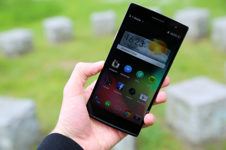
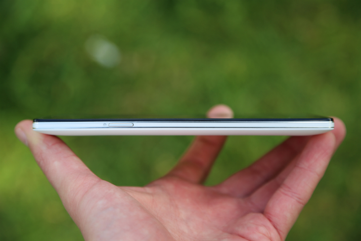
Although the handset boasts a large 5.5-inch display, it sits quite comfortably in the hand. The industrial design is rectangular and fairly regimented, but the rounded corners and softened edges ensure it’s never awkward to hold.
Surprisingly, the handset is quite grippy. I’m often worried that I’ll drop a smartphone with such a large display or physical footprint, but with the Find 7a my fingers were instantly locked in place. As I walked outside and checked Twitter on the tube, I never once worried that it would escape my grasp.
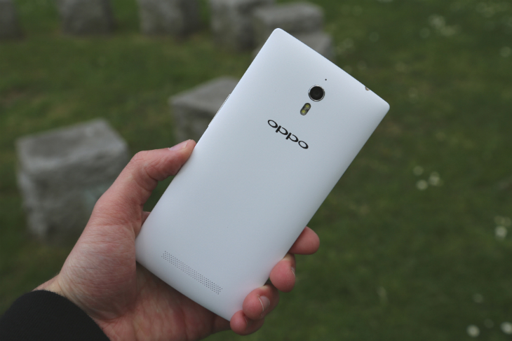
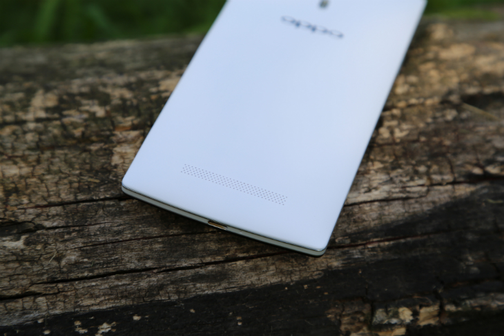
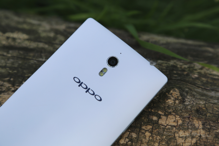
The back of the device is made from a textured plastic which looks underwhelming in photos, but is actually quite luxurious. I would often catch myself just running my finger along the panel, feeling the mesh of tiny dimples against my skin. The removable rear panel is also slightly curved, which means it nestles nicely in the palm of your hand.
With such a large display, it’s difficult to reach the top of the device without adjusting your grip. To compensate, Oppo has placed the power button on the left-hand edge and the volume rocker on the right. Both feel natural and reduce the number of scenarios where you’re forced to use two hands.
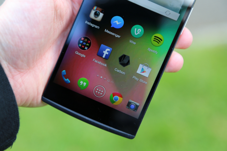
The bezel on the left and right-hand side of the device is almost non-existent, but it’s difficult to ignore the larger chin at the bottom. Here you’ll find three capacitive keys (Menu, Home and Back) which are discernible with a faint blue light. The glow needs to be stronger though; in natural lighting it’s difficult to make out their respective icons and for the first couple of hours, I was frequently peering at the keys and pressing the wrong options.
Underneath the capacitive keys is a blue, oscillating notification light which Oppo is calling the ‘Skyline Notification’. Nissan cars aside, it’s a welcome design flourish that makes the Find 7a stand out from other Android flagships.
At 170 grams, it’s not the lightest smartphone on the market. For comparison, the Samsung Galaxy Note 3 (review) is a couple of grams lighter, despite its larger 5.7-inch display. The all-metal HTC One M8 (review), meanwhile, is only 160 grams, although its smaller size is clearly a factor. Despite the extra weight, the Find 7a never felt cumbersome or heavy. If anything, it adds to the Oppo tradition of excellent build quality and dense industrial design – this is a smartphone that’s built to last a 24-month contract.
Display
When it was first unveiled, the Find 7 attracted a lot of attention for its 2K (quad HD) display. It’s a huge selling point and as such, it’s difficult not to feel a little disappointed with the lower-specced Find 7a.
But you shouldn’t be. If you remove the Find 7 from the equation, the Find 7a still stacks up against the latest flagship smartphones from Samsung, HTC and Sony. All three companies have opted for 1080p (full HD) displays, most likely to optimize performance, battery life and production costs. The Find 7a is no different and shouldn’t, therefore, be dismissed so easily.
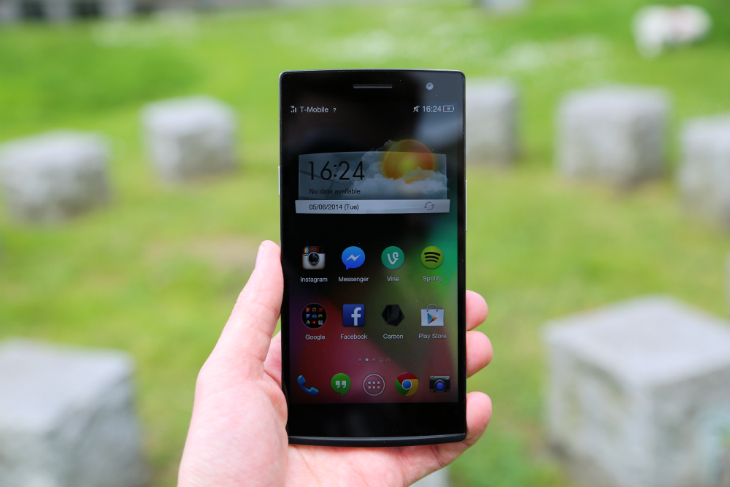
The 5.5-inch IPS display has a resolution of 1080 x 1920 pixels, or 401ppi. The viewing angles are superb and, by adjusting the slider in the notifications pull-down, the maximum brightness is impressive. Anything less is a little dim in my view, but it’s worth experimenting with an Android app like Lux.
Contrast is excellent, with piercing whites and deep blacks. Color representation on the N1 tended to be on the cool side, but Oppo appears to have fixed most of those problems for the Find 7a. Whether you’re checking Instagram or streaming a film from Netflix, colors are rich and vibrant, with an appropriate blend of temperature and saturation levels.
Sound
I’m still waiting for a handset that can match the BoomSound speaker setup on the HTC One. Both the original and HTC One (M8) offer a superb audio experience, with excellent volume, levels, depth and stereo effects.
Alas, the Oppo Find 7a doesn’t offer front-facing speakers. Instead the audio is blasted backwards, which feels counterintuitive if you’re watching a music video on YouTube from the other side of the device. Or watching a movie. Or taking a call on Skype. Or anything that involves listening and looking at the screen simultaneously, basically.
Despite my frustration with rear-facing speakers, the Find 7a is excellent at audio playback. The first time I queued up an album on Spotify, I had to double-check that it was the handset, not a Bluetooth-enabled speaker, that was throwing the tunes back in my direction. I tried a range of genres and was surprised at the clarity, breadth and depth produced by the Find 7a.
Did I mention this handset is incredibly loud? With the volume slider set at 33 percent, the rear-facing speaker filled my makeshift office with ease. At 75 percent it was able to drown out – or at least compete with – a small gathering that had congregated in my kitchen. That’s impressive.
Color OS
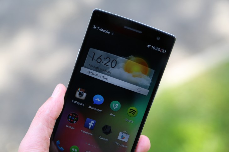
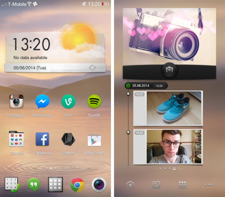
When you first set up the handset, you’ll be confronted with Color OS, Oppo’s take on Android. The company’s default theme and launcher is wildly different from stock Android, with exclusive app icons, system-wide fonts and widgets.
It’s brash and inconsistent. For instance, swiping right from the home screen reveals what Oppo is calling ‘Spaces’. These are essentially full-screen widgets; Oppo has the photo option set by default, but you can replace or supplement it with a music-centric alternative if you prefer.
They’re oversized and limited in functionality. But oddly, the shortcuts underneath have a different design to the regular Color OS app icons. While they’re in-keeping with the rest of the theme, it’s these small details that make the UI feel muddled and unfocused.
Color OS is also burdened with a large amount of pre-installed software. I counted 34 Oppo-produced apps when I switched on the device, which is simply unnecessary for a modern Android smartphone. Coupled with the usual array of Google services and a small selection of games developed by Gameloft, the app drawer was packed from the outset.
That’s an unpleasant experience, especially before I had even opened the Google Play store and downloaded any of my preferred apps.
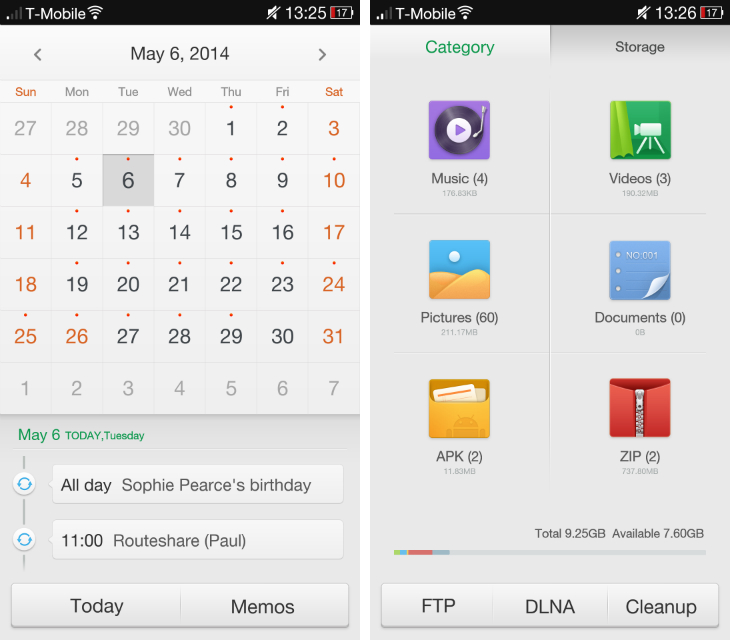
The bevy of pre-installed apps could be forgiven if they were unique or remarkable, but they’re not. The email, calendar and note-taking apps, for example, all pale in comparison to Google’s offerings and the Files app, while useful, wastes large portions of the screen with unnecessary white space. Most of them are serviceable, but I wish Oppo would dial back on the sheer quantity of pre-loaded software. As the saying goes: It’s quality, not quantity that matters.
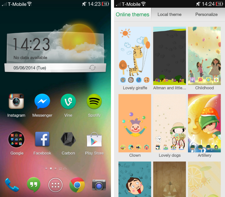
The saving grace of Color OS is its extensive customization options. The device comes with its own themer app, which offers an array of wallpapers and app icon packs. They won’t affect the design of the apps themselves, or the system-wide menus and settings, but it goes a long way to refreshing the device’s appearance. Again, most of them are garish and a little silly, but dig deeper and you’ll find some attractive options. I quickly settled on a theme that imitates stock Android version 4.3 (Jelly Bean) and opted for a nifty lock screen that incorporates a weather widget and camera shortcut.
By long-pressing on the home screen, you can also add widgets and choose between three animation effects: Default, Tilting and Vivid.
By swiping down from the upper left-hand corner, you’ll trigger a space for custom gestures. The basic premise is that you draw a symbol on-screen to launch an app or common function of the device. Oppo has two set up by default – an “O” for the camera and a “V” for the flashlight – but you can create custom gestures for calling contacts, sending an SMS, launching a website or app. It’s a bit of a gimmick, but works as advertised.
Camera
I was impressed with the swivel camera on the Oppo N1 and approached the Find 7a with similar expectations. Oppo’s latest smartphone packs a 13-megapixel rear-facing shooter and thankfully, it doesn’t disappoint.
The camera app has a simple, minimalist design that should appeal to first-time photographers. All of the shooting modes and settings are hidden under a few icons, but they’re usually only a single-level deep – I was never rooting around to find them and they rarely stopped me from capturing an important moment.
With everything locked to their default settings, the Find 7a produced some sharp, detailed images. The camera has a tendency to underexpose images, but it’s easy enough to counter through spot-focusing. Just tap on your subject and the camera’s exposure settings will be adjusted accordingly.
Otherwise, I was very impressed with the camera. It doesn’t rival the iPhone or the ‘PureView’ shooters in Nokia’s Lumia handsets, but it’s certainly one of the better Android devices I’ve used. If you’re in the market for a new smartphone and care about photography, this device should be in your shortlist.
Notably, the Find 7a can shoot RAW images, animated GIFs and in a high-resolution mode called ‘Ultra-HD’. The latter produces 50-megapixel shots by taking ten photos in quick succession and stitching them together. It’s a novel idea but in practise, it rarely produced better images – even at 100 percent crop. Nevertheless, it’s an interesting concept that I hope Oppo takes further.
The device also supports 4K video recording and a 120 frames-per-second slow motion mode. It’s serviceable for Instagram and Vine, but I wouldn’t depend on it for anything else. In testing, the final footage was occasionally choppy and exposed, but the color balance and contrast was always reasonable.
Sample images
Sample video
Performance and battery
Usually when I say a smartphone “can last a day,” I mean the hours to which I’m awake. If an Android handset can frequently make that quota with regular use, I’m pretty content. So I was surprised to see that, after 24 hours, the Find 7a was still standing. Admittedly, I had very little charge remaining – just a few percent, to be exact – but I was still taken aback by the battery life. It’s nice to know that if you fall asleep and forget to charge your phone, the next morning you’ll still have enough juice to make it to the office.
The Find 7a has a 2,800 mAh battery, which is a fraction higher than the HTC One (M8) and slightly lower than the Sony Xperia Z2 (hands-on). It’s also removable, which means you can easily replace it with a spare battery when you’re struggling to find a power supply.
The handset also offers what Oppo calls Rapid Charge, a purpose-built charging system that can revive the device in only a short period of time. On its website, the company says you’ll get to 75 percent after just 30 minutes, and be able to take a two-hour call after just five minutes.
I couldn’t replicate those times, but it’s worth noting that my test unit came with a US charger – by fitting a UK adaptor, I was probably nullifying Oppo’s souped-up power brick. As a result, I’m reserving judgment for now.
The Find 7a runs on a 2.3GHz quad-core Qualcomm Snapdragon 801 processor and 2GB of RAM. It’s very competitive with the latest devices from Samsung, HTC and Sony, and in regular use I didn’t notice any performance issues. Admittedly, the Find 7 (with the 2K display) is slightly more powerful – it boasts 3GB of RAM and brings the processor clock speed up to 2.5GHz – but I suspect the improvements will be marginal.
Whether I was editing photos or playing intensive games such as Asphalt 8: Airborne, the Find 7a never missed a beat. Moving around Color OS was fast and snappy, and I never experienced any noticeable lag across the UI.
The bottom line
Slowly but surely, Oppo is building a reputation for itself. The Chinese company has built yet another device with stellar hardware – both in terms of industrial design and the components fitted inside. In all of the key areas – display, camera and speakers – the Find 7a is an absolute joy to use and frequently surpassed my expectations.
The 5.5-inch display is too large for my tastes, but its physical footprint will likely appeal to the same people picking up the Samsung Galaxy Note 3 and Sony Xperia Z Ultra. I would prefer a 4.7-inch or 5-inch version, but that’s just my personal preference.
The software is where Oppo is struggling at the moment. Color OS still feels bloated and unfocused, especially in comparison to the latest versions of Sense (HTC) and TouchWiz (Samsung). Against Motorola, which essentially ships stock Android, and Sony, which takes a very hands-off approach, the Find 7a just doesn’t come close.
But then we get down to the price. The Find 7a will ship later this month for €399 (roughly £330) in Europe, which is only slightly more expensive than the Nexus 5. The price for the US is still to be confirmed, but it’ll likely undercut Samsung, Sony and HTC’s offerings.
The device looks good, performs well and has excellent build quality. If you can find a way to modify the software experience – Nova Launcher Prime is a good place to start – this is a handset you should consider.
Get the TNW newsletter
Get the most important tech news in your inbox each week.
