Motorola’s Moto G smartphone shocked everyone. Mid-range handsets rarely delight avid smartphone enthusiasts, as they’re often riddled with compromises and offer little in the way of innovation. The Moto G bucked this trend with stellar performance for its low-cost price-tag, alongside a clean design and minimal tweaks to the Android experience.
Now, Motorola is back with the Moto E, an entry-level smartphone that aims to supersede the higher-end feature phones and bevy of slow, cheaply made Android handsets. With the tagline “goodbye dumphone,” Motorola is pitching a low-end smartphone for the masses. This is about mid-range performance, coupled with a price-tag ($129) that everyone can afford.
Design
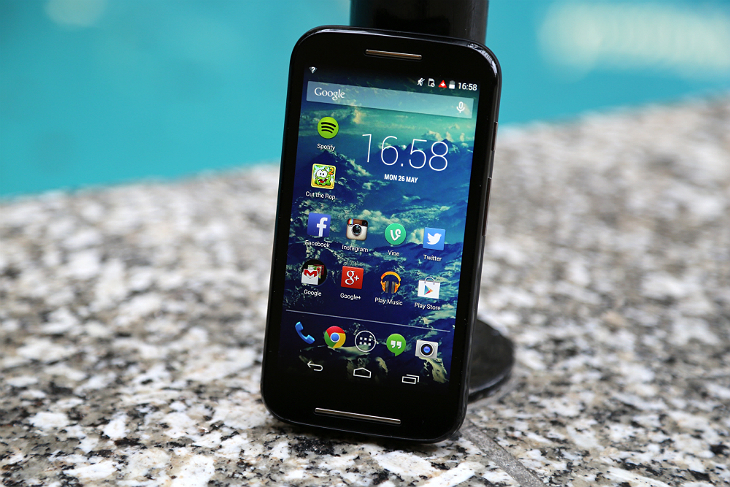
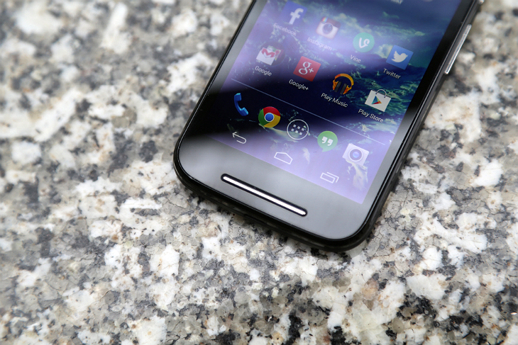
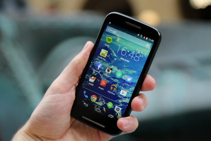
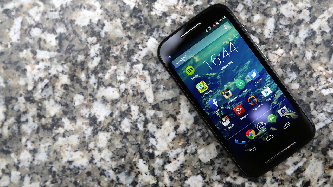
The Moto E isn’t Motorola’s most elegantly designed piece of hardware. It’s a pleasant handset, but it doesn’t have the style or sophistication that made the Moto X stand out. On the front, you’ll find two chrome speaker grills at the top and bottom, which increase its physical size and, unfortunately, tends to pull your attention away from its compact 4.3-inch display.
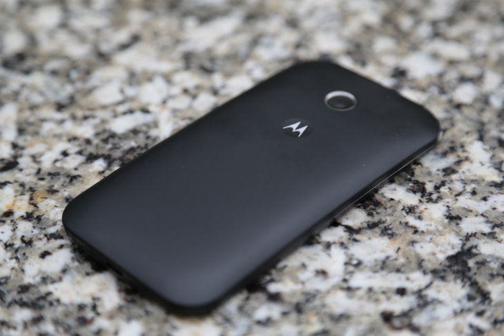
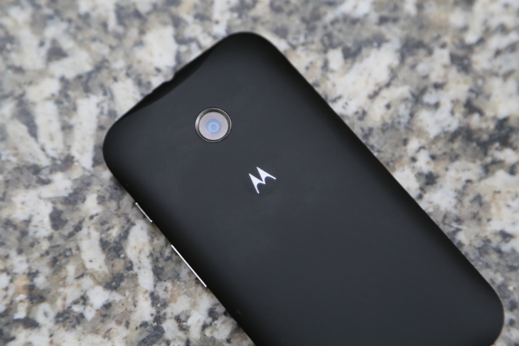
The build quality is top-notch, however. Although you can peel off the interchangeable backs – called Motorola Shells – at any time with your finger nails, the Moto E feels like a single, cohesive device. The adjoining line is clearly visible, but the sheer density of the hardware gives it some considerable heft. At five ounces, this is by no means the lightest smartphone for its size, but you get the impression it could easily withstand a few drops and knocks.
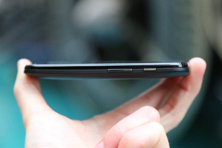
The volume rocker and power button are located on the right-hand side, nearing the top of the device. You can reach them easily without adjusting your grip, but they don’t feel particularly well-built. While the Moto X buttons were clicky and responsive, these are mushy and lack sufficient travel.
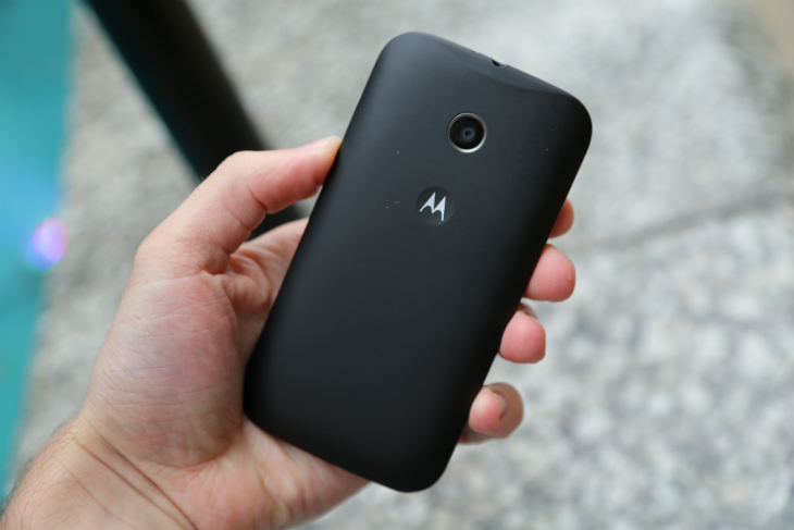
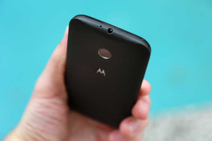
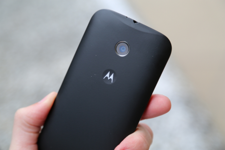
On the back, the Moto E shares a near-identical design to its pricier siblings. The circular camera module is discreet and doesn’t protrude from the back Shell, so you can place the handset on a flat surface and it’ll sit perfectly still. The dimpled Motorola logo is a delight too – your index finger will rest there naturally and it only improves the ergonomics of the hardware.
Alongside the Moto X and Moto G however, the Moto E is a little chubby. The curved back and rounded edges give it a healthy dose of style, but it’s not enough to hide the Moto E’s portly profile. It’s a shame, because shaving just a couple of millimeters would have made a huge difference here.
Display
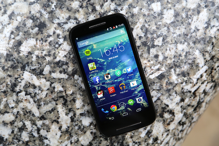
Pixels, or a lack thereof, make a huge difference. The Moto E sports a 540 x 660 resolution display (256 ppi), covered by tough Gorilla Glass 3 and an anti-smudge coating – which rarely flatters Google’s mobile OS.
Stop for a moment and you’ll immediately notice the jagged edges surrounding each app icon, as well as the soft text and UI elements littered across each screen. The panel is fairly bright though and, even in direct sunlight, I was able to unlock the handset and navigate apps without shielding the screen.
Viewing angles are respectable and color representation is accurate, for the most part. Blacks are strong and deep, but whites tend to border on a dull, faint grey. This is particularly noticeable when browsing ebooks, emails and the Web – the Moto E simply lacks the contrast needed to display this content properly.
Despite these problems, Motorola has nailed the fundamentals. The touchscreen is responsive and does an admirable job of hiding the usual smudges and occasional scratch. It’s neither impressive or terrible, instead sitting comfortably in the realm of adequacy. For an Android smartphone with such an affordable price-tag, that’s an achievement in itself really.
Sound
Finally, a new Android smartphone with front-facing speakers. The placement makes a great deal of sense when you consider how everyone is consuming media on their mobile devices. Too many manufacturers bolt the speaker(s) to the back of the device, which reduces power and stereo sound reproduction when you’re staring at the screen. For music videos, sports highlights and Instagram clips, it’s just a poor design choice and wildly inefficient.
None of this is a problem with the Moto E. The speaker grille on the front packs some real punch; if you’re sat on the beach or want to share something in a crowded room, you can ramp up the volume and easily make yourself heard. While I was working on this review, I found that 50 percent of the handset’s maximum volume was easily enough to fill my room with some tunes.
The speaker is crisp and clear, although the dynamic range is somewhat lacking. High notes are sharp and punchy, but you’ll notice some distortion at higher volumes. At the low-end, the bass is shallow and underwhelming, although that’s common for most smartphones – regardless of the OS.
These are small blemishes against an above-average speaker, however. The overall performance is excellent and casts a long shadow over similar smartphones in its class. If you use your handset for music and podcast playback in your home, the Moto E should serve you well.
It’s worth noting that with a pair of headphones, the handset is equally impressive. Audio playback will, of course, vary depending on your choice of earbuds and the format/source of the content, but regardless of which “cans” I’m using – the Moto E is always able to deliver.
Software
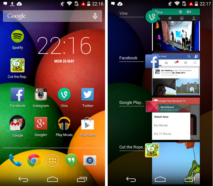
As with the Moto X and Moto G, Motorola has made few Android alterations for the Moto E. Aside from a few pre-installed apps, you would be hard pushed to differentiate the software experience from a Nexus or Google Play Edition device. For all intents and purposes, this device runs “stock” Android.
Aside from the Moto G – which was later released as a Google Play Edition – we’ve never seen a low-end smartphone with such a tempered take on the OS.
The move is particularly important because it’s often OEMs’ ostentatious skins and unwanted bloatware that hamper low-end hardware. These tweaks and alterations are easily forgiven on high-end devices, but for entry-level smartphones the impact on performance can be dramatic.
As such, it’s probably the best user experience you can get on a sub-$150 handset at the moment.
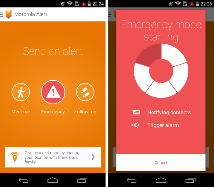
Motorola does offer a few unique software features to entice users, however. A new addition is Motorola Alert, which makes it easier to notify friends and family when you’re worried about your personal safety. After specifying an emergency contact and your domestic emergency services, the app can be set up to sound an alarm or auto-dial any of these numbers.
Additional modes let you send a text to selected contacts with a meeting place, as well as send your current location at regular intervals. A neat flourish is the ability to alert certain contacts when you leave or arrive at a pre-selected location. For instance, your spouse can be alerted when you leave the office late at night, or when you stumble out of a nightclub at 3am in the morning. Combined with the timed location updates, it’s a simple and effective way to give worried friends, partners and parents peace of mind.
After its excellent debut on the Moto X, the Assist app makes a welcome return for the Moto E. Within the application are a range of modes that alter the profile of the device based on when and where you are. The smartphone can be silenced for all but the most important calls late at night, or when your calendar shows that you’re in a scheduled meeting. Similar to the Moto G though, there’s no Driving mode in this particular version. I’ve never owned a car – so this isn’t a drawback for me – but its omission here is still notable.
Camera
Low-end smartphones are full of sacrifices, and the camera is usually first on the chopping block. As long as the sensor is 4-megapixels or higher, device manufacturers are happy to throw in whatever is cheapest, saving crucial component costs for other aspects of the handset.
Unfortunately, that’s equally true on the Moto E. The 5-megapixel rear-facing camera is just poor. Regardless of your subject matter and lighting, the Moto E is unpredictable and struggles to produce a decent shot. The fixed-focus lens does its best to keep everything crisp and sharp, but it rarely impresses.
The camera is capable of producing respectable photos though; in bright sunlight, I’m able to capture the occasional scene with reasonable color and clarity. These moments are few and far between though – the wildly inconsistent results mean you just can’t trust the Moto E to deliver.
Video recording is equally disappointing. Colors look washed out and the Moto E struggles to keep up as you pan horizontally. For short clips the handset is adequate, but you’ll never be surprised or impressed by the final footage.
Motorola’s latest device doesn’t have a front-facing camera either. So if you’re a selfie addict, or enjoy video calls through apps such as Skype, LINE and Google Hangouts, you’ll have to look elsewhere.
Sample images
Sample video
Performance and build quality
For the most frequent tasks, such as reading email, checking Twitter and browsing the Web, the Moto E holds up just fine. As we mentioned earlier, the almost “stock” Android experience helps to optimize the performance of the Moto E. As you pull down the notification shade, switch home screens and browse the system settings, the device rarely slows down.
For lighter use – which is what most first-time smartphone buyers will be using it for – the Moto E fares remarkably well. In the past, I would find feature phones and low-end smartphones almost unusable, with glacial load times, frequent app crashes and unnecessary clutter. The Moto E is far beyond this category, with a base-level performance that any user should be content with.
Admittedly, the dual-core 1.2 GHz Qualcomm Snapdragon 200 processor occasionally struggles. The Google Play store takes a while to load and you’ll need to wait a few moments for chunkier apps such as Spotify.
The device can be a little sluggish, but it’s perfectly usable and never enough to cause frustration. I notice a small amount of lag while typing and switching apps takes a smidge longer than I would like, but frankly I’m nitpicking here. For its price-tag, the Moto E offers excellent performance in a petite package.
The onboard storage is a problem though. The 4GB offered simply isn’t enough, especially when you consider what the Android platform and the pre-installed apps take up. A microSD card is absolutely essential, so be sure to factor that in when you’re considering a Moto E purchase.
Battery life was one of my biggest concerns for the Moto E. The non-removable 1980 mAh battery sounds woeful on paper, but in the real world it doesn’t fair too badly. I’m able to use the smartphone for a full day (or the hours for which I’m awake, anyway) without any problems, although you’ll need to charge it every night without fail – or face a dead device in the morning.
The serviceable battery life can be attributed to the smaller, low-resolution display and the processor nestled under the hood. They’re not the most powerful components and, as a consequence, affect what I do with the device every day. Unlike most high-end Android smartphones, I’m not using the Moto E to edit photos or play games such as Monument Valley on the bus.
This is a budget smartphone and if you treat it as such, the performance and battery life won’t be a problem.
The bottom line
The Moto E is one of the best entry-level smartphones I’ve ever used. For its price, the industrial design and solid performance is fantastic. Combined with “stock” Android 4.4 KitKat, it’s a reliable device that anyone can use.
But it’s still a hard sell.
The Moto E (4GB) costs $129, but for an extra $50 you can upgrade to the base-level Moto G (8GB). As well as the increased storage, you’ll gain a higher resolution display, a faster processor, larger battery and better camera.
You’ll also gain a front-facing camera and a more attractive industrial design. The only downside is the Moto G’s missing microSD card slot, which you can reclaim by jumping up to the new 4G-enabled Moto G ($219).
All things considered, the Moto G represents better value than the Moto E. However, the extra $50 is almost half of the Moto E’s asking price, which could mean a lot to first-time smartphone buyers. While the Moto G will probably age with more grace, the Moto E is still a good entry-level smartphone.
Motorola has sacrificed a lot to reach that magical $129 price-point, but it’s also retained just enough of the core performance to make the Moto E enticing. The feature phone isn’t dead just yet, but after handling Motorola’s latest smartphone, its inevitable demise feels closer than ever before.
Get the TNW newsletter
Get the most important tech news in your inbox each week.
