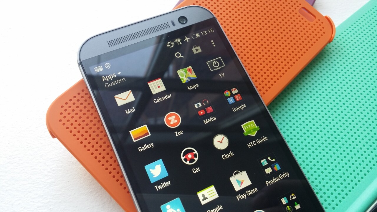
In one way, pretty much everything was known about HTC’s new range-topping One (M8) handset well in advance of its launch. Photos leaked, specs leaked, and most of the info was pretty accurate. The result is that it wasn’t a launch full of surprises.
Nonetheless, it’s one thing to know the straight paper specs, and it’s another to spend some time living with a phone to see what it’s really like to use day-in, day-out.
Not only does HTC’s newest flagship device go up against rivals like the Samsung Galaxy S5 and iPhone 5s, it has some big shoes to fill too – the first HTC One won plenty of praise for its design and performance, even if those plaudits didn’t necessarily translate into sales.
Priced at around $649 in the US and around £530-£550 in the UK, does the freshly launched M8 offer enough to tempt customers, or even upgrading One owners?
Design and hardware
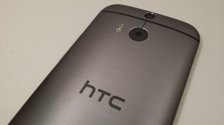
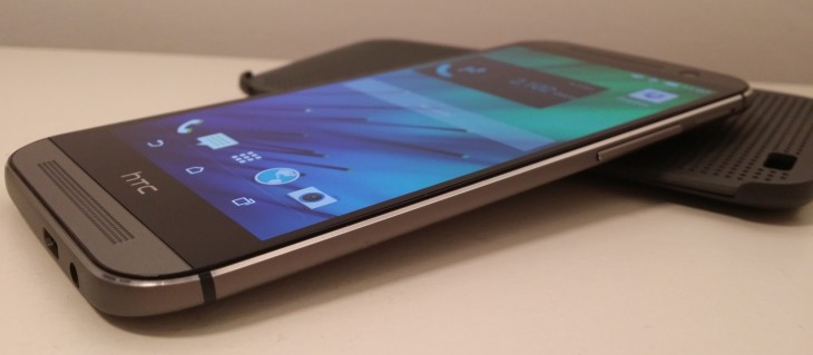
To say the design of the phone takes cues from the original would be an understatement – aside from being larger and having a few other tweaks, it’s very much based on the same idea.
That means you get an all metal shell (90 percent of the total handset, versus about 70 percent of the HTC One) that imbues a certain premium quality feel to the device. The overall result of this new suit is a more rounded feeling handset. It’s heavier too – officially weighing 160 grams, making it significantly heavier than rivals like the iPhone 5s at 112 grams (although it has a smaller screen, so this is to be expected) and the Samsung Galaxy S5 at 130 grams.
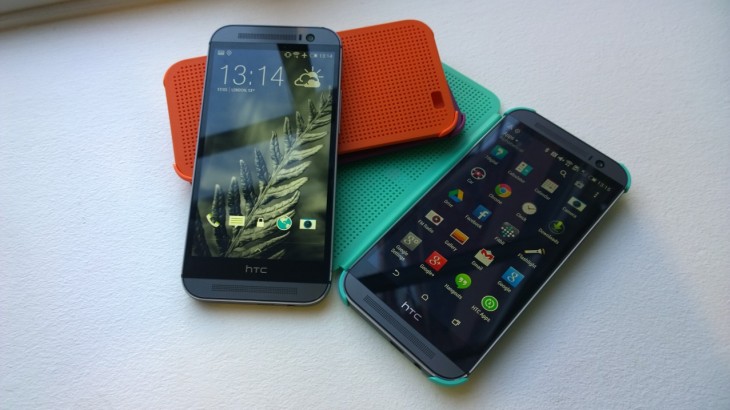
The metal chassis doesn’t account for all that weight though, the 5-inch 441 PPI full HD (1080 x 1020 pixel) display certainly has some of it to answer for – but given its outstanding performance, sharp images and bright screen that’s still visible in direct sunlight, it can be forgiven for adding a few grams. The screen is particularly good at maintaining a good quality image from off-center viewing angles too.
There’s also a snappier processor under-the-bonnet, a quad-core 2.3GHz chip with a motion sensor for basic movement tracking without the need for another device, just like the iPhone 5s.
The motion sensing has also been used to enable some quick launch features too, but more on that later.
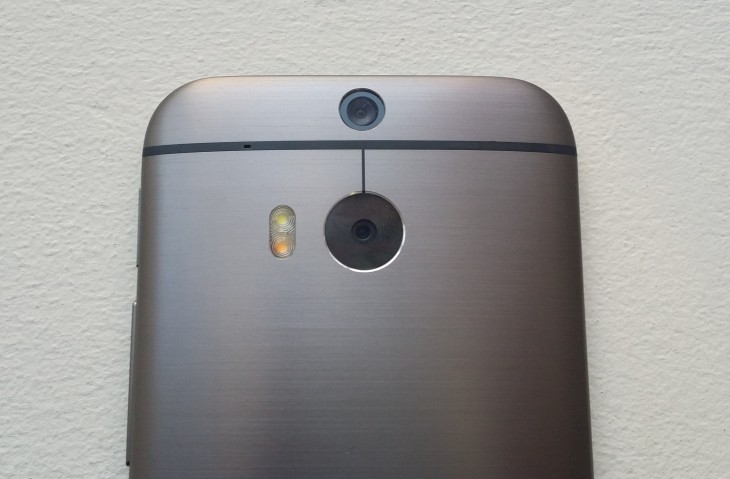
The main difference to the design is on the rear of the phone and comes in the form of the Duo Camera, HTC’s new dual-sensor system for capturing additional spatial information alongside the main image. The sensor of the main camera itself is pretty much the same 4-megapixel ‘UltraPixel’ camera found in the HTC One.
Although it’s called Duo Camera, the second sensor above the main lens is just that – a sensor. It can’t be used as a stand-alone camera.
Impressively, on the front of the device is a 5-megapixel snapper for video calling and selfies – there’s now a dedicated selfie mode on the camera too, along with a range of other options.
On the right-hand side, there’s a volume rocker and the slot for the nano-SIM – a new addition for this model. On the left, there’s finally a microSD slot for expanding the on-board storage. We’re looking at the model with 16GB of internal storage, but there will be a 32GB model offered in some markets. In reality, you get about half of that 16GB to use out of the box.
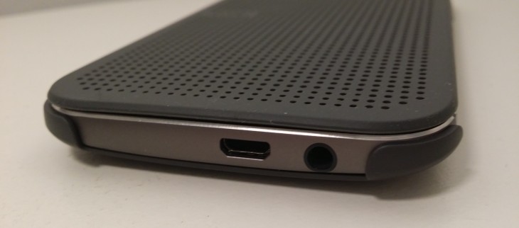
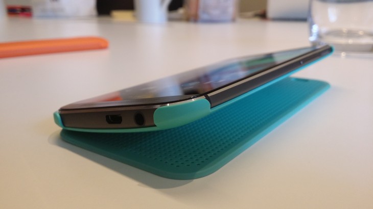
There are still the dual BoomSound speakers above and below the display, too. In fact, the only other real difference in the hardware is the relocation of the headphone socket from the top to the bottom of the phone.
HTC said at the announcement that the speakers are 25 percent louder than the original model – and provide a rounder sound too. In my testing (made easier by having an HTC One to hand), it definitely sounded louder and rounder; where the original One sometimes sounds excessively tinny at high volumes, the new generation provides an altogether warmer sound.
It’s still not going to sound its best with anything bass heavy, but I can’t think of any phone that provides a good bass sound. There’s a good reason for that – to achieve good bass, you’d need a bigger chassis, which isn’t usually a desirable feature in a phone.
Considering this, it’s impressive what HTC has managed to achieve in the audio on the One (M8). It might not be perfect sound, but it’s the best sound I’ve heard out of any smartphone.
Battery life has also been improved this time around (jumping from a 2,300mAh unit to a 2,600mAh pack) but despite a larger capacity unit, it’s really HTC’s software tweaks that will make a bigger difference to your battery life.
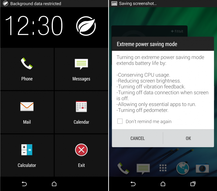
In your usual every day use, you’re still going to want to charge the One (M8) about once a day, although this can be significantly extended if you’re willing to switch into the ‘Extreme Power Saving Mode’ which pretty much stops you doing anything except making calls and sending messages/emails. It also switches off things like Bluetooth, as well as the on-board pedometer too.
In my testing, the device charged from 10 percent to full in a little under 2.5 hours, so even when it does run down, it doesn’t take too long to rejuice.
Camera
The camera in the One (M8) is a big deal for HTC. Unlike pretty much every other manufacturer, HTC decided to bow out of the megapixel wars with its 4-megapixel UltraPixel camera found in the HTC One. And for the One (M8) HTC has stuck to the same formula, which brings one obvious disadvantage – if you want to blow up your smartphone camera pictures to put on your wall (for example), this probably isn’t the handset for you. Quite simply, with a 4-megapixel sensor , it won’t capture enough information to make it worthwhile once you’ve scaled it up.
However, most people never get to that point, so the lack of megapixels isn’t really an issue in itself.
Obviously the biggest change in camera terms is the switch to using a ‘Duo Camera’ – equipped with an extra sensor for capturing depth and spatial info, which allows you to add effects to your images.
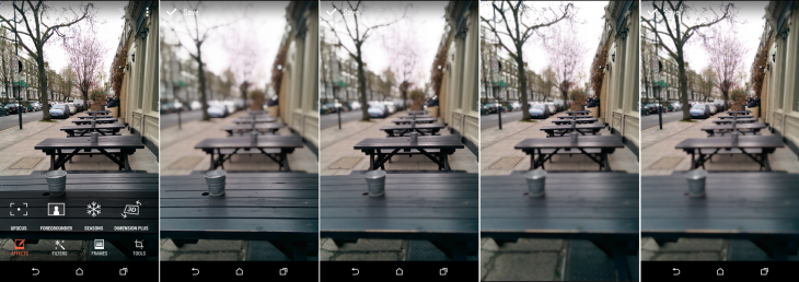
Among the new features is a 3D-like effect (called Dimension Plus) that alters the perspective of your shot a little bit – not one I’ve found useful so far – and others like Foregrounder, UFocus and Seasons, which are a little more useful.
UFocus allows you to select a part of the image to refocus on after taking a shot – so if you want to create a nice shot with a bokeh effect as the background, that’s easy to achieve with UFocus. You can see the effect in the images below – by selectively going through and selecting each table, the focus of the image changes.
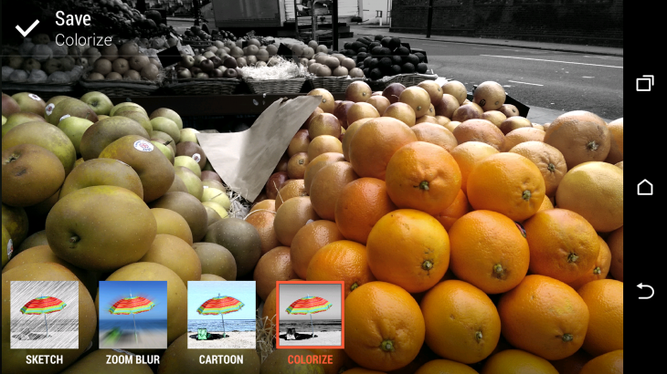
Foregrounder offers similar options, allowing you to select a section of the image to keep in ‘normal’ focus and then presenting the option to shade the rest of the images out or create a zoom blur (among other effects) or drain the color from part of the image (shown below).
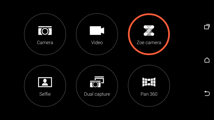
In fact, the camera options have been rejigged to provide quick access to every camera mode (including the freshly added Selfie and Dual Capture modes) directly from the capture/viewfinder screen, so switching between modes is a breeze.
And while we’re speaking of selfies, the front-facing 5-megapixel camera provides some of the best quality images for video calls (or selfies) you could realistically want, so if these things are important to you, it’s worth bearing in mind.
The Zoe capture mode is still present too (and being spun out as a standalone app for other Android devices later in the year) but there have been a few tweaks to the way it works for the One (M8).
Now, unlike the preset few second clip you get with the HTC One, you simply hold down the capture button for more than three seconds and it will carry on shooting in Zoe mode until you stop it.
More than all the new photo and camera tweaking options, at launch an HTC spokesperson told TNW that the camera had been designed to improve on the HTC One’s performance in bright conditions.
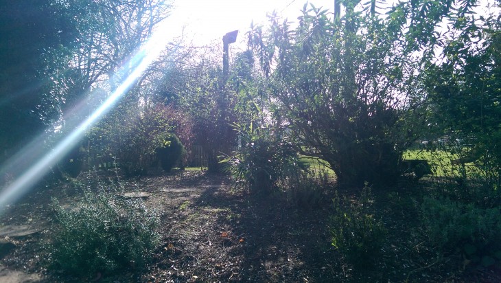
Unfortunately, in our testing, images taken in direct sunlight or in particularly bright conditions still come out completely overblown.
For comparison, the shot below was taken with the original HTC One at the same time. Although the image above was obviously taken looking directly towards the sun, it’s still a shame to see it lose quite so much detail in the sky in order to try and capture the rest of it more accurately and sharply.
Here’s one taken on the same sunny day not looking directly into the sun – a much better overall result, and one that was easier to capture than with the original One.
Overall, I find the camera performance improved from the original, but it’s modest gains rather than giant leaps. Perhaps the most impressive thing about the new options, is that it doesn’t slow down the actual taking of the picture very much.
To achieve similar effects on the Galaxy S5 requires a steady hand and an excess of patience, neither of which I have. But the One (M8) snaps away happily with very little lag at all.
The new modes I find to be a bit hit-and-miss. UFocus and Foregrounder are the ones I’ve found myself using most often, and while they’re easy and quick to get to grips with, they don’t offer much control over the area your selecting (or, by extension, the area you’re blurring/shading out).
Still, as a quick and easy way to make your shots look a bit more attractive, it’s nice to have the new options on the table. There are many more effects, edit options and tweaks tucked away too, most of which were available on previous models in the series.
Software
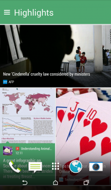
With the new handset comes the newest build of HTC’s Sense UI (version 6), focused primarily around BlinkFeed updates.
My favorite change to BlinkFeed is the fact that the main stream is no longer paginated, it’s a free flowing list of items that you can scroll through to your heart’s content.
It’s a small change, but one that makes a difference. For me, at least.
As before, you can also add your own content to the stream, with things like your social channels automatically being pulled in if you connect your accounts. It’ll also integrate updates from connected apps now too, so you can get things like your Fitbit progress updates right there in your stream.
It’s also a bit easier to add new content via search – although adding a specific RSS feed (if it’s not currently a partner of BlinkFeed) will still need to be done manually by pasting in the feed address. The article and image sizing has been standardized now too, to ensure that all the items are displayed in the same way, thereby looking just that little bit more slick overall.
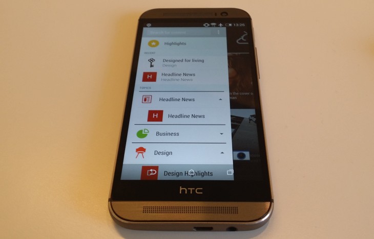
Ultimately, some people hate BlinkFeed (and if that’s you, there’s still the option to switch it off) but as someone who has never been too heavily invested in Flipboard, I’m perfectly happy to stick with BlinkFeed as my stream of constantly updating info.
Alongside launching the handset, HTC said it was also going to release a BlinkFeed APK for developers, so it should become integrated with even more services over time.
There are other tweaks introduced by Sense 6, like some minor changes to the font and a few other hardly noticeable cosmetic touches, but not too much to write home about.
With the new generation One comes the most recent version of Android too – version 4.4, KitKat. For a full list of all the changes introduced between Jelly Bean and KitKat, check out this page. There’s also good news if you like the sound of the hardware but aren’t keen on operator UIs, as HTC is planning to launch a ‘vanilla’ Google Play Edition of the One (M8) in the coming weeks.
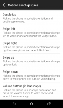
Thanks to the range of sensors on board (and the new motion-sensing capabilities), the phone also supports a range of new gesture shortcuts with its ‘Motion Launch’ feature.
These allow you to launch directly to the home screen, BlinkFeed or camera while the screen is off without needing to press the power button.
To achieve the latter, you hold down the volume control while in landscape mode with the screen locked. Double-tapping the screen when switched off will show the lock screen, and swiping right (in portrait mode) will launch straight into BlinkFeed.
Swiping left takes you to your widget panel and swiping up from the bottom just unlocks the phone and takes you to whatever you were doing last.
HTC has also done away with the hardware buttons found at the bottom of the screen on the HTC One. Instead, for the One (M8), there are now on-screen controls for switching between running apps, the home screen and stepping backwards.
From the company’s perspective, this was done to standardize apps across different devices. From my perspective, I’m just glad to have a dedicated button for accessing running apps again and that I won’t be left trying to go to the home screen by tapping the HTC logo, as I was with the original at first.
Dot View case
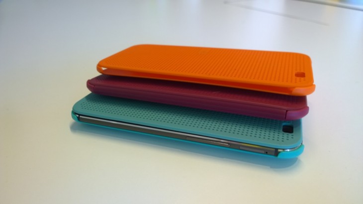
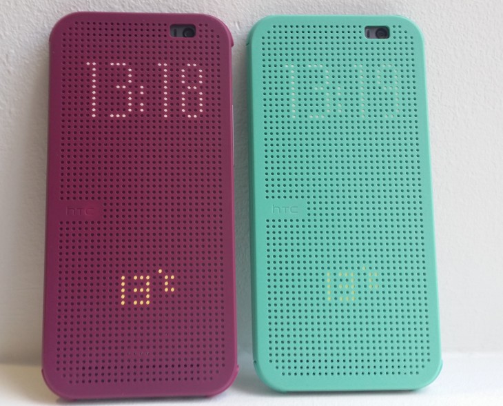
Alongside the launch of the phone itself, HTC also introduced a Dot View case (in a range of colors), which you’ll either love or hate. It simply slips on over the outside of the handset and can be used to quickly check the time or weather – or indeed incoming call notifications – without needing to open the cover, as it supports HTC’s double-tap gesture.
The first time I showed it to a non-tech friend, they laughed at how it looked, and it doesn’t really scream high-end premium to me but each to their own – for some people, this will be just what they were looking for and something a bit different to normal.
When in the case, the phone switches to using the low-res dot matrix display you see through the case. In normal use, you can’t select to use this display though, it’s only activated when the phone is in the Dot View case. If you really do want to get a peek of it outside the case, just take it out and sit it on top of the case, then when you press the power button, it will be using the alternate display.
Perhaps the most annoying thing for me about the case though is how the handset sits if the case is folded back underneath the device – it just won’t go flat. Naturally, it also adds to the overall bulk too – and somewhat ruins the sleek lines of the device. The final annoyance of the case is that if you’re using it and want to take a picture, you’ll need to leave it flapping open as there’s no way of taking a picture if it’s doubled back behind the handset.
To my personal taste, the case is a ‘swing and a miss’ – it’s a nice idea, but not one I want to live with. You might, though.
Conclusion
For the launch of the HTC One (M8), HTC eschewed headline grabbing features like waterproofing, biometric security or a heart rate sensor and instead focused on improving the core experience of using a smartphone.
The end result is a well-designed, responsive handset that has an amazing audio experience (for a smartphone) and a camera that’s certainly more accomplished than last year’s model, if not quite on par with some of the other range-toppers.
In taking this route, HTC did exactly what it set out to do – it made a better version of the already impressive HTC One. Unfortunately, for consumers that never cared much for the HTC One, the upgrades are unlikely to sell them on the new model, even if it is one of the best Android phones you can go out and buy today. It’s just not the most exciting.
Get the TNW newsletter
Get the most important tech news in your inbox each week.
