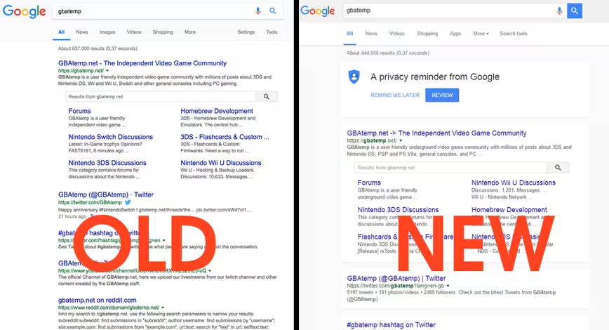
Search might be getting a facelift in the months to come. It seems Google is currently experimenting with a revamped version of its signature Material Design layout for its search engine service, as spotted by sharp-eyed Reddit users.
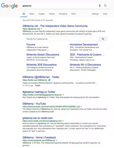
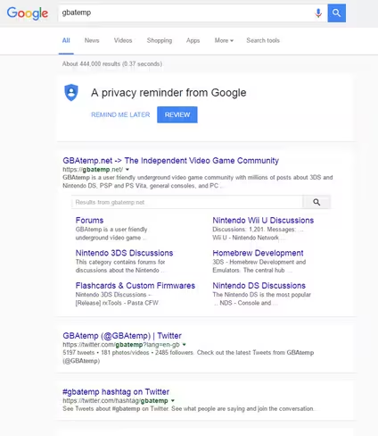
Here are a couple of screenshots to check out for comparison. The former is the old design, the latter is the revamped version:
Unlike the previous version, the new format has much more defined borders and accentuates the older card-box view. It remains unclear how widespread the test is, but TNW staffers still see the older design.
Since introducing it back in 2014, the Big G has gradually updated its extended suit of applications with Material Design.
Starting off with Search, the company eventually brought the aesthetic to YouTube and Chrome – both the browser and the operating system.
Still, it is not out-of-the-ordinary for Google to polish on its designs. Indeed, last year the internet titan updated its Material Design guidelines to help creatives work out the best color theme for their products. It also released this handy color tool that helps you effortlessly put together delightful color patterns.
We’ve reached out to Google for further comment about the updated Material Design layout and will share more details if we hear back.
The Next Web’s 2018 conference is just a few months away, and it’ll be ??. Find out all about our tracks here.
Get the TNW newsletter
Get the most important tech news in your inbox each week.
