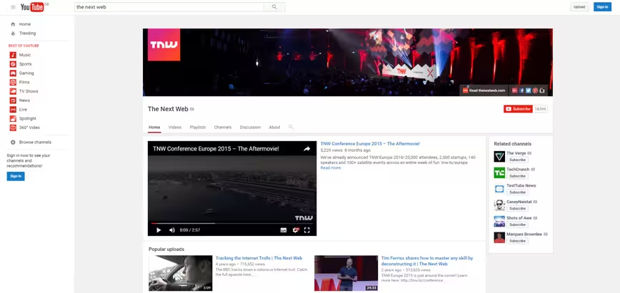
Google is continuing to roll out its Material Design makeover across its desktop products and it looks like an update to YouTube isn’t too far away. Here’s what to expect and how to enable it right now in Google Chrome on the desktop.
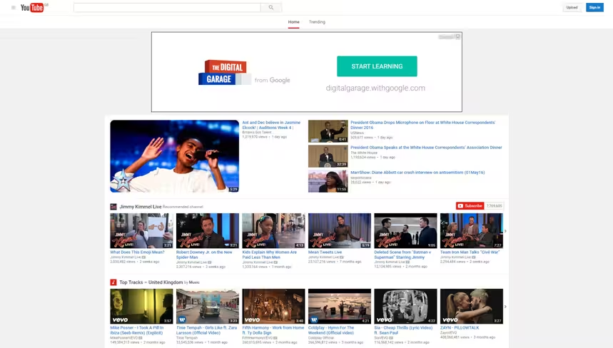
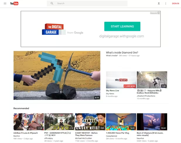
On the homepage, you’ve now got a Material Design-inspired Search bar in the center and the ‘Upload’ button has been replaced by the same upload arrow you see on Google’s mobile apps.
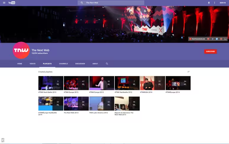
The most notable changes come to the Channel pages, with the background color now matching the dominant color of your header image, and a revised circular logo rather than the previously square stylings and altogether less engaging page layout. Giving creators a more personal-feeling page makes a lot of sense given that they’re the lifeblood of the platform.
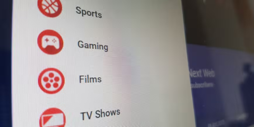
The circular icon approach has also been applied to the main sidebar menu, which makes it look a lot neater and more modern overall.
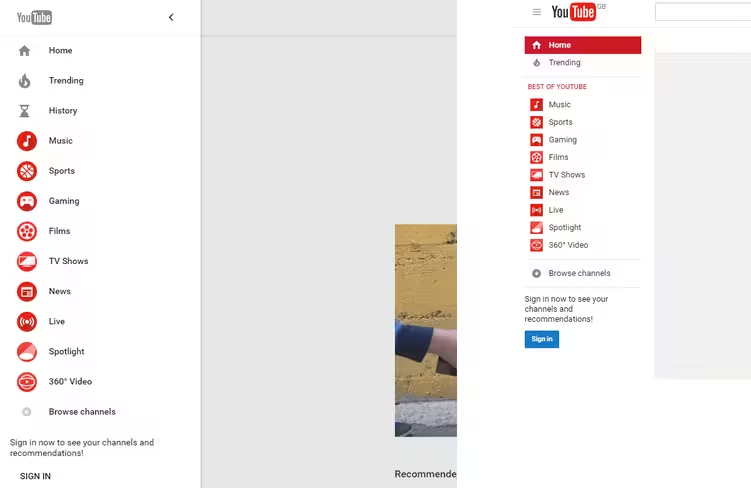
The video player page itself is actually one of the least changed aspects under the material design guidelines, with the introduction of more whitespace around videos, rather than a grey background to help demarcate between different page elements.
Again, this relative lack of change may well be deliberate – most people arrive at YouTube at a specific video page, rather than the top-level domain. If the first thing you saw was needlessly confusing, it could upset YouTube’s massive number of users.
There are a few other minor changes to discover, and if you’re a Chrome user, you can enable the new design right now. Credit for these directions go to Reddit user GiorgioMarinel via Android Police. If you want it to work, you’ll need to use Chrome and visit the US version of the site, rather than a local version.
1) go to https: www.youtube.com/?gl=US
2) open the developer tools (ctrl + shift + i)
3) go to the ‘Resources’ tab and delete the VISITOR_INFO1_LIVE cookie for the YouTube domain
4) go to the console and define the VISITOR_INFO1_LIVE cookie using the following command:
document.cookie="VISITOR_INFO1_LIVE=Qa1hUZu3gtk;path=/;domain=.youtube.com";
In my testing, the Material Design changes only currently show up if you’re not logged into an account. If you are, and you follow the instructions above, it should revert to the new design once you hit log out.
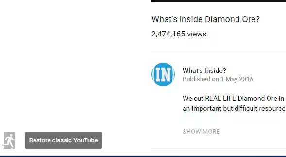
You can do this at any time using the button in the lower-left corner of the page.
If you want to take the Material Design one step further, you can enable it for Chrome itself right now too.
Get the TNW newsletter
Get the most important tech news in your inbox each week.
