Color is important. Choosing the correct palette to use is vital. It determines how usable your app or website is, and how readable any text is.
With that in mind, Google has updated its Material Design guidelines to account for color, and introduced a new tool that helps designers and developers in this respect.
To recap, Material Design is a set of guidelines that defines what an Android app should look like – at least according to Google. This set of diktats covers everything from layouts to animations.
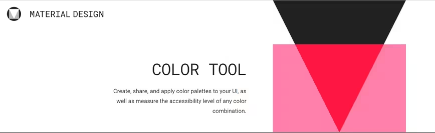
The new color tool is, in my opinion, the most exciting part of this new update. It allows you to experiment with color in real time, by creating and applying color palettes to a sample Material Design environment, or through components in CodePen.

The 💜 of EU tech
The latest rumblings from the EU tech scene, a story from our wise ol' founder Boris, and some questionable AI art. It's free, every week, in your inbox. Sign up now!
It also lets you check if any text rendered in your color scheme is legible. Google has taken a standards-based approach to this, and the tool judges each scheme according to the W3C’s Web Content Accessibility Guidelines. A huge part of this focuses on the design decisions you can make in order to ensure text is readable to those with visual impairments.
Overall, it’s refreshing that Google is considering this often overlooked aspect of accessibility. It’s also rather nice to see Material Design continuing to mature. You can check out Google’s guidelines here, and the Color Tool here.
Get the TNW newsletter
Get the most important tech news in your inbox each week.