Let’s start with a simple thought:
What was the last meal that you had? How did you decide to eat a certain dish as opposed to anything else?

If you are someone like me, you would have gone through the pain of endlessly scrolling restaurants and dishes on an app before you found the one for the day. Or if you were lucky, you would have had your meal cooked by someone you love.
Every day we make thousands of choices subconsciously. Some of them are active choices but most of them are implicit defaults.
Influence of choices:
Every choice that we make is influenced by someone who has made a conscious decision to communicate the options in a certain manner. Think about it.
- A supermarket displaying certain products at eye level.
- A shop keeper pushing features of a certain mobile phone.
- A food ordering app displaying the bestsellers at the top.
- An e-commerce store highlighting discounts of select items.
The individual who influences your decision in the above context is called a choice architect.
Choice architect
A choice architect has the responsibility for organizing the environment in which people make decisions. In short, all designers are choice architects.
The responsibility of a choice architect
Every choice architect has an immense responsibility, as they influence the decisions made by others and they are expected to create those choices that are beneficial for the end user. Every insignificant detail can have major impacts on people’s behavior. A good rule of this is to assume that ‘everything matters’.
There are two schools of thoughts on how choice architects think about communicating choices to people.
Libertarian
One school of thought is to say that people are self-aware individuals and make the best choices in every situation and hence we lay out all the options and information in front of them and they make their own choice.
But in reality:
- In many cases, we are pretty bad at making decisions (i.e) we wouldn’t have made a certain decision if we had paid full attention and passed complete information and had self-control. We make better choices in familiar environments, not all are familiar ones.
- For example, we accept ‘terms and conditions’ on a website being unaware of the consequences of what we sign up for.
Paternalism
The other school of thought is that the choice architects choose exactly what an individual wants and put it in front of them so that they don’t have to make a choice.
But in reality:
- We equate ‘choice’ to freedom as it gives us the feeling of being in control of decisions that we make.
- In environments we trust, we accept the choice made by others. For example, the case where your loved ones pack a box of lunch and that makes us happy.
Is there a line that we could draw between the two schools of thoughts? Richard Thaler thinks so. He suggests the idea of libertarian paternalism.
Libertarian paternalism is a relatively weak, soft, and non-intrusive type of paternalism because choices are not blocked, fenced off, or significantly burdened.
Can there be a non-intrusive way of pushing people towards certain choices that might be beneficial for the individual?
Nudge
A choice architect can ‘nudge’ an individual to make a certain decision without blocking him from choosing other options. Nudge, as defined by Richard Thaler:
A nudge, as we will use the term, is an aspect of the choice architecture that alters people’s behavior in a predictable way without forbidding any options or significantly changing their economic incentives.
To count as a mere nudge, the intervention must be easy and cheap to avoid. Nudges are not mandates. Putting the fruit at eye level counts as a nudge. Banning junk food does not.
Curious to know more? Check this video out
A short thought:
Once a faculty from my design college gave us an interesting example when students were struggling to finish their design projects. In his words
‘You are looking to go from point A to point B and I can give you a compass but don’t expect me to give a map’
I found that statement to be simple yet profound. Bringing the same metaphor to choice architecture, you gotta give someone a compass to navigate and not a map to reach the destination.
Nudge in action
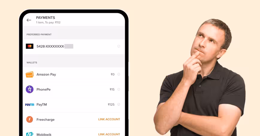
To illustrate these ideas, I analyzed the choice of architecture and nudges in the ‘choose payment method’ activity of various Indian apps. Why payments? A payment flow is ubiquitous of the purchase we make and open up a possibility to analyse a wide range of examples.
Single time payments:
As the name suggests, a single time payment represents any online payment where the money is paid upfront using a payment method. In recent times, the number of payment methods through which you could do an online purchase has increased. On average most of the platforms offer one or many of the following methods
- Credit card
- Debit card
- Netbanking
- UPI (BHIM, Google Pay, PhonePe etc)
- Closed wallets (like PayTM, Ola Money, Amazon pay etc)
- Pay later (simple, lazy pay)
- Pay on delivery
- Meal cards (Sudexo, Zeta)
I have picked 10 tech companies that provide various services and allow their users to pay through multiple payment methods. The nature of choice architecture of the ‘payment method’ activity is mapped across a spectrum that ranges from the liberal to paternal. The ones that fall in the midway offer an individual an optimal ‘nudge’ to make a decision.
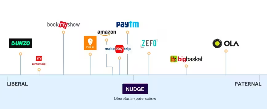
From the mapping, it’s clear that the apps that fall in the mid-range push the users toward a non-intrusive influence as opposed to others.
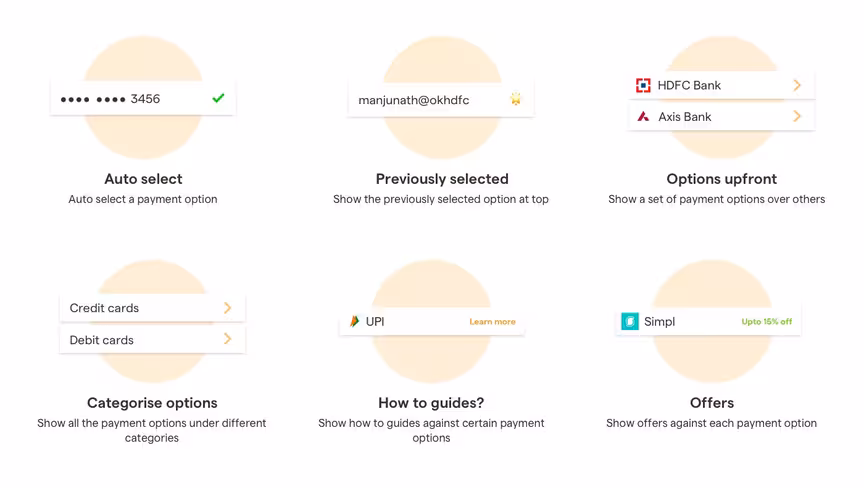
Types of Nudges
I could sense a pattern in the type of nudges that these apps used to influence the individuals. The nudges in these apps could be categorized into the following
Detailed Analysis
Some in-depth analysis of the payment method screen and my thoughts around it.
Dunzo
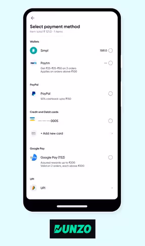
- Lays out all the options up front
- There is no clear categorization in this type of listing. For example under the category, PayPal, the only option is PayPal
- UPI and Google pay are two different category
- The absence of a visual cue like a divider makes it even more difficult to scan the options
- Payment discounts are shown upfront but not highlighted
Rentomojo
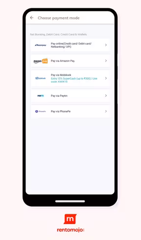
- Some of the major payment methods are clubbed into a single option
- All the other payments options are listed below it at the same level
This arrangement excludes visibility from all the possibilities (For example: Can Google Pay be used or not?!) - No clear categorization
- Payment discounts upfront
- A few payment categories are shown upfront and rest of them are grouped under ‘More payment options’
- Even though payment methods are categorized, it misses a nudge to choose one over the other
- Does not show the previously used method or details
Amazon
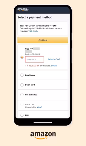
- Previously used payment methods shown upfront
- Selects a payment method by default
- Explanatory text for how to use a certain method and why certain payment methods aren’t available
- Rest of the options below that
- Payment methods grouped under categories
Zefo
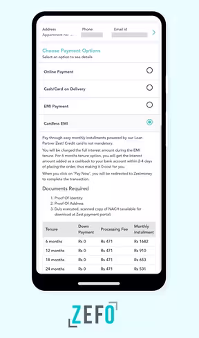
- Payment options are shown as categories to choose from
- Tapping on each category gives the user more information about the particular payment methods
- Though it seems like a good option, it becomes intimidating when you see a large chunk of content opening up when you tap on an option
Bigbasket
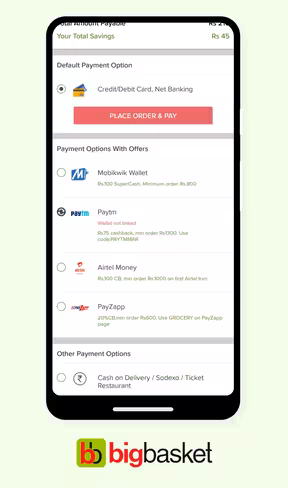
- Takes a strong call in terms of the language used like ‘Default payment options’
- Categorizes the payment methods a little different from the usual ones. For example here the categories are ‘Payment methods with offers’
- Once the user clicks on ‘Order and pay’, the order is placed first and in case of a payment failure the order is auto-converted into ‘cash on delivery’
OLA
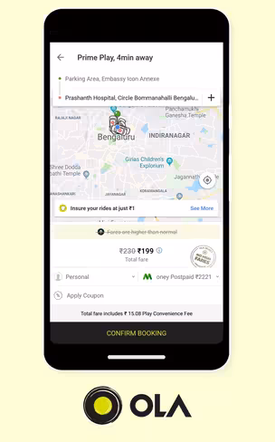
- How many times has your driver called and asked if its an ‘OLA money’ ride or ‘cash ride’, to realize you are not even aware of the payment method selected.
- OLA selects payment method by default and doesn’t allow the user to change it during the ride
- There are cases where you might have thought its an online payment to later realize the ride was a ‘cash’ ride.
- The fact that it auto selects the payment method without an explicit confirm makes the activity more paternal in nature.
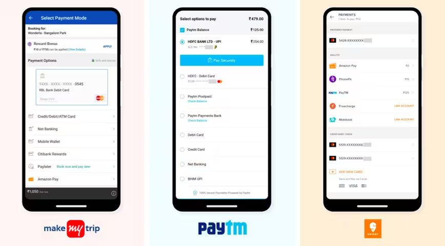
A few more examples of a ‘choose payment option’ activity, which falls under one of the above-illustrated examples.
The next time when you design an activity which allows the users to make a choice, make sure your choice architecture provides a ‘nudge’ without being too liberal or paternal in nature.
TNW Conference 2019 is coming! Check out our glorious new location, inspiring line-up of speakers and activities, and how to be a part of this annual tech extravaganza by clicking here.
Get the TNW newsletter
Get the most important tech news in your inbox each week.