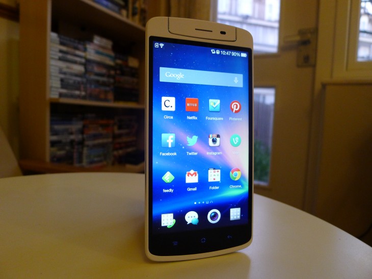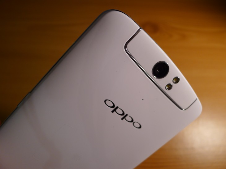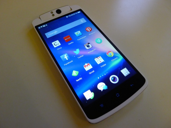
The N1 is the first Oppo handset to come with CyanogenMod pre-installed. Just as the Nexus line is heralded by many as the epitome of stock Android, many hope that Oppo’s latest flagship handset will emerge as the bastion for Cyanogen Inc‘s popular and custom Android firmware.
The device packs some promising specs. A 1080p IPS 5.9-inch display, a 1.7GHz quad-core Snapdragon 600 processor and 2GB of RAM. A competitive high-end smartphone indeed, but one coupled with two unusual hardware tricks: A rotating 13-megapixel camera and a touch-sensitive O-Touch Panel on the back.
To date, the N1 stands as the best opportunity Oppo and Cyanogen have to break into the upper-echelons of OEMs and mobile market share respectively. A large-screen Android smartphone with a cutting-edge camera and customizable software experience. On paper, it’s the perfect ‘dark horse‘ device.
Design
There’s no escaping it: The N1 is a mammoth smartphone. Oppo’s latest device will certainly draw some attention in public, if only for its sheer size. Even so, the shape and stylings of the device are fairly unremarkable. It’s a white, matte plastic slab with soft, rounded edges that takes influence from the stylings and design language found in almost every Samsung device.
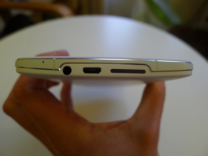
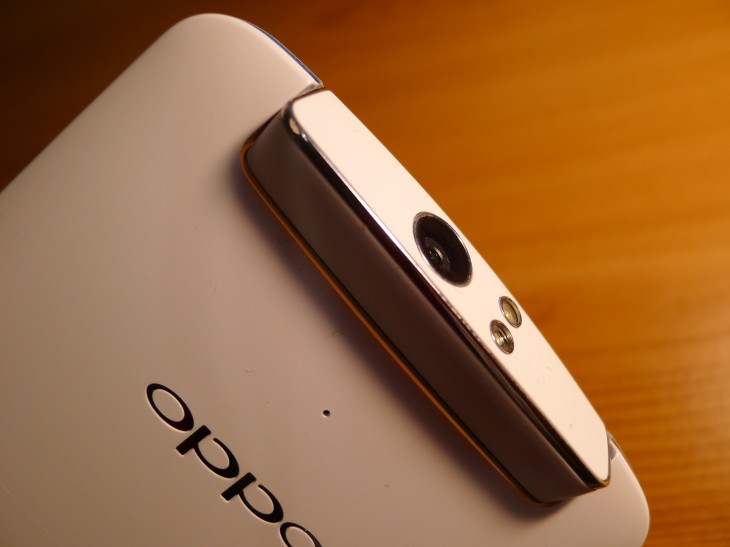
The front and back plastic plates are fused together with a small, alloy frame that wraps around the circumference of the device. It’s coated in a smooth, ceramic grey, but the aluminium is still visible via two finely cut chamfers on either side. At times the N1 resembles a fine piece of jewellery, but it’s just a little too brazen and gaudy for my tastes.
The trim is replicated on the rotational camera unit, the two LED flashes and the camera lens itself. It does add a small degree of sophistication to the handset, and highlight what is generally a pretty solid, durable build.
At 6.75 inches tall and 3.25 inches wide, the N1 is almost impossible to use one-handed. Part of that bulk can be attributed to the huge chin and extra space needed to stow its all-important swivel camera. The 5.9-inch display is gargantuan anyway, but this makes it look and feel like a small tablet, rather than a high-end smartphone.
The smooth plastic makes it a difficult piece of gadgetry to grip too. Even when it was nestled securely in the palm of my hand, I was worried that the smallest bump would make me lose control, or just watch in horror as it casually slipped through my fingers and plummeted towards the floor.
Unless you’re taking a phone call, you’ll need to use both hands to interact with a smartphone this large. It’s a much better fit in this scenario, and again makes me wonder if the N1 would have been better positioned as a small Android tablet similar to the Nexus 7 or Samsung Galaxy Note 8.0.
Display
One of the most striking features about the N1 is its huge, 5.9-inch display boasting a highly competitive 1080×1920 pixel resolution (373 pixels per inch). Colors are generally rich and vibrant, although the blacks could be a little deeper and richer. Nevertheless, it’s a fantastic display whether you’re browsing the Web, playing games or watching a movie, offering sharp, detailed images for your eyeballs to get lost in.
At times the screen can look a little undersaturated, but I grew accustomed to it fairly quickly. That might be a problem for photographers and filmmakers that like to edit on the move though: Color representation is a little on the cool side, so that might affect how your work will appear on other devices.
The automatic brightness setting is a little too conservative in my opinion, but as with almost any Android device you can simply override this. On the highest brightness setting, the N1 performs well in a wide variety of lighting conditions. It’s not the best display out there, but the N1 is impressive nonetheless.
Sound
The speaker grill is positioned at the bottom of the device and in most scenarios, it’s pretty underwhelming. When the HTC One debuted in February with dual front-facing speakers, it set a new standard for audio playback. In comparison, the N1 is cheap and shallow, regularly distorting sounds at higher volumes. If you like to play music or stream movies aloud, this will likely disappoint.
On headphones, it’s a much better story. The sound profile is dynamic and noticeably richer, serving up deep, booming bass lines and pronounced high notes. With a decent set of buds or over-ear headphones, I expect most audiophiles will be content.
Color OS
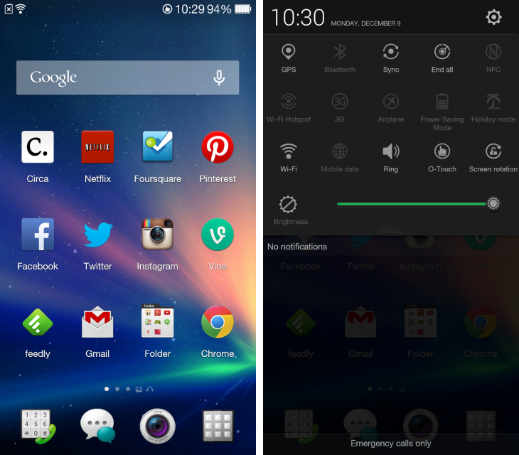
The standard N1 runs Color OS out of the box, which is Oppo’s latest take on Android version 4.2.2. Given that Google has now pushed Android up to version 4.4 (KitKat), the Chinese smartphone maker feels a little behind the curve, but hopefully we’ll see the ROM updated in the months following its launch.
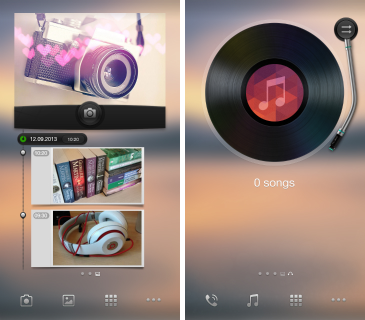
Just like the N1, everything about Color OS is big. Whether it’s widgets, app icons or menus, the entire user interface feels cumbersome and ill-suited to a device of this stature. It’s quick and responsive, but brash and incohesive too: Oppo offers two separate home screens, called spaces, for accessing the camera and music player, but they use a compulsory wallpaper and a set of app icons that are completely different to those shown on the home screen.
Color OS is also swamped with Oppo’s own software: At my count, there were 33 apps pre-installed on the device, which is excessive. Thankfully, most of them are serviceable and unobtrusive, if unremarkable in their design and functionality. Some, such as the Files app, waste large portions of the screen with unnecessary white space, but others feel more considered and restrained. The calendar app, for instance, is a delight, with a sparse use of color, a good choice of fonts and a lovely swipe gesture for viewing individual months or years. Likewise, the weather app uses some tranquil, full-screen wallpapers for conveying the outlook for the coming days.
The problem is that many of Oppo’s apps replicate the functionality of Google’s own, oftentimes fantastic software. A music player is welcome, but so is Google Play Music. The email app is adequate, but Gmail is even better. Oppo’s efforts to differentiate through software are admirable, but I sense the company would’ve been better off focusing those efforts on other aspects of the device.
Color OS is boosted, however, by Oppo’s implementation of O-Touch. The rear touch panel, which covers a small area on the back of the device, can be used to launch or close any specified app with a double-tap, as well as capture photographs and scroll both vertically and horizontally in some of Oppo’s own software. It works fairly well, but it’s nothing like as quick or responsive as the N1’s beautiful 5.9-inch touchscreen. It’s an interesting feature, but I never found it particularly useful or engaging in day-to-day use.
Cyanogen Mod
Every N1 supports CyanogenMod, the popular community-driven Android ROM, out of the box. Color OS is set up initially, but an Oppo spokesperson said it will be “very easy” to install CyanogenMod from the stock recovery options in the final retail version.
(A limited edition version of the handset, which ships with CyanogenMod exclusively, will be released at a later date.)
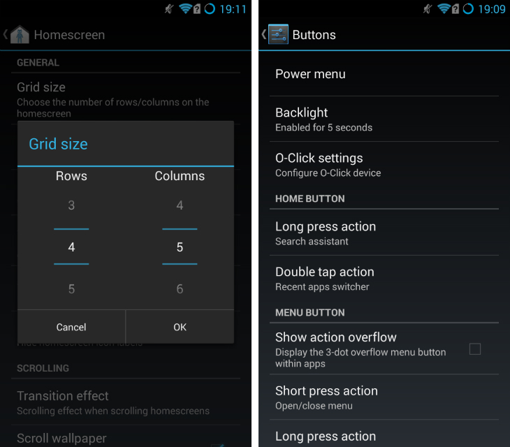
This particular CyanogenMod build is based on Android 4.3.1 and comes with the usual array of customization options that go up to and beyond what is offered in stock Android. Simple tweaks include toggling the clock in the status bar, adding a percentage indicator to the battery icon, changing the size of the dock and even changing the app ‘grid’ on the home screen.
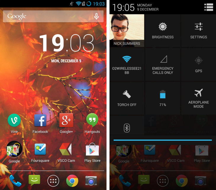
Similar to Android tablets such as the Nexus 7, this version of CyanogenMod splits the status bar pulldown, giving you notifications on the left-hand side and access to quick settings on the right. There’s also the option to change how the Home, Menu and volume buttons react, which can be helpful for quickly launching an app or starting a common task.
Essentially, CyanogenMod is built for power users and Android enthusiasts that love customizing and tweaking the design of Google’s mobile platform. Some of the app icons and UI elements still feel a little blown-out, but I suppose that’s to be expected on a smartphone as large as this one.
Otherwise, what you’re getting is an experience that is remarkably close to stock Android. It doesn’t have all of the new aesthetic tweaks and features found in Android 4.4 (KitKat), but it’s a huge improvement over Color OS, as well as TouchWiz, Sense and most other Android skins developed by smartphone manufacturers.
In short: If you’re picking up the N1, CyanogenMod is a no-brainer.
Camera
The N1 is equipped with a 13-megapixel camera, which swivels a little over 180-degrees to double-up as both the front and rear-facing shooter. Now, this is notable because most Android smartphones are fitted with a terrible front-facing camera, making even the most sober ‘selfies’ blurry and distorted. The promise is that by nailing the lens on the black, Oppo doesn’t have to cut corners on the front. One camera to rule them all, in other words.
Well, Oppo has done it. The 13-megapixel sensor is hardly revolutionary, but the images produced are far beyond what I would normally obtain from any mid or high-end Android device. It’s not perfect by any means – the N1 is still a step behind the iPhone (5/5s/5c) and the Nokia Lumia 1020 (our review) – but it’s a massive step in the right direction.
Images are sharp, with natural colors and a suitable amount of contrast. Whether that’s from the camera itself or the software that is processing the images, I don’t know, but it feels like Oppo is tinkering less with the RAW files.
While shooting indoors or in low-light conditions, a noticeable amount of noise creeps in. That’s a little disheartening, but for me that’s preferable over terribly inconsistent, blurry or low-resolution photos. Most importantly, I felt like I could trust the N1 in any situation. When a spontaneous moment arose, I could take the smartphone out of my bag, shoot and know what to expect from the final image.
Moving parts are a concern on any device, but on the N1 it just didn’t seem to be a problem. Oppo says they’ve built the unit to withstand 100,000 rotations and while I think that’s a tad optimistic, it will certainly last until your next upgrade. Again, knowing that I can put my weight behind the N1 makes it a truly standout camera phone. Regardless of where you are or what you’re shooting, this handset delivers.
Sample shots:
Sample video:
Performance and Battery
The N1 offers exceptional stamina due to the dependable 3,610 mAh battery hidden inside. Unless you’re actively using this device for hours on end, this massive power pack will take you through a day – maybe even a weekend, at a push – without hitting the red. It’s one of the few Android devices where, even as a power user, I was able to leave the house without my charger and not feel a pang of regret before the end of the day. While it’s true that the N1 has a large display, and this inevitably takes quite a hit on the battery life, it’s been offset by such a large and capable power supply.
The N1 runs on a 1.7 GHz quad-core Qualcomm Snapdragon 600 processor, 2GB of RAM, and either 16GB or 32GB of internal storage. On paper, they’re all top-of-the-line specs and I’m happy to report that in real-world use, they don’t disappoint. Whether you’re running Color OS or CyanogenMod, the handset is silky smooth, with fast load times and effortless multi-tasking.
Resource intensive video games such as Asphalt 8 were never a problem, even when I was jumping back and forth between Snapseed, Gmail, Google+ and a host of other Android apps. It’s not the most powerful device out there – I imagine Google’s Nexus 5 (our review) beats it on raw horsepower – but the N1 is still a capable and reliable device.
Wrap-up
Some parts of the N1 feel like a gimmick. The O-Touch pad on the back of the device feels a little unnecessary and Color OS is filled with software features that are overblown or worse than what is already offered by stock Android.
Yet the N1 packs an impressive camera. The rotating unit might not be the most elegant solution, but it works. Oppo has delivered a pretty impressive 13-megapixel camera and for that alone, the N1 is a smartphone worth considering.
There’s no hiding the fact that this is a large smartphone. Too large for my tastes, although the demand for large screen devices such as the Samsung Galaxy Note 3 has proven that there’s certainly a market for this sort of hardware. It’s not going to fit in your pocket, but if you’re okay with that the N1 is a well-made and fairly attractive handset.
CyanogenMod tops it all off. It boasts a near-endless amount of customization options on top of the pure Android design that most of us know and love. It’s not quite stock Android – version 4.4 (KitKat) is still out of reach for the N1 – but if you can go without it, this smartphone will serve you well.
Note: The N1 went on sale in China last month for for CNY3498 ($574) on Oppo’s website. It launches today (December 10) in the US and Europe for $599 and €449 respectively, as announced in a Google+ update.
Get the TNW newsletter
Get the most important tech news in your inbox each week.
