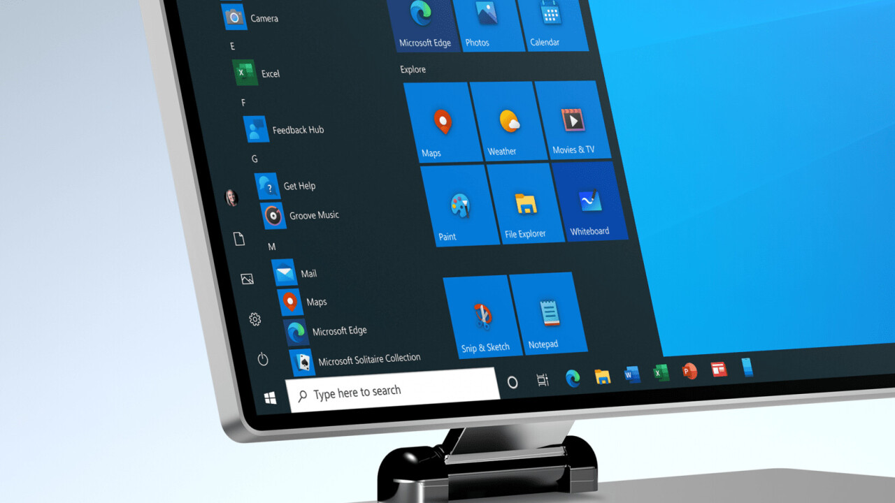
In November of 2018, Microsoft revealed a revamped set of Office icons it had created under it’s fresh new Fluent Design aesthetic. In December of 2019, it announced it was bringing Fluent redesigns to virtually all of Windows 10’s icons. Now the company is beginning to roll out some of these icons, starting with Windows Insiders.
The first apps to get the new look include Calculator, Groove Music, Mail, Voice Recorder, Alarms & Clock, Movies & TV, and Calendar, according to The Verge, with many more on the way. At least the Mail and Calendar apps should be available to regular Windows 10 users very soon, since they appeared in the Windows 10 Release Preview update track (the others are in the slightly more beta-y Fast Ring).
Microsoft has started rolling out new colorful icons to #windowsinsiders (fast ring)! Start Menu + Taskbar + Splash screen! https://t.co/4g5XBzvUL7 pic.twitter.com/Bf2e9tVPhp
— Aggiornamenti Lumia (@ALumia_Italia) February 20, 2020
Ugly icons have plagued Windows for years. Even when Microsoft moved to minimalist ‘Metro’ Design era flat icons, it never got around to redesigning all the Windows icons, leaving us with the current mishmash of white silhouettes and dated skeuomorphism.
Fluent Design was introduced at Microsoft’s 2017 Build conference, presenting an intriguing new direction for Microsoft. You can read more about it in our breakdown here, but the essence is that it combined elements of lighting, motion, depth, material, and scale to make for adaptable elements that work across devices (PCs, phones, TVs, VR) while looking pretty too. Microsoft latest promo video for its new unified Office app gives you a good idea of the aesthetic direction the company is headed in.
Microsoft has promised to revamp all of Windows 10s built-in icons, so it’s only a matter of time until the roll out is complete. For more on Microsoft’s new icon designs, you can read this post.
Get the TNW newsletter
Get the most important tech news in your inbox each week.


