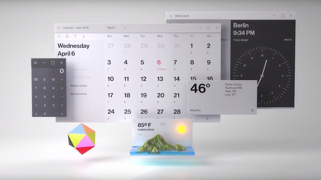
Windows 10 is getting a huge makeover that’s starting with the upcoming Fall Creators Update. But for all the hoopla over the Fluent Design System (previously known as Project Neon) and its new aesthetic philosophy, we only got the brief look at it during Microsoft’s Day 2 Build keynote. The demo real flashed by bit too quickly, and Microsoft didn’t really explain when to expect certain visual changes. Some of the images were future concepts likely years from now, others were changes that are already rolling out.
Fret not; we’ve dug deeper into Fluent for you so don’t have to. For a quick refresher (or if you’re just hearing about fluent), check out Microsoft’s intro video below before we dive in.
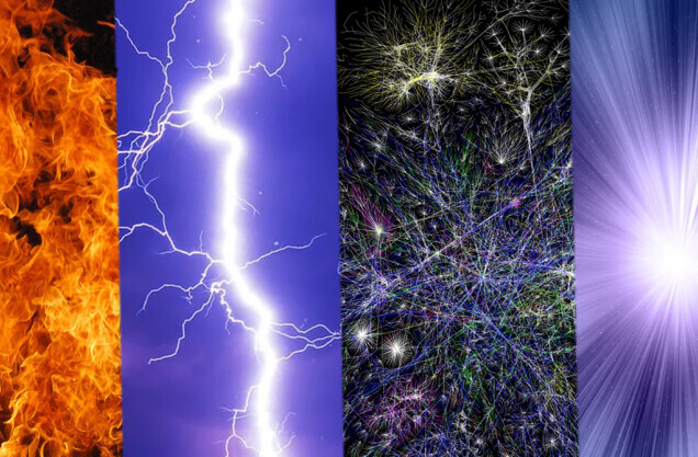
Fluent is an aesthetic philosophy made up of five primary components
Fluent is made up of five different aesthetic pieces. Here’s a synopsis:
- Light: Adds an element of illumination to apps – particularly useful for mixed reality, in which illuminating where you’re gazing serves as a pointer, and helps separate UI elements from virtual environments.
- Depth: Adds z-axis information to the UI for things like parallax effects and some extra pizzazz in mixed and virtual experiences. It helps establish a relationship between UI elements, adds some polish to animations, and can increase the sense of space within an app.
- Motion: Adds animations that interconnect as you navigate throughout an app’s UI. Helps establish continuity as you move between pages, selections, and tasks.
- Material: Controls ‘physical’ properties of UI elements. The first of these is a frosted acrylic look, with modifiable characteristics. Materials can also dictate how the UI can “bend, stretch, bounce, shatter, and glide” as you interact with them, something that will likely play a greater role as mixed reality becomes more prominent.
- Scale: Affects how apps reshape and present themselves across different devices.
These appear to be general concepts rather than hard-and fast rules. Depth, for instance, even includes sound as a UI factor.
Fluent will roll out in gradual ‘waves’
Don’t expect Fluent to radically reinvent Windows 10 with the Fall Creators Update later this year. You’ll start to see elements of it show up, but Microsoft is describing Fluent as a series of ‘waves,’ each introducing new features and visual elements.
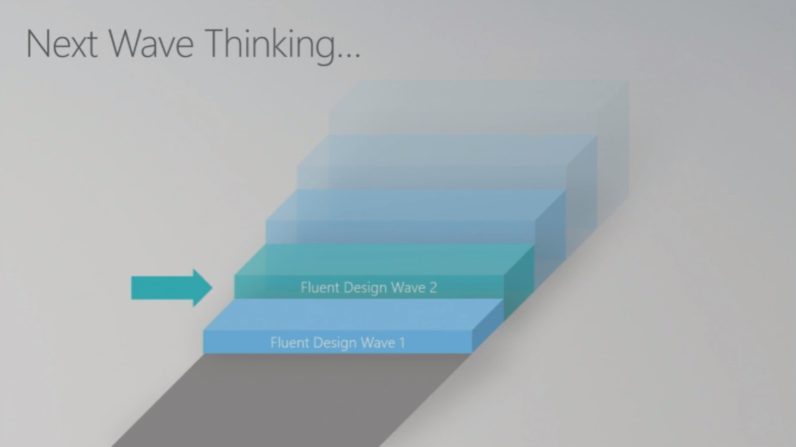
A post-keynote session for Fluent specifically mentioned two waves, but the graphic above shown during the presentation suggests there are at least five on the way. That said, the timing isn’t clear for each of the waves. It might be that Microsoft is timing them with each new release of Windows 10, or that the features will be made available as they come
Some of it has already rolled out
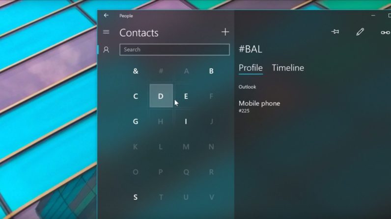
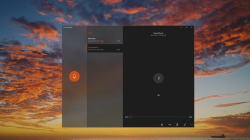
You might’ve already seen some elements of Fluent if you are a Windows Insider or pay close attention to Microsoft’s first-party apps. The People, Calculator, Voice Recorder and Groove apps, are already showing off some of the cool lighting effects, transparent materials, and fancy animations.
Breaking down Fluent Wave 1
Fluent Wave 1 seems to focus on five new specific new effects for developers to play with: Reveal Highlight, Acrylic Material, Connected Animations, Conscious Controls, Perspective Parallax. Most of these aren’t particularly revolutionary, and some of these effects could already be achieved on Windows with some tinkering, but Microsoft is baking these elements directly into Windows to ease the burden on developers and give users a cleaner, more cohesive look.
- Reveal Highlight: You can already play with Reveal Highlight if you’re a Windows Insider with some of Microsoft’s first-party apps mentioned earlier. It shows up as a glowing effect that highlights different buttons you can interact with. It helps to show what you’re pointing at when using using mixed reality apps, or when you’re hovering over a screen with a stylus. It also just looks purdy.

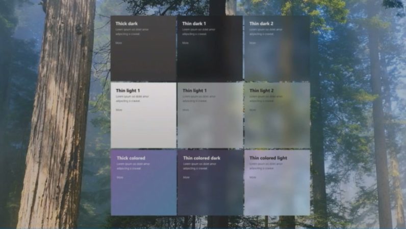
- Acrylic Material: The first of the Fluent materials, it takes UWP apps from boring solid colors to semi-transparent, textured elements. Moreover, there are different types of acrylic materials you can use to establish design hierarchies or just prettify things a bit. They can also be assigned colors or match your current Windows theme. Acrylic is just the first materials too; other materials with different properties appear to be coming in future waves. It’s kind of hard to imagine what those will be though without making things look gaudy. Wood? Metal? Pizza?

- Connected Animations: Adds seamless transitions for individual UI elements as you navigate around an app. For example, tap on an album in Groove, and the album cover will animate into place instead of instantly changing.
- Conscious controls: This is a bit more of a vague concept than specific addition, but conscious controls are UI elements that can adapt to different device types and appear only as you need them. In one example, scroll bars only appear when you hover over them, rather than taking up permanent space on the side of the window. You know, like they have on mobile devices for years. In another, example, tapping on the text box in Edge with a pen automatically displays a handwriting box.
- Perspective Parallax: Part of Fluent’s ‘Depth’ pillar, Perspective Parallax essentially puts different UI elements on different plane’s of the Z-axis to help establish some interaction hierarchy. Background might scroll slower than foreground elements, creating some parallax, which in turns adds a sense of depth.
If you have an hour to kill, you can learn more about the specific changes coming in Wave 1 through this talk at Build (you can speed up the video too):
It’s not as power-hungry as it looks
If all these fancy effects sound like they’ll destroy your battery life, worry not. Aside from promises of being power efficient, Microsoft says Fluent effects like Acrylic can respond to power settings. The company wasn’t specific, but I can imagine the feature turned off in an ultra battery saver mode, for example.
Future Fluent changes will be more dramatic
Cool as some of the new features already are, some of the concepts that flashed by during Microsoft’s demo reel are much more interesting and dramatic departures from the current aesthetic.
I mean, just look at this redesigned version of the Explorer app. It’s completely different from what explorer has looked like since basically Windows 98. Want:
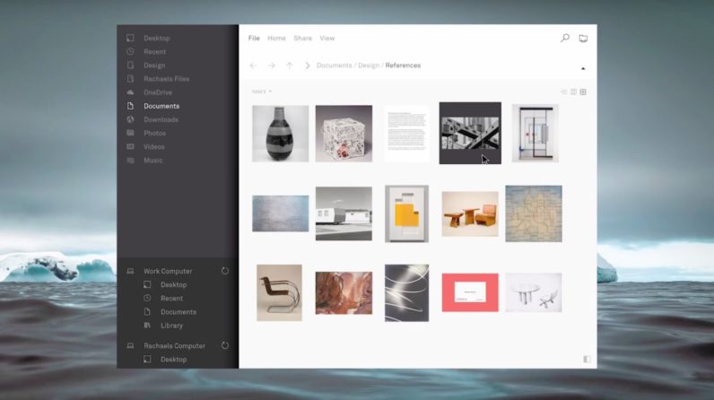
It’s worth reiterating that these appear to just be concepts though. In another image, we can see another redesigned version of the explorer app. While it’s also much sleeker than the current version, it’s totally different from the one above:
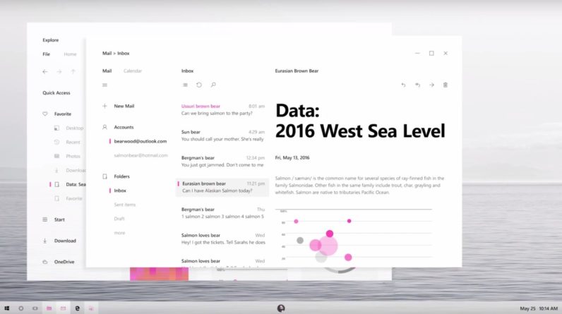
Also note the redesigned task bar with new monochrome icons (except the active windows, which are pink), and a central profile photo. I’m not sure what having your profile in the taskbar would help with, but I suppose it might tie in with ‘My People’ feature coming with this update.
Here’s an interesting one where we see UI elements aren’t constrained to traditional Windows. Of course, there are some Win32 apps that show off similar functionality, but it looks like Microsoft may want to give UWP apps some greater flexibility.
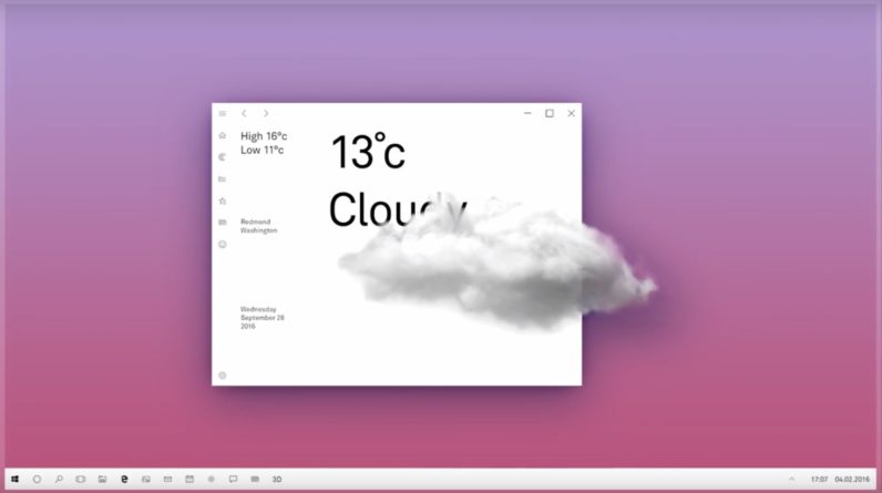
Most of these concept images have slightly different looks and coloration – notice how there doesn’t seem to be an acrylic material for the above windows. Perhaps Microsoft will allow you to manually select different Materials at some point?
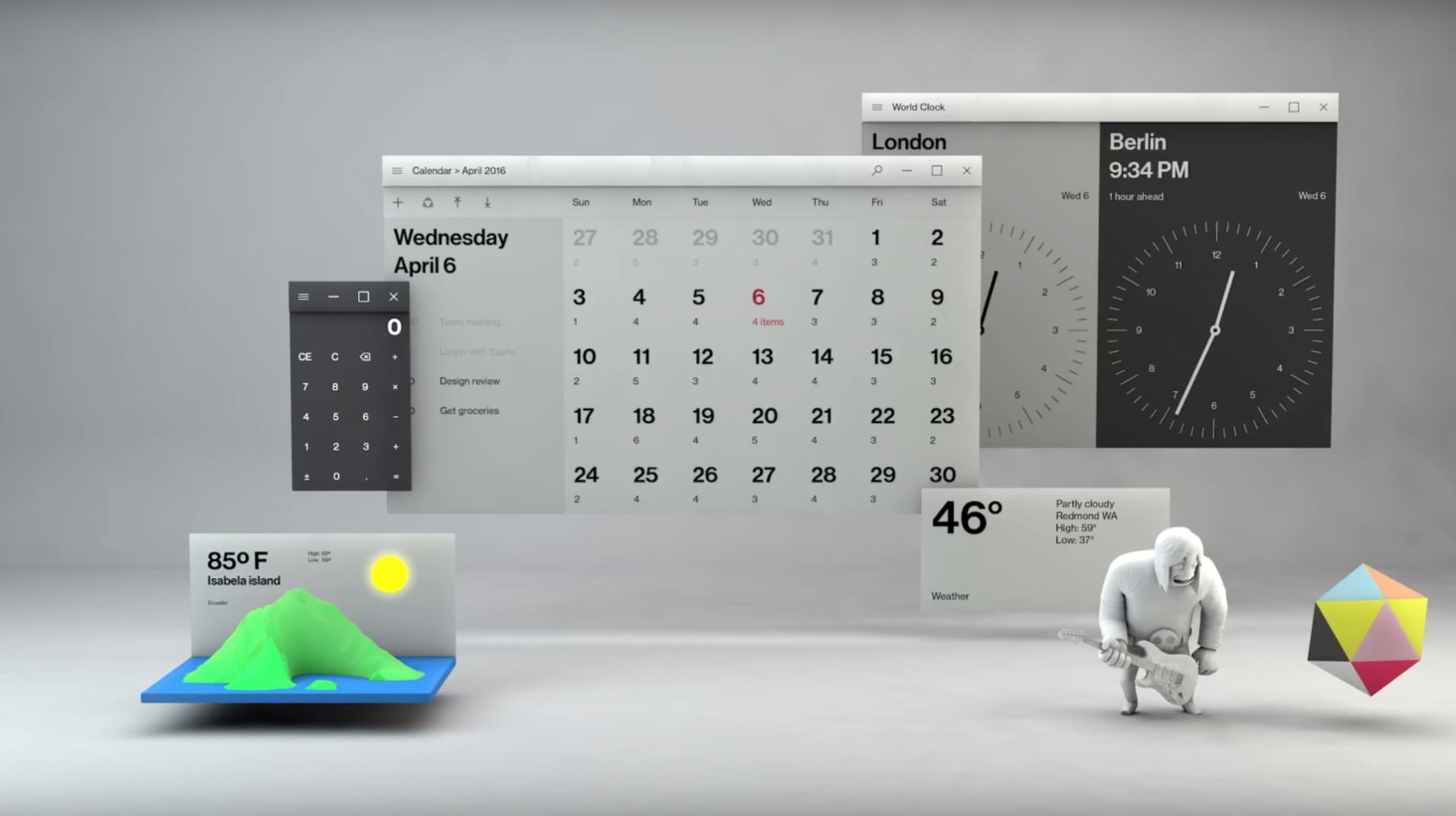
And then there are a bunch of images showing some more radical 3D interfaces. I’m not sure where Microsoft is going with some of these, whether they are abstract concepts meant to demonstrate the pillars of Fluent Design or if they’re ideas for future Windows interfaces. I mean, what’s this image about?
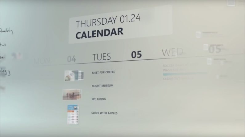
In this other example, we a concept for how a future HoloLens interface could look:
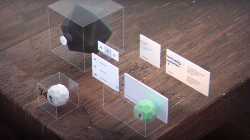
And then check out this aesthetic out, which is totally different from everything else shown at the event. Note how each image has slightly different colors, materials and even lighting. There’s a physicality to Windows we haven’t seen before.
Maybe its the beginning of a UI for mixed reality headsets as they become poised to replace our monitors, or maybe its just an abstract concept demonstrating the pillars of Fluent design. Either way, it’ll be fun to see where Microsoft is going with its new design philosophy.
Fluent will go beyond Windows
Microsoft’s demo reel showed off several screenshots of current Fluent features, and even some concepts for future versions of Windows 10, but it also showed of plenty of abstract ideas and clips from other Microsoft products.
The message is clear: Fluent isn’t just something for Windows 10, but rather something that will likely permeate throughout the company – much like Material Design has shaped Google. In the future, we’re likely to see Microsoft branding evolve from the current totally flat design to something with a bit more variety and motion.
There’s a reason its official name is the Microsoft Fluent Design System, not Windows. In fact, it seems the company wants to make Fluent a pioneering UI for all 3D interfaces.
In any case, its clear that we’ll be hearing about fluent for quite some time – Microsoft is only just getting started. For developers looking to learn more about Fluent and best practices, check out Microsoft’s hub here.
Get the TNW newsletter
Get the most important tech news in your inbox each week.
