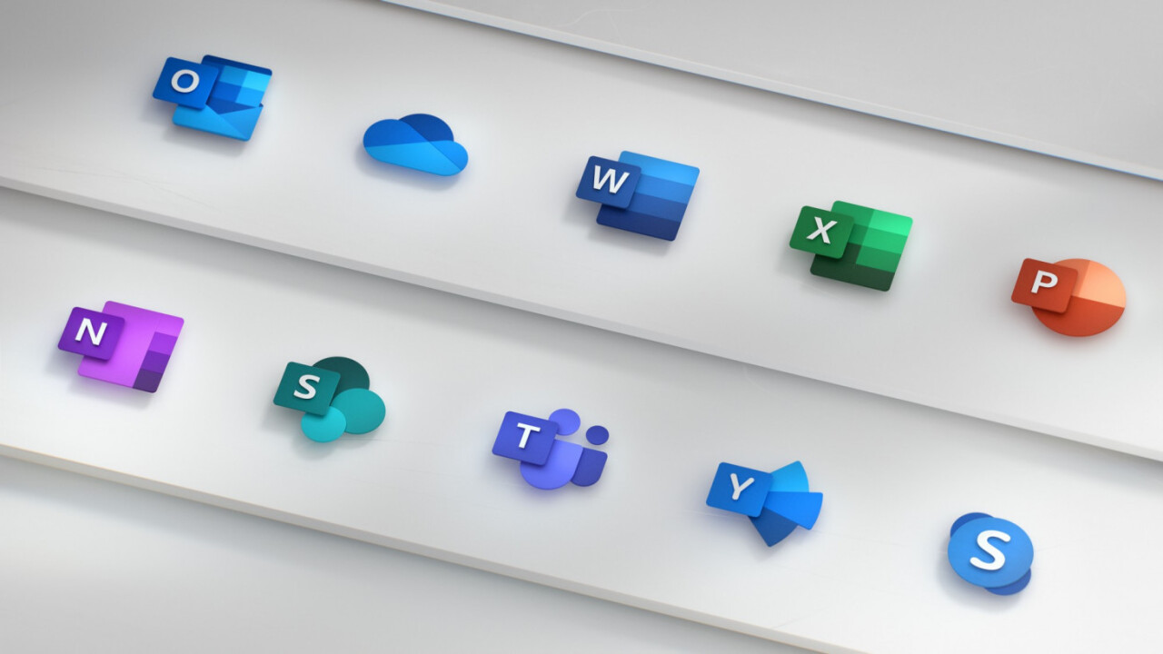
Microsoft was one of the pioneers of the current trend of flat design, but recently the company has been evolving its aesthetic into something a bit more three-dimensional. Last year, it unveiled its new approach, called Fluent design, adding depth, lighting, motion, and more to its aesthetic. Fluent has slowly been making its way into Windows, and now it’s hitting Microsoft Office in a big way. Say hello to the new Office logos:

If you ask me, that’s a big upgrade over the current suite:

And I don’t think it’s just a matter of newness, given some of the questionable and outright disastrous redesigns we’ve seen before.
In a Medium post by lead Office designer Jon Friedman, Microsoft notes that the world has changed a lot since 2013, the last time it redesigned its logos. Back then, selfies and emoji were new concepts, AI was only beginning to make its mark, and you were still more likely to save files locally than in the cloud.
The new logos reflect a more modern aesthetic, as well as the principals outlined in Fluent design. Notably, they are layered in a way that allows them to separate the letter and the accompanying symbol, adding a sense of depth “which sparks opportunities in 3D contexts.” The symbol is now larger than the letter because Microsoft wants to emphasize the content you create over the tool itself.

The new logos will make their way over to the apps in the coming months, but in the meantime, you can read Friedman wax philosophical on the new designs over at the blog post – or check out the embedded video. Better yet, the new ethos isn’t exclusive to Office. In a reply to a comment, Friedman notes “this is the beginning of a cross-company effort to update all icons in the same style.” In a separate reply: “It is a huge undertaking to build a common system and design 10 icons at the same time. Now that we have established the system we will start to scale it across all of Microsoft.”
Bring it on, I say. Microsoft has tried to position itself as a company friendlier to artists and creative folk with its Surface hardware and various Windows 10 Updates, but its design has remained inconsistent over the years. Here’s hoping this is a sign times are changing.
Get the TNW newsletter
Get the most important tech news in your inbox each week.


