![Apple’s inconsistent iPhone X design guides hint perfection is no longer priority [Update]](https://media.thenextweb.com/2017/10/Untitled-1-1.avif)
Around the same time Apple rolls out each new major release of iOS, the Cupertino company also distributes its detailed Human Interface Guidelines to help appmakers design and build software in a more efficient and intuitive manner.
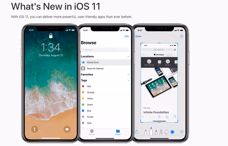
The documentation essentially outlines the best design practices for its mobile operating system, accompanied by numerous tips on how to streamline the user experience for more meaningful engagement. But it sure seems the Big A made a teeny-tiny mistake in the design guides for the new iPhone X.
As you can see in the screenshot below, while the clock positioned left of the much-talked notch indicates the time is 9:41, the big clock in the first render shows a completely different time – 1:34.
The minor inconsistency was first spotted by fastidious Redditors who shared the funny error in the Apple subreddit.
But as some Redditors have rightfully pointed out: There appear to be even more concerning discrepancies in the renders from the official guidelines.
For one, showing two separate time indicators on the lock screen goes against anything Apple: It is counter-intuitive and thoroughly unnecessary.
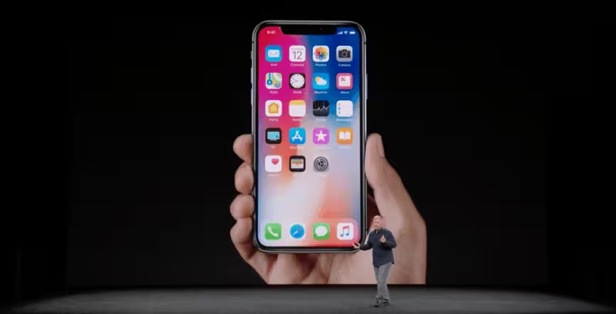
Another bewildering detail is how the screen area in the upper-left corner ought to be filled up. This space was previously reserved for displaying your mobile carrier, but early leaked iPhone X sketches suggested Apple will no longer be showing the carrier brand there.
This possibility was further confirmed during the live demos at the official iPhone X reveal keynote, which showed the time indicator will appear in the upper left corner (when the screen is unlocked) – though there were images that suggested the upper-left area could remain empty altogether.
But things started to get confusing once again when tech aficionados began releasing their hands-on videos with the new X handset.
In a video by popular tech vlogger Marques Brownlee, you can clearly see the Verizon brand displayed in the upper left corner of the iPhone X (when in lock screen).
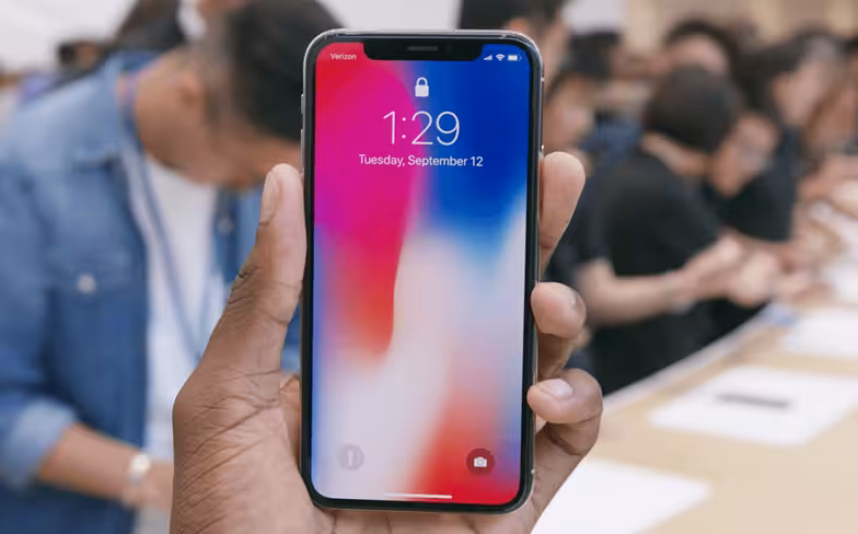
This adds up to three different ‘best design practices’ Apple has so far suggested for the upper-left notch area in one way or another. Say what you will, but this makes me think the Cupertino titan did not entirely think this through.
What strikes me as particularly troubling, though, is all the confusion Apple is creating with these very obvious inconsistencies in the official renders – which by the way are supposed to lead by example.
Designers have already voiced their suspicion the inconsistencies in iOS 11 will make their jobs a living hell. And sketching for the iPhone X and its notch could turn out to be particularly cumbersome.
Yes, Apple has shared some advice on how appmakers can take advantage of its new tools to easily adjust their apps to accommodate the X’s unusual form factor, but that is still one more thing designers will have to keep in mind when prototyping for the new flagship.
And while Jony Ive continues to insist the iPhone X is merely the beginning of a new chapter for Apple, it sure looks like the company is off to a bumpy start.
This might seem like petty criticism, but what Apple has always stood for is precision and perfection. I see little of that in iOS 11 so far… as much as I continue to hope the iPhone X could still prove me wrong.
Update: Apple has updated its product renders, fixing some of the issues mentioned above.
Get the TNW newsletter
Get the most important tech news in your inbox each week.