During its annual special event yesterday, Apple lifted the lid on its all-new iPhone X – a handset it labels the future of smartphones. But it seems the future will be a little more of a hassle for developers and designers, than it will be for consumers.
The iPhone X represents a significant departure from the iterative form factors we’ve come to expect from Apple, introducing an enhanced (almost) edgeless OLED display, a new FaceID facial recognition technology and a rounded all-glass design. But perhaps its most eye-catching aspect currently remains the notch at the top of the screen.
It certainly was one of the highlights on the Twitterverse, attracting a pile of doubting eyes and cheeky wisecracks mostly oriented at the awkward challenge it presents to appmakers:
https://twitter.com/ow/status/907681830975008774
https://twitter.com/thomasfuchs/status/907764896829452288
"The notch was a good idea" —Apple fanboys, 2017
I present to you Exhibit A pic.twitter.com/HzQLwBrbDC
— @[email protected] (@jedmund) September 12, 2017
This is from the Apple video about how to handle the notch. This is an Apple-sanctioned example of what "optimized" looks like.
— @[email protected] (@jedmund) September 12, 2017
The Big A has released its Human Interface Guidelines for building apps for the X – and, indeed, it appears appmakers will have a few more things to worry about when developing for the new flagship.
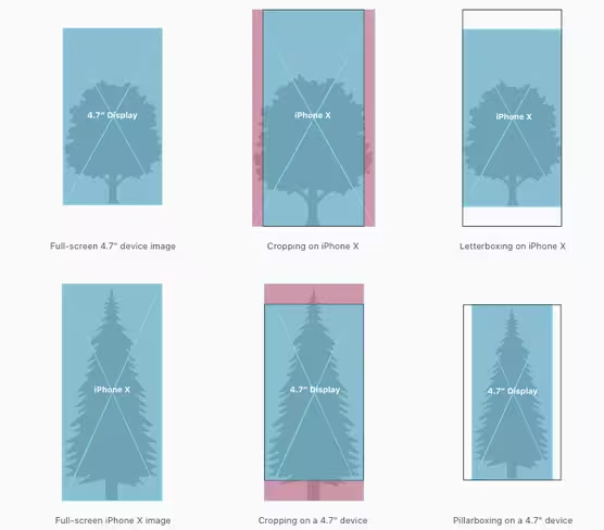
Unlike the 6, 7 and 8 which sport 4.7-inch panels, the X is not only a little taller (145 points to be exact), but also has rounded corners. This means that if creators continue to follow the old standards when building apps for the new flagship, some areas of the screen might remain unused – or the notch might hide the app interface.
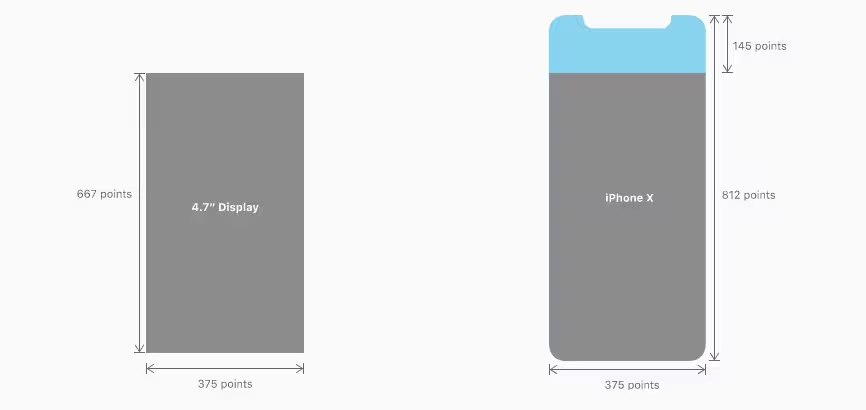
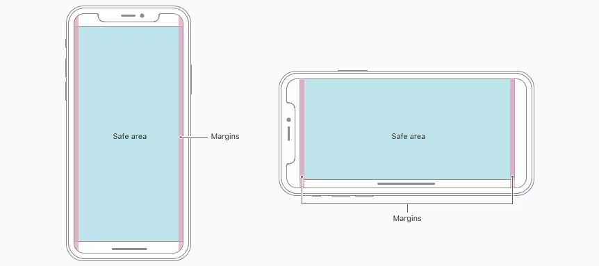
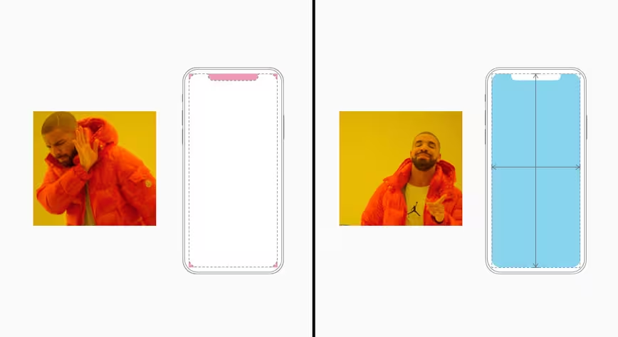
With this in mind, the Cupertino giant instructs appmakers to “ensure that layouts fill the screen and aren’t obscured by the device’s rounded corners, sensor housing, or the indicator for accessing the Home screen.”
Among other things, this includes making sure that interactive controls don’t appear at “at the very bottom of the screen and in corners,” that the interface doesn’t bring attention to the device’s rounded corners, and that the user interface isn’t clipped by the notch.
Here is how that might look like
The good thing is that, according to official Apple footage (you will need Safari to open it), not every app will require custom tailoring for the X – and even if it does, the company’s new UIKit and XCode 9 software should make this a fairly easy task.
We already know mobile carriers are going to hate the notch, time will tell whether this will be the case with developers too.
Meanwhile, those interested can peruse the full guidelines here.
Get the TNW newsletter
Get the most important tech news in your inbox each week.
