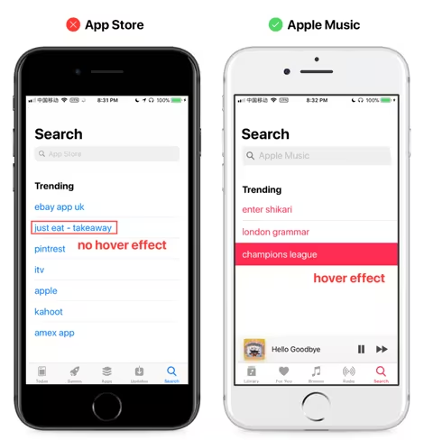
Apple is usually lauded for raising the bar for product and interface design, since way before it launched the first iPhone. But designer Ryan Lau has noticed a number of design issues in iOS 11 which lead him to believe that the company’s software development division is no longer paying as much attention to detail as it once used to.
And he’s right.
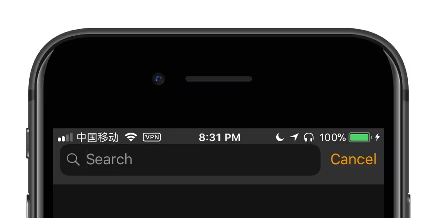
In an exhaustive post over at Hacker Noon, Lau lists several gross inconsistencies in UI elements, ranging from font rendering problems to alignment issues and buggy or redundant animation across iOS’ core interface and bundled apps. They might seem like minor niggles, but considering that Apple wants to charge over a thousand dollars for its new flagship phone, having icons and text line up isn’t too much to ask.

Lau also noted how some of these problems weren’t even present in iOS 10, and have only cropped up in the latest version. He also said that these bugs occur in the Golden Master (GM) of iOS 11, which is generally the final, ready-to-ship version of the platform.
Hopefully, Lau’s post will catch Apple devs’ attention and encourage them to fix these issues before they begin to aggravate design-conscious fans of the brand. Head over to this page to see all the bugs he caught.
Get the TNW newsletter
Get the most important tech news in your inbox each week.


