Here at TNW we do something most other large tech sites don’t: get our writers to create their own article images.
If you take a quick glance at other big news outlets, you’ll see the majority of images have a very stock photo feel to them. But not at TNW. Here, we’re all about DIY article images.
Why? Well, by making our own visual art, we — the writers —get to add another element to our stories. We can stretch our creative muscles, use the medium of image to highlight a specific element of our story, create a vibe, or, regularly, make ourselves laugh.
Despite the creativity dripping off our DIY article images like fat from a hog roast, there is a subsect of society that doesn’t really like them: graphic designers. It’s hard to know if this is because of their jealousy over our disregard for their lame “guidelines” or if it’s because of their envy over our “creativity.”

The 💜 of EU tech
The latest rumblings from the EU tech scene, a story from our wise ol' founder Boris, and some questionable AI art. It's free, every week, in your inbox. Sign up now!
But, this meant one thing: we had to get a designer to review some of our DIY article images. And sometimes guess what the hell the article‘s about.
Specifically, we got in animator, photographer, games designer, and all round good guy James Wragg. You can check out his work here, and give him a follow on Twitter here.
Without further ado, let’s find out what he had to say!
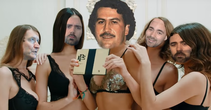
This beautiful bit of design is from a piece entitled ‘We analyzed Pablo Escobar’s brother’s folding phone promo video.’ The faces from left to right are: Tim Cook, the author, Pablo Escobar, the author, and the author.
This is what Wragg had to say:
“Okay, so… I have a lot of questions.
“First up, design. The triptych of the author‘s superimposed face is sloppily done; with mismatched skin tones and jagged edges. But, the far-left… uh… girl? Their face blends almost perfectly with the body, a feathered selection creating a seamless montage. Ditto with the central Columbian drug lord. I can only assume this is intentional, [Editor’s note: it was not] and holds potent meaning.
“Are the models with the author‘s faces imposters? Are they wearing masks? Is this some sort of twisted Greek theater performance? No, no, probably not. This image is like a vision of hell from Hieronymus Bosch; to study it is to become lost.”
I’m gonna put that down as a positive review. You can’t stop me.

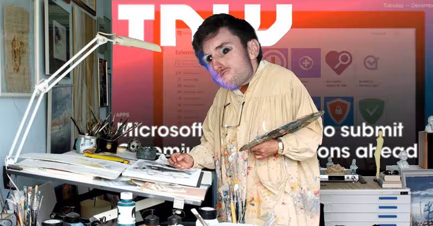
This DIY article image was created by David Canellis for an article entitled ‘TRX Q3 2019: Justin Sun’s canceled Warren Buffett lunch did its price no favors.’
No, I don’t know what that means either, but such is life.
Without any of this contextual information, Wragg put his substantial design brain to the task and had this to say:
“I’m sorry, but there’s no way anyone could paint such fine detail with a fat-ass brush. I can usually suspend my disbelief when it comes to feature images (as it’s a medium without much need for internal consistency), but I have my limits. This is trash.”
Well, fuck you too, James.
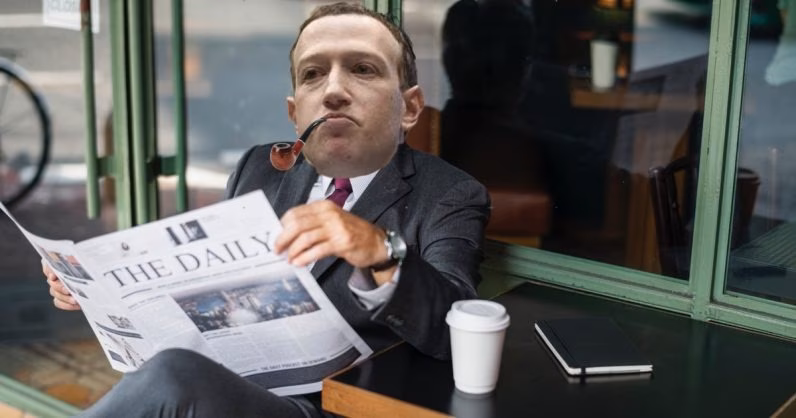
This example of our DIY article images — which is from the ‘Facebook is courting publishers with multi-million dollar deals to launch its news tab this fall‘ article — was created by Ivan. Let’s find out what Mr. Wragg thought:
“Sometimes, image editing is like baking profiteroles; it all relies on the right ingredients. And here, Mark Facebook’s tilted noggin is just asking for a Sherlock Holmes pipe to be stuck in it. What can I say? It just works.”
Can’t disagree with that.
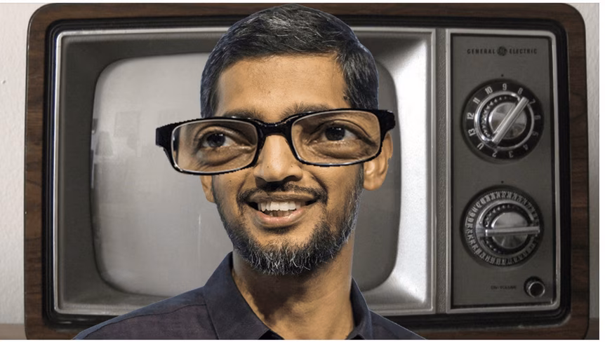
This gem is from our piece where we told people how to watch Google’s latest Pixel event. That’s called a public service, suckers. This is what our design friend, James Wragg, thought of the effort:
“I should mention that my celebrity knowledge is practically non-existent. I have no idea who this man is [Editor’s note: it’s Sundar Pichai, previously Google CEO, now Alphabet CEO]; who any of these people are.
“Though, I enjoy the aesthetic decision to mimic that old Playstation commercial where the girl has uncomfortably far apart eyes. I also commend the choice of background image. Take this from me, and I don’t say it lightly: royalty free stock images of retro televisions are a precious resource. I’ve used the same Pixabay retro television in, like, six different commissions. But this one is brand fucking new. I’ve never seen it before. For that alone, this is a five-star picture.”
Inspiring words. I’m starting to feel our DIY article images are actually good now.
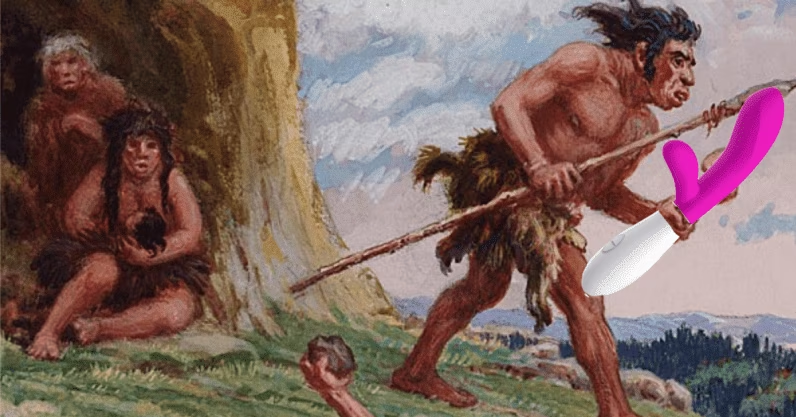
Can you guess what article this is from? Damn straight, it’s ‘The evolution of sex toys: From 30,000-year old stone dildos to hi-tech vibrators‘ from our very own Cara.
This is one of my favorite of our DIY article images, but let’s see if James feels the same way:
“I could critique the rough image editing here, but that would seem trivial when such an evocative narrative is being spun.
“Immediately our curiosity is piqued; why does this caveman have a sex toy? Why is he running from a mother and a creepy old dude? Has he, daresay, just used the item? Or is this a post-apocalyptic scene, of human descendants using our titillating technological detritus as weapons of warfare? Whatever the answer is, I know I’ll like it.”
Wow. You know what? I fully expected Wragg to dislike the large majority of these, so I’m actually feeling a warm glow of satisfaction spreading over my entire body.
Is TNW‘s feature image style for everyone? Of course not, but nothing cool, interesting, and unique is for everyone; it’s for cool, interesting, and unique people. Just like you.
Get the TNW newsletter
Get the most important tech news in your inbox each week.