It was due time for a refresh, when you consider how much work Google has done with the rest of its services across the Internet, and it appears that YouTube is starting to get a loving brush stroke, as well. After watching a quick video this morning, we spotted this:
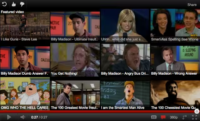
As you can see, the new design for YouTube’s “related videos” suggestion showcases 12 videos in a single pane, rather than one large related video, then a few smattered around the border. Interestingly, there’s also another view of this same pane, which allows both related videos and advertising to be showcased:
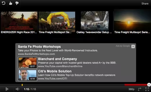
This makes us wonder of we’re about to see the full rollout of YouTube’s new design that we first spotted a few months ago. With a letterbox-driven format, the new design looks incredibly promising, and this mutliple-choice format for related videos would seem to fit the design quite nicely.
Do you have the new related videos yet? If not, as is typical with Google, they might be rolling out slowly. Give us your thoughts in the comments.
Related: Ever wondered why the new Google designs actually look good? We found the story.
Get the TNW newsletter
Get the most important tech news in your inbox each week.

