Google is not known for great design.
That’s not to say that minimalist design cannot be great design. There are many extraordinary cases of excellent minimalist design. And I’m not saying that Google’s user experience is bad: by keeping simple, the most basic features, at least, are easy to grasp — just don’t go looking at your account settings or anything like that.
Android has long been lambasted as an ugly mobile OS in a world where aesthetic seems more important than feature set.
But Google+ and all that falls under its umbrella looks good — really good. The trademark minimalism is still present, but it’s been done with style (is that contradictory?) and is something to be appreciated.
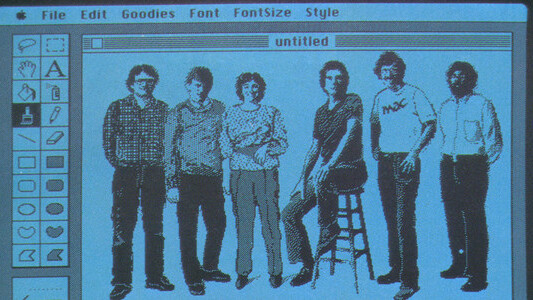
That’s because interface designer Andy Hertzfeld, member of the original Apple Macintosh team, was given free reign over design decisions, AppleInsider reports.
Despite the headline, Hertzfeld is quoted in the piece describing the process and it seems he was not so much given free reign as he took it. “Better to ask forgiveness than permission” and so on.
Hertzfeld was worried that Larry Page wouldn’t like it with its animations and drag-and-drop fanciness, but “he loves it.”
Google today also revealed a new navigation bar which can be seen in most Google web apps (though not in Gmail, at least for me), and a new design for its search page and mobile site.
Get the TNW newsletter
Get the most important tech news in your inbox each week.


