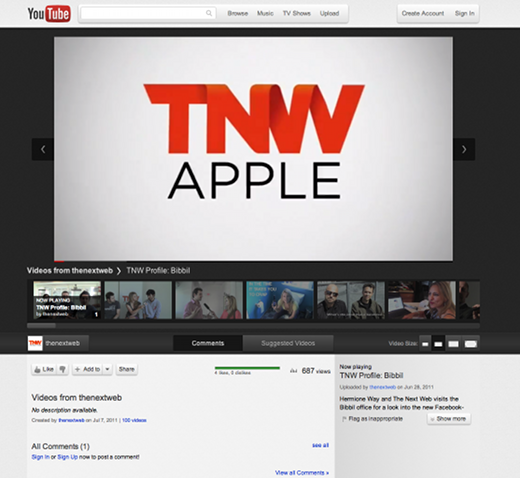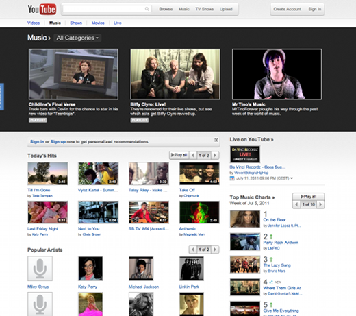
YouTube has unveiled a gorgeous experimental new design which it’s called Cosmic Panda. As you can see in the screenshot below, it looks gorgeous. To get yourself switched over to the new design click here.
Although it hasn’t been officially announced, the experiment has been tweeted about by a couple of YouTubers (here and here). UPDATE: Official announcement here.
Billed as “A New Experience for Videos, Playlists, and Channels,” Cosmic Panda offers features like comments that update without you needing to refresh the page, and a gorgeous, slick design that gives YouTube a much-needed refresh in the style department. Scroll down for more of our observations.
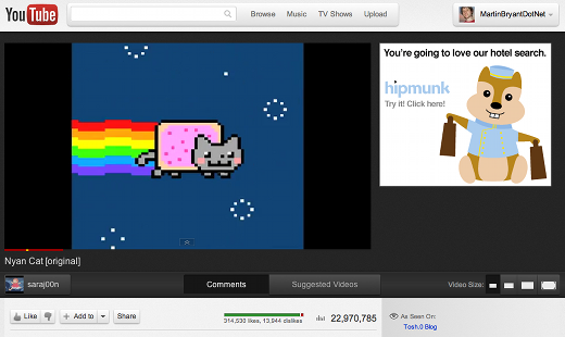
The new video page presents videos against a dark background, making them a little easier on the eye, although the big display ad next to it kind of ruins the effect.
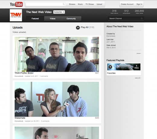
The channel view is, quite frankly, gorgeous, with letterbox-style thumbnail previews:
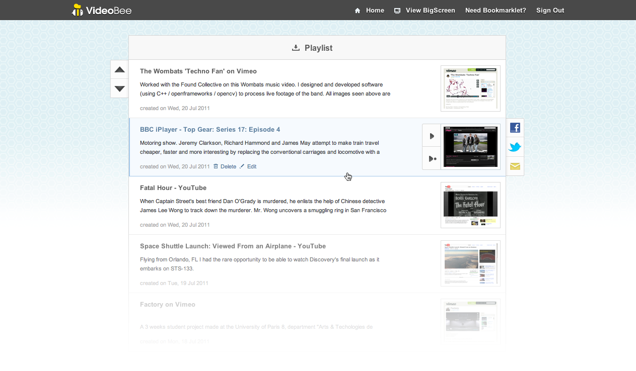
And here’s playlist view:
In all, aside from that big display ad we mentioned above, we’re impressed by this ‘Cosmic Panda’ redesign. If you try it and don’t like it, you can always switch back from www.youtube.com/cosmicpanda
Get the TNW newsletter
Get the most important tech news in your inbox each week.
