In addition to the revamped Yahoo Finance for iOS app released this week, Yahoo today unveiled a redesigned Yahoo Finance website. Yahoo says the new look is meant to provide users with access to the stocks they care about, relevant business news, and deeper data integration.
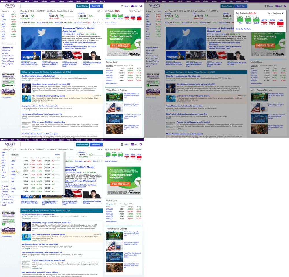
Without further ado, here’s the new homepage:
Right off the bat, Yahoo wants to emphasize the Following section in the top left, which lists the stocks you’re currently tracking. This isn’t strictly limited to the homepage: the little box makes it easy to keep an eye on all your companies from any Yahoo Finance page.
Hardcore investors will be happy to know the Yahoo Finance Portfolio has been updated to let you sync your brokerage accounts for a real-time view of your performance. This means you can see your best and worst performing investments right from the Yahoo Finance homepage. It’s obvious Yahoo wants to make its service a one-stop shop.
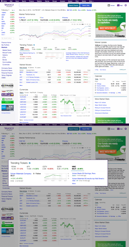
As you can see above, Yahoo has integrated the Markets section into the homepage so you can get a better idea of how the overall market is performing. There’s also a new calendar feature for the day’s market-moving events as well as Trending Tickers, which show you stocks that are trending with Yahoo Finance users.
The only unfortunate part of this update is that it probably would have been better timed for release yesterday, on the day of the biggest tech IPO of the year. Nevertheless, Yahoo Finance is still the best service for keeping track of stocks, and it’s great to see that Yahoo isn’t leaving it by the wayside anymore. Now, where’s the new Android app?
See also – Yahoo unleashes mobile redesign across Mail, Homepage, Search and more and Yahoo beats Google to take top spot in comScore’s monthly US Web rankings
Top Image Credit: Justin Sullivan / Getty Images
Get the TNW newsletter
Get the most important tech news in your inbox each week.


