Whether you’ve already upgraded your precious iPhone to the new iOS 5 or not, here’s an update that any Twitter addict can get excited about. Now, clicking the share button on almost every single official Apple app allows you to share your content directly to Twitter, wherever you are.
Of course, if you’ve been keeping up with our coverage, you probably already knew that. Over the course of today, we’ve shown you everything the new iOS 5 update brings, including several upgraded Apps, a full review of iOS 5 with 15,000 words worth of Apple goodness, including an entire guide to iOS 5’s iCloud service.
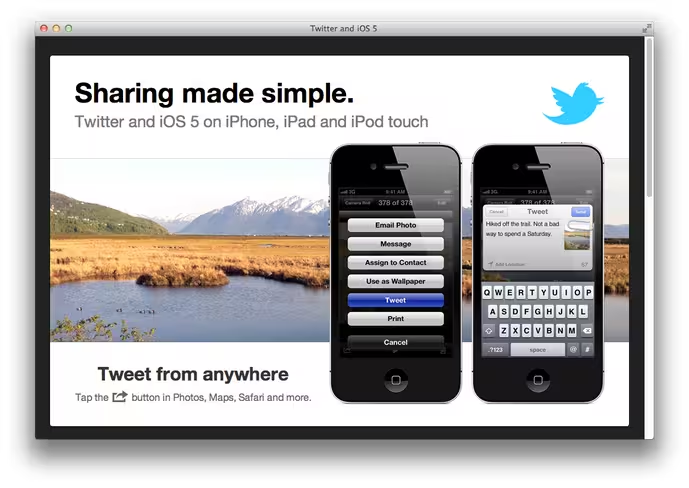
Keeping up with the hype, we’d like to show you how Twitter is approaching the changes. Taking a peek at Twitter’s iOS-dedicated landing page shows that our favorite little bluebird broadcasting service has completely revamped its look. Even the log-out screen on iOS has a new feel to it. Curious yet?
Take a peek.
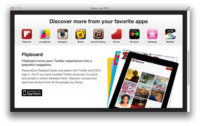
 Twitter also puts a focus on apps like FlipBoard, LivingSocial, Instagram, Words With Friends, SoundTracking, Chomp etc, leading us to believe that these apps will certainly be worked with more closely in the future.
 Also updated is the Twitter logout screen on iOS. Jack Dorsey, Executive Chairman of Twitter and CEO of Square, just posted a picture of his Twitter logout screen on his iPhone, stating, “Hello, iOS 5. Welcome to Twitter.”
Are we all “Ooo”ing and “Aaah”ing yet?
There’s no word on why Twitter chose the above picture. We’ve managed to surface a few photos on Zimbio that show where the image may have been sourced from, but again, no idea why. We’re now trying to discover whether it’s the same default image that all users will see — which isn’t rolled out to every user quite yet, by the way — or if the logout picture changes according to what we’ve uploaded to Twitter’s picture service, etc. We’re also curious to know whether the image changes each time Twitter users log in or out. We’ve reached out to Twitter for comments.
Apple’s products and general user interface are well known for being simple, clean, and incredibly user friendly. It makes sense that Twitter would make an effort to step up its game in terms of visuals and presentation. I, for one, applaud the efforts towards “prettying up” the service, and am excited to see what will come next.
Also, Jack, it looks like your iPhone needs to be charged. You’re welcome. Wouldn’t want you to miss a call.
Want to catch up with everything iOS 5 that we’ve written about today? You can do so here.
Get the TNW newsletter
Get the most important tech news in your inbox each week.
