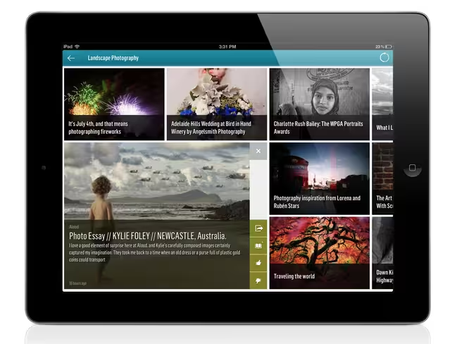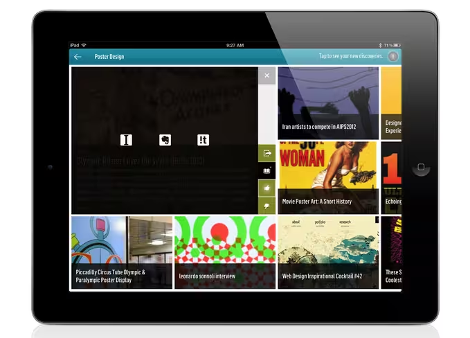
We’ve told you about Trapit before, the newsreader app that uses brilliant algorithms to help you “trap” news about any topic that interests you. Today, the company has unleashed an updated version of its iPad app and it’s going to turn some heads with its look, feel and functionality.
In case you forgot, Trapit is the sister company of Siri. Yes, Apple’s Siri, so you know that there’s awesome technology under the hood here.
We had a conversation and demo with Chief Product Officer and Co-Founder of Trapit, Hank Nothhaft, Jr., and we discussed the evolution of the product and it became quite clear to me that we haven’t seen anything yet from Trapit. Yes, the product has gotten that good in a short amount of time, and yes there is way more to come.
Trapit’s users are extremely engaged, with 60% of them being active. Its web app, which was launched ahead of the native iOS app last year has served as the testing ground for all of the features that we see in today’s iPad iteration. Even though iPad users account for less than 50% of Trapit’s total users, they account for 84% of the daily usage on the service. Needless to say, Nothhaft has his team laser focused on nailing the iPad experience.
Smarter than your average newsreader
While most newsreaders simply pull in all of the links from your friends on Facebook and Twitter or force you to subscribe to different feeds, Trapit lets you type in a word or phrase about what you’re interested in and then its AI does the rest.
The service will dig deep in its arsenal of trusted sites, surfacing the best and most relevant content for you. It’s a great experience and a timesaver, since you’re not wading through crap. As you go along, you can tell Trapit if the result was worthwhile or not, and it will get smarter as you train it.

Unlike a service like Flipboard, you have easy access to all categories, or keywords, and you can swipe through them quickly. There’s a bar that pops up on the bottom that lets you flip through different stories, ala Apple’s cover flow. The key with the app’s design is that you’re never stuck or reach a dead end.
Nothhaft tells me that the company will eventually build versions for other platforms, like Android, but he really wanted to get it right on the iPad first. Mission accomplished.
My favorite feature is the new “ticker” that’s on the right-hand side of the app, which pops up all of the most recent news for all of the keywords you’ve “trapped.” This is especially nice for when you’re counting on reading about breaking news on a particular subject. If you were to have trapped “Olympics”, this ticker would have been killer.
Reading things later
Trapit has its own “read it later” functionality, but its userbase was asking for other options, Nothhaft told us. Starting today, Trapit users will be able to save articles that they find to Instapaper and Evernote. More services could come later, but these are the two that people were frothing at the mouth for:

In addition to these saving features, you can share items to Twitter and Facebook, thanks to built-in iOS functionality. This will obviously get even cooler when everyone has iOS 6.
The service has come a long way since its inception, and there’s a lot to like about it. One of the things that I’d like to see in the future is a way to remix some of the content that you’re given. For example, if I wanted to merge a trap of iPhone 5 news with iOS 6 news, it would be cool if there was a way to do that. Other than that, Trapit is pretty bulletproof when it comes to finding relevant and timely news.
Get the TNW newsletter
Get the most important tech news in your inbox each week.


