Twitter’s Jack Dorsey and Dick Costolo took the stage today at their “Come See What We’re Building” press conference to unveil some important changes to its microblogging platform. The event took place at Twitter’s unfinished offices at 1355 Market St. in San Francisco, which it will be moving into next summer.
In their introduction, Dorsey and Costolo announced that since its integration with Apple’s iOS 5, Twitter sign-ups have been up 25%. They also announced plans to launch self-serve advertising for marketers in 2012. In an obvious catchup play with Google+ Pages and Facebook, Twitter launched Company profile pages. @DisneyPixar, American Express and The Red Cross are amongst the launch partners for the newly redesigned company pages.
But the biggest changes of all have been a redesign and brand new apps that focus on simplicity, discovery and usability. With distribution and monetization (somewhat) under its belt, Twitter is now focused on creating a more meaningful experience for its users.
“Twitter’s redesign turns their website into a true app experience, with smart curves, effortless photo and video viewing, sharp icons, and generous white space. It’s not intrusive, or difficult to navigate like a Facebook redesign. It’s all really a fresh breath of air.”
-TNW East Coast and Design Editor Harrison Weber
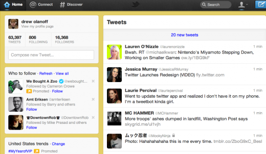
The four new elements released today are Home, which delivers your Timeline up to 500% faster, with a cleaner interface; Connect, which will show you all of the tweets that have been retweeted; Discover, a hashtag icon that will mean “discovery” on Twitter; and Me, which shows you everything going on within your stream and what the people you follow are up to. Both Twitter on the web and Twitter on mobile apps have been redesigned to include these updates. Let’s dive into how these four elements affect the service holistically.
Simplicity
Twitter’s web and mobile experiences are now one in the same. The new tab menu is the same across all devices so you’ll get the same experience on mobile and desktop. And that experience is much more streamlined and visually focused. Similar to TNW’s new sharing feature that you’ll see above, Twitter has placed more options at sub-levels, rather than right on the surface. On the Home page, Tweets are now expandable to show more information such as replies, retweets and embedded photos and videos.
➤ Don’t miss our walk-through of the new Twitter iOS app here.
The New Profile interface (click to enlarge) has shifted all of your profile information, Who to follow and Trending topics to the left.
Twitter believes that “everyone should be able to view and interact with Tweets on the Web in the same ways you would from any Twitter client”, so in that regard it has introduced a new way to embed tweets that simply requires users to copy and paste a line of code or even a link.
Discovery
@Connect
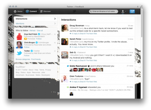
The new Connect feature is for @usernames so you can learn more about people on Twitter. It includes two sections: Mentions and Interactions. Mentions is where you can see all the Tweets in which you are mentioned in one place. Interactions show the impact you have on other people on Twitter such as who follows you, retweets or favorites one of your Tweets, or adds you to a list.
Here’s what @Connect looks like (click to enlarge):
#Discover
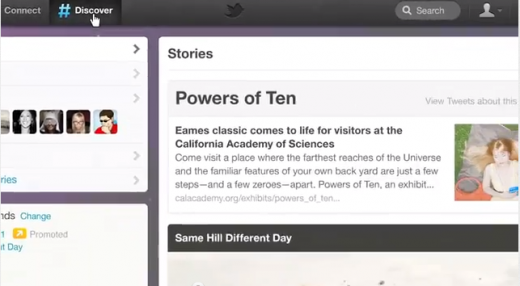
Twitter’s new #Discover Feature is a gamechanger. Or as Twitter says, “It’s where simplicity meets serendipity.” The new Discover section is the company’s first big step into content and news curation. When you use Discover, you’ll see search results reflecting your interests—based on your current location, what you follow and what’s happening in the world. As you use Twitter more, Discover gets even better at serving up more content just for you.
As the name “Discover” says, this new section is all about discovering new content, which means you’ll see curated tweets from people you don’t follow. For instance, if you enable geolocation you’ll get to see hashtags about what’s going on near you in real-time.
Discover’s new sections include Stories, Activity, Who to Follow, Find Friends and Browse categories.
Here’s what Discover looks like:
Usability
First, the Tweet button is now everywhere in the interface on the top-level navigation. Twitter says it wants to make sure you can tweet no matter where you are on the site.
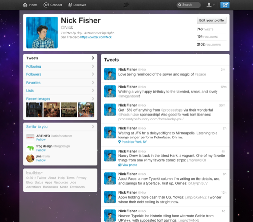
The new profile section “Me” includes the same information as before: your bio, a photo, your location and a link to your web site or blog but in a wider more profile like format. As Twitter says, “The Me tab is your opportunity to introduce yourself to the world.”
To increase sharing, Twitter debuted a new #hashtag button that alerts website visitors when there’s buzz around an interesting conversation. With the new button, users can join in with one click.
The new #hashtag button is perfect for brands or personalities that are intending to generate buzz for an event, product or television show — in fact it’s going to help make hashtags trend a whole lot quicker. “Hashtags are the new URL,” said co-founder Jack Dorsey. The company is hoping to train people on what a hashtag is and how to use it.
There’s something delicious about Twitter. It’s bite-sized, sharp and smart. It’s a playground for the intellect. Today, Twitter’s redesign has expanded this playground into a well-designed festival. What was simple is now more complex, yet still streamlined and consistent. What was playful now feels exploratory. And something about the new Twitter feels more human.
“There’s a universe within a Tweet, 140 characters is just a wrapper now.”
-Twitter CEO Dick Costolo
The new Twitter will be rolling out to all users in the next few weeks.
Also read: Missing your DM and Account Switching shortcuts in the new Twitter? Here are two hidden gestures.
Featured image: Shutterstock/Matt Gibson
Get the TNW newsletter
Get the most important tech news in your inbox each week.

