![A walkthrough of the new Twitter 4.0 app for iPhone [Screenshots and Video]](https://img-cdn.tnwcdn.com/image?fit=1280%2C720&url=https%3A%2F%2Fcdn0.tnwcdn.com%2Fwp-content%2Fblogs.dir%2F1%2Ffiles%2F2011%2F12%2FScreen-Shot-2011-12-08-at-11.46.36-AM.png&signature=01875ebed800a264d2c24640088cb593)
Twitter has released a drastically redesigned version of its service for the web, mobile devices and iPhone users. The new interface is designed around four categories, Home, Connect, Discover and Me, lets take a look at how it works.
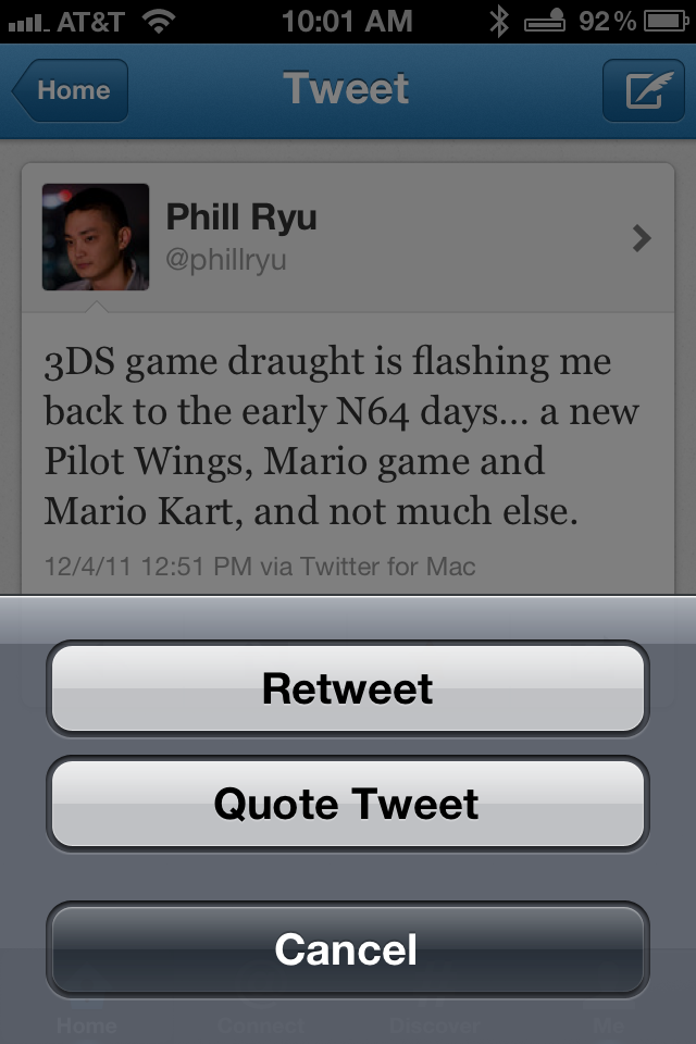
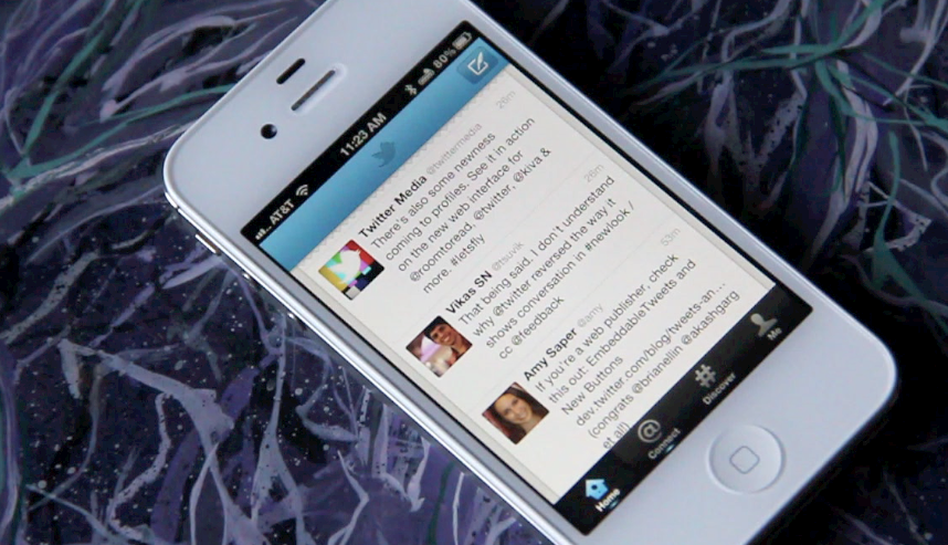
In general, the layout has been simplified, with more options placed at sub-levels, rather than right on the surface. The Home section remains fairly similar to the timeline view, although the ‘swipe right to reveal options’ gesture is gone. Strangely enough, this option remains on the mobile web version.
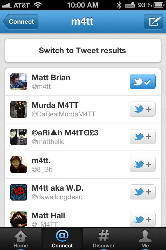
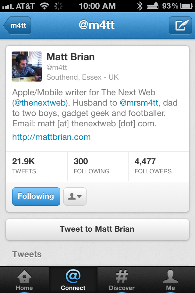
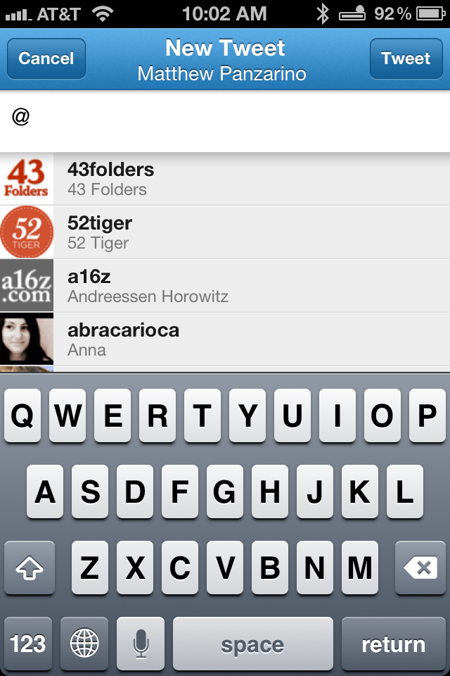
Under Connect, you now have two different views, Interactions or Mentions. Interactions will show you retweets and favorites, as well as mentions, while the Mention option is only your mentions. Note that the conversation view has been reversed, with the latest tweet at the bottom and the thread traveling upwards. This is a fairly silly change in my opinion, and feels arbitrary, although it could just be a ‘newness’ allergy.
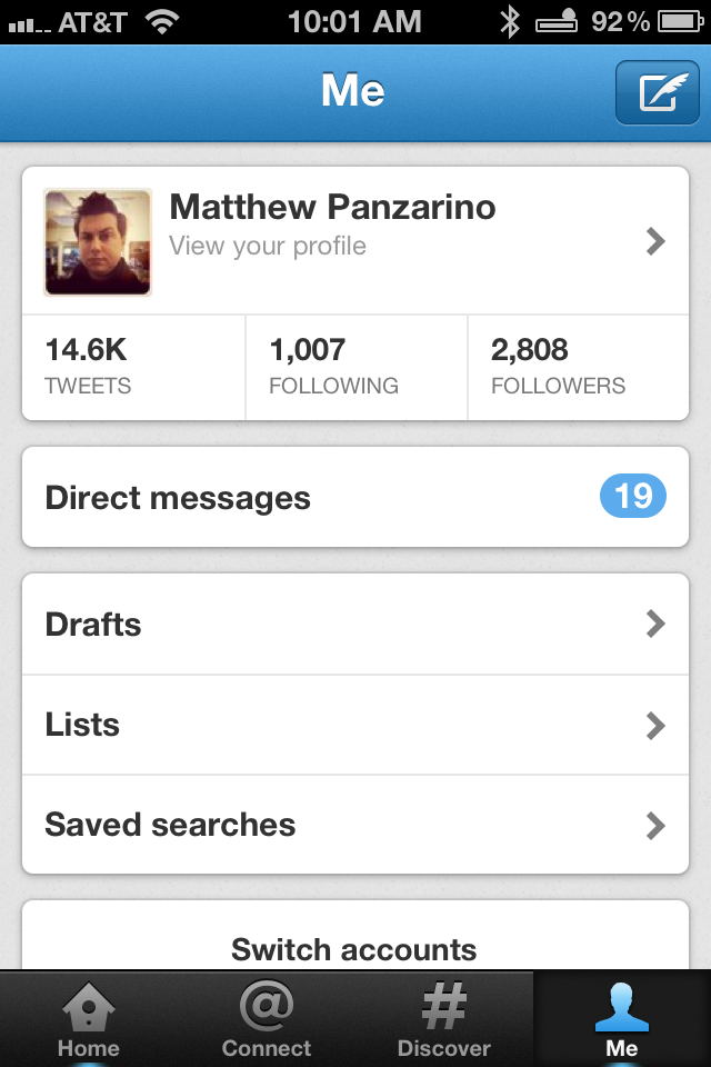
The DM section and account switching are buried under the Me option, with no direct link to those. Thankfully, there are some gesture shortcuts built in to the new Twitter app to give you quicker access. If you swipe right on Me, you bring up the ‘switch accounts’ menu and if you swipe up on it, it will bring up your DMs. This seems fairly obscure to me, and it will likely be difficult or impossible for many users to find on their own.
Once you’re in your DM list though, there is another problem, there is no way to mark all DMs as read at once. Instead, you have to tap on each one separately. This strikes me as tedious and completely unnecessary. The current iPad version, along with most other Twitter clients, offers a way to do this.
Another very, very curious and almost debilitating change for those of us that have very active feeds is the inability to load older Tweets ‘backwards’ in the timeline. That means that any Tweets past a certain amount (which in my feed amounts to less than an hour) will not be loaded going backwards. So, if you scroll back through your Tweets, you can’t get at older posts. This is incredibly poor behavior for anyone who likes to read their stream on the iPhone. Just a really poor decision.

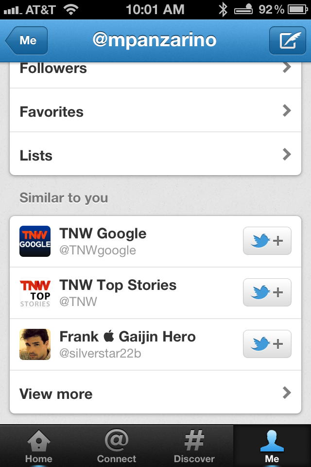
The Discover tab evolves Twitter further along the path toward a bit of a micro-blog or Flipboard-like social magazine. It allows you to see images right in column, but it provides snippets of stories and a collated section of Tweets on a given topic. You’ll also see curated Tweets from people you don’t follow that are surfaced using geolocation. This should allow the Discover selection to show you not just trending topics, but also those happening where you are locally.
There are also some quirks that show off the rough edges of the new app. When you slide right on a DM or DM conversation item, the delete button just hangs out there, looking pretty rough. The Favstar integration is gone, and the Instapaper integration is worse, making you load up a webpage before sending it on to the read later service, rather than just sending it directly. You’ll also find that Twitter has done away with MLKSHK and many other custom sharing options.
The new Twitter for iPhone and mobile web, along with the whole new product of course, definitely focuses on fronting content for users. This should help Twitter newbies and those just signing up for the service to discover content and users to follow, but it will most likely leave many ‘power users’ left in the lurch. This is where third-party clients like Twitterrific or Tweetbot on the iPhone, Rowi on Windows Phone will really shine, moving beyond Twitter’s ‘Twitter for new people’ interface and approach.
Twitter also announced a bunch of other news today, including embeddable Tweet buttons, Tweetdeck for Mac and Windows as a native app and a revamped discovery feature. For a complete run-through of the day’s Twitter announcements, check out our post here.
Get the TNW newsletter
Get the most important tech news in your inbox each week.
