After testing a radical profile redesign on the Web, Twitter is doing the same on mobile.
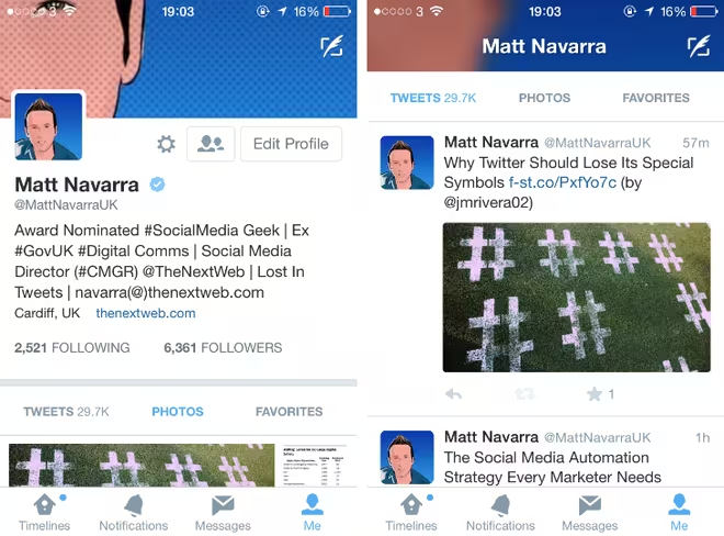
A fairly ambiguous update for its iOS app was released today and TNW’s social media director Matt Navarra spotted the change after tapping the ‘Me’ tab at the bottom of the screen.
Whereas before the profile photo was displayed in the center, it’s now been shifted to the left-hand side. The cover photo is still visible, but it’s been pushed upward to make room for the user’s bio. Before, this information would only be visible once the user swiped horizontally – now it’s front and center, on a white background that blends into the user’s profile photo above.
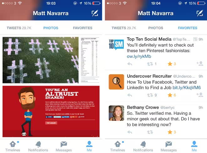
The redesigned profile pages also have two new timeline options, titled photos and favorites. The former is a vertical feed displaying all of the embedded images that the user has tweeted previously; the latter is an archive of everything they’ve starred while browsing the social network.
The test appears to be a partial roll-out. Other members of TNW have updated to the latest version of the iOS app, but can’t see the redesigned profile pages. There’s no guarantee this will be launched for everyone, but it’s a better use of space and offers more information than the previous version.
We’ve reached out to Twitter for comment and will update this article with any information we receive. In case you needed a reference, below is a comparison between the old (right) and new (left) profile design:
Read Next: Twitter for Android and iOS get photo tagging for up to 10 people and ability to add up to 4 photos in a tweet / Twitter files for lawsuits in Turkish courts to get ongoing ban of its service lifted
Get the TNW newsletter
Get the most important tech news in your inbox each week.


