Twitter is walking a tightrope. The fast-paced social network stood at 241 million monthly active users earlier this month and while that figure is up from 232 million the previous quarter, it’s evident that Twitter’s upward trajectory is beginning to slow down.
The concern is that in its present state, the service is too confusing or time-consuming for newcomers to get to grips with.
To get the complete Twitter experience, users need to figure out which accounts they should be following and understand the difference between hash-tags, mentions and retweets. Dick Costolo, the chief executive of Twitter, has admitted that the platform’s “scaffolding” and language needs to be addressed.
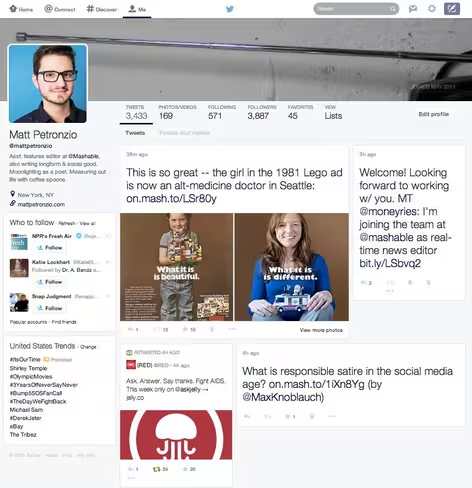
No doubt, Twitter is hoping to build a user base that can rival Facebook. As Mashable reports, to this end the company is testing a profile redesign that shares more than a passing resemblance to Facebook and Google+.
Image Credit: Mashable
The profile picture and corresponding bio is now shown more prominently in the top left-hand corner, while the cover photo spans the width of the page. The size and arrangement of tweets is of greater importance, however. They’re larger than before, with a two-column layout that offers more space for media.
As with most major redesigns, the screenshots received an icy reception. While users are always cautious about changes to a service they know and love, this one spiked an unusually large and vocal response.
OMG NO! Twitter Testing Major Profile Redesign That Looks a Lot Like Facebook – http://t.co/CWMwZCY9md
— Naina (@Naina) February 13, 2014
Twitter, this is horrible.. just horrible!!! http://t.co/7QLuLgHrwF
The essence of Twitter………. GONE…… don't do this! #PISSED
— STEF || SOONGYU 'ㅅ' (@spiderliliez) February 13, 2014
Don't do it, Twitter: Twitter Testing Major Profile Redesign That Looks a Lot Like Facebook http://t.co/PgntyEyux8 via @mashable
— Stephen Taylor (@SteKenobi) February 13, 2014
Twitter is experimenting with its core DNA and not surprisingly, some people are worried. As the saying goes: “If it ain’t broke, don’t fix it.”
To be simple, isn’t quite so simple
The simplicity of Twitter is an integral part of its success. Early adopters loved the short-form messages because they were concise and easy to consume. Reviewing a feed was effortless because, unlike Facebook, everyone was forced to write pithy tweets with little room for misinterpretation.
The jargon crept in as users discovered how they could perform advanced actions, such as republishing or quoting another person’s tweet while sticking to the site’s 140-character limit. Ironically, it was the simplicity of Twitter – reactive, real-time text messages that anyone could read – that has created this perceived barrier for newcomers.
Twitter has tweaked its service to better integrate some of these actions. Retweets, for instance, can now be triggered with a single click or tap and no longer require typing the word “RT”, unless you want to preface it with some of your own thoughts.
Costolo wants to do more though. When he commented on the “scaffolding” that’s supposedly slowing Twitter’s growth, he also suggested that multimedia content, such as photos and videos, needed to be brought to the fore. That thinking will have no doubt been the driving force behind the latest profile redesign experiment. Twitter wants to appeal to a broader group of users, which means adopting a more visual design similar to Facebook or Google+.
To improve the ‘onboarding’ experience though, Twitter risks upsetting its older users. By placing further emphasis on photos and videos, it’s detracting from the simplicity that makes Twitter so special.
The approach isn’t a new one, however. Users are already seeing and using Twitter Cards, which expand links, photos and other media within their stream. The transition has been a slow one, but it’s not particularly difficult to see the direction that Twitter is headed in.
Walking the tightrope
Twitter is trying to strike a difficult balance. It wants to accelerate the number of people who are signing up and using its service each month. To do that though, the company believes it needs to tweak how tweets and media is displayed. While that may appeal to some people who may have avoided the service until now, Twitter risks alienating some of its most vocal and passionate fans.
Mashable says Twitter is still making tweaks to its profile redesign experiment. It’s also worth emphasizing that at this point, there is no guarantee that it will be rolled-out all of its users. That’s the purpose of testing after all; to see what works and make changes if it doesn’t. Nevertheless, this latest test is a strong indicator for the direction Twitter is headed in. Supporters of the service might bristle at the changes, but they’re likely here to stay.
Top Image Credit: DAMIEN MEYER/AFP/Getty Images
Get the TNW newsletter
Get the most important tech news in your inbox each week.


