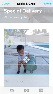
Storehouse has shrunk down its iPad app for creating beautiful photo and video stories with the release of an iPhone app.
Storehouse launched at the start of this year to high praise for its design. Given that Storehouse co-founder Mark Kawano served as a UI designer for a number of Apple’s photo-centric apps, the level of polish was to be expected.
We’ve been testing the beta version of Storehouse for iPhone, and it lives up to the same standards. With the smaller real estate, the new app works best for short, simple posts. It’s not really designed for creating the types of long-form content that you would on the iPad version, although it’s possible if you have the patience.


According to Kawano, Storehouse content was designed from the beginning to work well on the iPhone. For instance, the iPad version doesn’t allow photos next to text even though it would fit because that wouldn’t translate onto the iPhone.
One key difference between the use case for the iPad and iPhone versions is that your iPhone probably takes a lot more pictures than your iPad. As such, the iPad version relies on pulling content from a variety of sources, such as your DSLR pics on Flickr. You can still do all that from the iPhone app, but if you’re composing a story while out, chances are you’ll find most of the images you need in your camera roll.
“What we’re seeing with the iPhone, we’re seeing way more different types of stories…creating stories in the moment,” Kawano said.
 You can manually adjust photo sizes and layout when you add them to your post drafts, but it’s also designed so that you can just drop in photos or videos, add your text, and then hit the publish button.
Along with the iPhone version, Storehouse has added new discovery features to the platform. You can now add hashtags to your posts and browse specific categories. Users also now have Web profiles with a unique URL.
“The first iPad version was a really great creation tool, great story format, but distribution and discovery was an area we weren’t really robust on,” Kawano said. “Now we’ve been able to learn the way people want to discover content. We’re taking all those lessons and putting that into the iPhone. In general, this update has made storehouse a whole lot more personal and more social.”
➤ Storehouse for iPhone | iPad
Get the TNW newsletter
Get the most important tech news in your inbox each week.


