There’s no doubt about it — Storehouse, an iPad app that lets you quickly lay out and publish photos, videos and text as shareable stories, is simply gorgeous.
After all, the app was launched just yesterday by Apple’s former user experience evangelist and UI designer Mark Kawano — and his design and UX credentials, which include iPhoto, Aperture and Photoshop, are evident in Storehouse. (Read more about that in my colleague Josh’s earlier piece.)
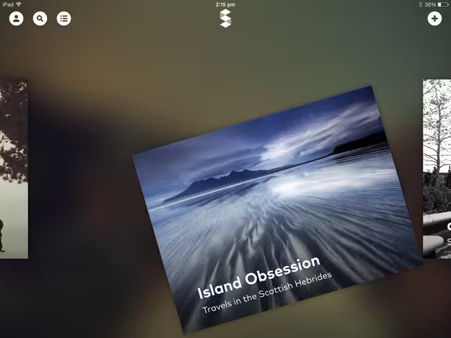
The app is designed to be like a magazine, where you stumble upon stories that sort of float dreamily in the app. You can scroll sideways to get an overview of all the stories published on Storehouse, then tap on one and scroll upwards to access the entire story. After you’ve read the piece and had your fair share of ooh-ing and ah-ing over the photos and videos, pinch the story and it’ll go back to the main page.
Storehouse stories are even better than traditional magazines though, as videos can be woven in for a multimedia experience that is like no other.
It’s even more amazing when a story’s cover graphic is a video — basically the video loops perpetually, so it seems like you have people moving in the frame. It is kind of magical for me simply because it reminded me of Harry Potter, where characters in portraits could move.
Creating your own story
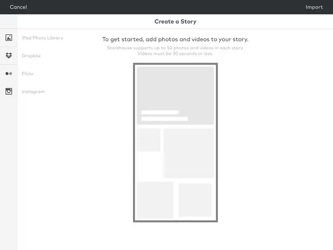
When it comes to creating your story, all you have to do is tap the ‘+’ button on the top right of the app homepage. It takes you to a page where you can start by adding photos and videos. As of now there are four options for you to import photos from — your iPad photo library, Dropbox, Flickr and Instagram.
I chose to link up my Instagram account and got presented with a list of my photos — from which I could either import a select few, or even all of them at one go. After you’re done with that, Storehouse takes you to a page where you can key in the title and subtitle of your story, as well as crop or resize your image.
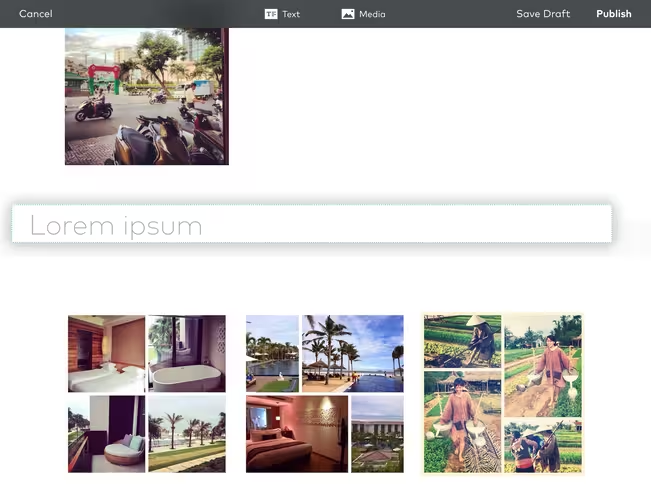
To resize your image, just tap and drag on the blue reference points. To make your media full screen, drag any of these points to the edge of your iPad. Moving the images around is just a simple matter of tapping and dragging.
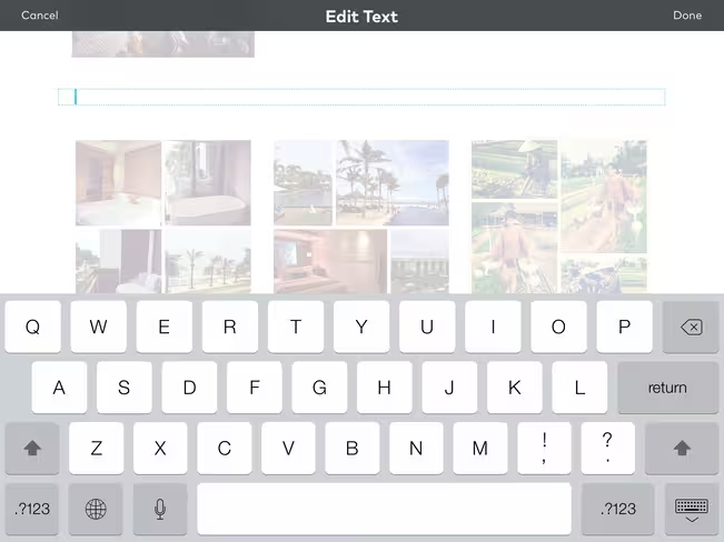
Text-wise there aren’t that many options though — you only get to choose three styles: a header, quote or normal text. Furthermore, there aren’t any options for formatting the font or color of your text, which is something that I would like to do. However, one nifty feature is that you can simply drag the text-box to wherever you want it to be.
Finally, you can either choose to save your story as a draft or hit publish. Once you decide to publish it, the story goes out on Storehouse’s own network and you can share a responsive Web version to Facebook and Twitter.
Storehouse is tailored for high-quality media
My dream of producing an amazing-looking story though, was destroyed when I saw the final product. True — it was a beautifully laid-out story, but the lower resolution of my photos compared with professionally-taken media made the final result a stark contrast to how it appeared in my imagination — and this is where Storehouse may just very well alienate layman content creators.
Basically, Storehouse is built for photos and videos with higher resolutions that can be stretched full-screen without compromising on quality.
First of all, linking up with Instagram may not be that wise an idea when the resolution of Instagram photos and videos just isn’t that high. The iPad also isn’t equipped to take high-quality photos and videos, so the fact that Storehouse exists only as an iPad app may be detrimental — although Kawano felt that using a touchscreen to compose the stories made the process more “playful and engaging.”
Honestly, I much enjoyed browsing other users’ amazing stories instead — and I suspect I will only be tempted to create my own story if I had taken the effort to tote along a dSLR on my holiday and wanted to share a story about my travels.
I can see it taking off among professional photographers, film-makers and designers though — already a lot of the stories on Storehouse come from such people in the creative industry, and they are downright beautiful. Some are also republished by Storehouse itelf.
In essence, Storehouse is more of an alternative to mainstream magazines — you get to view a mish-mash of multimedia stories from people who span various industries. Storehouse needs to attract a critical mass of creators in order to mature into a full platform — but indeed it may be wiser if less people with low-resolution photos (i.e. me) post our stories up there. After all, the beauty of Storehouse could just very well be marred by such imperfection.
Headline image via Shutterstock
Get the TNW newsletter
Get the most important tech news in your inbox each week.


