The launch of the HTC One (M8) might not have been a well-kept secret, but as HTC’s range-topping device for the next year, it will need to fend off ‘the best of the rest’ in order to win consumer attention.
But with incremental upgrades being the order of the day, does it perform well enough to stand a fighting chance of appealing to buyers and helping the company’s bottom line? We spent half an hour or so with the new generation HTC One (M8) to get a feel for the device.
Design and performance
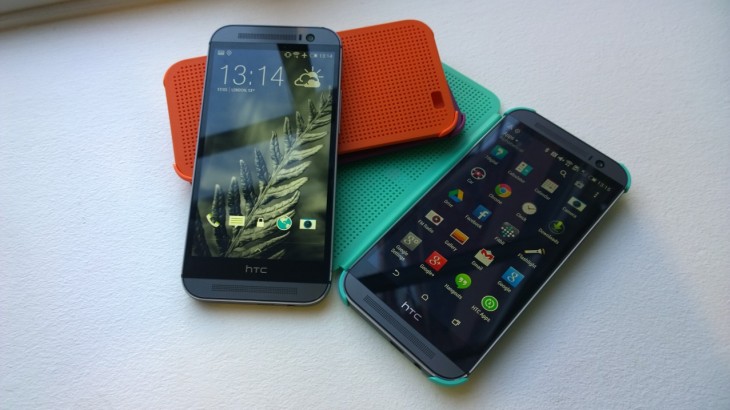
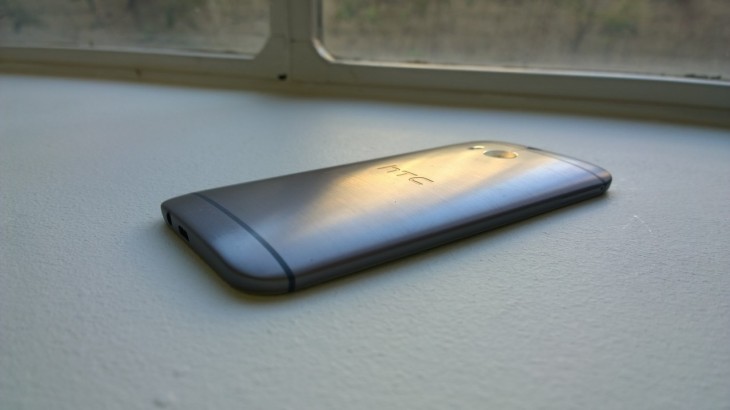
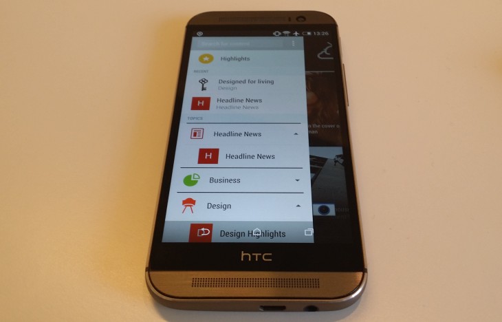
The HTC One (M8) keeps much of the same design as the original HTC One, and as such, it looks and feels pretty familiar. If you were a fan of the first, you’ll probably like this.
The screen is slightly larger at 5-inches, up from 4.7-inches, so the overall chassis is slightly bigger and heavier.
At 160g, it’s considerably weightier than, say, the iPhone 5s at 112g, and just a little heavier than the incoming Galaxy S5 at 145g. Ultimately, unless you’re really sensitive to weight in your pockets or bag, this isn’t likely to be an issue.
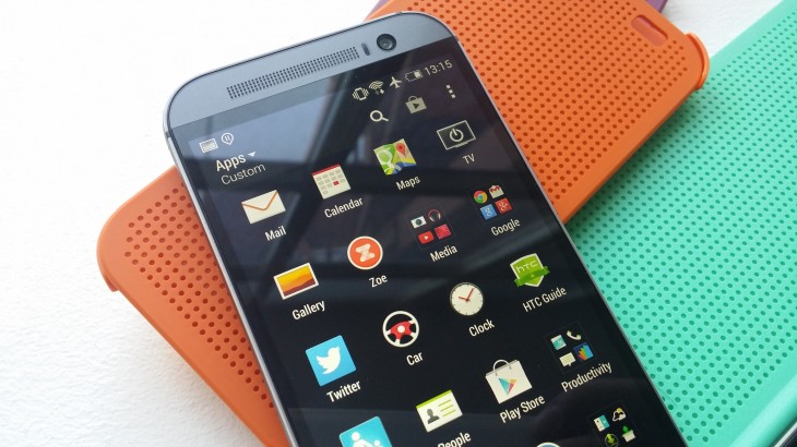
That 5-inch screen, with full HD resolution is pretty impressive though. Bright, crisp; it certainly left us with a good first impression – and not once were we left waiting for the phone to catch up with our pawing at the screen. Clearly, a 2.3GHz processor is enough to keep it chugging along very nicely indeed, but we’ll need to wait for a full review to see if it performs as well under more pressure – like when multi-tasking or playing graphically intensive games.
It keeps the same dual-speaker design as the original too, but promises to be a little louder. We couldn’t verify that it’s exactly 25 percent louder that the company claims, but it was certainly a strong performance from a smartphone and definitely gives a more complete sound than the first One. Again, it’s hard to say if the lack of Beats makes a difference but initial tests suggest not.
Camera and effects
One of the key differences in the performance between the first and second generation handsets is the camera. While I liked the first HTC One, the camera was nothing much to shout about with far better rivals on the market.
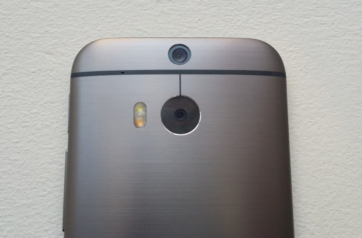
For the new One (M8), HTC has stuck to its guns and used the same 4-megapixel ‘UltraPixel’ sensor, but has combined it with another ‘camera’ (essentially a sensor that captures extra spatial information) and Qualcomm’s Image Signal Processing chip to allow for extensive after-effects to be applied.
In our initial testing, the One (M8) fared pretty well at dealing with the indoor location we were using. However, the first generation wasn’t too bad indoors either – so, again, we’ll have to wait for a full review (and a sunny day) to really be able to put it through its paces and find out if bright pictures look a little less washed out this time around.
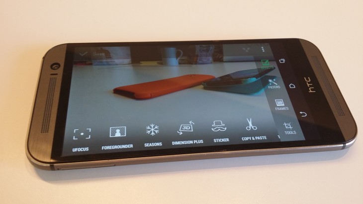
What we did get some time to play around with is the numerous camera options and post-shot tweaks – and if you like to edit photos on your phone, there really is a whole lot here to play with.
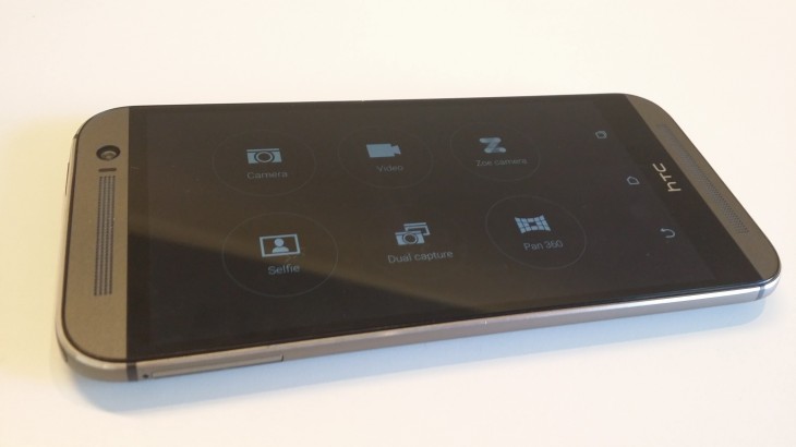
Once you’ve taken a picture, there’s a range of new effects too, some of which are thanks to that new sensor on the back of the phone.
Among the new options is a slightly gimmicky ‘Dimension Plus’ option that augments the perspective of the angle that the photo was taken at, and some slightly more useful selective focus and retouching tools called UFocus and Foregrounder.
As an out-of-the-box way to add a professional looking blur to your images, for example, they do just fine. It’s worth noting that there were a few post-processing artifacts on the image after refocusing in some of our tests.
Perhaps the best thing about the camera though, is that it doesn’t take forever to capture an image. Sometimes, when vendors add new photo options to a camera, using them in real-life is practically impossible because it takes so long. This shouldn’t be the case for the One (M8).
Other tweaks?
It’s now possible to wake the HTC One (M8) by double-tapping the screen – and there are a few other gesture controls (officially called ‘Motion Launch’) supported from when the screen is switched off. For example, swiping from left-to-right will launch BlinkFeed, right-swiping will open widgets and swiping up from the bottom will take you to your last action. You can also jump directly into the camera mode by using the volume buttons on the device.
HTC has also made the jump to using on-screen software buttons, rather than the back and home buttons either side of the HTC logo on the original device. It’s a change I’m pleased to see. A spokesperson said it’s to ensure app compatibility across devices, which makes sense, but I’m just happy I’ll no longer tap the logo expecting it to actually do something, only to be disappointed when it doesn’t.
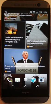
Sense 6 introduces a few new tweaks too – but these are primarily focused on BlinkFeed. Notably, the BlinkFeed list of updates is no longer paginated, so it’s free-flowing as you scroll, making for a much better experience. We’ll be digging into the software tweaks more in our full review.
Accessorize
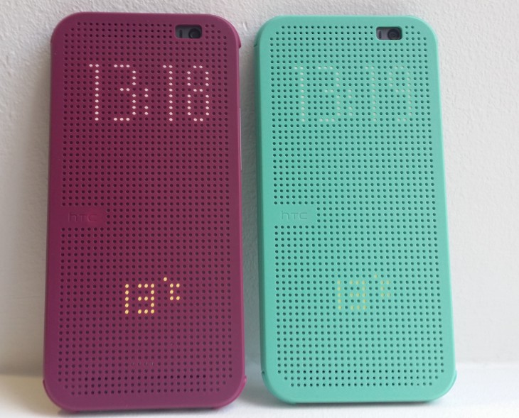
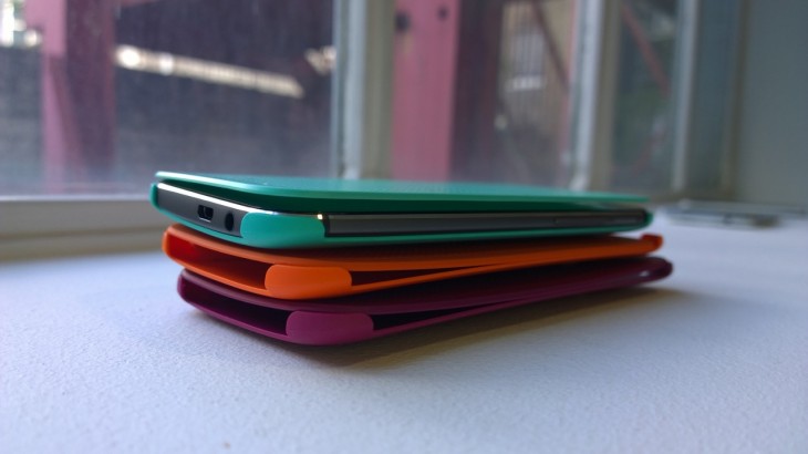
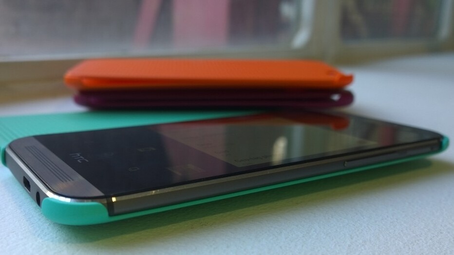
Alongside the new device, there are new cases – available in a range of colors.
The slightly soft rubbery-feeling Dot Cases are a nice touch for original accessories, and support the double-tap feature – which shows the time and weather through the case. Alas, there’s no way to enable the cool dot matrix mode that lies below while the case open – it’s a bit like your fridge light when the door opens.
I say “nice touch”, but this is only really if you don’t mind your premium-priced smartphone being encased in a not all that premium-looking shell.
There’s also no pricing on them just yet, so it’s hard to say if they’ll represent value or not. Either way, you’ll want to ensure your phone is fitted in snugly, else the case doesn’t sit very neatly (shown above).
Does the One (M8) offer enough?
HTC has focused much of the upgrade on iteration – there’s a slightly bigger screen, the processor got a bump, there’s more storage – and finally the option of microSD expansion. It’s all good news, but it’s not the headline grabbing features and heart-rate monitoring hardware that rivals can shout about.
Ultimately, I suspect people want a reliable high-end device that performs well over more niche features. But as more high-end range-toppers like the Sony Xperia Z2, Samsung Galaxy S5 and other devices can list being waterproof (for example) among their features, then those features become less niche and more of a staple. From HTC’s perspective, it’s a tough balance to strike – if it had included these features in any sort of harried or ill-considered way, it would draw criticism for that too.
In planning, building and now delivering its new One (M8) flagship around a few core experiences, the company can now only hope that the handset offers enough today to see it through to the introduction of another new model in a year’s time.
In the meantime, we’ll have a full review up in the coming days.
Get the TNW newsletter
Get the most important tech news in your inbox each week.
