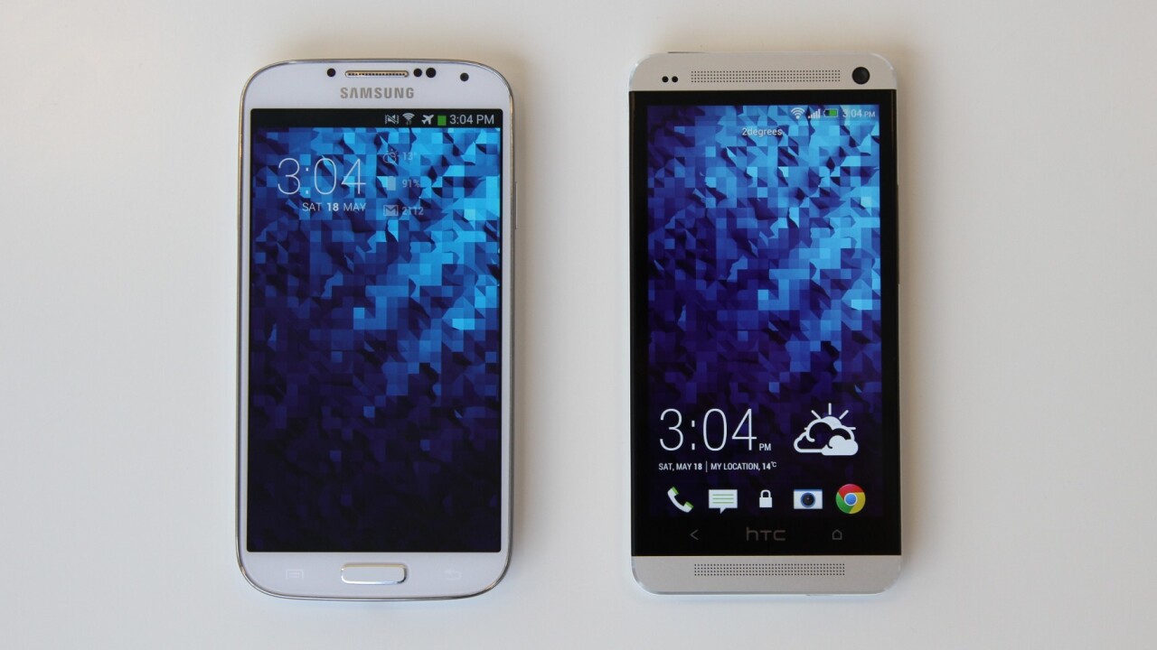
It seems that 2013 is the year that handset manufacturers realized they had to step up their game. The contrasting situations of the two largest Android manufacturers is perhaps the most interesting part about their latest handsets. HTC — at one of the company’s lowest points of all time — released the One, their most refined handset to date as a move that could almost be described as desperation.
Conversely, Samsung is the strongest they’ve ever been, releasing the Galaxy S4 as an iteration of a proven method and a marketing technique that can only be described as a never ending salvo. These two very different positions have caused the two to release their most thought out and well-designed handsets to date, both at essentially the same time. This creates a horrible, yet wonderful situation for consumers to be in.
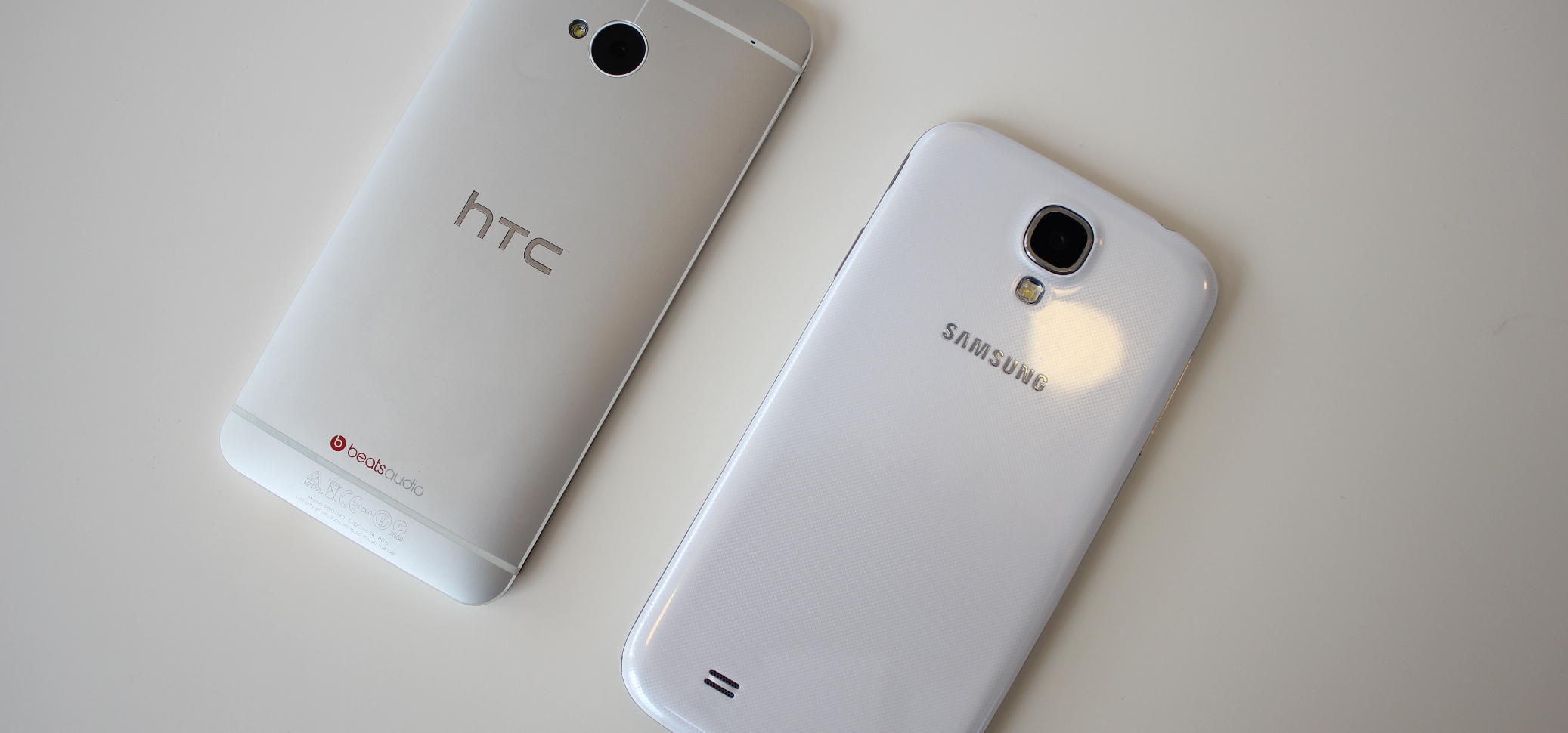
There is a big choice to make, with both devices offering a very different experience at a similar price point. Some consumers may choose based on the hardware (plastic or metal) whereas some may choose based on the software experience. In the real world, it’s not really possible for a potential buyer to get a good feel for both phones before they actually need to purchase one and we know that the store experience is not reflective of how it will be to use the phone for a long time.
If you’re stuck, unable to make a decision about if the HTC One or the Samsung Galaxy S4 is for you, then consider this a guide. A look into what using both devices is like and how it felt to be able to freely switch between them.
Hardware
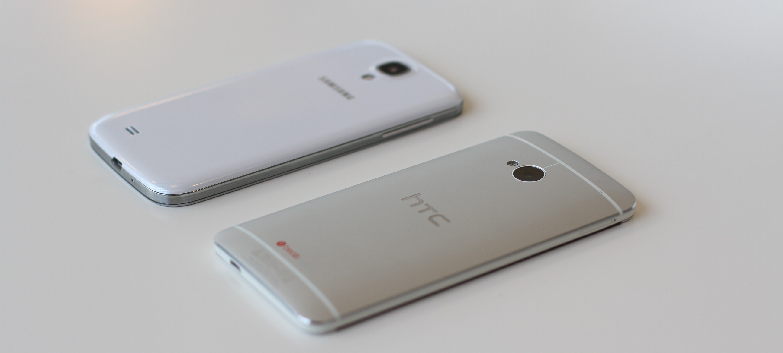
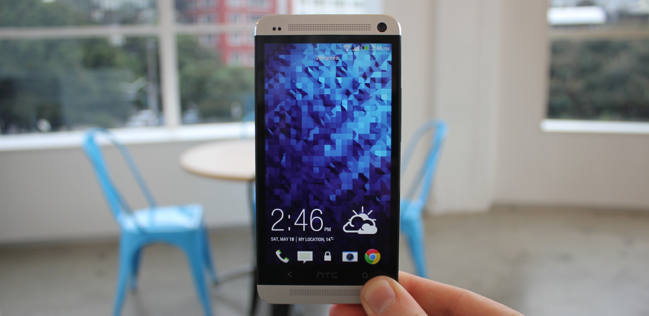
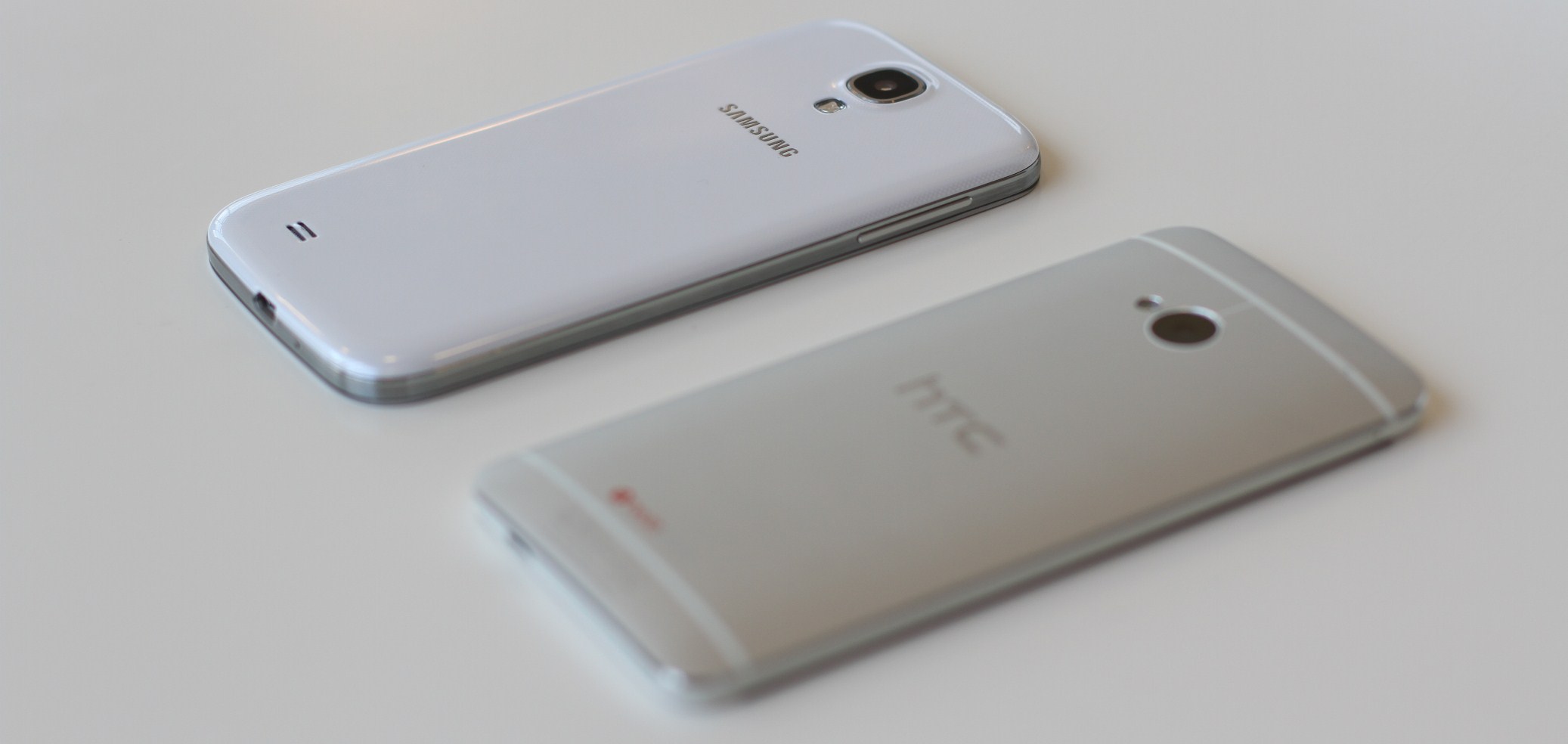
Forget anything else, this is the first time a handset manufacturer has managed to get it just right on an Android phone. When you pull it out of the box for the first time, it’s easy enough to sit there dumbfounded by how great it looks and feels in your hand. The same thing happens when you pull it out to show people.
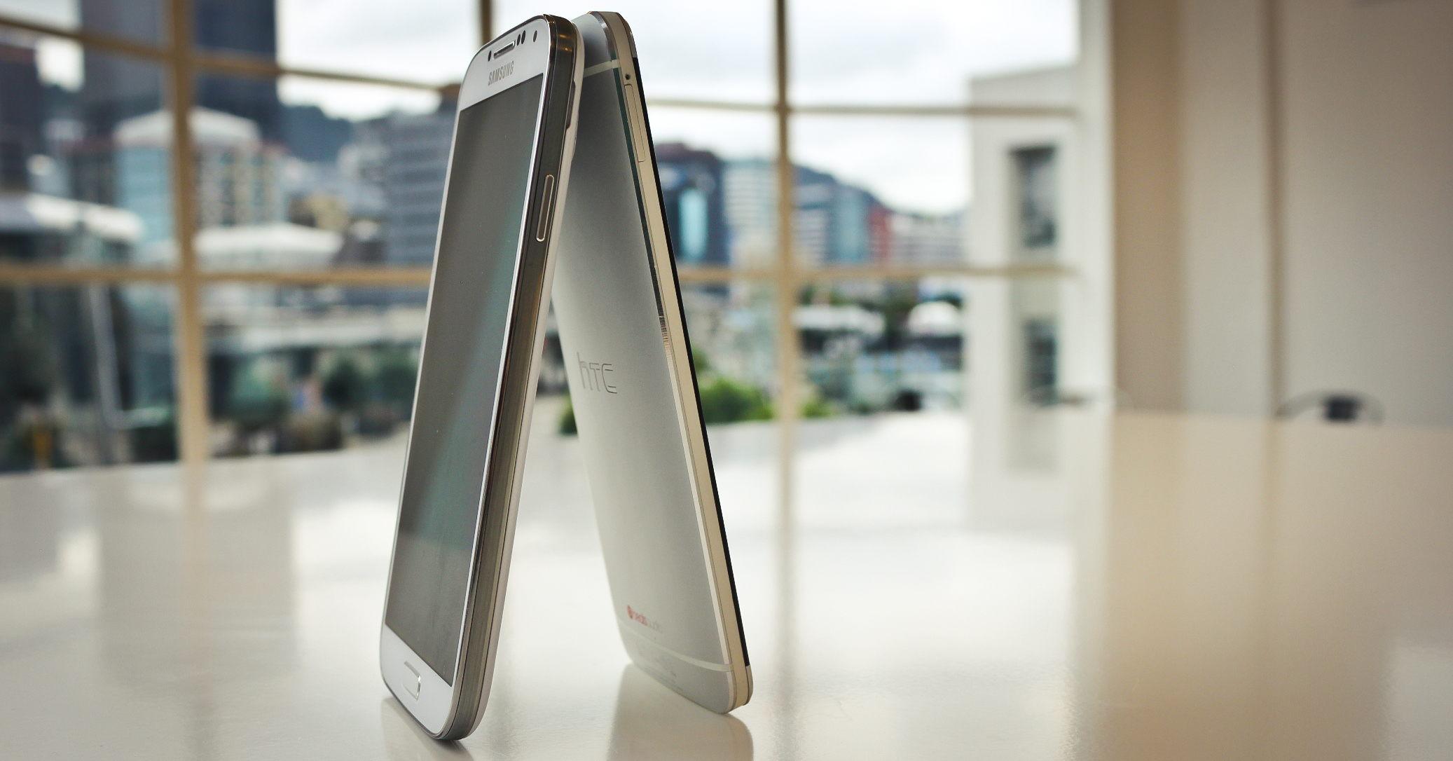
The unibody metal has sharp edges, not dissimilar to the iPhone that make it feel slick and expensive. The only phone that really could be considered similar to the One is the iPhone 5, which shows how well the company has done in this regard. For a 5 inch phone, it doesn’t feel too big and is certainly not uncomfortable to hold. It nestles into your palm nicely thanks to that curved back. It doesn’t stop there, either.
The phone just gets more beautiful when it’s turned on, thanks to the 4.7″, 1920 x 1080 display (that’s 468ppi). I don’t know why HTC wasn’t running around shouting about this from the rooftops with a gimmicky name not too dissimilar from “Retina” instead of touting the camera when they announced this phone, because the screen is one that would excite any pixel-density enthusiast. It’s incredibly sharp and very good at reproducing color and whites.
Unfortunately for the One, though, HTC made some confusing design decisions that really ruined the experience. First off, one that’s been complained about a lot is the strange positioning of the HTC logo in the middle of the home and back buttons at the bottom of the screen. It’s the most infuriating thing, because as you use the phone more and more you’ll still jab at the HTC logo to go home before realizing that you need to move slightly to the right.
Again, HTC made the unfortunate choice to put the power button on the top left of phone that’s pretty large; when I put the phone in front of people they actually struggled to naturally figure out how to turn it on at first, as did I. We’re accustomed to big buttons on the front of the handset — like on the iPhone 5 or the Galaxy S4 — which just aren’t there on the One. This is more of a problem when you consider the fact that many Android phones have the power button about a third of the way down on the right-hand side, creating a habit that’s hard to break.
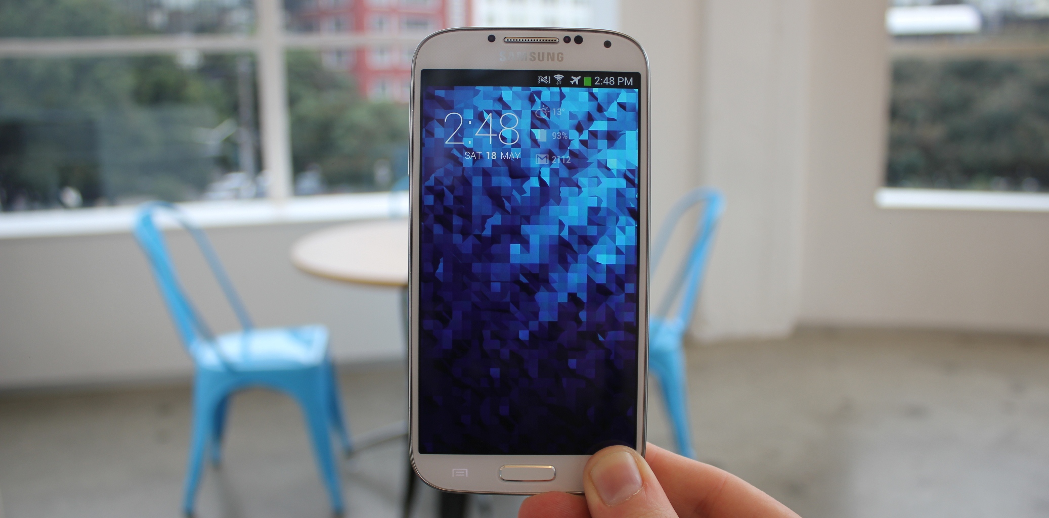
When you start comparing the S4 to the One it becomes difficult. Holding the S4 and the One in both hands makes it easy to tell which phone feels better. The S4 has this slimy plastic feel to it, which cheapens the experience by a whole lot when you’re holding the two. But, once you’re able to get past the plastic feel it’s actually extremely nice to hold. Something about the combination of lightweight materials and curved edges makes the S4 very nice to use.
The bezel around the edge of the S4 screen is satisfyingly thin and the screen feels like it’s using every inch of space on the phone that it possibly could. The slight difference in screen size over the One of 0.3″ feels a lot roomier, but unfortunately for the S4, it’s not quite as good at reproducing whites as the One for some reason. I even tried disabling the auto-tone adjustment mode on the S4 but it just wasn’t cutting it. It isn’t something that you’d notice very easily, but if you put both phones next to each other it becomes apparent that the S4 screen is inferior in this area.
However, Samsung makes up for this in almost every other aspect of the display. The S4 display is also a 1920 x 1080 display with a pixel density of 441 ppi. Colors pop brightly from the screen and it’s vibrant and attractive. The screen itself is actually nicer to use, too, as your finger glides effortlessly. I loved using the S4 because of this and when I found myself having to decide which screen I liked the most, I always came back to the S4. It’s extremely attractive and despite the PenTile based screen (just like the S3), I found myself not even thinking about it.
Samsung doesn’t escape from design goofs either, with the back button on the S4 being on the right hand side of the phone for no apparent reason. When switching between the One and the S4, I found myself inadvertently pushing the home button to go back on the One and the menu button to go back on the S4. Not a problem your average user is likely to run in to, but still one that causes me to question what Samsung was thinking.
As for that physical button? It’s actually kind of nice. More than anything, it gives those who are jumping ship from the iPhone to the S4 a life ring; something they are used to that’s in the exact same place which takes you home. Smart move.
Audio/notifications
HTC has been a proponent of beats audio for some time now, but it hasn’t really ever meant much. This time around, the company seems to have stepped it up a notch and has done what all others haven’t: they’ve put dual stereo speakers on the front. What’s more is they’re actually good. I hadn’t even tried them for a day or two after I got the phone and when Random Access Memories came out I purchased it from the Play Store without even thinking and accidentally hit play on Get Lucky. I think I stood there for a good 30 seconds with my mouth wide open because I couldn’t believe how great the sound actually is. It makes a huge difference when the speakers are facing right at you and there’s actually two of them.
There seems to be a small drawback to this, though. The sound on the One is often quite loud compared to other phone handsets, I found myself in many meetings apologizing profusely when I received a call and the phone began blaring. It can be hard to gauge just how loud it’s actually going to be when you set the volume, so watch out for this. It’s not a dealbreaker, but it might catch you out occasionally.
On the S4, audio is nowhere near as good as the One, but I don’t think that’s really an issue for many (unless you’re the type to listen to your music on speaker while on the bus). Samsung thought about it a little bit, though, and include a little bump by the speaker so that if it’s sitting on a desk it wouldn’t be muffled.
On the topic of notifying about alerts, the vibration mechanism in the One seems to be almost too powerful. I found it extremely frustrating every time it was on a desk and a vibrating alert came through — it’s too aggressive — especially compared to the S4. The S4 gives subtle, light vibrations (that you still won’t miss), while the One vibrations seemed a bit over zealous, especially when left on a desk. If you’ve used an iPhone before they’re soft and subtle, but the One seems to take it a bit too far. I found it a little frustrating after a while and ended up disabling all vibrating notifications on the One.
Camera
Most smartphone users will tell you the camera is the most important part of their phone. When HTC announced the One, they glazed over the features and went straight to the camera. The company claims on their website that the One has Ultrapixels which are “an advanced imaging technology that offers a great leap in the quality of point-and-shoot photos.”
Unfortunately, this is not true and is only marketing; Ultrapixels aren’t all they’re cracked up to be. Whilst the 4 Megapixel camera with ‘Ultrapixels’ on the One can take pictures that are full of light and color, it doesn’t take pictures that actually look good. I never looked at a photo from the One and thought that it was a nice picture.
It seems like the post-processing on the One runs some sort of noise reduction filter over all photos and even ones taken in bright daylight come out looking dull and unexciting. You’ll be hard pressed to actually get a photo that’s sharp out of the One, too. In one word, I would call the photos from the One mediocre. It isn’t bad, it’s just not very good.
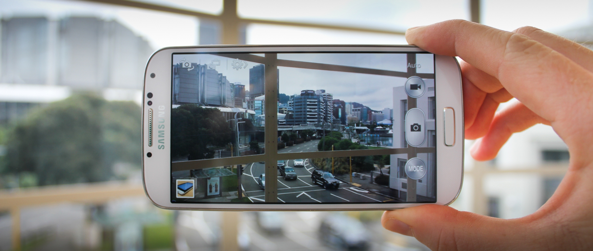
The situation on the S4 is quite the opposite. The camera is extremely satisfying and is the culmination of years of work on Samsung’s part. Not only is the camera interface not confusing or laggy, the camera on the S4 often shoots so fast that it’s hard to know if a picture actually was taken. It’s actually easy to take a good looking photo on the S4, you’ll be left wondering why it was so hard for phones all along.
The crazy part about the S4 are just how many features are in the camera. They’re not just gimmicky, so if you’re used to shooting on automatic, I’d recommend you reconsider; some of them are legitimately useful. For example, a mode called ‘Eraser Mode’ is for those times where you’re trying to get a shot of something and somebody walks past — it’ll remove the person without you having to do it — which is quite slick.
There’s other useful features here too, like the built in ability to create cinemagraphs. Despite Samsung’s marketing barrage, the dual shot feature in the S4 is one of the most pointless I’ve run into. The only time it was ever useful was when I wanted to show people how ridiculous it was. If you really want to be in the photo with your friends/family/children, just get someone to take the picture for you.
If the camera in your phone is important to you, I wouldn’t consider the One a viable phone. The S4 is really that much better; I would go as far to say that it’s the best Android camera I’ve used so far and comes extremely close to that of the iPhone 5, especially in terms of ease of use.
Performance
I’m of the strong opinion that phones are reaching the point where talking about specifications is becoming irrelevant. A few years back it would be essential with Android to worry about how much RAM or processor speed you could get out of your phone, but talking about it now is becoming increasingly passé.
It’s very obvious when using both the S4 and the One that this is the case, as well. The One and the S4 both feature quad-core processors from two different strains as well as 2GB of RAM onboard on each. The One features a Quad-core 1.7GHz Snapdragon 600 processor whereas the S4 (for this review) has a Octa-core (yes, eight cores) 1.6 GHz Cortex-A15 & quad-core 1.2 GHz Cortex-A7. That’s fine on paper, but there’s really little real world difference, though and I’ll bet your average user couldn’t tell the difference in performance at all. That claim to ‘eight cores’ is misleading, though, because only four of them will be used at any given time. If you want to read more about the Octa-core in the S4, Engadget has a great overview.
In the real world, neither phone misses a beat for the most part. The S4 seems to fall down occasionally thanks to some of the software that’s bundled. I’d sometimes end up in a situation where I’d opened the Gallery application and the whole phone locked up for 15 seconds. Not a good look, but this doesn’t happen outside of this situation too often and it’s not enough to cause a problem. I would hope Samsung plans on releasing a software update to fix this.
As for battery life, the One seems to be another device that HTC missed the mark on. If you recall the One X which was plagued by issues where users complained they couldn’t even make it through a day on one charge the One won’t be too dissimilar. It’s just not great. If you want to actually use the phone for long, you’ll be making sure you’re never far from a charger; I found myself charging it by dinner time.
The S4 doesn’t suffer quite the same fate, with the phone being able to last through a day or two at a time without much worry. The best part is that any sort of activity I could throw at the device didn’t seem to change that too much. Tweeting, emailing, reading a book on the bus or playing a few games didn’t matter/ It’s the first time I’ve used a phone without needing to think twice about whether or not my obsessive tweeting was going to mean needing to find a wall outlet by the afternoon. This is what all smartphones should be like.
Software: Touchwiz or Sense?
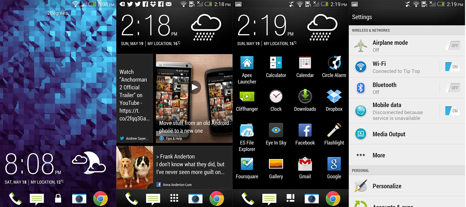
It pains me to see great phones ruined by terrible software but it’s something both Samsung and HTC can’t seem to get right. Unfortunately, they both haven’t managed to make their software much more tolerable with their new flagship phones, either. HTC released Sense 5 with the One, but while it’s become less intrusive and performance intensive as previous iterations it’s still terrible. Kudos to the company for attempting to reinvent Android with Blinkfeed but it’s just not great at what it does.
The company said at their announcement event that it was intended to keep you updated all the time with the latest that’s going on in your world — which is entirely true, you can customize it with news sources, Twitter and Facebook — it almost slaps you in the face every time you turn on your phone. David Pierce of The Verge put it well when he said that Blinkfeed “it’s like having someone shove a newspaper in your face every time you open your eyes.”
There’s literally no way to disable it outside of replacing the launcher which the average user probably wouldn’t do anyway. Going further, the application drawer seems to ignore the standard interaction that users of Android (and iOS) are used to; it scrolls up and down instead of right to left. Every time I opened the drawer I would swipe to the right before realizing that I couldn’t do it.
Even more frustrating, HTC decided that the expanded notifications that came with Android 4.1 were a waste of time and disabled these entirely. Thanks?
All this said, HTC has done a good job of speeding up Sense and transforming it from the laggy dog it used to be into a responsive skin that doesn’t let you down. I just wonder how much of it’s necessary since it doesn’t really add any value at all over stock Android. At least HTC doesn’t load up their phones with a swathe of applications you can’t remove, although I’m sure carriers will do that anyway.
The One doesn’t really include any special ‘feature’ applications outside of what is considered the Android default, but they’ve definitely re-skinned everything they can. The Messaging application is inconsistently designed, with conversation view not really being laid out all that well. People, clock and all the other stock applications got the Sense treatment too, but it’s just so cartoony compared to stock Android, which leaves me wondering why HTC bothers. If they made a pure Google phone, they’d get a lot further. 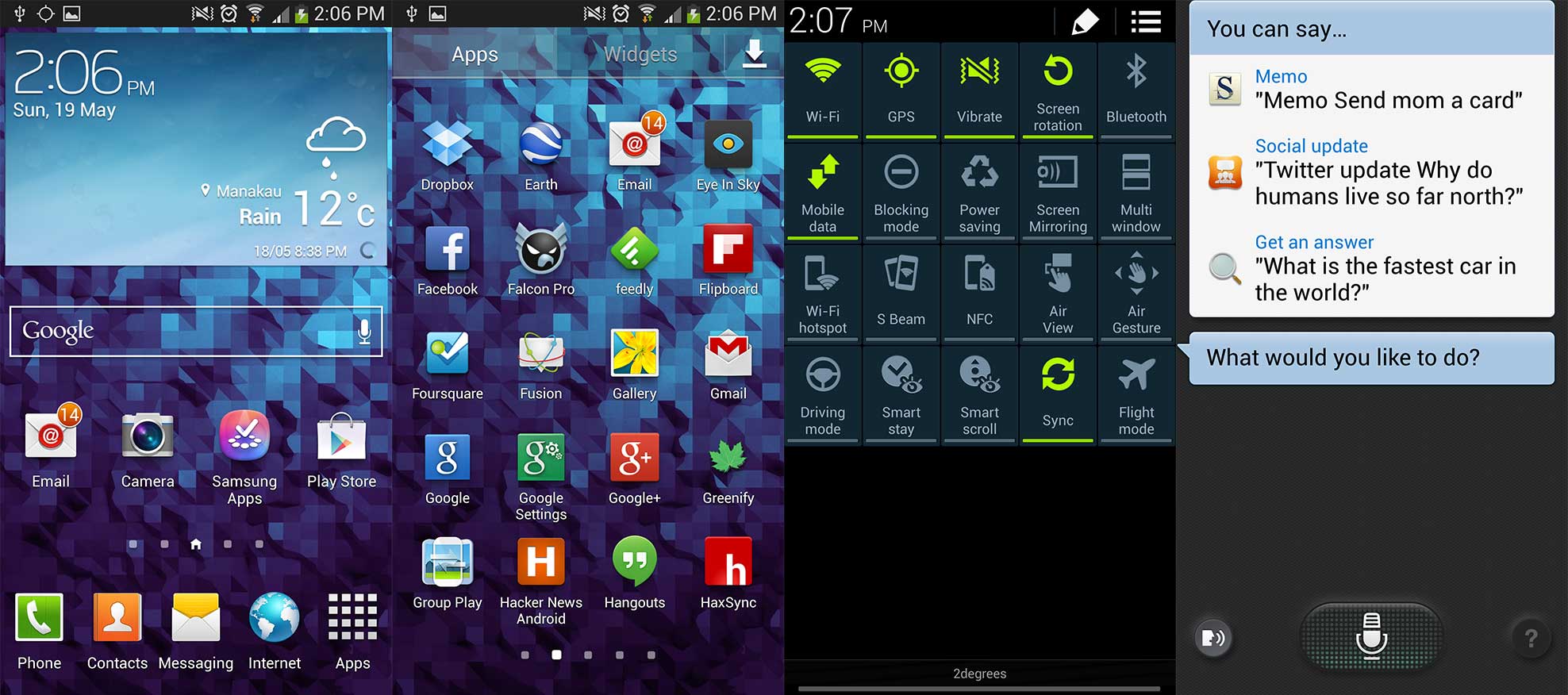
Some of the Samsung applications are somewhat useful, like S Health which promises to help you get fit but also feels like an excuse for the company to have included some sensors like the barometer. It’s a great idea to bundle something like this, though and means that the phone owner doesn’t have to buy their own exercise application. There’s even an application that turns the S4 into a TV remote using the built in IR blaster (which can be fun if you like messing with other people’s TV’s).
Back to Touchwiz itself, Samsung has tried to add value almost everywhere they can. Android 4.2 has a basic quick settings menu that’s not very good so Samsung went ahead and made it better by adding 20 options to the dropdown instead. If you’ve ever wondered why you can’t scroll with your eyes, now you can! Or maybe you wondered why you can’t just gesture over the phone in the air to go to the next page of the news, now you can!
For all of these features Samsung’s added — some of which could be sort of useful — there isn’t really any reason to use them. It’s easier just to use the phone without them enabled although some of them — like the one that doesn’t let the screen turn off while you’re looking at it — would be more useful if they were actually reliably good at detecting your eyes properly. They’re too inconsistent to be useful.
More often than not, though, the number of options/features on the screen and the popups to let me know that there’s a feature were just overwhelming. Occasionally I’d turn something on by accident only to find out about it later when I reached over to picked something up on a table and the phone lit up and did something because it thought I was gesturing. There are menus buried inside of buttons that don’t look like menu items and there are options everywhere. It’s just a bit much.
Touchwiz isn’t bad, it’s just unnecessary. The bright, high contrast colors are somewhat off putting compared to the light colors of stock Android. There’s some real value here, like the quick settings, but sometimes it just feels like you’re drowning in a sea of applications and options.
Summary
I’ve reviewed phones for a few years now and this is probably one of the harder decisions I’ve ever had to make when I’m actually looking to purchase a new phone for myself. While the One has beautiful hardware and great sound, it just falls over in the camera and battery areas. It’s just not good enough, coupled with HTC’s track record for how slow they are to update their phones and the fact that the One doesn’t even have Android 4.2 yet, it’s disappointing. The One’s hardware design is a glimpse into the future of hardware, but the company really missed the mark on a few major things here, which seems to be a common theme with HTC phones.
If the One was running stock Android it could be a different story, but it isn’t and that’s HTC’s loss yet again. If you’re looking for a phone that has great sound/hardware design and don’t mind that the camera is below average, the One is for you.
The Samsung Galaxy S4 is a formidable competitor to the One, with that camera that hits all the right spots and the battery life that doesn’t make me loiter around wall sockets making up for the slightly cheaper hardware design. The deal is made even sweeter if you look at the fact that next month you’ll be able to get a Google version of the S4; Samsung’s done what HTC wasn’t able to. Samsung’s made an almost-perfect phone even better by allowing us to buy a version that’s not loaded with cruft.
If you’re American, you’ll argue that the $649 price tag is expensive, but you’ve been lied to by carriers who claim their handsets are “free”. Look at the true cost of any phone, even the HTC One in unlocked form (it’s $649) and you’ll learn it’s entirely reasonable. My search for a perfect Android phone is likely to finish with a Google version of the S4. If you’re looking to buy either a HTC One or a Nexus, I’d encourage you to wait for the pure Google S4. I think it’ll be worth the wait.
Update: Rumors say that HTC is likely to announce a Google Edition of their phone — which is awesome — but if it were to come to fruition, it wouldn’t solve the main issues I had with the One. Their camera quality and battery life is far more inferior than that of the Samsung Galaxy S4’s and most of the magic for both of those things is in the software. The stock Android camera just isn’t very good on its own, nor can it take advantage of HTC’s imagesense technology, so my opinion still stands that it’s best to wait for the Samsung Galaxy S4 ‘Google Edition.’
Get the TNW newsletter
Get the most important tech news in your inbox each week.
