The screen size war has begun and smartphone manufacturers are engaged in a ever escalating war of larger and larger phones every few months, but do consumers really want them? It’s a hard question to answer; if you ask Apple they don’t seem to think that anyone would ever want a phone that’s over five inches.
But, we live in a world where Android phones that are creeping over the five inch mark are becoming more and more popular. The Samsung Galaxy Note, HTC One and the Asus Padfone are all examples of this slow creep towards bigger. Sony’s thrown their hat in the ring now too, with the Xperia Z hitting the market.
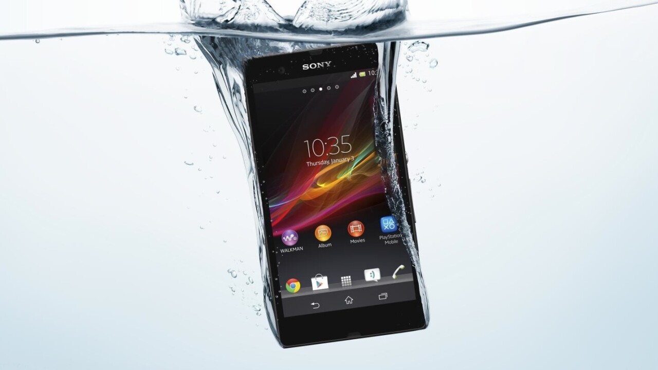
Sony obviously isn’t the most well known Android manufacturer, but with their latest attempt they hope to be. The Xperia Z is a huge leap away from their previous devices in design and build quality as well as the size. The company has really thought about how they can differentiate themselves and they went ahead and added something that their competitors haven’t managed to yet: waterproofing.
First though, let’s get the specifications out of the way. The Xperia Z sports a 1.5 GHz quad-core processor, 2GB of RAM, 16GB of storage (with a MicroSD port), a 13 Megapixel camera and a 1080p screen. Not bad; add on the fact that the phone can support pretty much any frequency you can throw at it (it’s LTE capable too) and you’ve got a solid handset.
The Xperia Z feels premium and solid when you pick it up, unlike my experience with the Samsung Galaxy S4 (which feels like cheap plastic), the Xperia Z feels as premium as the iPhone does. Many argue that it doesn’t matter what it’s made of — plastic, glass, metal or polycarbonate — but it does matter. The way that the phone feels in hand determines just how good one feels about buying it.
Unfortunately, that premium feels seems to diminish slightly when the phone is actually turned on. The default Sony software experience is tacky, but not overly offensive. Sony’s insisted on rolling their own flavor of the UI, which comes with odd animations and strange cartoon graphics that really make no sense. I just don’t get why manufacturers can’t leave the experience alone, either, since stock Android became something awesome when Ice Cream Sandwich was released almost two years ago. Customers love stock Android, so why go to the trouble of skinning it? Their skinning even resembles stock Android but it almost seems like they’ve just skinned it for the sake of it.
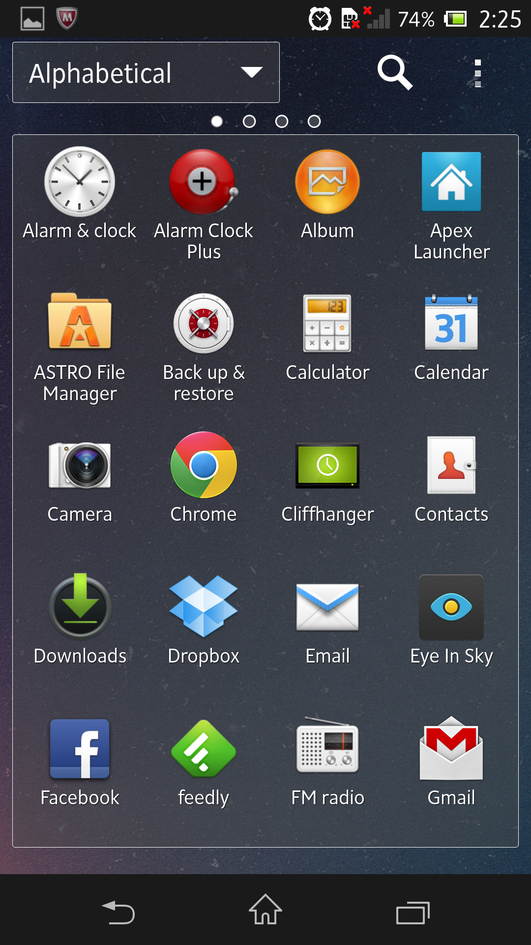
Unfortunately, most of the default applications are skinned in some strange manner. We won’t go into too much detail about them, since they can generally be replaced, but the icons and general styling basically ignores the Holo UI and leaves much to be desired. Some menus, such as the application launcher feel half finished, which leaves much to be desired from a phone with stellar hardware. That said, they aren’t as terrible as Samsung’s Touchwiz, so there’s that.
 They’ve also added in these strange little mini applications that are able to float over anything else that’s on the screen. You can drop a calculator, post-it or timer over your screen and it’ll persist no matter where you are in the OS. In the two weeks I had the phone, the only time I actually used this was to see what it actually did.
Not all of the modifications to the software are bad, though, with Sony managing to add in some legitimately useful things such as “stamina” mode for battery which actually manages to stretch the battery life over at least two days. Stock Android could indeed learn that trick from Sony, since the only other Android phone I’ve ever used that’s able to do this is the Samsung Galaxy S3.
In general, the performance of the phone was good, but it certainly doesn’t feel like it’s got a quad-core under the hood with all that RAM. It’s not slow per se, but even the Nexus 4 feels snappier. I really don’t understand why the company needed to throw in a processor with so many cores, because it provides no clear benefit.
My favorite part about the Xperia Z is just how rugged it is. The waterproof factor changes the game and naturally, I wanted to see how far I could push the phone. The Xperia Z works happily in situations where there’s lots of splashes of water (the shower) right down to in a spa pool. It can be fully submerged too, but don’t expect the touch screen to behave how you would want when it’s wet.
The added security of the phone being waterproof is stellar, though and can make for good fun when you drop your shiny new phone in the pool to shock your friends. The biggest drawback of this waterproofing is that all the ports of the phone are hidden behind little rubberized plastic flaps — which feel solid — but can be a pain to pull open and closed. But hey, that’s not a deal breaker for a phone that’s completely waterproof and actually looks nice.
One of the biggest things any buyer will ask about first is “what about the camera?” In the Android world, they can be pretty hit and miss and for myself, ever since I switched from using the iPhone I’ve never taken as many pictures. In a not-exhaustive test, the Xperia Z wasn’t able to reverse this trend for me.
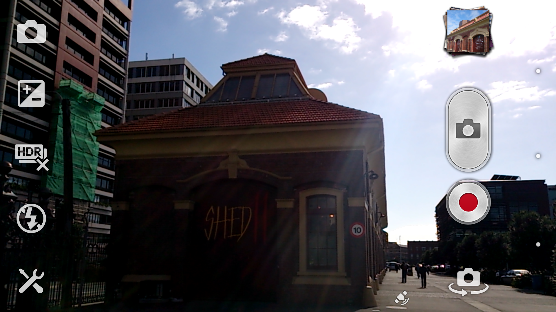
It takes photos that are pretty good (some examples above), capturing deep colors and a good amount of detail but seems to inexplicably take grainy photos that wash out. I don’t get it, since Sony raved about how great the 13-Megapixel shooter was at the launch event. It’s basically down to the camera application, not the hardware. It’s not good enough, unlike HTC who have spent a lot of time perfecting their ImageSense technology, Sony hasn’t spent long enough in this area.
The crux of this review, as indicated in the title, is that five-inch screen. There’s a holy war in the smartphone world between those who think that size phone is ridiculous and those that actually kind of like them. The first time I ever considered that a 5″ screen could actually be nice was when I saw the HTC J Butterfly. The display on that phone is stellar and was the point where I thought that perhaps the size was worth it.
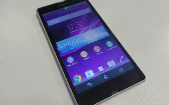
Washed Out. Image via The Inquirer
Unfortunately, the Xperia Z display doesn’t quite live up to the butterfly screen, but it’s still good. Mirroring the comments of many others in their reviews of the Xperia Z, the viewing angles are a bit strange. If the phone is on a table and you’re looking at it seated from the side of the table the screen is clearly dull and off-colored. The screen almost completely washes out. That’s because Sony — for some inexplicable reason — opted for a TFT display in the phone instead of an AMOLED or something else. For a company that prides itself in making TVs, it’s strange that they didn’t think to put something nicer in here. The display is stellar when you’ve got it in your hand (which is likely where you’ll have it 90% of the time) and despite The Verge saying that the “Xperia Z is more attractive with the screen off rather than on” I disagree and believe your average person won’t even notice it. But your mileage may vary, so I encourage you to try one in the store before you buy.
As for if 5 inches is too much? I don’t think so. It wasn’t really an issue at all from me (my main phone is a Nexus 4). The usable screen space makes up for the overall size of the phone, although the adjustment in how I had to hold the phone was probably the most jarring part. If you have small hands you’ll likely need to do what I do and hold the phone up with your pinky to be able to reach the top of the screen, which may be an issue for many already. Indeed, sometimes it’ll need to be used with two hands, but it’s comfortable enough to use with one hand on the go. Basically, it’ll take some time to get used to.
I really liked the Xperia Z but believe Sony released it at an unfortunate time for a company that’s trying to break into the Android market like Samsung have. Their marketing push is admirable, which shows what’s needed to succeed in a tightly-packed Android world. Unfortunately for them, the other handset manufacturers have released their flagship phones too, which either have the marketing advantage or the style advantage. We’re talking about the Samsung Galaxy S4 and the HTC One, of course, which are the phones to beat this year.
I don’t know if the Xperia Z has enough going for it (aside from the waterproofing) that makes dropping a similar amount of cash on a Sony phone as opposed to Samsung or HTC one worth it. It may come down to just what a customer is looking for in the device materials; the Xperia Z features sandwiched glass instead of plastic in the S4 or the unibody metal design in the One. That said, I can’t find a compelling argument that Sony is giving to get the Xperia Z over the other offerings. If Sony had released a year ago we might have been having a different conversation, but unfortunately for the company they’ve entered the market at a time when the Android wars are at fever pitch with little reason to switch sides.
Get the TNW newsletter
Get the most important tech news in your inbox each week.
