“How do you make the smartphone interesting again?” That’s the question Motorola seems intent on answering with the new Moto Z and its more pragmatic sibling, the Z Force.
Our phones are our most important devices, but the market has reached something of a saturation point. In particular Buying expensive phones seems like overkill as budget phones increasingly offer solid designs with good-enough performance.
Some manufacturers, like Samsung, have reacted by cramming even more features into their devices. Others, like HTC, have stepped back and looked to the basics of what makes a smartphone good. And now, we have the nascent trend of modular phones, in which manufacturers let users expand their phones’ features themselves.
It sounds like the best of both words, but my experiences with modularity so far hav been disheartening. The first flagship to incorporate the concept, the LG G5, is a decent device, but largely failed to live up to its potential. Google’s Project Ara is still a ways off for consumers, and is a shadow of its initial all-modular concept.
That ambivalent outlook has changed in the week I’ve after my initial hands-on with both the Moto Z and Z Force (the Droid Editions coming to Verizon). They’ve given me hope that modular smartphones are the way of the future. Plus – some quirks aside – they’re just pretty darn good phones even if you never attach a module.
By the numbers
Here’s a basic rundown of the specs on the smaller and cheaper Moto Z ($624 full-price):
- Snapdragon 820 CPU, Adreno 530 GPU
- 4GB of RAM
- 32GB/64GB of storage (expandable via microSD)
- 5.5 inch QHD AMOLED screen
- 13 MP F1.8 camera with OIS, phase detection and laser-assisted autofocus
- 2,600 mAh battery
- Quick Charging (supposedly 15 hours of mixed use in 15 minutes)
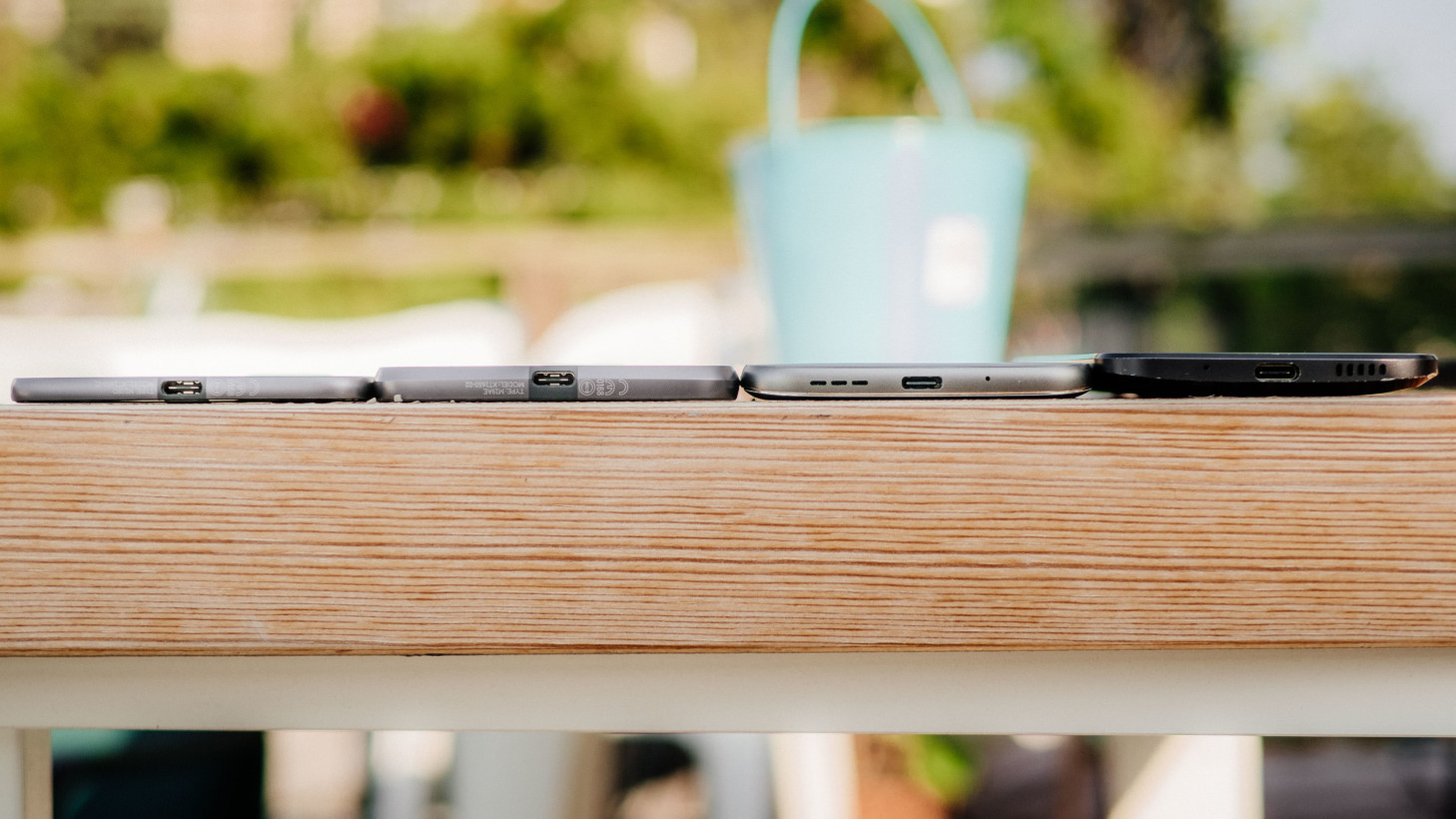
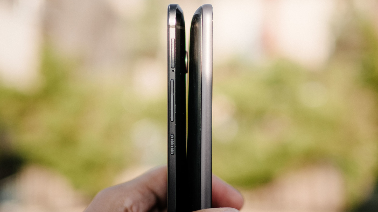
- 5.2mm thick
- Water-repellent coating
- Fingeprint reader
- NFC
- USB-C
- Always-on voice-control
The Z Force offers a few practical advantages at its higher price point ($720). Your extra 96 bucks (and a few millimeters around the waist) net you a much larger 3,500 mAh battery and Motorola’s incredible ShatterShield screen (it scratches but really is unbreakable – trust me, we tried). You also get 21 MP rear camera with deep-trench isolation for improved low light capture and all da pixels.
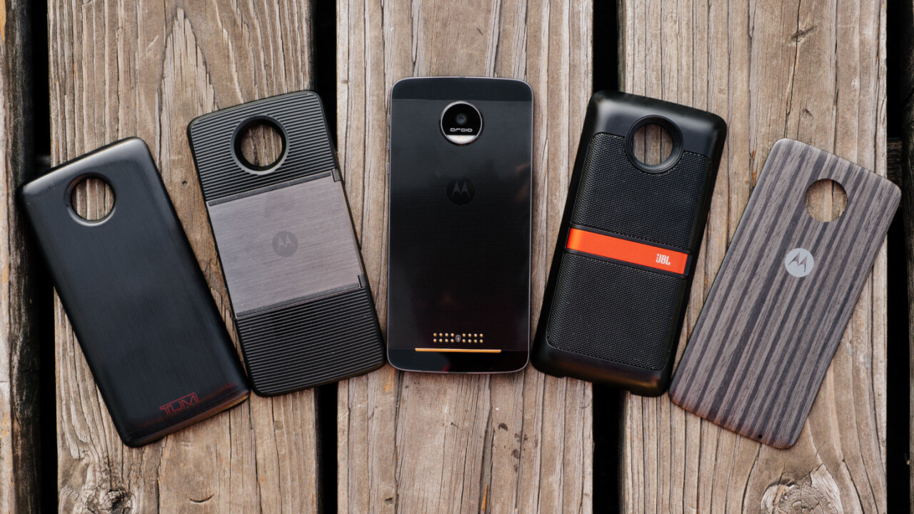
Of course, the main selling point of both devices are the expansion modules that snap on magnetically to the back of the device. These currently include non functional Style Mods, battery packs, a speaker, and a projector.
Business in the front, part in the back
The phone’s basic design is divisive, but I personally love (most) of the Moto Z’s business in the front, party in the back design. I also think it looks better in person than press renders make it out to be.
Business first: the Moto Z has way too large of a bottom bezel, which is a shame given Motorola has traditionally been one of the best about reducing its phones’ chins. The use of on-screen navigation is a bit of salt in the wound.
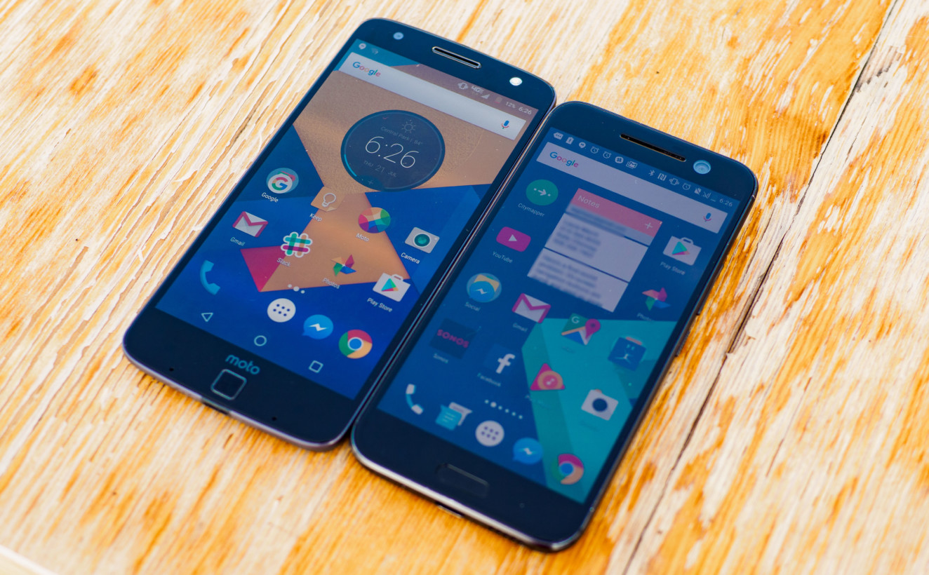
Up front you also have a very effective fingerprint sensor (which you will confuse for a home button even though it’s not), the front-facing camera (with flash!), and various sensors for Motorola’s gestures. I prefer the black model over the white, as it hides most of this clutter. The dual front-facing speakers are unfortunately gone from the Moto X though.
On a side note, while that ShatterShield screen is great for peace of mind, it does scratch more easily than the Gorilla Glass on the Z. Thankfully, the top layer is basically a fancy invisible screen protector, and is completely user-replaceable.
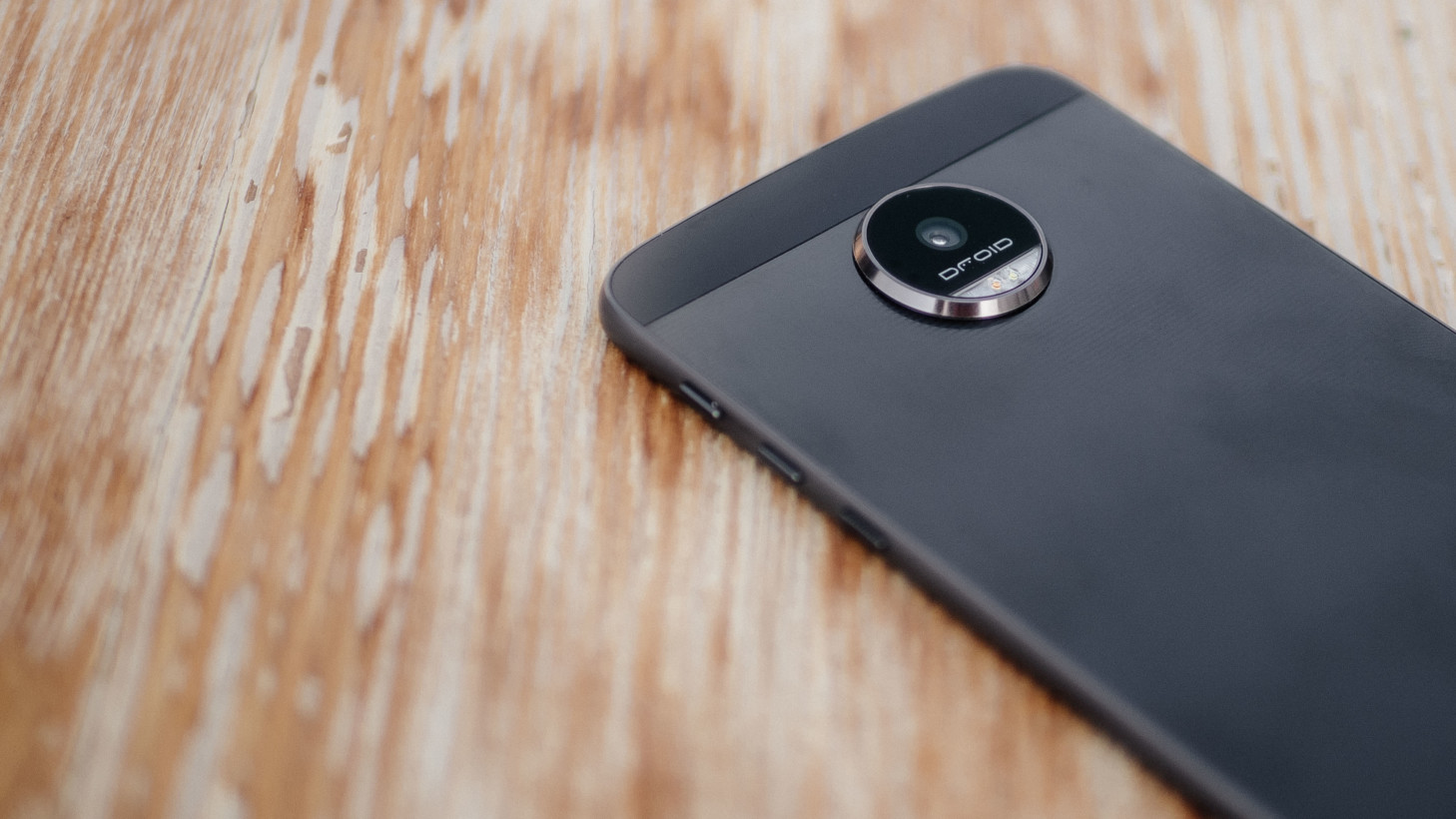
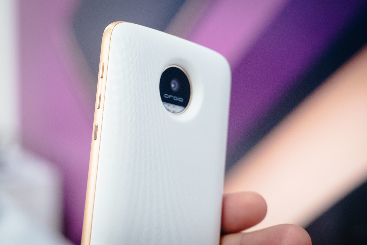
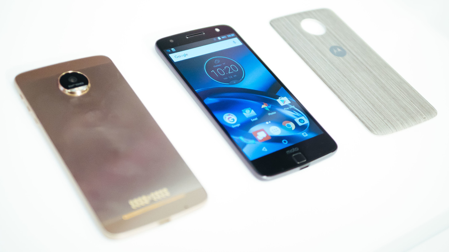
As for the posterior festivities, it’s a conspicuous mish-mash of patterns, with a huge camera hump and gold pins for interfacing with modules, a glossy top and bottom where the magnets are, and a subtle striped pattern on the rest of it. It’s also a fingerprint magnet.
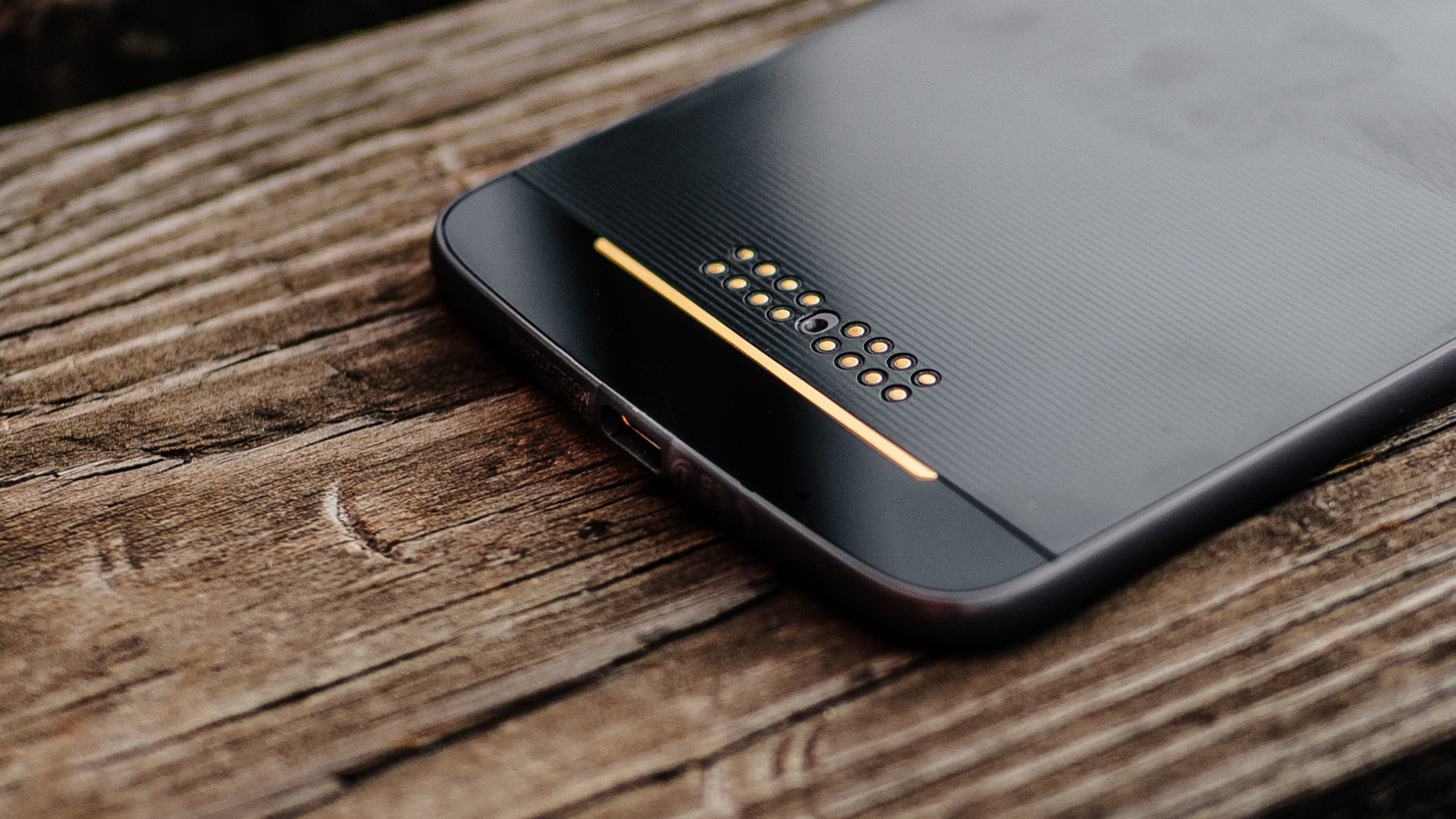
Some people will hate the busyness of it all, but there’s something old-school nerdy about it that I appreciate.
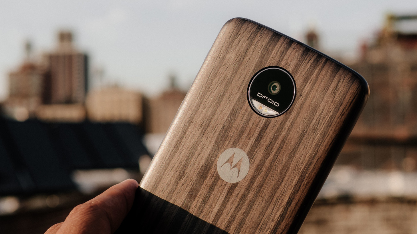
Truth be told though, the above (and some of Motorola’s marketing) are somewhat misleading representations, given the phones come packed with a Style Mod (at least on Verizon in the uS). These mods only thicken the phones by two or three millimeters, add grip, and basically eliminate the camera bump. I expect most people will apply them immediately, as there’s little reason not to.
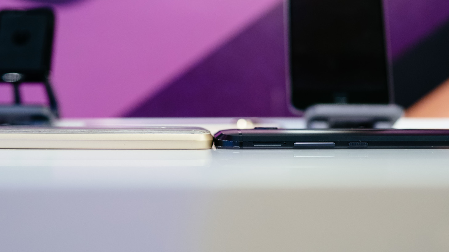
The “real wood” Style Mod my review units were packed with gained repeated compliments from friends and strangers. It’s also worth noting that even with the Style Mod, the Z Force only feels thick relative to its smaller sibling; it’s still about as thin as my HTC 10.
Oh, and this phone doesn’t have a headphone jack, so you’ll either need to use the included adapter, Bluetooth headphones, or one of those fancy new USB-C headphones. That compromise is somewhat reasonable on the smaller Moto Z, which is literally just too thin, but it’s a forced omission on the larger Z Force. You’ll just have to begrudgingly accept it and move on.
Finally, there’s no Verizon logo whatsoever – thank goodness. There’s just a bit of inconspicuous ‘Droid’ branding on the camera lens, which I can live with.
Modularity low on the compromise
Of course, the phones themselves are only half of the story.
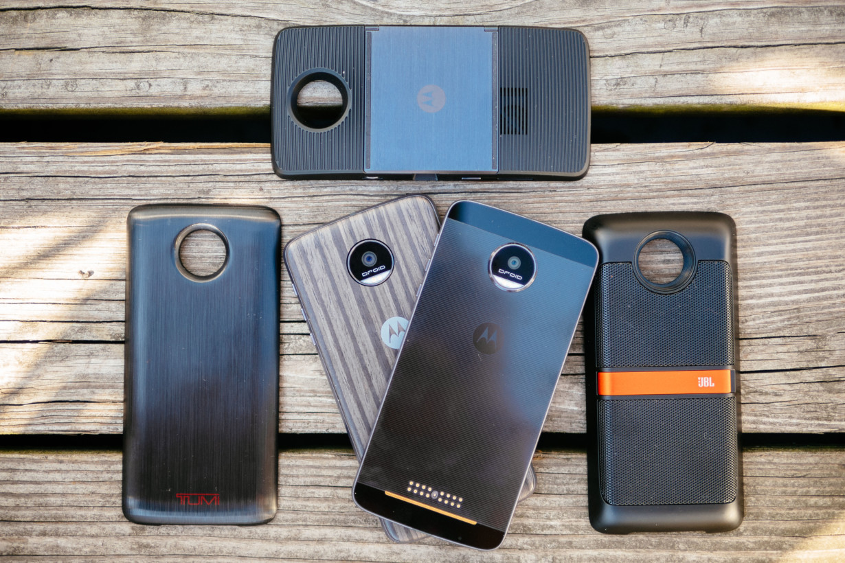
There are only four types of Mods so far, with more coming thanks to Motorola’s Mod developer program. Here’s to hoping developers jump on the opportunity, because this is the best implementation of modular design we’ve seen yet.
Style Mods
Adding Mods is as easy as placing them on the back and letting the magnets do the work, and they will not move or come off unless you make them. One of the Style Mods I tried had a tiny bit of give if I pressed hard enough against it, but I never noticed in everyday usage.
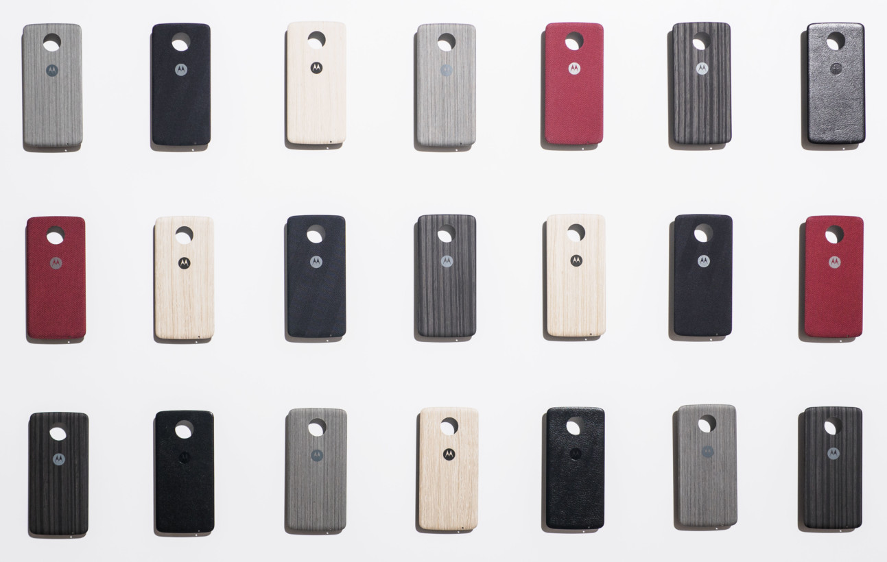
For all intents and purposes, the phones feel like one solid slab once a module is attached. The Mods integrate seamlessly, unlike the eyesore gap at the bottom of the G5’s housing.
The aforementioned Style Mods will come in 6 designs at launch, including wood, leather, kevlar, and some solid colors. Partners like Incipio are also already working on some alternate back plates (I need something in blue, please), which will cost $15.
Power Packs
The initial set of Power Packs add 2,200 mAh to your device. That makes for a rather crazy 4,800 mAh on the regular Z or 5,700 mAh on the Z Force.
The beauty of them is once again their seamlessness; they add much less thickness than comparable battery cases for other devices. On the already-thin standard Z, adding a battery pack just makes it feel like a bit of a thick phone, rather than a phone-with-a-battery-pack. You could very well just leave the pack on your phone all the time and forget about it.
The other nice part is that you don’t have to put it on your phone all the time. The battery packs are thin enough to easily carry in a pocket or stick into a bag, and take literally one or two seconds flat to add or remove from your phone.
It’s a much more elegant solution than traditional battery cases or carrying around an external battery pack. I just which there were a way to charge the battery when it’s not attached to the phone.
These range in price from $60 to $90, as they’re currently branded designs from TUMI and Kate Spade New York. That’s definitely too expensive for a battery pack, but hopefully third parties will release cheaper designs soon. Motorola says some future Power Packs will support wireless charging as well.
JBL SoundBoost Speaker
The $80 JBL SoundBoost Speaker is where things start to get a bit more experimental. It adds a set of speakers with much improved sound quality and volume over the default setup (which is just decent), as well as a kickstand.
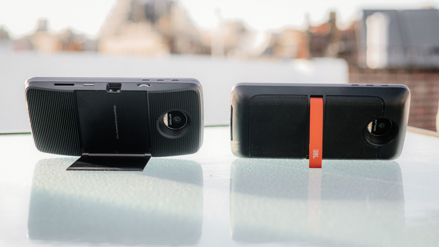
More specifically, it adds a lot of bass presence smartphones can’t achieve on their own, which enough volume to fill a large room. It’s a bit muddier sounding than I’d like, but certainly better than anything you’ll get out of a smartphone alone, in a smaller package than a Bluetooth speaker.
Again, it makes the phone a lot thicker, but it remains pocketable. You can also just use it as an extra 1,000 mAh battery when you don’t need the sound. Another b
Insta-Share Projector
This one is definitely my favorite Mod, though it’ll cost you $300. You can basically have an 70″ 480p projector screen anywhere as long as it’s dark enough. At 50 lumens, it’s not exactly the brightest projector our there, but it’s serviceable indoors at close distances, and is easily visible at night.
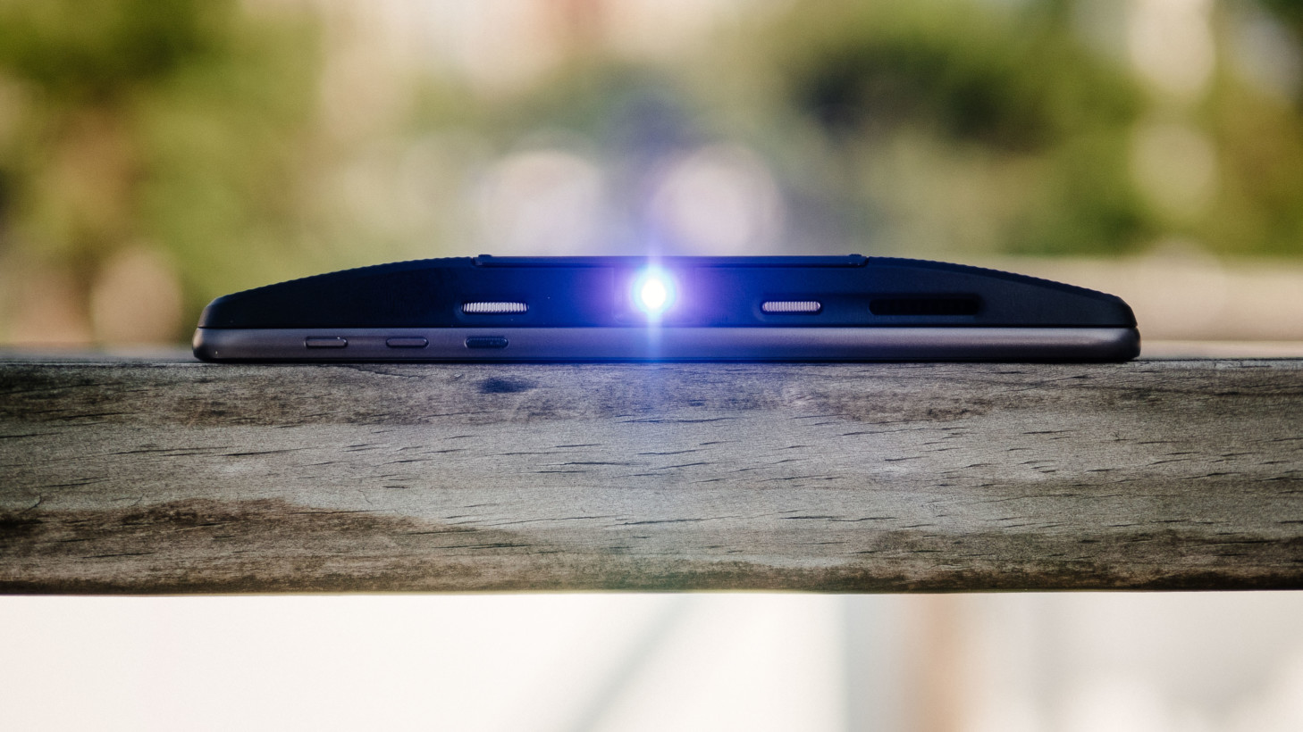
The included kickstand is a nice touch, and though you’ll have to set the focus manually, the automatic keystone correction works pretty much perfectly to adjust the screen to whatever angle you’re projecting from. I generally used the kickstand to project Netflix onto my bedroom ceiling.
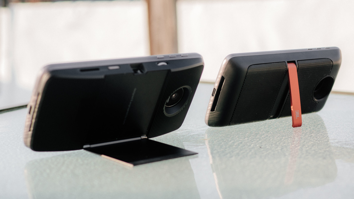
Again, it’s small enough to keep the phone quite pocketable, and includes its own 1,200 mAh battery.
Using it
I popped my own SIM card into each Moto Z for a few days throughout my testing period, and had great time using them as my daily drivers (Verizon phones are thankfully unlocked out of the box).
Forgetting about the mods for a bit, the Moto Z and Z Force are also just really good phones. Unlike LG, Motorola didn’t forgetting about getting the basics right (well, aside from the headphone jack, *sighs*).
Firstly, the AMOLED displays are excellent. Easily the best I’ve seen from Motorola, and about as good as anything we’ve seen from Samsung yet this year. White balance is natural, colors are saturated but accurate, and visibility in direct sunlight is some of the best I’ve seen.
It’s also worth noting than unlike on the Turbo 2, the Z Force’s ShatterShield screen doesn’t seem to affect its quality. The colors are a teensy bit less saturated, and you would never notice unless you were comparing side to side.
Qualcomm’s Snapdragon 820 has proven itself on every device I’ve tried this year, and the Moto Z is no different. It flies through apps, and I never felt any slowdown throughout my testing period, despite installing all my regular suite of apps almost immediately, and despite Verizon including almost twenty bloatware apps.
That performance is surely aided by Motorola’s use of near-stock Android, which also bodes well for the phone in the future. The things that aren’t stock are mainly useful additions too; I’m particularly fond of Motorola’s gestures: a double twist to launch the camera is probably the most convenient camera shortcut I know, and a double chop for the flashlight came in handy after my room’s lightbulb burnt out.
Also worth noting, Motorola has the simplest one-handed mode gesture, although you have to activate the feature from the ‘Moto’ app. You just swipe up from the navigation bar at the bottom, and the screen shrinks to a manageable size. It’s excellent and I used it all the time.
Battery life black magic
I don’t know what kind of black magic Motorola worked for the Moto Z’s battery. The Moto Z has a tiny 2,600 mAh battery, so I fully expected it to be a repeat of the drama after the Galaxy S6’s mediocre longevity.
But it’s not. On my first day of using the phone all day after installing all my apps, I got five hours of screen-on time. That wasn’t streaming video all day – which phones do very efficiently nowadays – but actually browsing the Web, messaging, writing emails, taking photos outdoors, etc. With more intermittent use, I still averaged over four hours of screen on time.
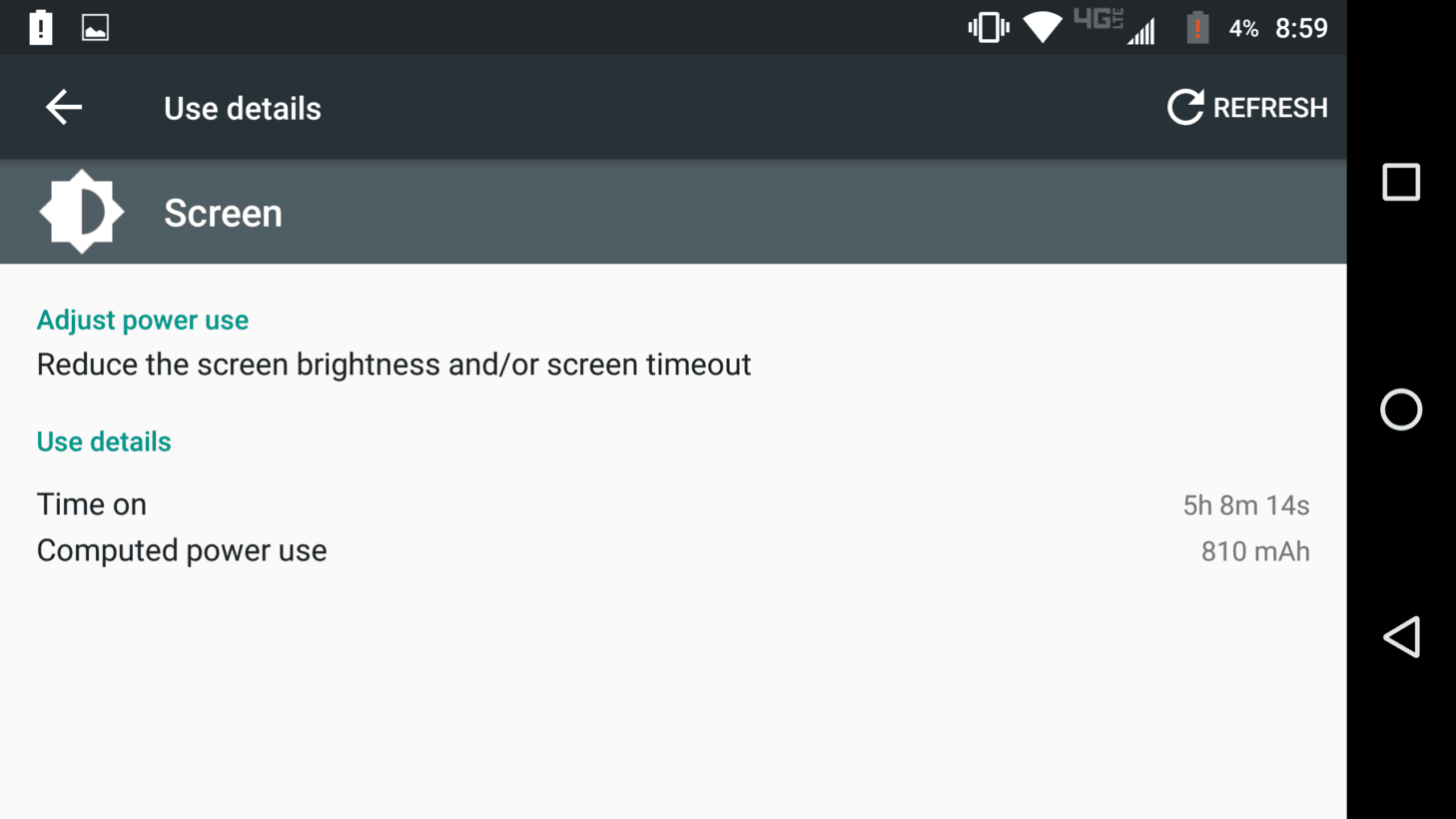
That’s about an hour more than I generally get with the Galaxy S7 and HTC 10, both of which have smaller screens and larger batteries. That could be blamed on additional apps I’ve installed overtime, but this is still better performance than I got from either of those phones on a fresh install.
Needless to say, the Z Force lasts a good deal longer, anywhere from six to eight hours screen on time in my testing, which translates into a solid day and a half of normal usage.
It’s worth noting that using Motorola’s always-listening voice features and motion gestures do seem to drain the battery a bit during idle time (especially if the phone is jostling around in your pocket instead of laying on a table) but never enough to be a worry.
You should rarely much never have trouble getting to the end of the day, and the fact that you can just pop in a battery pack in seconds makes these the best phones of 2016 for longevity.
Oh, and there’s quick charging too. Unfortunately, the Z’s can be a bit finicky about third-party chargers. Some Quickcharge 3.0 chargers I have lying around showed the buzzwordy ‘TurboPower’ notification, other times they didn’t. Basically, you’ll want to use the one in the box when possible.
Camera
You can get some really good photos out of both Moto Z’s. The problem is it’s inconsistent in difficult lighting situations.

Overall, both of the Z phones capture saturated, realistic images. Colors are particularly great with the right amount of punchiness. If it’s not a very high-contrast scene, you should have no issues getting some best-in-class photos. It’s the auto-HDR feature that can be a bit wonky on both cameras.
While Samsung and Apple have pretty much mastered HDR, Motorola has more issues with situations that call for it. Generally, the phone tries to preserve the highlights, which is a good thing, except when it leads to shadows being crushed.

Naturally, I would then try to adjust my exposure point to save the shadows, but then highlights would be blown out. E.g this situation, where details in the clouds are all but gone:

Compare this to my HTC 10, which hit a much better balance of of highlights and shadows without any input from me (although it’s a less punchy photo overall):

Other times, HDR worked like a charm, so hopefully Motorola does some tuning to work out the kinks. It could easily add a couple of extra exposures when the contrast gets too high for the sensor to handle.

As for the Z Force’s 21 MP camera, it does capture more detail, particularly towards the edges of a frame (it seems to have a larger, better lens than the smaller Z). It also offers slightly better low-light performance, but you probably won’t notice a difference unless you’re very picky or making large prints.
Ultimately, the image quality here comes down to the process, which is pretty much the same, although I found the cheaper one to be a bit more consistent in difficult lighting. In standard daylight conditions, which one takes better pictures is basically a toss-up, assuming you aren’t pixel-peeping.
Final thoughts
The Moto Z series and Mods offer customization potential no phone can match up to, at least until Project Ara gets here. That’s a title LG briefly held with the G5, but the crucial difference is that Motorola isn’t sacrificing the core smartphone experience.
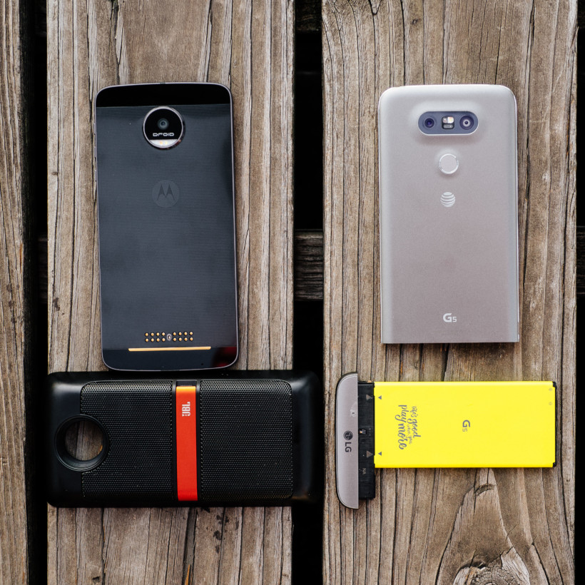
I realize I’ve been a bit harsh on LG this review, but that’s because it’s the only other real reference point out there – no other flagship phones offer modular features at all. And the Moto Z succeeds precisely where the G5 failed.
Basically, if you were to never use a Mod on the Moto Z, it would still be one of the best smartphones of 2016. The mods are just very sweet icing on the cake.
More importantly, Motorola is making modularity simple; there’s none of this turn off your device, slide out a battery, slip in something else business. Whereas it takes a full minute or two to add functionality to the LG G5 if you factor having to restart the phone, on the Moto Z it’s usually a couple of seconds.
That kind of ease of use may not sound like such a big deal, but it’s what could actively capture the attention of the mainstream, and lead to better development of modules and modular devices in the future. It’s a shame the phone and mods will both be on the expensive side when they go on sale on July 28, though not unreasonable given the competition (or lack thereof).
Here’s to hoping the mainstream does catch on, because modularity might just be what makes smartphones interesting again.
The Moto Z and Z Force Droid editions are available from Verizon now. No word yet on when unlocked versions will arrive. The Z will cost you $624 (or$ 29 a month) while the Z force will set you back $720 (or $33 a month).
Get the TNW newsletter
Get the most important tech news in your inbox each week.

