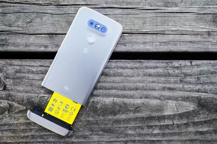
The LG G5 is the most exciting smartphone in a long time. Instead of just the expected metal redesign and bumped up specs, LG chose to actually do something daring: try to reinvent the smartphone.
It was the first phone from a major manufacturer to feature two different rear facing cameras, the first mostly-metal phone to allow users to replace their batteries, and the first smartphone with the potential for multiple extension modules.
But potential and execution are two different things. While the G5 remains the most inventive smartphone of the last few years, spending more time with the device has, in part, been a sobering reminder that innovation doesn’t always mean better.
And so LG has built the most divisive phone of the year so far.
Design
LG has made a metal phone, just like everyone else. Yay! Too bad it’s so boring.
It’s a metal rounded rectangle. Its most identifiable physical features are the dual camera hump and the clickable fingerprint sensor. Both of them protrude in an oddly wart-like manner.
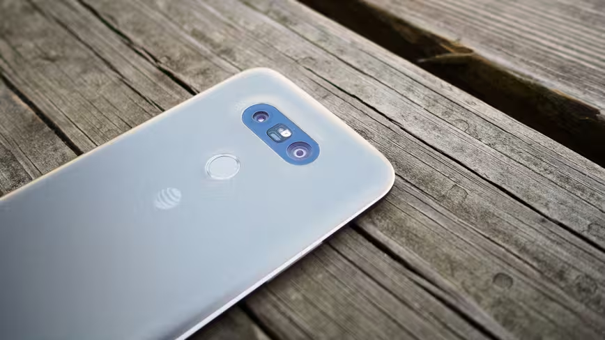
Meanwhile, the detachable bottom leaves a tiny gap in the casing that looks like someone took a machete to the phone’s chin and then tried to put it back together. There must’ve been a better way to cover that seam.
The front end fares better. The way the top of the device slopes slightly away from you is a neat touch. I preferred the concave curvature of the G4, because it made the top of the screen a little easier to tap, but hey who needs practicality right?
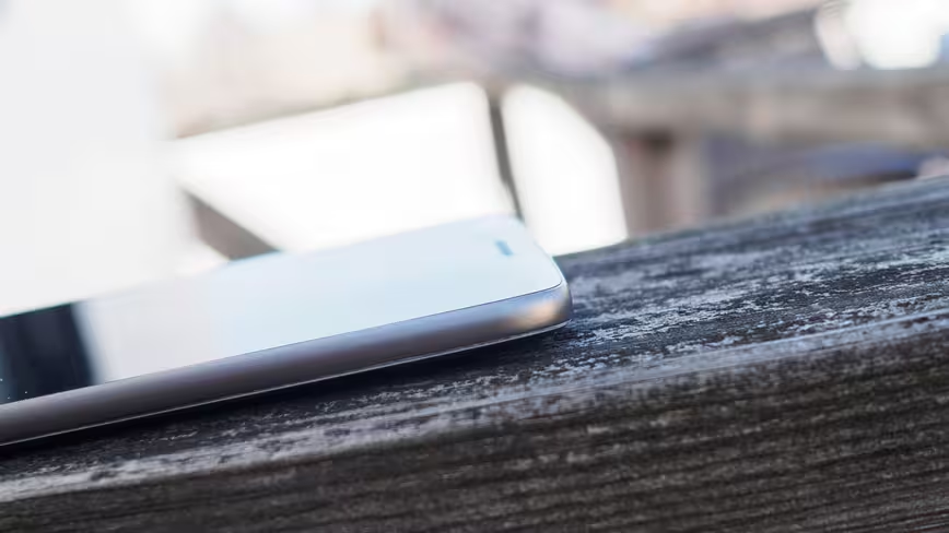
The detachable portion looks better from the front too – there’s a little lip that makes the transition from glass to metal seem the same as any other smartphone, and you wouldn’t notice unless you were looking for it.
The in-hand feel is okay – the G4’s curvature and grippy pleather made it more comfortable to hold. But the worse part is that the G5 doesn’t really feel like it’s fully metal.
Though it’s not because the phone is actually mostly plastic, like some have suggested, it feels slightly hollow in a way an iPhone 6s or HTC 10 never does.
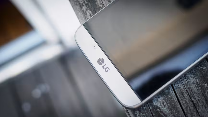
Of course, LG hasn’t always been known for building the most beautiful devices, or even for having a consistent design ethos. But at least they felt like they were trying to be unique.
The G5’s lack of polish betrays the fact that this is the company’s first metal phone; I actually would’ve preferred something more in line with the eccentric design of the V10 or the G Flex 2’s extreme-but-useful curvature. I’d even argue that the G5 looks and feels less premium than the plastic-and-pleather G4.
But those modules!
Now of course some of those design choices are because of the detachable modules, or ‘Friends’ as LG calls them (*sighs*).
The most notable of these is the replaceable battery, which for the first time solves the problem of irreplaceable batteries on all-metal phones.
That’s why it’s unfortunate that LG doesn’t include a replaceable battery with the G5 by default; it’s a stand out feature that average consumers won’t be bothered to use because they won’t buy an extra battery. At least some carriers have had the initiative to include one, along with a dedicated charging cradle.
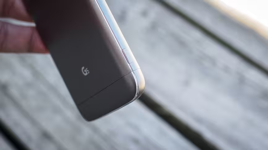
Aside from the standard battery module, there are two other Friends currently available: a Hi-Fi Bang & Olufsen audio module complete with its own DAC, and a camera grip with extra buttons an additional 1,200 mAh battery. LG didn’t make either available for this review.
LG says it’s working with third party manufacturers to create more modules, but who knows whether any of those will actually come to fruition. I hope LG at least makes the Friends compatible with future G-series phones, but given the company’s track record, that seems unlikely.
Still, at least having the option for customizability is pretty awesome, not to mention replacing your battery after its capacity drops in a year or two. That’s something no other metal smartphone can claim.
Display woes
First, the good stuff. At 5.3 inches and QHD resolution, the display has a 577 ppi pixel density, and viewing angles are great, with no rainbowing from the IPS LCD panel.
It gets really bright too, which makes it fairly easy to read in sunlight – noticeably more than its predecessor. Contrast is also good for an LCD panel, though it’s obviously nowhere as good as an OLED screen.
Unfortunately LG – a company that specializes in making displays – managed to make the worst display on a flagship phone this generation for a single reason: the color temperature is way too cold, with a distractingly blue-green hue.
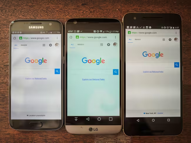
LG has tended towards cooler displays than other manufacturers in the past, but I can’t remember the last time I saw a panel so blatantly bluish compared to everything else out there. And unlike the HTC 10, which has a better panel to start,there’s no tool to adjust the color saturation or color temperature.
It fares decently when your ambient color temperature is already fairly cool – the noon day sun, fluorescent lighting, or cloudy mornings – but even then is still noticeably bluer than most displays.
Basically, it feels like the G5 is never capable of making a true white color, even after a couple of weeks of using the phone. Maybe LG was just trying to be different, but it’s just jarring. The display alone is enough for me to question recommending the phone.
Using it
Like Samsung, LG has redesigned its UI for its latest generation of devices. Unlike Samsung, I’m not sure it’s for the better.
While I actually quite like Samsung’s new light blue color scheme, LG is using this wireframe black-on-white look that kind of reminds me of a Mac from the 90s.
That wouldn’t be so bad if it weren’t for the aforementioned cool display. It makes the entire UI look worse. For example, the entire settings menu and notifications sheet take on this pale blue-gray look in use that just looks very meh.
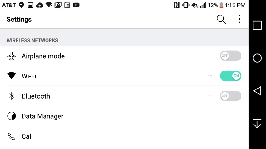
The customizations are also all around less useful than Samsung’s. There’s no one-handed mode to be found, and LG has removed the ability to use apps in split screen or windows mode.
That might be because Google is baking those features into Android N, but I missed them during my review period, and LG isn’t the fastest at issueing OS updates.
But – and this is an important ‘but’ – the software doesn’t seem to slow down the phone at all. While my Samsung S7 feels no faster than my Nexus 6P, the G5 is slightly faster than either in side-by-side comparisons.
Whether switching apps, playing games, navigating maps, or scrolling through the Web, there seemed to be no way of significantly slowing the device down. And this is despite the fact that the G5 and S7 have identical processors, and that both of my review models came pre-loaded with AT&T software.
Also, one software tweak I do like: LG lets you pull down the notification sheet from the navigation bar, which makes the phone infinitely more useful on the go. Other manufacturers, take note.
Two cameras really are better than one
Here’s one thing LG did really well: the G5 has the best camera setup of any smartphone, and it all comes down to that second camera. We’ve gotten used to the typical wide-angle lenses of our smartphones; the ultra wide-angle lens on the G5’s second shooter allows you to capture much more of a scene.


That means no wasting time with a panorama and bad stitching, no stepping back to fit the entirety of that building in your photo, no hurting your friend’s feelings because you couldn’t fit them in the group photo. Just toggle the wide-angle camera from the main shooting UI, and you’re good to go.
It makes shooting with the G5 the most fun I’ve had using a smartphone camera in years. There’s a reason professional photographers tend to carry multiple lenses around: they provide different perspective and can completely change the nature of a scene.

Sure, the second shooter is ‘only’ 8 megapixels, there’s a fair bit of fish-eye distortion, and the main camera is slightly worse than Samsung’s new sensor and lens combo, but none of that really matters. The G5 is more versatile and the quality is more than good enough with either camera.
The rest of it is typical Android smartphone fare: RAW photos, manual controls, laser autofocus and 4K video. The UI is largely unchanged from the G4 and V10, but it didn’t need much changing.

Ultimately, it comes down to this: pick up a G5, and you can take wide-angle photos that simply aren’t possible on any other smartphone out there, at least not without inconvenient panorama stitching.
That alone makes the G5 a more versatile photography tool than anything else on the market. You can be assured other manufacturers will follow suit (looking at you, Apple).
Battery
Battery life was a resounding ‘pretty decent’. I get a bit over 3 hours screen-on time in my typical heavy usage, and could mostly last until the night without an issue. Quick Charge 3.0 also means the battery can recharge very quickly, although it’s worth noting for some reason LG only includes a Quick Charge 2.0 adapter in the box.
I don’t think anyone will be complaining much about battery life overall, and it seems better than what I got from my G4 anyway.
But on the other hand, you’re still settling for less: the S7 and HTC 10 offer bigger batteries with smaller screens, and that’s been reflected in their excellent longevity so far, which are able to get in the 4+ hours of screen-on time range.
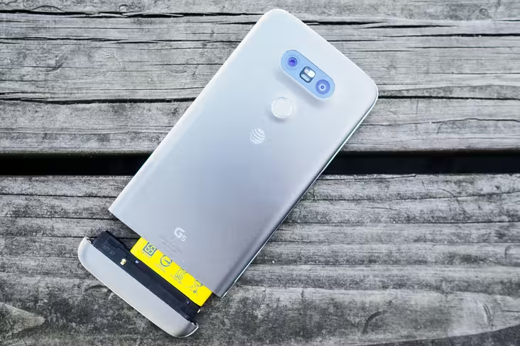 The replaceable battery is a compromise in quantity over flexibility.
And yet neither of those phones will let me pop in a second, fully charged battery within 30 seconds of the prior one dying. I thought it was one of those nice-to-have features I’d never actually use, it turns out I’ve used it every single time my G5 has run out of charge, and it’s quickly become my second favorite thing about it, behind the camera.
Too bad the extra battery and charger isn’t included by default, even if it would’ve brought up the price point a bit.
Potential, disappointment, and resignation
I’ve never had more trouble reviewing a device than with the G5.
It was supposed to be the holy grail for Android power users: all-metal design, expandable storage, top-notch specs and a removable battery. It even kept the IR blaster (which I still use, thank you very much).
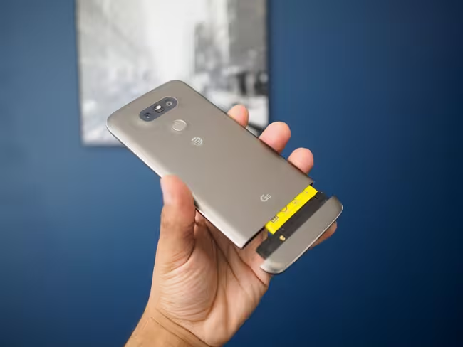
I admire LG for being pretty much the only flagship manufacturer still delivering all the traditional power-user features. If you need all of those things, then the G5 is the phone for you.
Unfortunately for everyone else, the execution is so disappointing. While Samsung, HTC, Apple and and others seem to have refined their smartphone designs to something nearing perfection, the G5 feels distinctly like a work in progress. It’s like LG was trying so hard to get ahead of the game that it forgot to get some of the basics right.
But lest this review end on too negative a note, let me clarify that I think the G5 is a good device that had the potential to be great somewhere in its design process. It just happens to have come out in a year with the toughest smartphone competition ever, and good isn’t good enough.
Here’s to hoping LG keeps all of the G5’s best ideas and gets the rest right with the G6.
Get the TNW newsletter
Get the most important tech news in your inbox each week.


