Richard Ziade, founding partner of Readability, is forthright with me about the wait for an official iOS app. “It did take a really long time.”
In fact, the official app of the reading platform took over three months from its initial announcement back in November to make it to market. “I think there were a couple of reasons,” says Ziade, “first, we were still evolving as a service and as we tweaked and pivoted the app needed to catch up. On top of that, we weren’t…conventional so we didn’t fit neatly into a particular type of app that could just breeze through.”
If you’re unfamiliar with the service, Readability [App Store, free] is similar to other apps like Instapaper and Read It Later in that it allows you to save articles you see on the web, or come across in various apps with integrated support, for later reading in a pleasantly reformatted manner. Services like these are the primary way that I consume any long form content from the web these days, as my daily schedule is hectic. This allows me to go back to them at my leisure and read on through without the distraction of a bunch of ads and formatting clutter.
http://www.youtube.com/watch?feature=player_embedded&v=hjWf1D7uCeA
Readability also has a subsctiption program in place that allows it to commit 70% of your monthly contribution to being distributed to the sites from which you harvested the articles. It’s a novel commission system that allows you to kick back to the sites you enjoy while enjoying their content on your terms.

It is worth noting that the Readability service was a $5/month affair up until late last year, this ensured contributions to almost any site you grabbed an article from. Now the service is free, so contributions are not guaranteed when you’re saving articles from a default account. If you’re serious about giving back to the blogs you frequent, be sure to hit the subscription page up here.
“Ubiquity and simplicity,” Ziade says, when I ask him about what else separates it from other services in its arena. “Readability is a platform first and foremost. A wide array of apps deeply integrate the service and practically stand as clients on their own.”
Readability does integrate with a ton of apps — David Chartier also has a good list over at Wind on a Leaf — there’s a good chance that you use one or more of them, like Tweetbot or Early Edition, already. The extensive support means that you have easy access to the Readability share option as well as the bookmarklet in pretty much every popular web browser.
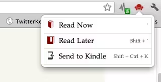
The bookmarklet is how most people will use the app. In Chrome, my browser of choice at the moment, it takes the form of the signature Readability easy chair that sits next to your settings tool. When you click on it, you’re offered ‘Read Now’, ‘Read Later’ or ‘Read on Kindle’ options. Each of these comes equipped with a hotkey. One glaring omission is the fact that you can’t install the bookmarklet directly in Mobile Safari on an iOS device, you have to create it on the desktop and sync it over. That’s something that should be fixed as soon as possible.
Once you’re logged in to the service and you have the bookmarklet installed, you should be good to start saving items. I honestly had some difficulty with getting it done right in Chrome. After being redirected to a page that required additional confirmation a bunch of times I got a bit frustrated and uninstalled, reset my account password and reinstalled it. Everything was fine after that, with nothing but a brief overlay notice letting me know that the page had been tucked away for later browsing.
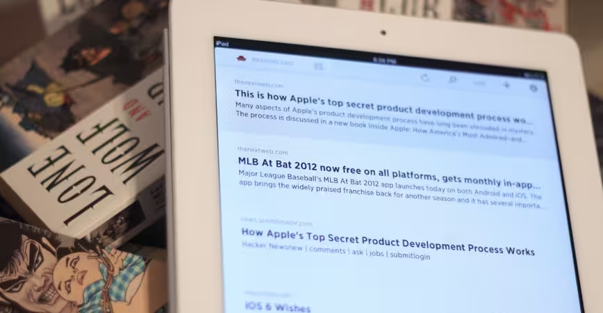
This is where the app for iPhone and iPad comes in. Crafted by the guys at Teehan+Lax, the app is tightly focused, with a lot of crisp clean lines and carefully chosen typography, as befits any reading-focused app. “In terms of simplicity,” Ziade says, “we wanted to build something that got out o the reader’s way and served a great reading experience. ”
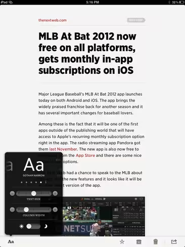
For the most part, the app succeeds well in this area, putting the titles and text of the articles front and center and offering a nice, if not expansive, selection of text display options. The app features Hoefler & Frere-Jones typography, including their Sentinel, Vitesse, Mercury and Gotham Narrow typefaces.
The controls of the app are nicely hidden until you bring up the lone menu bar with a single tap. On that bar are the typeface panel, with dark mode, type sizing and, mercifully, column width settings. I’m always frustrated by how many reading applications, like the Kindle app, overlook giving you control over your margins. I prefer my text wall-to-wall.
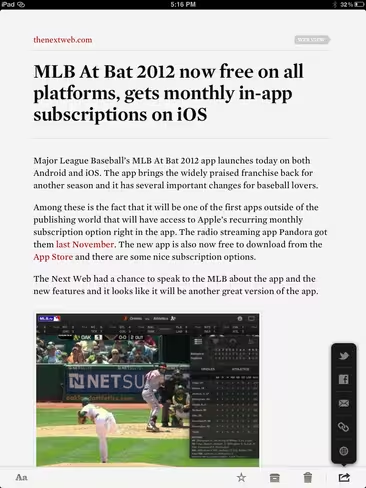
There are also favorite, archive and delete buttons, as well as a share button which brings up your ‘view on the web’, ‘copy a link’, ’email’ and social sharing buttons featuring Twitter and Facebook. Just enough for your normal reading session, no more, no less.
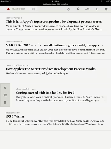
The main menu is accessed by swiping right on the article in a pleasantly sticky sliding motion that responds to inertia and will fall back if you let it go before the halfway point. A nice touch, with very smooth animation, that gives the app a very tactile feel. This is reinforced by a ‘swipe right’ action that reveals the favorite, trash and archive buttons hidden underneath individual stories. A few simple buttons at the top that give you your article count, a search and refresh button and settings access round out the main view.
Tapping on the reading list button gives you access to your archive and favorites categories. This action could be clearer, as it seems as if it would be a bit hard to find for the casual user looking for access to their archive or favorite items.
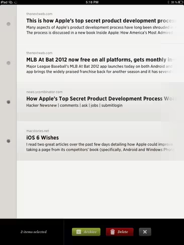
Tapping the edit button brings you into a ‘quick editing’ mode that allows you to delete or archive multiple articles at a time, useful for clearing out your reading list quickly.
I do wish that the sharing options were a bit deeper. While Readability offers Twitter, Facebook, email and links, Instapaper, by comparison, gives you email link, email full text, copy link, copy full text, print and twitter directly via iOS options. It also uses URL scheming to allow you to share to a ton of different apps like Twitter.app, Twitterrific, Tweetbot, Birdhouse, GoodReader, Atomic Web and many others. It’s not a huge deal as I do a lot of sharing to Twitter directly, but it would be nice to have some expanded options.
Is the app worth the wait? For those who already use Readability’s service, don’t use a ‘read it later’ service at all, or enjoy the idea that by simply saving and reading articles, they can contribute back to the publications they love, absolutely.
For those who already use an app like Instapaper or Read it Later? I’m not so sure to be honest. I really love the latest version of Instapaper, which puts a larger number of articles at your fingertips on the main page. My entire archive is there and I like the one-click simplicity of its Read Later bookmarklet. I also enjoy the curated reading list that contains content picked by Instapaper ‘editors’ and my friends with the ‘Liked’ feature. Read it Later provides a superior experience to both Instapaper and Readability when it comes to video and photo content, if those are the primary things you normally grab.
Nevertheless, Readability for iOS is a really well designed package and feels like a great amount of care went into it. There are some little niggling issues here and there, but nothing that is a dealbreaker, especially once you have it really rolling. And, at this point I’d have to agree with Ziade, who told me “we’re just really happy to finally be here!”
Get the TNW newsletter
Get the most important tech news in your inbox each week.

