The first page. Any iPhone or iPad user knows that the first page is hallowed ground. An app doesn’t make its way there and stay there unless you use it a lot, as in daily or more.
Everything else can go in folders on the second page or further on down. This is why the first page of any iOS device is always a good barometer of how important an app is to users. It’s also the place that you will find Instapaper on my devices, along with those of a lot of other people.
Instapaper, an app that allows you to grab the contents of a page to read them later in a pleasantly reformatted manner, has just been updated to version 4.0 and has made what is one of my most-loved apps even better.
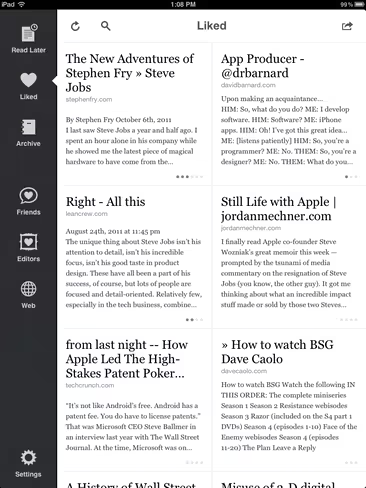
The biggest change is the overall look and feel which has gotten a touchup on the iPhone but a complete revamp on the iPad. There is a new grid layout that is reminiscent of Flipboard and that gives you more of the article text at a glance. The left side features a nice toolbar that keeps navigation available in all of the browsing views and provides context for where you are in the app.
The grid layout does mean that you will see fewer articles on a single page but I think that the tradeoff in context is worth it.
There are a few additions to the little non-modal popups used throughout the app. When you tap on a trash can now, it displays both Delete and Archive as options, giving you the ability to save it in your collection or ditch it.
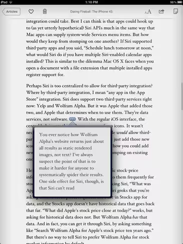
This modal popup is also used to great effect on footnotes, which are presented with a small symbol right inline with the text. This allows you to read a footnote reference without having to break the flow of your reading. Definitions are also handled this way and include the built-in iOS dictionary as well as Wikipedia support.
The other two big additions to Instapaper 4 is that you can now search the full text of any article if you’re an Instapaper subscriber. The addition of the ‘whole article’ search means that you can now purchase a subscription in-app, something that wasn’t allowed under Apple’s rules that a subscription had to add something to the app. So now you can subscribe on the Instapaper site or in the app itself and get the full article search.
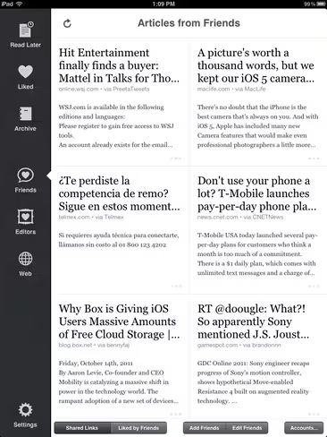
Another cool feature is the fact that the Friends section now not only features articles that have been ‘Liked’ by the people that you follow, but you can also view an aggregated collection of links from everyone that you follow on Twitter, Facebook or Tumblr.
This creates an automatic feed of Tweets (or other shares) with links, letting you scoot through a steady stream of just stuff people found interesting enough to share on social networks. A pretty neat and seamless way to handle this kind of importing and a way to quickly browse the stuff you’ve seen go by in your feeds to see if any of it is important enough for you to save and read.
Instapaper 4.0 also finally has a hardware brightness control, rather than the faux-dimming of the older version. This means that you don’t have to bounce out to settings when reading in bed as I often do after the wife has gone to sleep.
There are a bunch of other tweaks to the app that you can read about in the release notes or at creator Marco Arment’s site here.
It’s honestly safe to say that the most amount of time I spend in any one app outside of Kindle or a game is in Instapaper. It allows me to catch up on the news I see throughout the day but don’t have time to read right away and, with its archive of all of the articles I found interesting, becomes a repository for a lot of really great stuff over time.
The ability to tap the ‘Read later’ button in an app or the browser shortcut in Safari and know that I will be able to find it later when I want to read it has led to a couple of practical benefits for me. First of all, it brings a real sense of relief that I won’t lose it in the shuffle of hundreds of tabs that I open a day, any of which could be wiped out by a browser crash or simply by me forgetting. Now, I click the shortcut and close the tab, knowing I can get to it later.
The other thing it does is that it allows me to open the Instapaper app and know, absolutely, that everything in there will most likely be of some value to me. If I’ve clicked the read later link then something about the article has caught my eye or interested me, it has already passed one layer of editing in that I felt that I would be interested in reading something like this.
This makes Instapaper a customized repository of data that is all interesting to me. A feat that is unmatched by any algorithm or ‘generated newspaper’ app I’ve seen yet.
By making you the filter, instead of an anonymous app or aggregator, Instapaper allows you to make every second you spend in the app a good use of your valuable time. Imagine that you love tasty cherry-filling-injected donuts. Instapaper is like an order from a donut shop that only makes cherry filled donuts. You can close your eyes, reach in the bag and know that you’re always going to pull out a juicy morsel.
It’s an experience that you just don’t get with a collection of RSS feeds or even a Twitter stream and it makes the 2 seconds in sending a link to Instapaper the most valuable investment in time that you’ll probably make when it comes to choosing what to read.
It gives me so much pleasure to sit back with my iPad, put my feet up and open Instapaper because I know I’m going to get a beautiful experience and a dose of great reading, guaranteed.
Instapaper 4.0 has kicked the quality of this already great app up a notch and refined it in very nice ways for existing users. It also makes it more of a must-have than ever for anyone who reads any news or articles on the web that are longer than a couple of paragraphs. If you haven’t tried it yet I highly suggest you do so.
Instapaper 4.0 is available now as a free update or on the App Store for $4.99.
Get the TNW newsletter
Get the most important tech news in your inbox each week.


