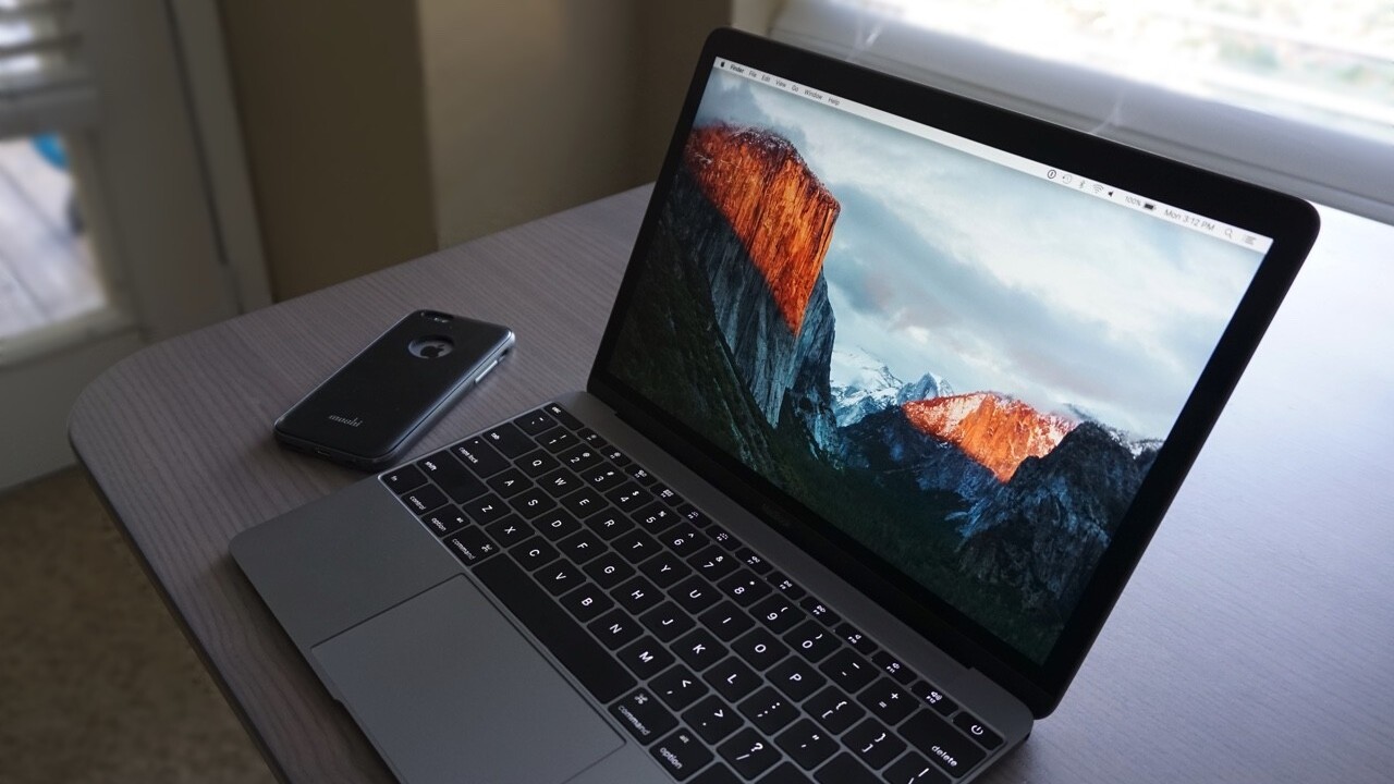
Tomorrow, you’ll be prompted to update your Macbook or iMac from OS X Yosemite to El Capitan. An iterative update compared to Yosemite’s massive overhaul, El Cap still packs some solid features and performance upgrades I think you’ll be happy with. It also works seamlessly with iOS — something that may be more of an attractive reason to upgrade. Here is what it looks like: OS X Yosemite vs El Capitan.
Metal
Apple’s graphics technology, first introduced at WWDC 2014, was originally seeded to boost iOS gaming. It’s now made its way to the Mac, and Apple says it will improve rendering times up to 50 percent across the board.
Gaming or not, Metal is going to help apps and files (like PDFs) open up faster. In-app, you’ll start to see more responsive graphical features; Metal has 10-times faster draw call performance versus OpenGL, and makes itself known throughout the operating system.
Spotlight
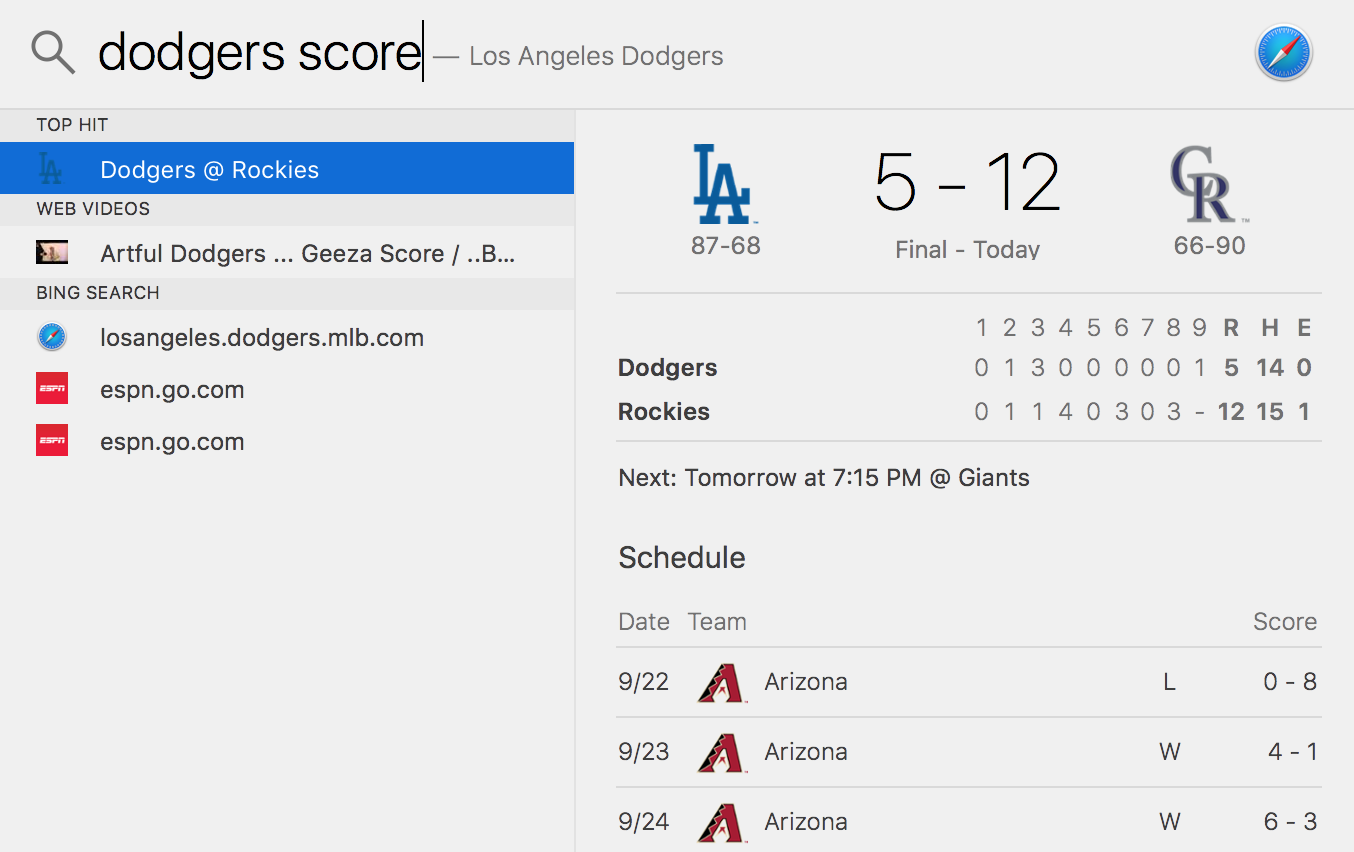
As in iOS, Spotlight on the Mac is now a bit smarter and more contextual. You can use natural language to search for items of interest — even sports scores!
You’ll also be able to grab stock or weather info, and Spotlight now sources video from YouTube, Vimeo and Vevo. Maps transit info is also searchable via Spotlight, and the most popular Safari page for any search will also show up.
All of Spotlight’s new power comes via deep linking to apps, and Apple’s own are leading the way. When you search for a document you may have been working on last week, you could simply type ‘document about El Capitan I was working on last week,’ and Spotlight would find the Pages file for you.

The same natural language support links back to Apple’s Mail app — a Spotlight search for ‘email from Lauren about Github’ would return a link to an email thread about Github. It would also show the Pages document I used to write this review based on the line you just read (how meta of me).
Spotlight can also be moved around the screen and resized; something Apple did to make multitasking easier, a common narrative for El Capitan.
Split View
Split View is El Cap’s way of letting you work on two items side-by-side, and it’s one of those ‘duh’ moments with OS X. It feels like something that’s been overlooked for too long, but it’s handy.
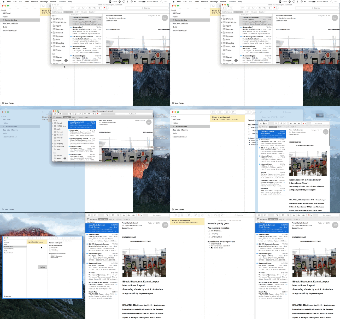
It’s part of a revamped Window Management system, and lets you easily split your screen between two apps. A simple long-press on the green maximize icon in an app places it as half of your screen.
If you’ve got a second app with the same capability on the same desktop screen, you’ll be able to click that to occupy the second half of your screen. The apps can be split evenly, or you can slide the middle bar around to suit your needs. There’s a limited number of apps making use of Split View on launch, but it’s cool enough that you should expect all Mac apps to make use of it soon.
Mission Control
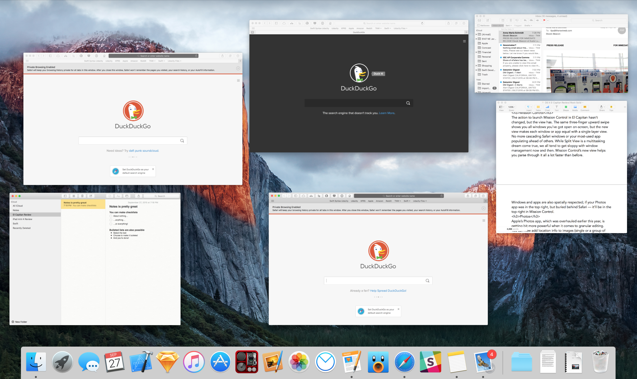
The action to launch Mission Control in El Capitan hasn’t changed, but the view has. The same three-finger upward swipe shows you all windows you’ve got open on-screen, but the new view makes each window or app equal with a single-layer view.
No more cascading Safari windows or your most-used app populating ahead of others. While Split View is a multitasking dream come true, we all tend to get sloppy with window management now and then. Mission Control’s new view helps you parse it all a lot faster than before.
Windows and apps are also spatially respected; if your Photos app was in the top right, but buried behind Safari — it’ll be in the top right in Mission Control.
Photos
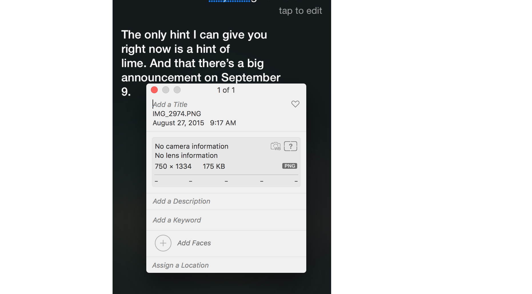
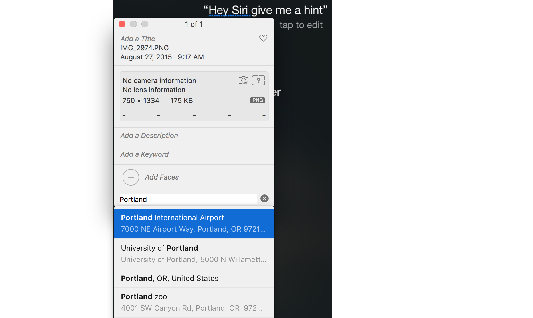
Apple’s Photos app, which was overhauled earlier this year, is getting bit more powerful when it comes to granular editing. You can now add location info to images (individually or in bulk — your call), and sort your albums by date or title.
Adding a location calls Maps into play. When you type in a location, it brings up Maps results, and selecting a location shows you a small Map view.
Batch changes don’t stop with location, though. You can also add multiple photos to a person you’re face-tagging, or switch the date, time and keywords associated with multiple photos as well.
Third-party editing extensions are also available for Photos, similar to what we see with iOS. Third-party extensions were unavailable at the time of publication, but I’d expect to see developers make their apps work with Photos soon (looking at you, Pixelmator).
Those extensions can also be used in combinations. I’d potentially be able to apply a favorite filter with CameraBag 2, but sharpen with Pixelmator.
If you’ve got a new iPhone 6s or 6s Plus, Photos on Mac supports live photos. Hovering over them plays the live ‘video’ snippet associated with your still image.
Apple also says launch time for Photos is 40 percent faster. Hello, Metal.
Maps
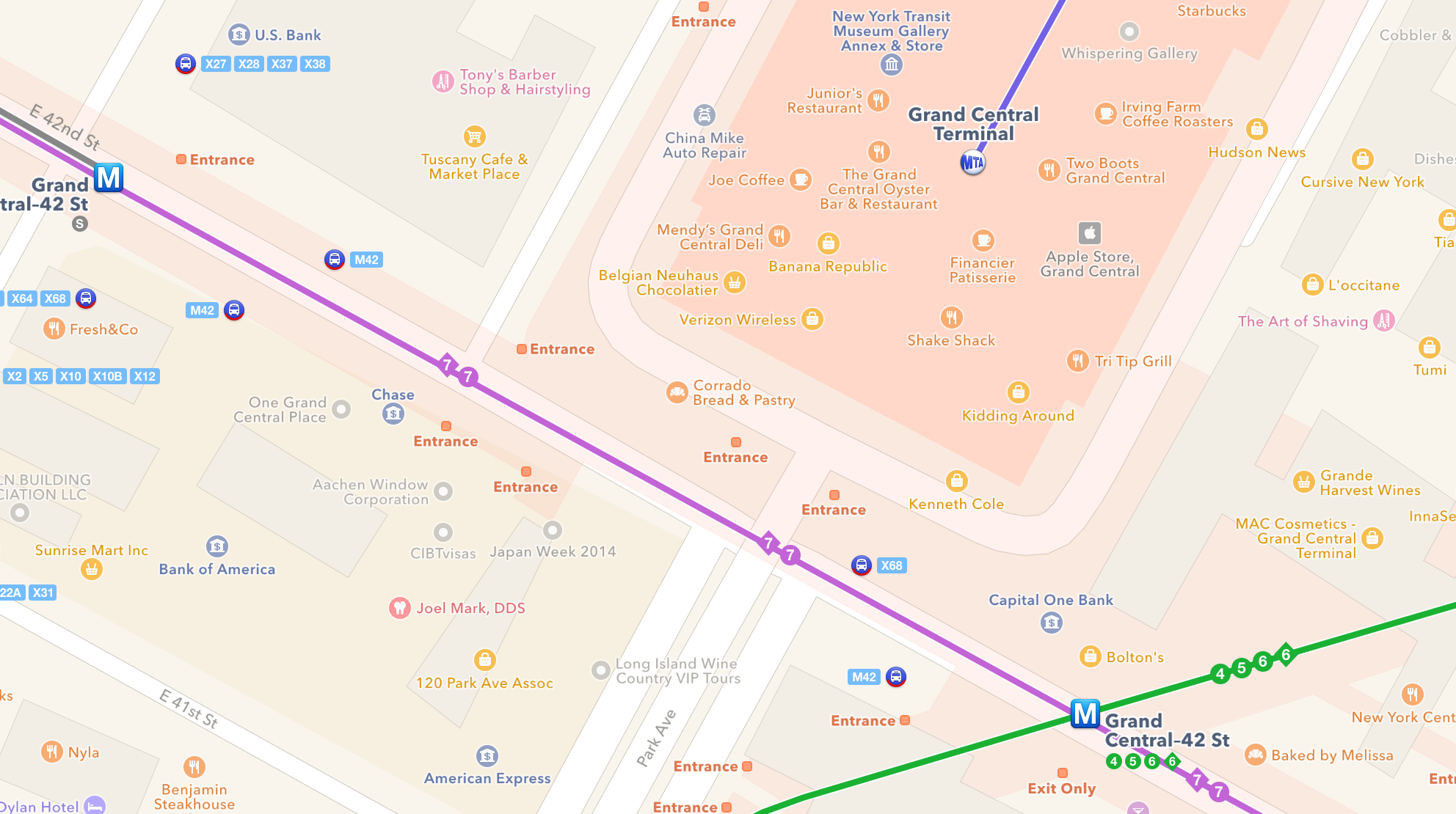
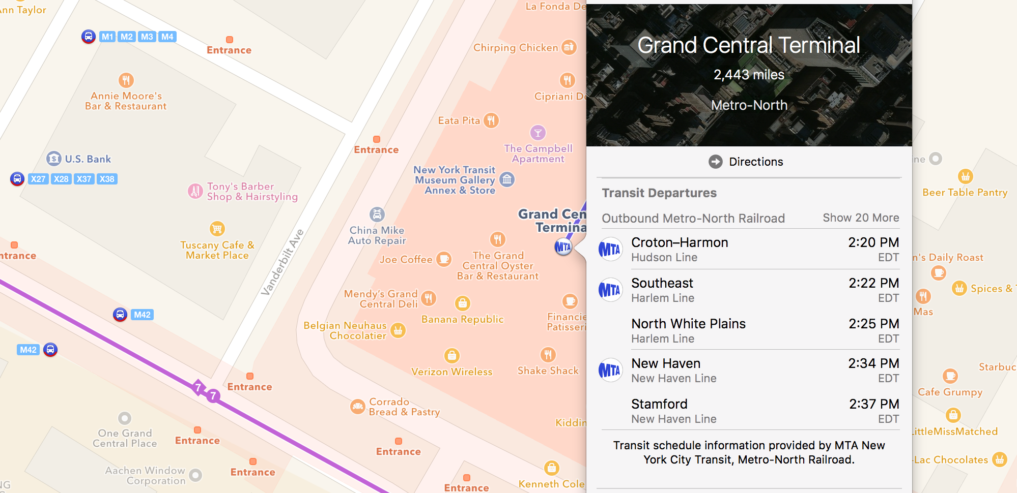
Though it doesn’t make for sensational headlines, the addition of transit information in Maps is actually a pretty big deal.
Not only does it tell you which train station and entrance you need, but Maps also lets you schedule trips via mass transit for the future.
The app even modifies which train or bus you may need to take if you were planning to leave in an hour. Stations also have cards in Maps, which tells you where lines may be headed.
Safari
The biggest changes to Safari are also slight, but welcome. Pinned tabs helps you keep a tab locked to your Safari browser, which is great for someone like me who routinely has the same five tabs open for work.
It keeps a small icon locked to the left of the screen, and any link opened within a pinned tab gets a new window. Those pinned sites are sticky, too; they won’t go away when you end your browsing session.
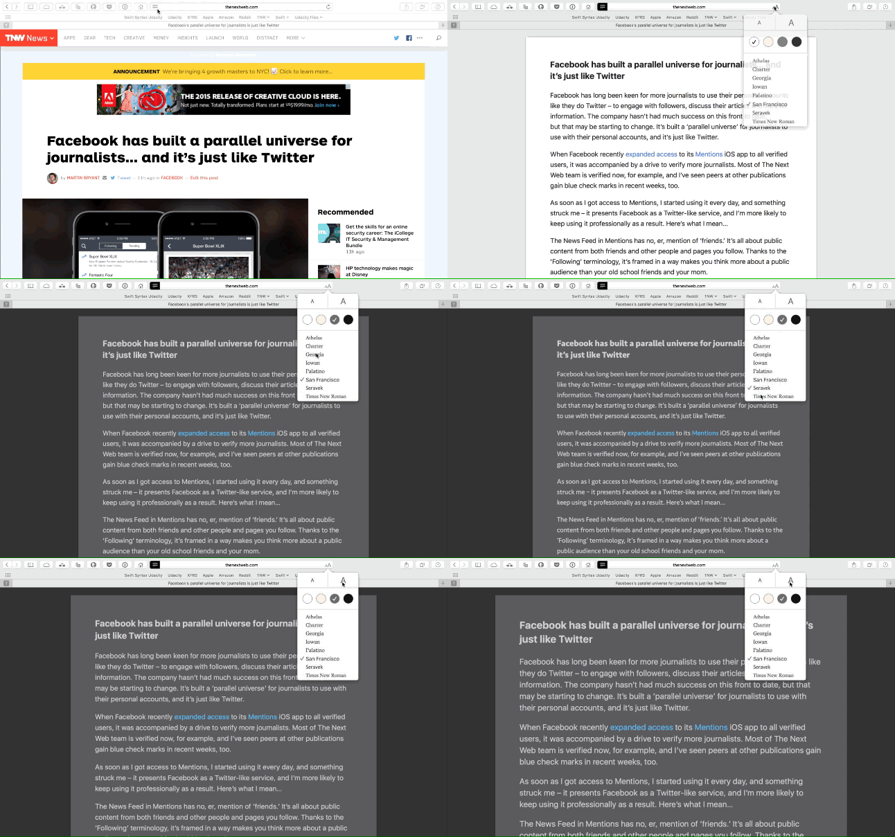
Reader mode is also improved, and lets you choose your favorite resizable font type. In addition, you can select to darken the background, which is great for lower power consumption or nighttime reading.
You can also silence noisy tabs in Safari. If a tab is playing audio, you’ll see a small icon in the URL bar up top (and the tab itself unless it’s pinned). A long-press on the URL icon shows you which tabs are playing music (you can navigate to tabs from that drop-down, too).
You can also click on the tab’s speaker icon to silence a tab.

Apple is starting to acknowledge email is as much a communication tool as triage for our daily routine.
Mail now lets you search using natural language (something we find in Spotlight), and can identify event invitations using natural language. If you got an email in the morning that read ‘let’s grab a drink at 8,’ Mail would notice that’s an invitation to meet up at 8:00pm and offer to add it to your calendar.
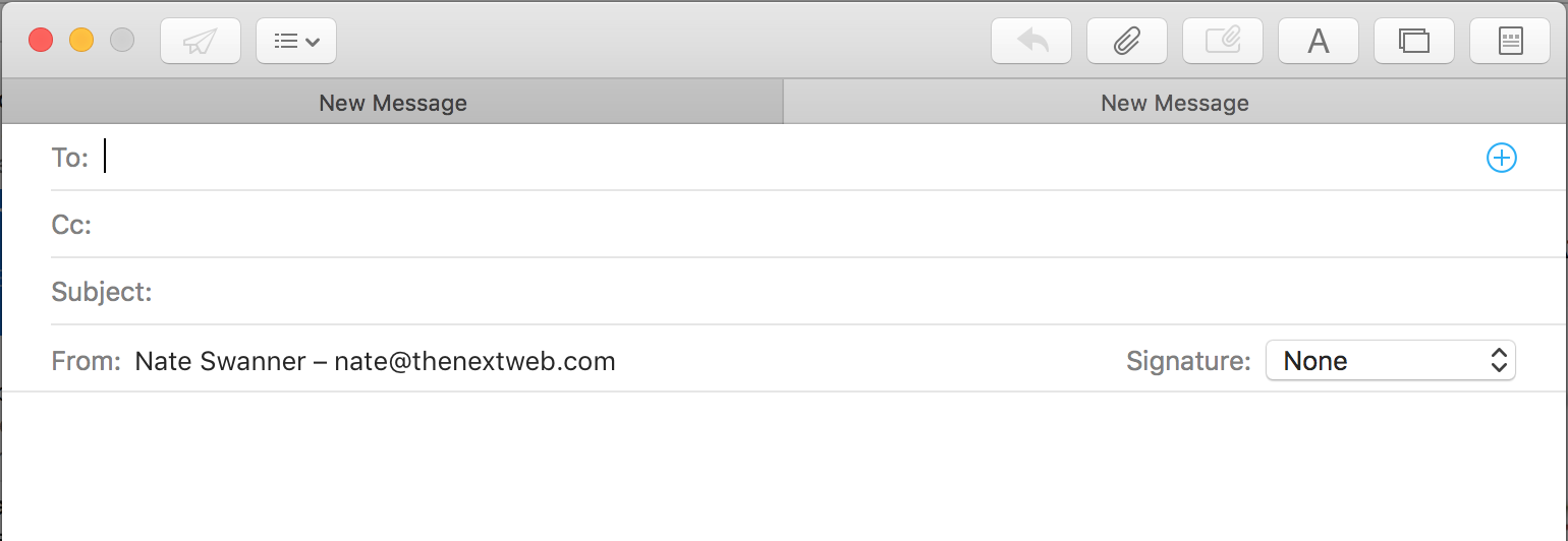
In full-screen mode, Mail’s compose window can handle multiple emails. If you’ve got several irons on the fire, you’ll only need one compose window to wrangle your email conversations.
Contacts are also managed behind the scene. If a contact’s info has changed, Mail notices and saves the new info. This happens whether or not a contact has explicitly told you in-line about new info or not; if they’ve simply changed an email signature line, Mail will pick up on that.
A new IMAP protocol grabs email via Mail twice as fast, too.
Notes
Arguably the biggest change to El Capitan’s forward-facing services comes via Notes. It’s that good, too — I promise.
Notes was reworked for both iOS 9 and El Cap, and syncs between your iPhone, iPad and Mac using iCloud. Changes made on one device are the same elsewhere; not ‘similar,’ but the exact same.
With Notes, you can organize ideas via a very simple folder system, which taps into accounts you’ve got linked to your devices. Your iCloud account is the default, but you could also use Gmail or others in Notes.
Adding external items of interest to Notes is probably where its true power lies. You can add photos, links, PDFs, videos, map locations, Pages documents, Numbers spreadsheets, Keynote presentations or audio files to Notes. If you ever lose track of an attachment, Notes lets you see everything you’ve added via a new attachments browser.
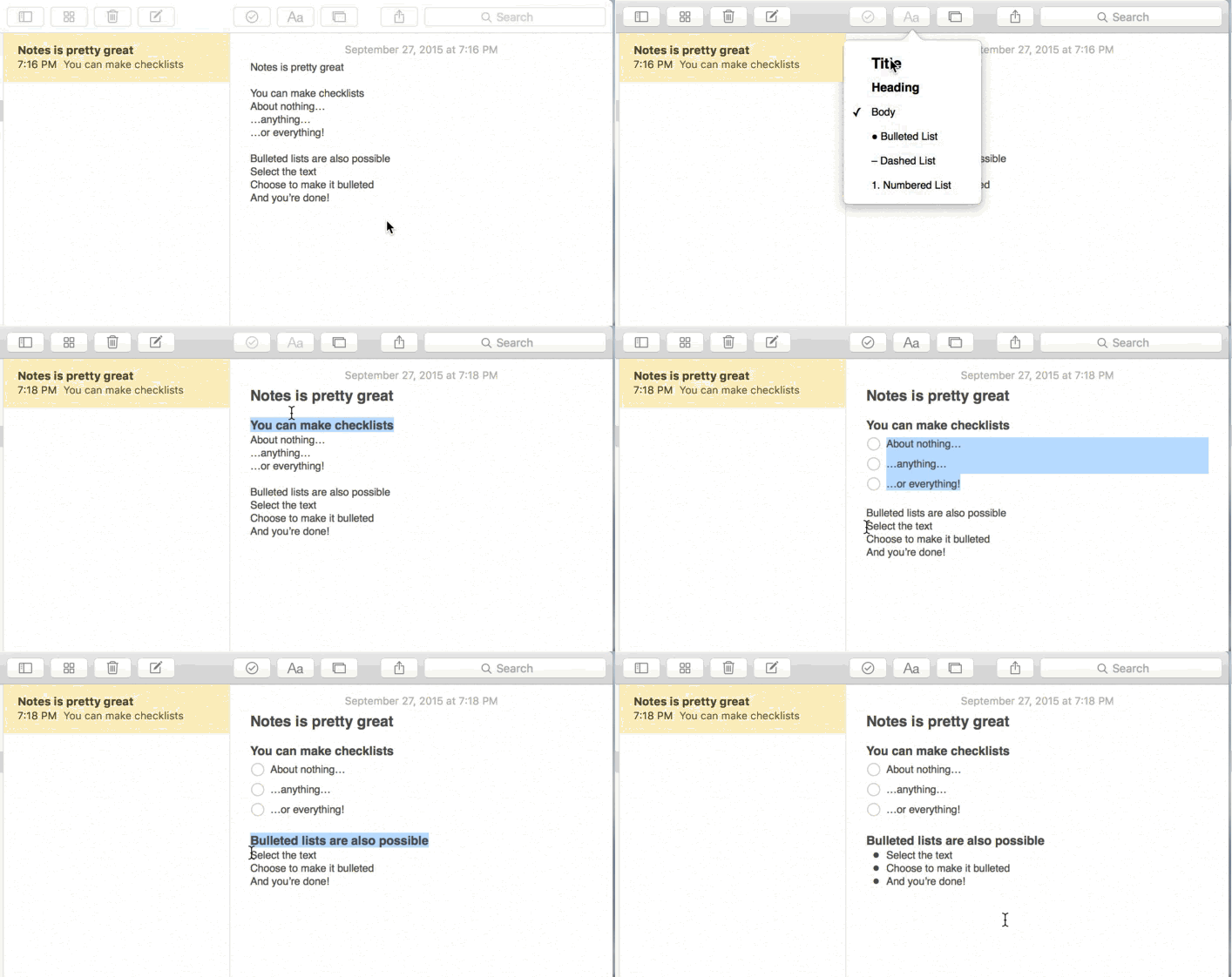
Notes also lets you do things like create checklists quickly and easily by selecting text and choosing that option. You can also alter fonts or create bulleted lists by selecting text.
Using El Cap
I’ve been using OS X El Capitan for a while now. I like Yosemite quite a bit, and wasn’t expecting much from El Cap — but the subtle changes have made a big difference.
A new favorite is Notes; I’ve been using Notes for just about everything, now, and it’s changed my workflow dramatically. I used to force myself to cobble things together: links saved to Safari’s reading list, notes in a third-party app and photos and files stored in a folder elsewhere. It was a pain.
Now, I can keep it all centralized in Notes. It’s recursive across all of my devices, and the practice of using it doesn’t change much when I go from El Cap to iOS 9. Notes also takes advantage of Apple’s share sheet, so I can add directly to a note from a webpage or social account. There’s no dragging, dropping or hoping clipboard actually saved a link.

Spotlight is also pretty handy, now. It always annoyed me that Spotlight was static to the center of my screen, but I can now move it off to the side. It also re-opens where you last placed it, making it more of an assistant than a source.
I can’t say Spotlight is as powerful as I’d like, but that’ll require third-party apps to accept deep linking. Once they do (and they should, because it’s a win-win), Spotlight will be amazing.
Mail is much better, but it hasn’t chased me off of Airmail just yet. I like the ability to work on multiple emails, but it doesn’t encourage me to ditch a favorite app. I’d like to see more work on basic features like bulk deletion; Mail’s gestures are nice, but a bit fussy for those times I need to quickly scan through hundreds of emails.
I don’t live in any city Maps supports for transit (Baltimore, Berlin, Chicago, London, Mexico City, New York, Philadelphia, San Francisco Bay Area, Toronto and Washington, DC in the US and UK; there are over 300 supported cities in China), but if I did it would be a killer feature. In toying with it, I can see myself relying on it for those times I’m in San Francisco or New York.
In iOS, I take advantage of extensions for Photos. It was the only real reason I downloaded Pixelmator for iOS (I’ve used it on Mac for quite some time), and I look forward to having the same feature set on the desktop.
Safari’s changes are minimal, but pinned sites are really helpful. I’m not crazy that it ends up sniping some screen real estate from me (it hosts pinned tabs in a bar up top), but I like not having to open the same set of windows ever day, and cursing at myself when I accidentally shut one of them down after clearing out a series of open tabs.
Reader mode is amazing; the granular controls make it pop. I already used it to strip away ad fodder as I’m reading, and it’s much more personal now.
OS X El Capitan has made performance improvements across the board, but Metal absolutely kills it on the Mac. I’ve never been let down with apps opening or images rendering on the desktop, but I’ve also never been overly impressed. Metal is subtle, but incredible. I open an app, and there it is — ready and willing to go, almost instantly.
OS X Yosemite vs El Capitan, the sentence: El Capitan is the perfect follow-up to Yosemite
Tomorrow, you should seek El Capitan out rather than let Yosemite update sometime in the future. It’s that good. El Capitan is as exciting as any iOS update — and that may be because it’s so much like iOS.
You won’t get a ton of third-party app support right away, but I haven’t run into any apps being broken by El Cap. Out of the box, it’s solid. Obviously, check any important non-Apple apps you rely on for reported bugs before you take the leap.
Performance improvements like Metal have helped El Cap feel demonstratively quick. There are other tweaks under the hood, and it all combines to bring a responsive operating system to Mac.
There’s subtlety abound in El Cap, but each change serves OS X well. Perhaps more to the point, El Capitan compliments iOS beautifully. Services like Photos, Notes, Mail and Maps are (mostly) the same app across iOS and OS X, now.
El Capitan is the spit-shine Yosemite needed. It’s faster, more powerful and intuitive, and works a lot better with iOS than the Mac ever has.
Apple will make OS X El Capitan available as a free download on September 30 via the Mac App Store.
Get the TNW newsletter
Get the most important tech news in your inbox each week.
