Now that Apple has moved to an annual OS X release, Mac users can expect regular iterative improvements to their desktop operating system instead of occasional ground-breaking shifts. OS X 10.10 – named for California landmark Yosemite National Park – includes several sorely needed advances that help your Mac play nicely with your iOS devices, but it’s still basically the same OS you already know, just with a nicer coat of paint.
First revealed back in June at Apple’s Worldwide Developers Conference, OS X Yosemite moves slightly toward Apple’s flat new design style, which first showed up in iOS 7. However, Yosemite doesn’t take the aesthetic to the flat extreme of iOS. The corner window sizing icons are now flat instead of bubbled, and the dock, finder and Messages now have translucent edges.
Handoff
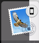 The new Handoff feature in Yosemite and iOS 8 lets you jump from the app you’re using on iOS to its Mac equivalent and pick up where you left off. For instance, I could start an email in the Mail app on iOS, then decide that I want to write more and switch to my Mac. When you’re using a supported app, an icon pops up on the left side of your dock.
If you’re using your Mac, a small icon will appear in the lower left corner of the lock screen on your iOS devices. Slide up on the icon, unlock your phone, and iOS will take you to the appropriate app. You can also handoff between two iOS devices.
I had mixed results with Handoff in my tests. Switching from the Notes app on iOS to OS X wouldn’t pull up the note I was working on, but Mail and Messages both worked consistently. Handing off from mobile Safari to OS X Chrome didn’t work, so I had to set Safari as my default browser on OS X. Developers will be able to build integrate with Handoff for their own apps.
AirDrop
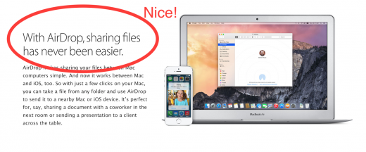
As part of Apple’s attempts to introduce deeper integrations between iOS and OS X, you’ll finally be able to AirDrop files from your mobile device to your Mac. It’s ridiculous that we had to wait so long for this functionality. Sometimes, it would take a few seconds for my Mac to see my iPhone, but, once it did, file transfers were seamless and fast. I sent a 25MB video in just a handful of seconds, making it the fastest way to transfer files between two devices.

Messages and Phone Calls
The Mac’s new communication abilities are among my favorite features in Yosemite. Calls that come in on your iPhone will ring as notifications on OS X. You can then answer the call and use your Mac as a speakerphone.
I had some trouble with the feature until I realized that it’s not compatible with WiFi calling. Turning on “iPhone Cellular Calls” on my iPhone automatically disabled the WiFi calling. Part of the problem is that OS X and iOS settings have grown increasingly confusing. The toggle to turn on placing calls through your Mac is located under the FaceTime section of iOS settings instead of the Phone section where I would expect it.

Call quality over my MacBook Pro’s speakers was passable, but I’d strongly recommend using a headset. Without one, the other side would occasionally hear an echo.
The feature requires that your Mac be on the same WiFi network as your phone. It worked perfectly even with my phone in another room.
Messages in OS X have been reworked, with the addition of audio messages and SMS functionality. You can also edit group text messaging conversations from the Mac. Paired with the upcoming iOS 8.1, you’ll be able to send cellular texts from your Mac through your iPhone. We haven’t tested that yet, but we’re looking forward to texting non-iPhone owning friends from our computers.
Spotlight
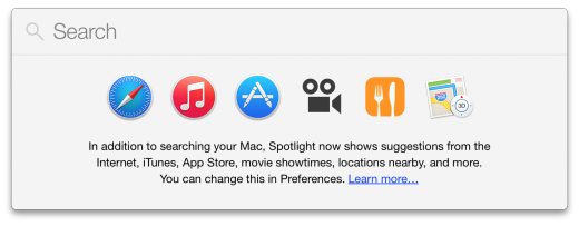
Apple has significantly expanded the Spotlight search feature in Yosemite, allowing you to search for more than just files. Wikipedia, Maps and Bing are now included in the results. The feature isn’t quite ready to replace Alfred and other launcher power apps, but it does make search marginally more useful. I did find the extra search queries to be on the slow side though. Inputting a movie title, for instance, would take seconds before iTunes or News results showed up.
Today View
 In keeping with the Today section found in iOS 8, Yosemite also includes the tab in its Notification Center. Pre-installed widgets include weather, social and calendar, but Mac app developers can also add their own.
Making use of Today view took a bit of training, but I found it to be pretty handy once I’d set up the widgets and turned on a keyboard shortcut. Simple information that I search for on a daily basis, such as local weather and time zone differences, are now a button-press away.
iCloud Drive
For those of you that trust Apple with your files in the cloud, the new iCloud Drive is baked right into the Finder.
The storage system automatically separates your files into separate folders for each application you’re using. Windows PCs can also maintain an iCloud Drive folder, though we have yet to test that feature.
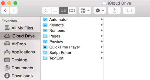
iCloud Drive acts as a centralized hub for managing your files, so you can edit a document on any device and have it show up on all the others. If you’re not on your main computer, logging into Apple’s Web version of iCloud Drive lets you upload, download and organize your files.
For iCloud Drive to take off as an alternative to Dropbox and Google Drive, I’d want to see a dedicated iOS app offering access to files and folders. As it is, you’ll mainly stick to individual apps, such as Pages, when jumping between OS X and iOS with the service.
Safari
Safari’s toolbar has gotten a redesign, adding buttons for downloads, tab view, and sharing. If you collect a lot of tabs, they’ll accordion along the tab bar, allowing you to scroll through them with the trackpad.
The search bar in Safari now includes some of the extra results, such as Wikipedia and iTunes content, that are found in the new Spotlight search. One welcome addition is the ability to open a single window in Private mode while keeping other windows in regular mode. Apple has also added faster Javascript performance and better privacy controls to Safari in Yosemite. OS X Safari now works with WebGL and includes native support for Netflix, which Apple claims could add as much as two hours of battery life to your machine.

For all its new features, Safari actually feels less usable. The interface changes bring desktop Safari more in line with its mobile version, but that’s not a good thing in my book – it’s as if Safari has been dumbed down even further. I’ll consider Safari for the occasional distraction-free browsing session, but I’m still sticking to Chrome for work.
The Mail app has traditionally been one of the weakest points in OS X. The two main additions in Yosemite are large attachment support and markup tools. Even so, the app still feels fundamentally broken for anyone who has to deal with a high volume of email.
Mail Drop allows you to send attachments of up to 5GB per email. Apple basically uploads the file to iCloud and then includes a link in the email that lasts for 30 days. I like that Apple is trying to solve this pain point, but OS X could do a better job at informing users what’s happening here. This is a case where Apple’s usual practice of making the process seamless and doing everything in the background isn’t very helpful.
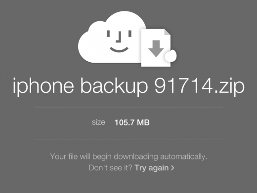
What if users have sensitive data that they don’t want to send to iCloud? Does the file completely disappear after 30 days? Will users trying to email files for long-term storage discover months later that the link has expired? I’d like to see more options and dialog here so that Mail Drop doesn’t just feel like a black box.
Mail markup is potentially useful, but the feature is buried in the interface. To access the tool, I had to click reply to an email, then click to include the attachment, hover over the image, then click the arrow to open the markup interface. I’m skeptical that the average user will even know the feature is there, let alone find it and use it.
Another addition to Mail is a signature option. It works similar to the feature in Preview, allowing you to hold up a signature to the camera. You can also sign with the trackpad, but it didn’t work for me.
Conclusion
OS X 10.10 adds much-needed integration for switching between iOS devices and Macs. Cross-device AirDrop and iCloud Drive also make it easier to manage and transfer files between the two. Continuity features like Handoff make the two operating systems feel like a unified ecosystem.
Improvements to the Mail and Safari apps on OS X still haven’t convinced me to use them as my default apps f0r email and browsing. Many of the other features included in Yosemite feel light on substance, but I’d upgrade just to place phone calls from my Mac and Airdrop files over from iOS.
Since Yosemite is a free update, I can happily recommend it. We didn’t encounter any show-stopping bugs with the update, but, as always, if your machine is important for work, you might want to wait a bit to make sure it’s safe.
➤ OS X Yosemite [Mac App Store]
Headline image: Scott Mcguire / Shutterstock
Get the TNW newsletter
Get the most important tech news in your inbox each week.

