Google has been tinkering with the black bar that shows up at the top of any Google property that you’re on. It’s a powerful way to let its users seamlessly jump back and forth between the huge number of services that the company offers.
Currently, the Google bar lets you share things on Google+ and displays a few top-level links to things like Google Maps and Gmail. We reported the new look a few days ago, and it according to an official post from Google, those changes should start rolling out for everyone very soon.
The Google bar will also carry a handy unified search box at all times.
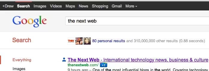
Currently, your Google bar looks something like this:
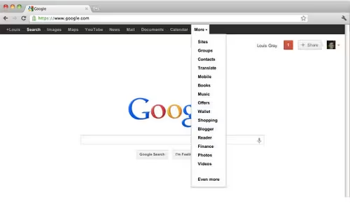
Among the changes rolling out are the inclusion of YouTube, Calendar, and Documents into the top-level links:
A link that got the heave-ho was Shopping, which currently gives you a variation of Google search with items you can compare prices for. The link to Video went to a Google search for videos and that has now been replaced by a direct link to YouTube.
I’m pretty excited about Calendar and Documents getting the top-level treatment, but I’d rather be able to customize what gets shown in the bar, which would make it way more useful for me. For example, with Google Drive reportedly coming out in the next few weeks, it’d be nice to have fast access to it whenever I’m using another Google product.
Get the TNW newsletter
Get the most important tech news in your inbox each week.

