With the release of Google+, the world’s biggest search engine has undergone a number of new design refreshes to blend native search options with the increasing number of social features — and it appears it’s about to change yet again.
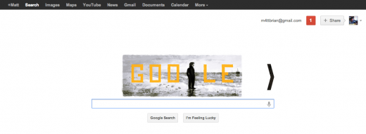
State of Search reports that Google has started testing yet another new layout that increases the visibility of the Google+ notification widget and account section, removing it from the black bar at the top of the page completely and merging it into the page itself.
If you like the look of the new layout in the screenshot above, the good news is that you are able to try it. All you have to do it head to your regional Google homepage or Google.com and do the following:
- Open the Developer tools within the browser. If you are using Google Chrome press CTRL + SHIFT + I, in Firefox press CTRL + SHIFT + K and if you are using Internet Explorer (8+) press F12 and then open the tab Console. Safari users press CTRL + ALT + I and in the panel that opens choose Console.
- Copy the code in this file into the developer/console screen and hit Enter:(If you want to use Google.co.uk change “.com” in the code to “co.uk” or your regional variant).
- As soon as you hit Enter, the new navigation should show immediately.
For those that use Google+ quite often, the lowering of the Google+ share function and notification widget into the body of the page may help increase interaction and make it easier to view new messages and Circle notifications.
Google recently moved to integrate social features into its search engines, coming in for a fair amount of criticism. By looking at its latest move, the company intends to forge ahead with its social integration, assisting the 90 million+ users it has already seen sign up.
Get the TNW newsletter
Get the most important tech news in your inbox each week.


