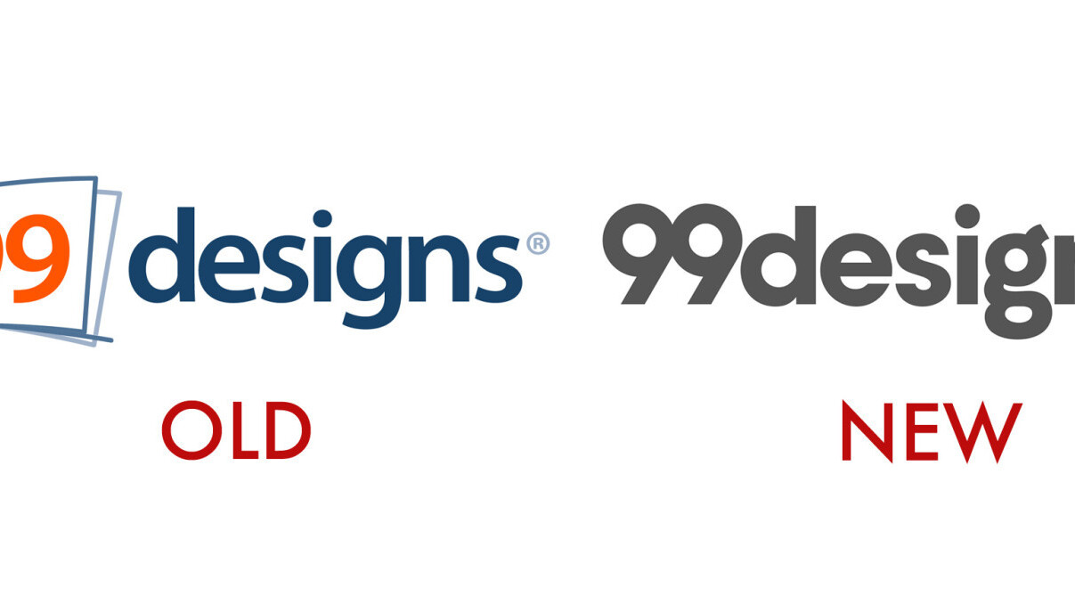
Prepare your eyes for yet another tech logo redesign – this time from 99designs, a design crowdsourcing website.
The new 99designs logo is now more straightened out, getting rid of the square that once separated the “99” from “designs.” CEO Patrick Llewellyn says the new wordmark is intended to showcase a more stripped-back version of the website, prioritizing its community over the company itself.
“The old logo for me represents that notion of ‘Here we are!’ … it captured the flip card approach and the fact that there were multiple designs coming in,” Llewellyn tells TNW.
“What we wanted to achieve with the new logo was something that was really flexible, and to make the site more about the customers who come and get important designs created.”
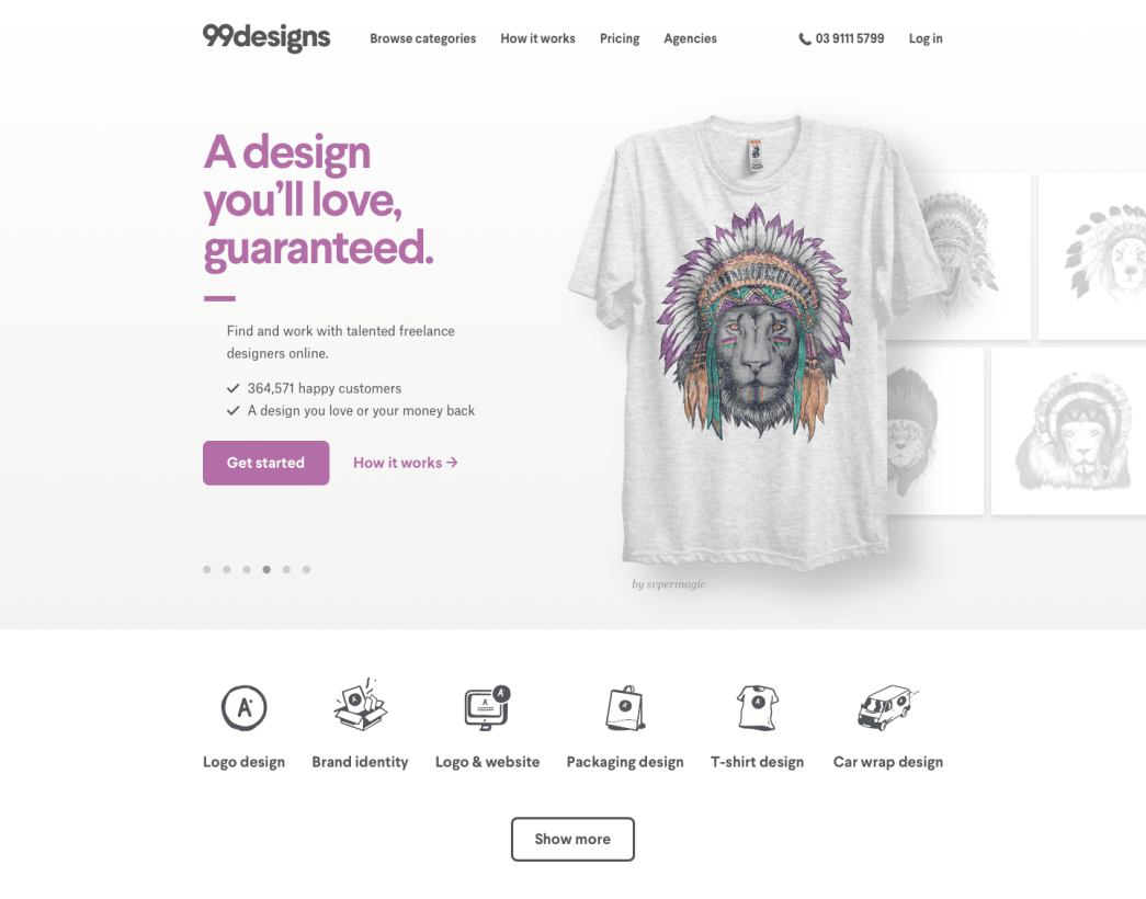
Indeed the new 99designs layout is much cleaner, with emphasis on the artist credited below each graphic displayed on the site. Even the 404 page showcases artwork by its community members.
The redesign, which was naturally crowdsourced by its own community, had been two years in the making, Llewellyn said. The team received more than 4,000 entries from 556 designers before deciding on the final look.
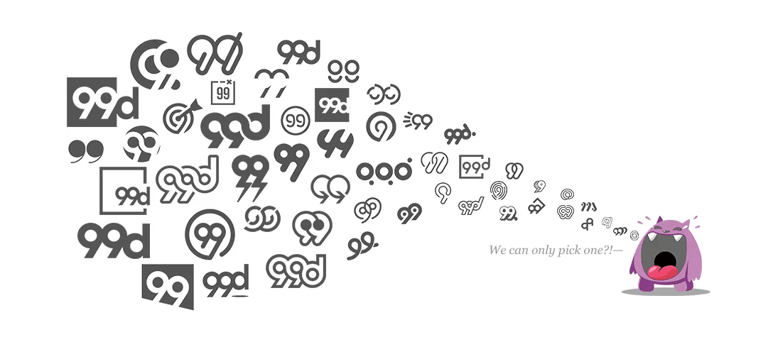
“The new word mark is clean and has an app treatment,” he describes. “Our position in the scheme of things is to be the canvas for everyone else. In our design contest we saw a great range of designs, but what we got to in the end we realized what was important was to continue to simplify who we are and what we stand for.”
The winning logo was designed by an artist based in Indonesia – a fact 99designs is proud of given its global community. It also awarded finalists with prizes despite them not making the last cut.
What do you think of 99designs’ new look? Personally, I think it’s much more modern and in tune with today’s Web aesthetic.
Get the TNW newsletter
Get the most important tech news in your inbox each week.


