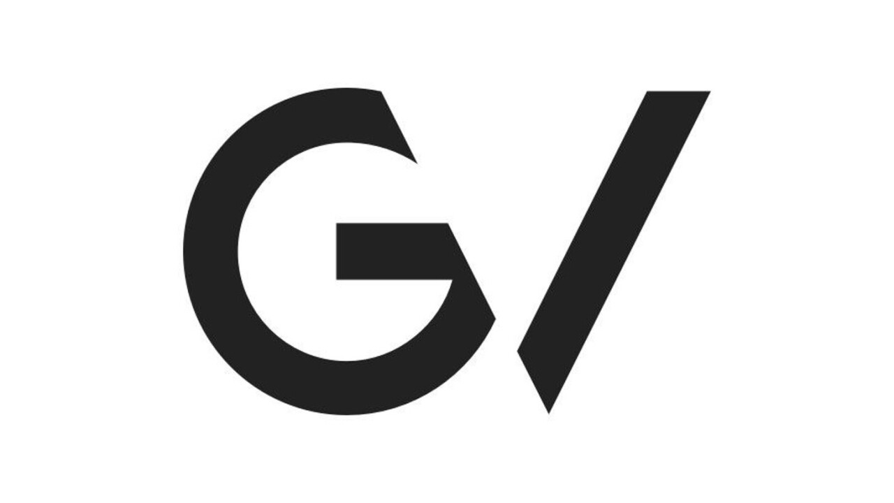
Google Ventures is not Google, but that wasn’t apparent from the way it presented itself. To drive the point home, Ventures now has its own logo, which is also a radical departure from Google’s own.
In contrast to Google’s happy typeface and bouncy GIFs, Google Ventures’ logo is a black ‘G’ ahead of a slash. The ‘G’ is cut off just a touch to allow your mind to create a ‘V’ out of the slash.
The logo also ushers in a new website for Ventures, which has a whole lot of the Material Design ethos found at Google. We knew bouncy graphics had to come into play somewhere, right?
In addition to the new logo and website, Google Ventures has announced where it spends most of its money. Unsurprisingly, “Life Sciences and Health” drive 31 percent of backing, while the vague “Consumer” moniker brings in 24 percent.
➤ 2015 Year in Review [Medium via The Verge]
Get the TNW newsletter
Get the most important tech news in your inbox each week.


