Dropbox finally publicly revealed a competitor to Google Docs, but you might not have noticed that something is a little different:
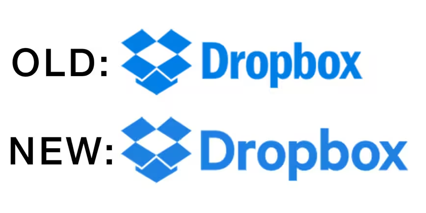
 Let’s look at that more closely. Here are the old logo and new logo compared:

Harris Roberts from creative agency Figmints first noted the change on the company’s blog. The new logo keeps the same box icon, but changed the font to a much rounder, squatter, and longer sans serif that resembles a customized Motiva Sans.
The new logo also uses an ever-so-slightly lighter shade of blue. Comparing the two logos in Photoshop shows different hex values: #007ee5 on the old one vs #1d81e2).
Although the new logo shows up on the page for Paper, it first popped up on at the end of a YouTube commercial posted on October 13:
https://youtu.be/84gwtx6Dvhg
The video also highlights a new tagline: “All Yours.”
It’s not the most dramatic change, but then again, Spotify caused mass panic when it shifted its shade of green, and the new font certainly looks a cleaner than the old one, which I was never a big fan of.
In any case, these sort of subtle changes are often indicative of a new direction for a brand. In this case, it’s still the Dropbox you’re familiar with, but the rounded shapes and lighter blue also make it feel a little friendlier – akin to Google’s new logo. That’s a vibe the company might be aiming for given its big new push towards collaboration.
Meanwhile, Dropbox has yet to update its branding assets page with the new logo – and it still shows the old color hex values as well – but expect it to start popping up elsewhere soon. Head on over to the Figmints blog for some more thoughts on the new logo.
➤ Dropbox has a new logo [Figmints]
Get the TNW newsletter
Get the most important tech news in your inbox each week.
