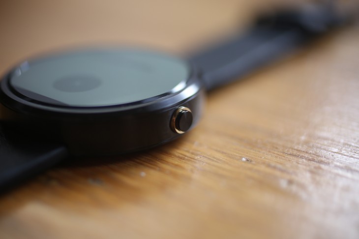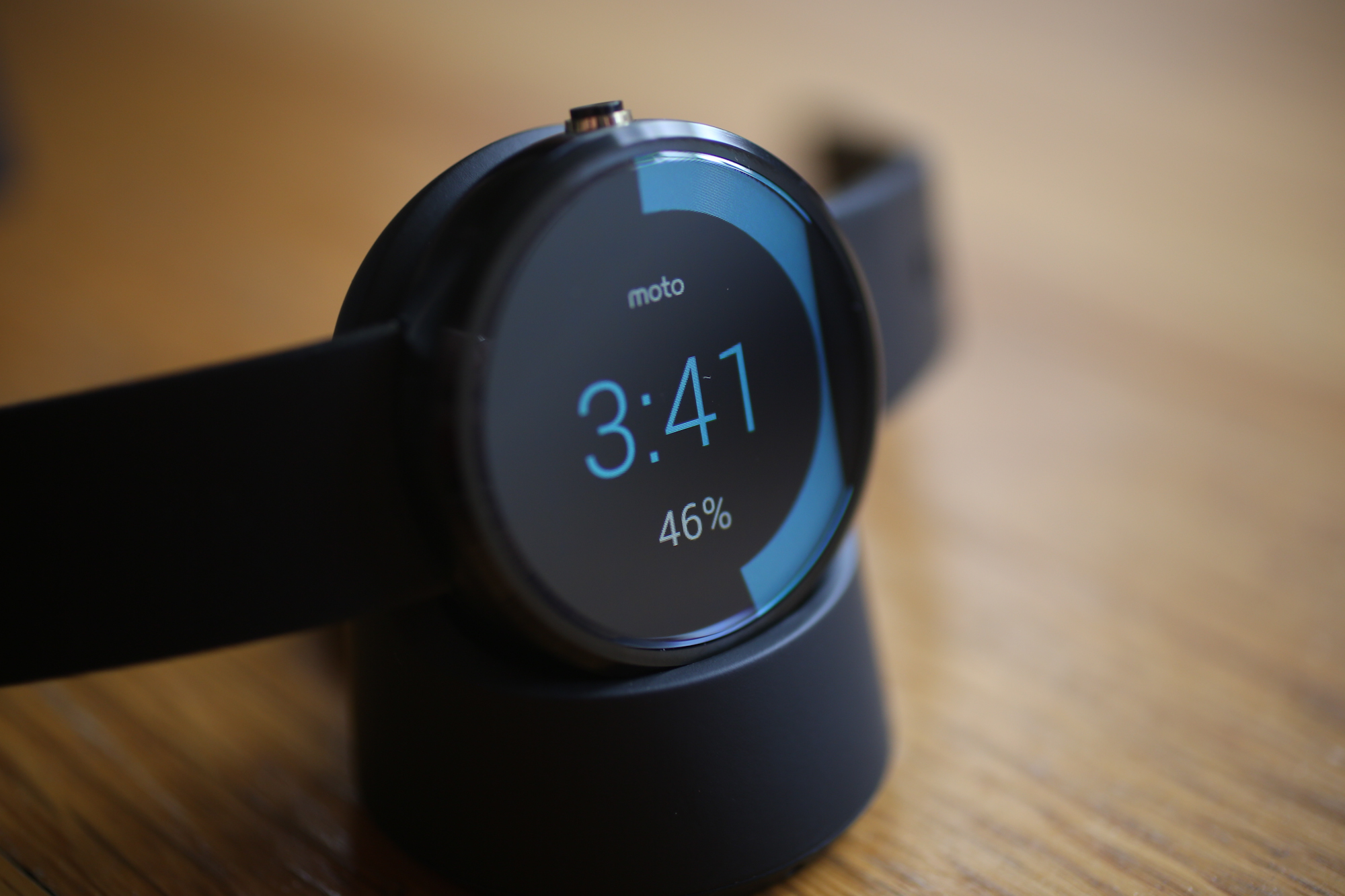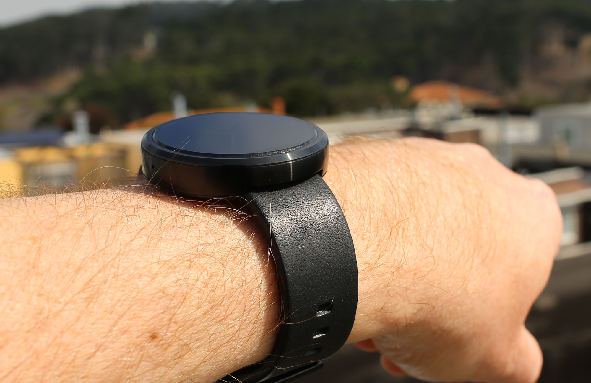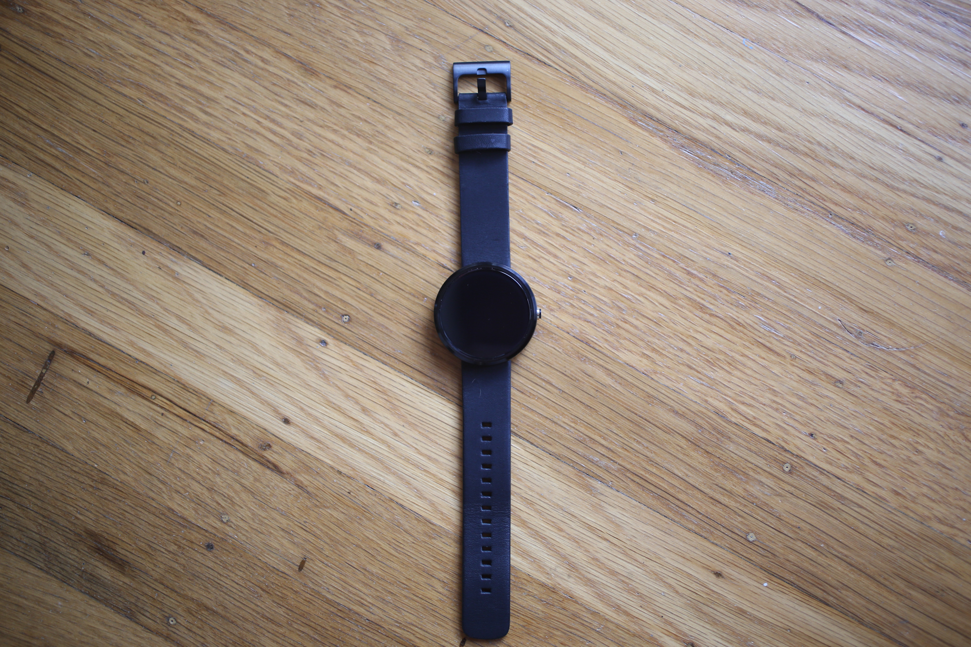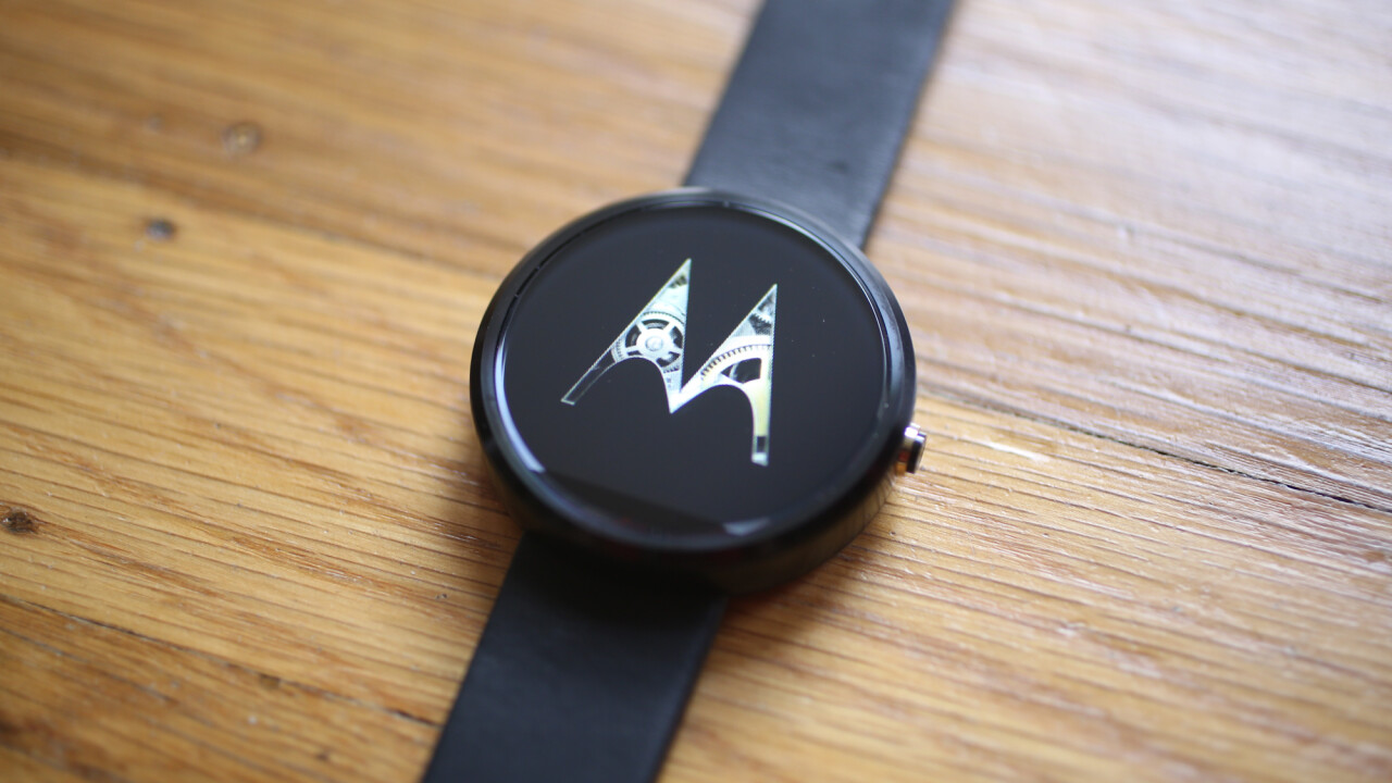
The best part about the Moto 360’s design is that you don’t always notice just how thick it is. At certain angles, the flat black version (it’s also available in stainless steel) of the watch looks like a traditional round-faced watch. Then you tilt your arm or it gets caught on a cuff and you’re reminded that a tiny, yet too big, computer resides on your watch and you have to decide if you’re proud or embarrassed.
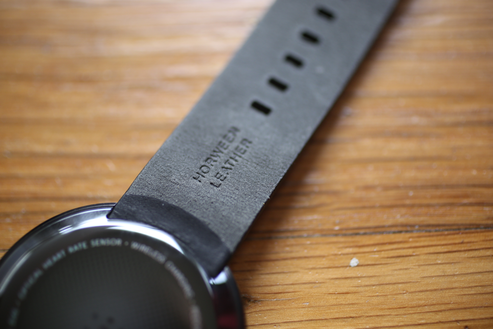
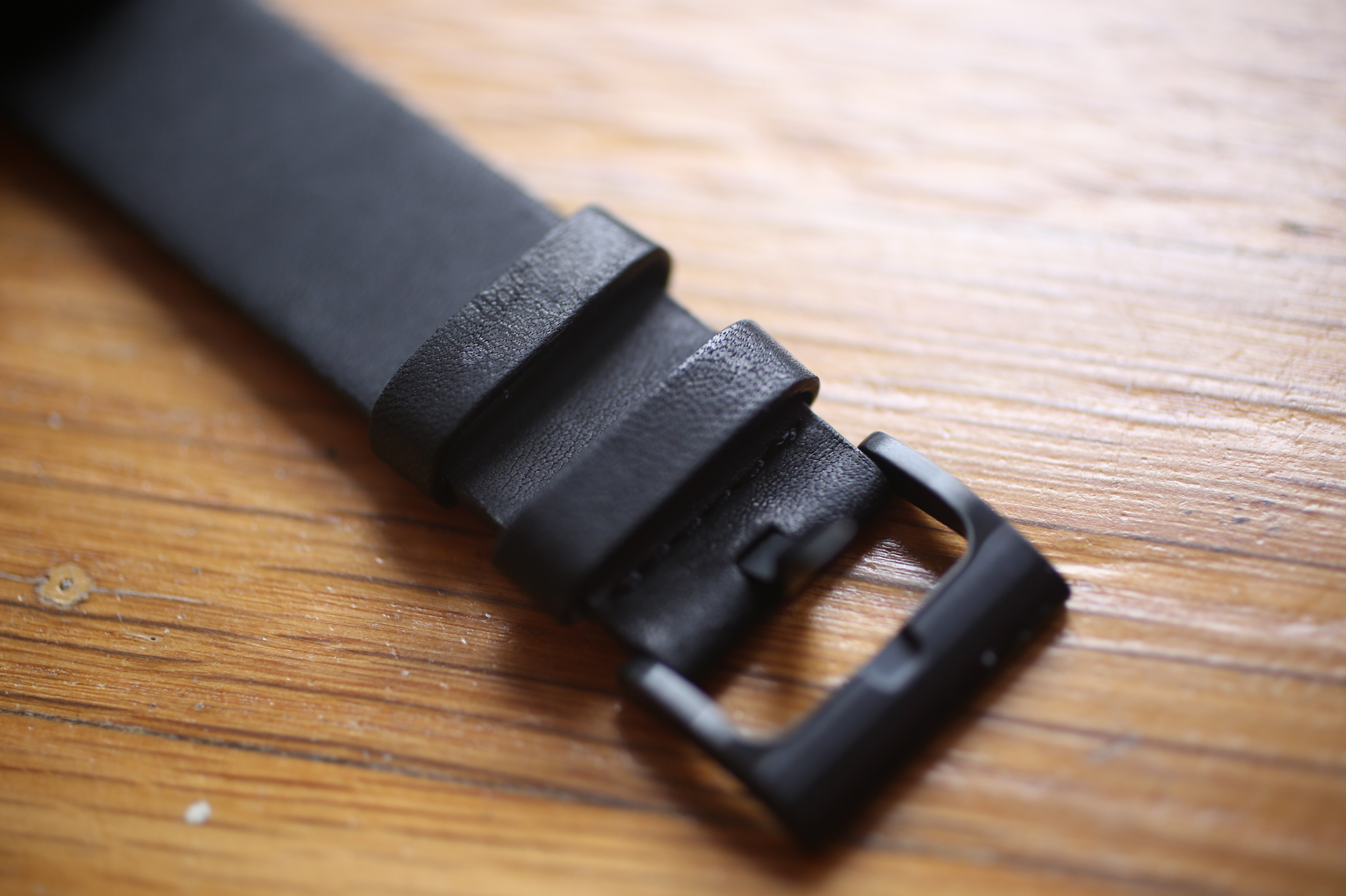
The Moto 360 with its Horween leather strap and Gorilla Glass face is a beautiful device. Motorola has been designing great looking devices for the past couple years and with the Moto 360, it went with a classic, sophisticated look that delivers on most of its technological promises most of the time.
And while it’s the darling of the Android world right now, a new challenger has emerged from Apple. The Apple Watch design is more polarizing than the Moto 360, but it’s hard to deny that the OS doesn’t look outstanding. But, like Android Wear, it only works with an OS-native companion device.
Apple Watch only works with iOS and Android Wear only works with Android. Right now it seems unlikely that either watch will cause a mass migration. But what this does mean is that engineers at Google are frantically working to make the next version as good as or better than the Apple Watch OS and that’s good news for Android Wear fans.
The Hardware
When the Moto 360 was announced at Google I/O and attendees were told they would get one there was an eruption of applause. Then the news that it would be shipped to them at the end of the summer elicited groans. Sure they could get the Samsung Gear Live or LG G Watch that day, but it was clear that the Motorola watch was the crowd favorite.
Apparently all you have to do to design a watch that everyone wants is to make it look like nearly every wrist watch ever made. The stainless steel watch feels solid in a the way that you would expect watches built in the 1950s by Swiss engineers. It looks classy while still strong enough to be used to bust through a window to save a baby trapped in a burning car.
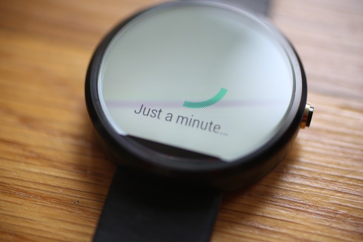
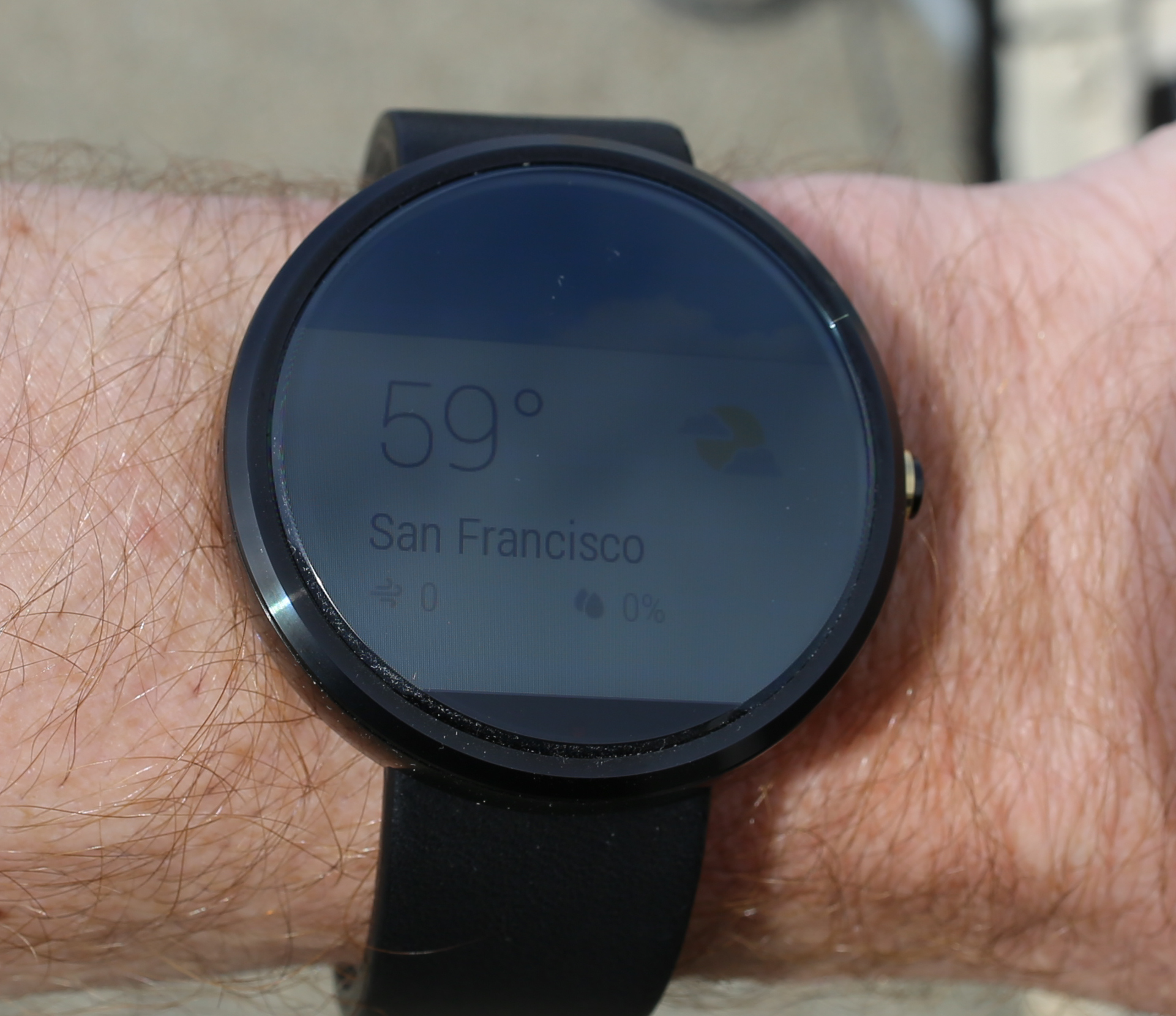
The face is protected by Gorilla Glass 3 giving it the ability to resist scratches, nicks and cracks. You feel like you can smack it against a desk (which I did) to make a point in a Mad Men-type board meeting. It protects a 320×290 pixel backlit LCD screen that gets bright enough — thanks to an ambient light sensor — that you can see the interface in the sun, something that mired the LG G Watch.
The display does have that weird dead zone at the bottom of the display. It looks like something on the display is broken; Like a lazy family of pixels have decided to call it quits after a fight with neighboring pixels. The tiny black sliver of nothing is staring at you all the time. That area houses the ambient light sensor and you sort of get used to it. But it glares at you when you’re using a classic watch face because the base of the six o’clock hour is missing.
The leather band is strong and during a test to yank it from the watch, it was steadfast. But it’s also comfortable on your wrist. Like a hug from a chinchilla. A live one, not a sad dead one.
The crown (or dial) doesn’t actually turn. Instead you push it to turn the display on and off. I still have issues with Android Wear turning on the screen when I swing my arm up. Maybe I’m doing it wrong. Maybe I’ve always swung my arm incorrectly. Thankfully, I can push the button and see the time and my notifications. You can also tap the screen to wake up the display, but pushing that button just feels cooler.
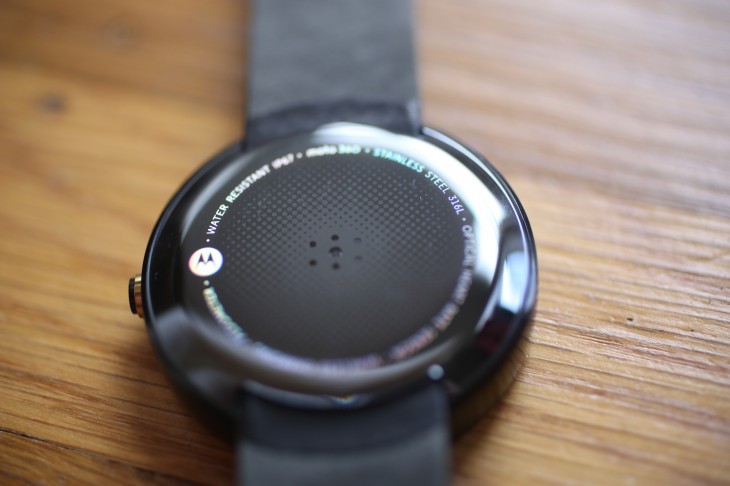
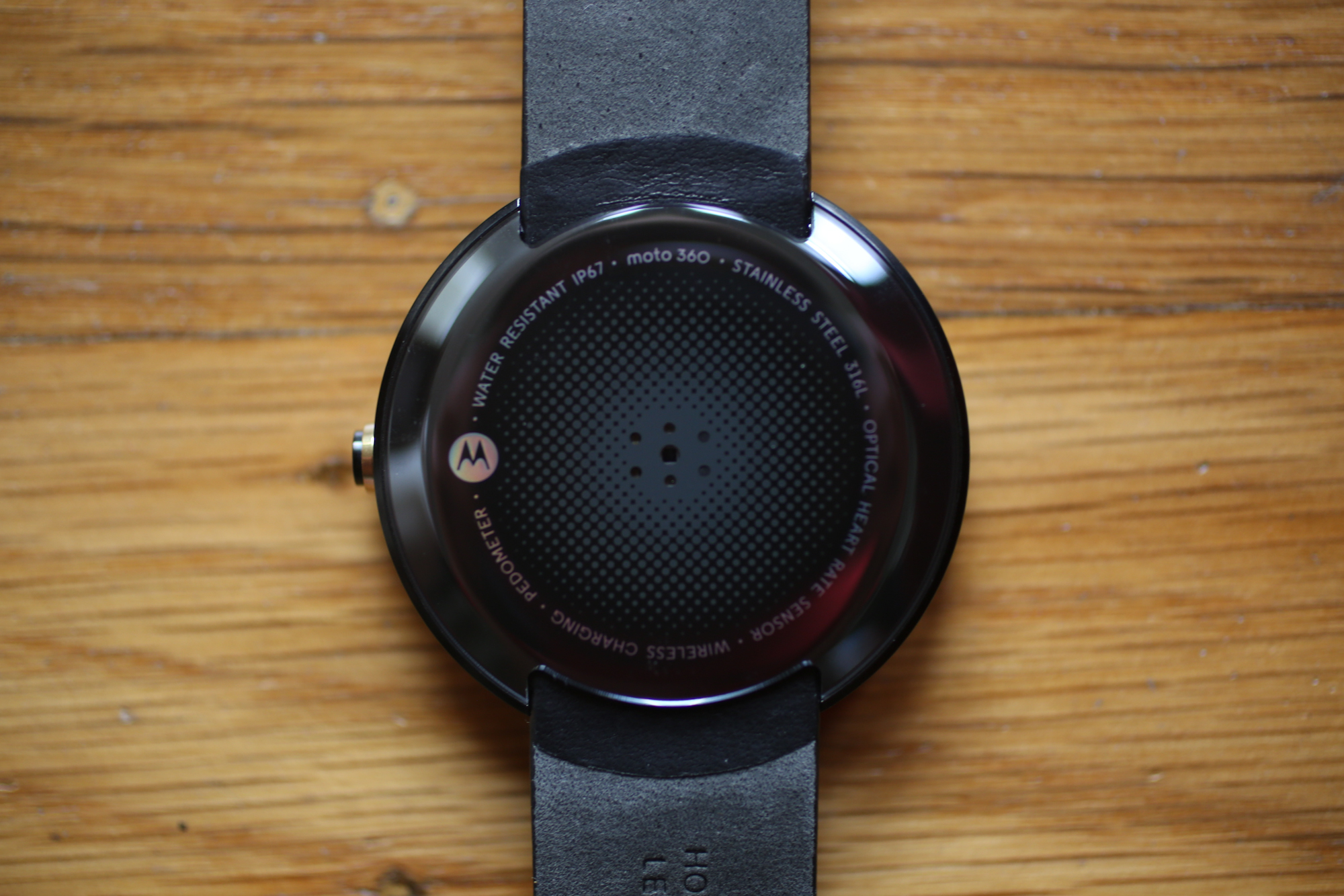
The back of the watch is home to the optical heart-rate sensor. It’s smooth with contoured edges so you never feel like your wrist is being pinned in by the edge of the watch. It has the same bulge you might remember from watches that used batteries that lasted years instead of hours. The back is also home to the inductive charger. Just place the watch on the supplied base and magnets keep it in place. During my tests it took about two hours to charge from eight percent to 100 percent.
Which is important because this watch will maybe last your entire work day if you’re a heavy user. Maybe. If you use it sparingly, you can get to the end of the day without any cause for concern. The battery might not last to dinner, but at least the watch is damn pretty.
This is a watch you want to show off and then quickly explain away the thickness as being a necessary because of the current state of technology and “hey, the Apple Watch is pretty thick too and who knows when that thing will be available.” If only you you could do the same with Android Wear.
The Software
On the surface it’s exactly what you would get on the Samsung Gear Live and the LG G Watch. You’re saying “Okay, Google” to your wrist like you’re Dick Tracey and the Google interface pops up to accept your voice commands. Like all voice-controlled devices, it sometimes ignored my greeting which led to me saying “Okay, Google” in an increasingly louder voice until the watch started paying attention. And yet at other times, even in loud environments, the watch was able to understand me over music and voices.
Android Wear is like a cat, sometimes it listens. Other times, it doesn’t even care that you’re there.
But when it does understand you and is tied into your Google account it’s still a little like magic. I can tell the watch to play The Smiths and without reaching into my pocket, I’m listening to the musical stylings of Johnny Marr and Morrissey. It tells me how long my commute will be, alerts me to new emails and text messages (which I can read on the tiny screen) and generally keeps my Android phone in my pocket.
Unfortunately, Android Wear is still buggy and it’s sometimes frustrating to use. For example, the watch would sometimes just disconnect from the phone. I had the same issue with the LG G Watch and figured it was new OS bugs. But nope, the problem is still there and it makes the watch less of a smart companion and more of just a really thick watch.
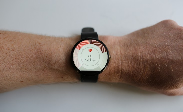
I also had issues with the heart-rate monitor. It would constantly time out trying to find my heart rate or return a heart rate that was far too low (40 bpm) for my sedentary lifestyle. The optical heart-rate sensor needs contact with the skin to register your heart rate. I assumed I was wearing the watch too loosely. So I tightened it up the strap one notch and tried again with no luck.
When it does work, you can see how active you’ve been throughout the day. But it’s like the rest of Android Wear. It’s almost awesome then it drops the ball and just looks at you with a sad cloud.
Android Wear still feels too much like a beta OS, which when you’re paying $249 for the future of wearables, is a huge disappointment.
Verdict
The Moto 360 is a beautiful smartwatch that doesn’t look like someone just shrunk down a smartphone, strapped it to a band, and called it a day. You’re happy to show it off to friends and non-snobby watch fans.
Unfortunately, it’s held back by an operating system that’s about 85 percent ready and if Apple’s Watch delivers on its demo, Android Wear and the Moto 360 will look antiquated very quickly. The watch is also a battery chewing machine and if you’re checking your notifications every few minutes (like I do) you’re going to be disappointed when dinner starts and your watch is now just a bracelet.
Having said that, I’m going to wear the Moto 360 around for at least a few more days. Maybe even a few more weeks. Android Wear is still “good enough” to be cool and I really like the how the Moto 360 looks on my arm. I’m over six feet tall, so how it looks on your wrist may vary. I can’t imagine it not looking foolish on small wrists.
But even if it is too thick and only looks good on low-level giants, Android Wear will get better and for now, this is the best looking watch for that future.
The Moto 360 is available now for $249.99. It requires an Android device with 4.3 or higher.
Get the TNW newsletter
Get the most important tech news in your inbox each week.
