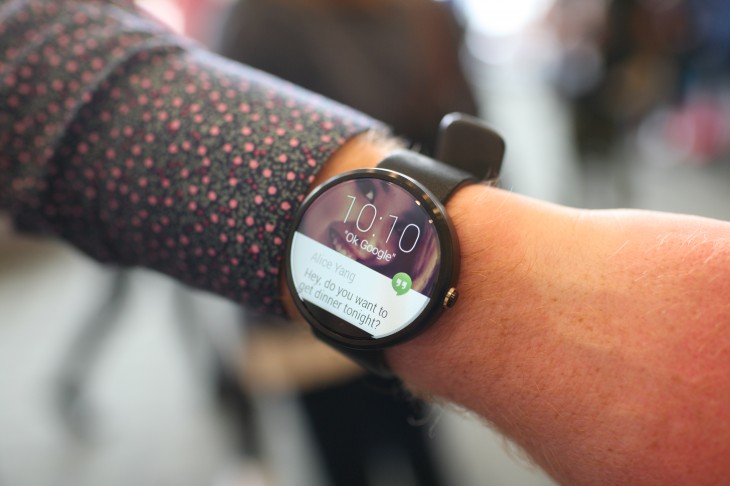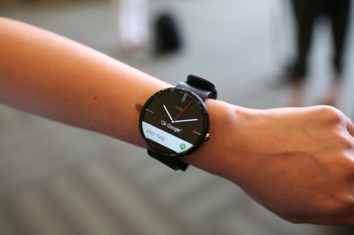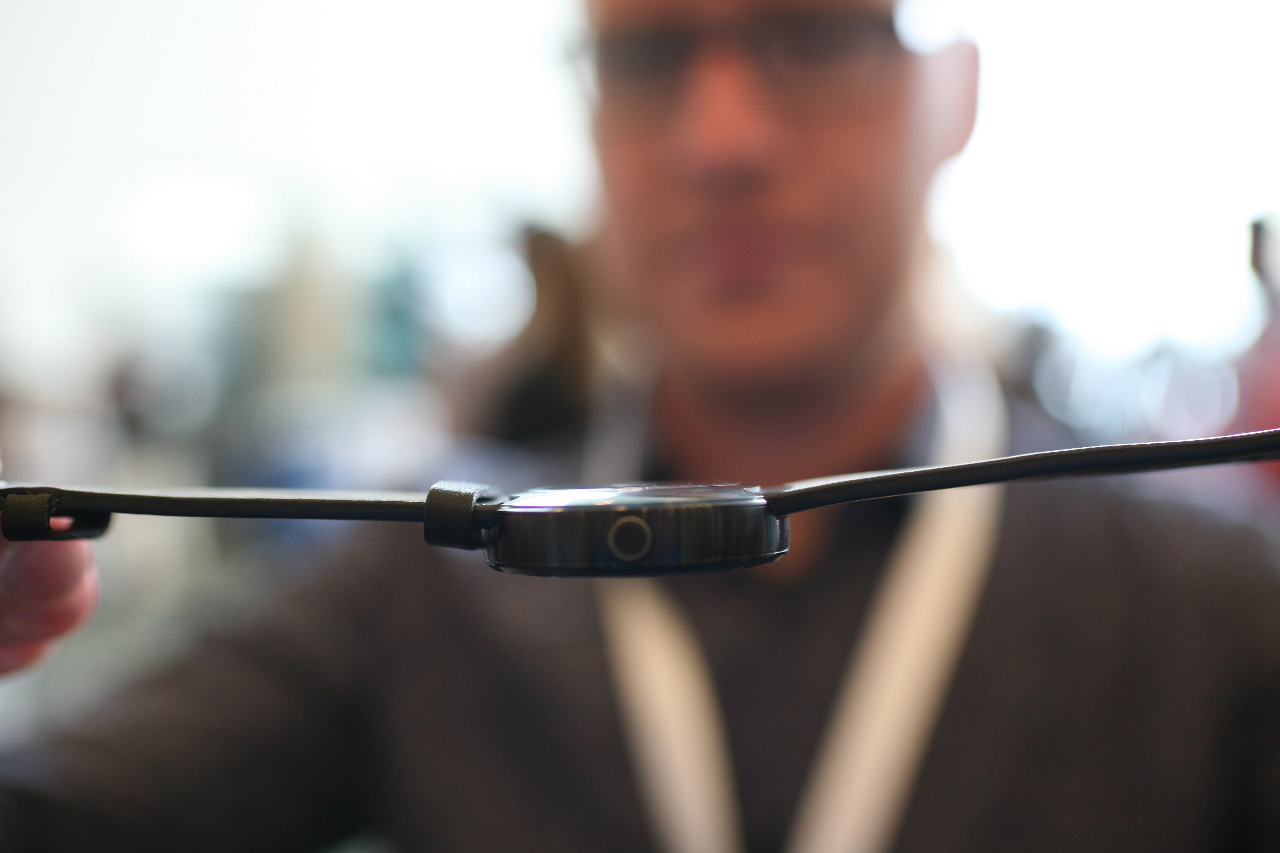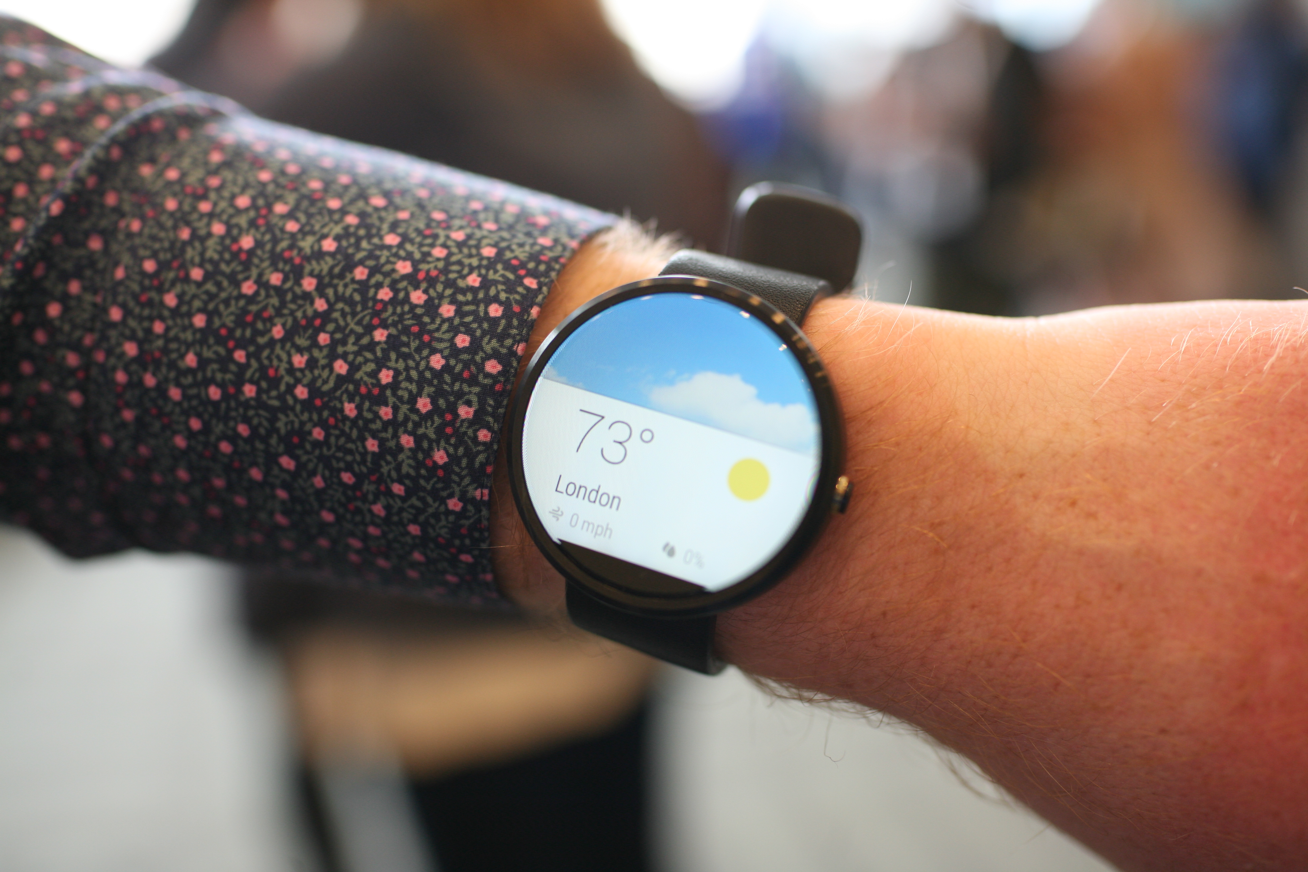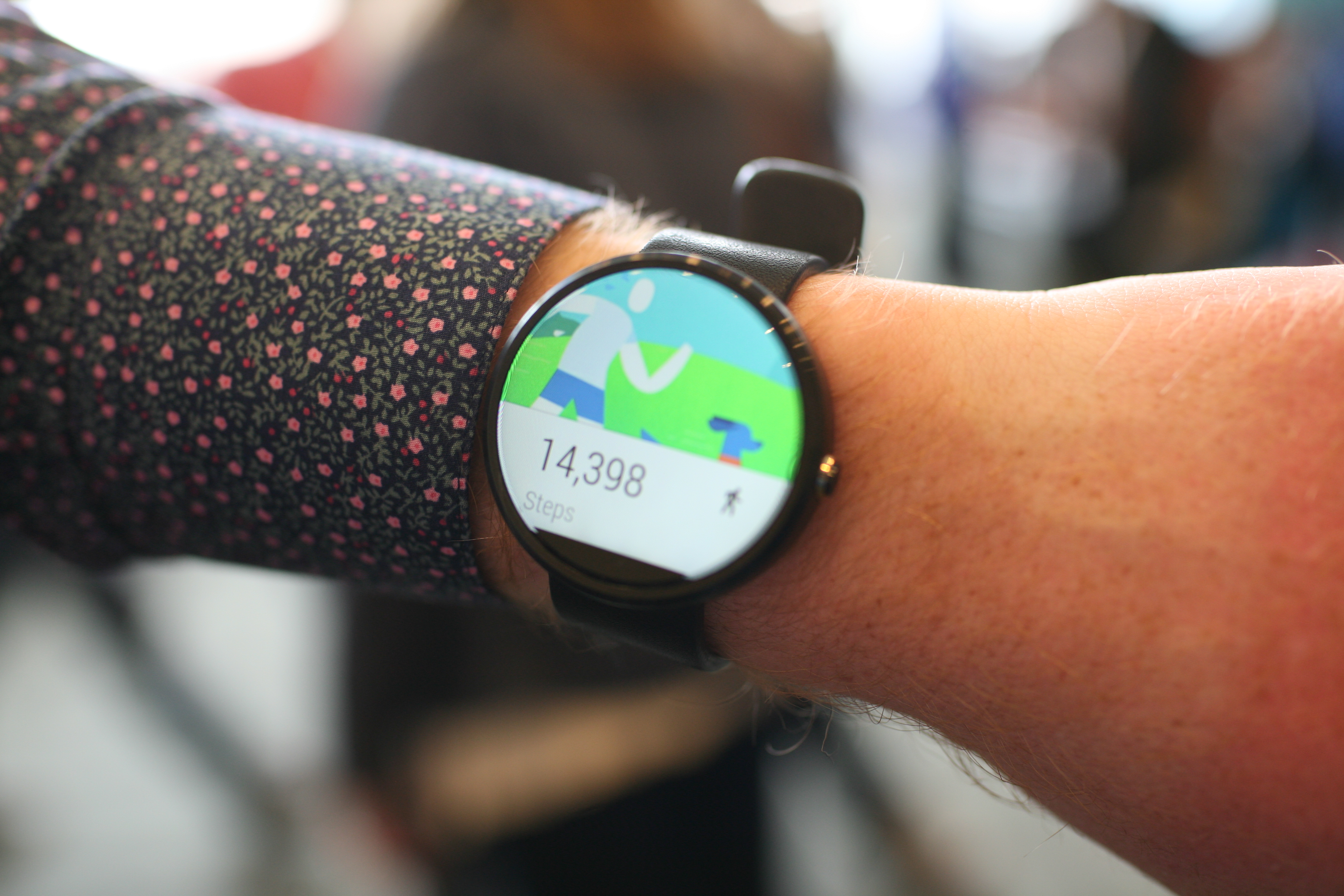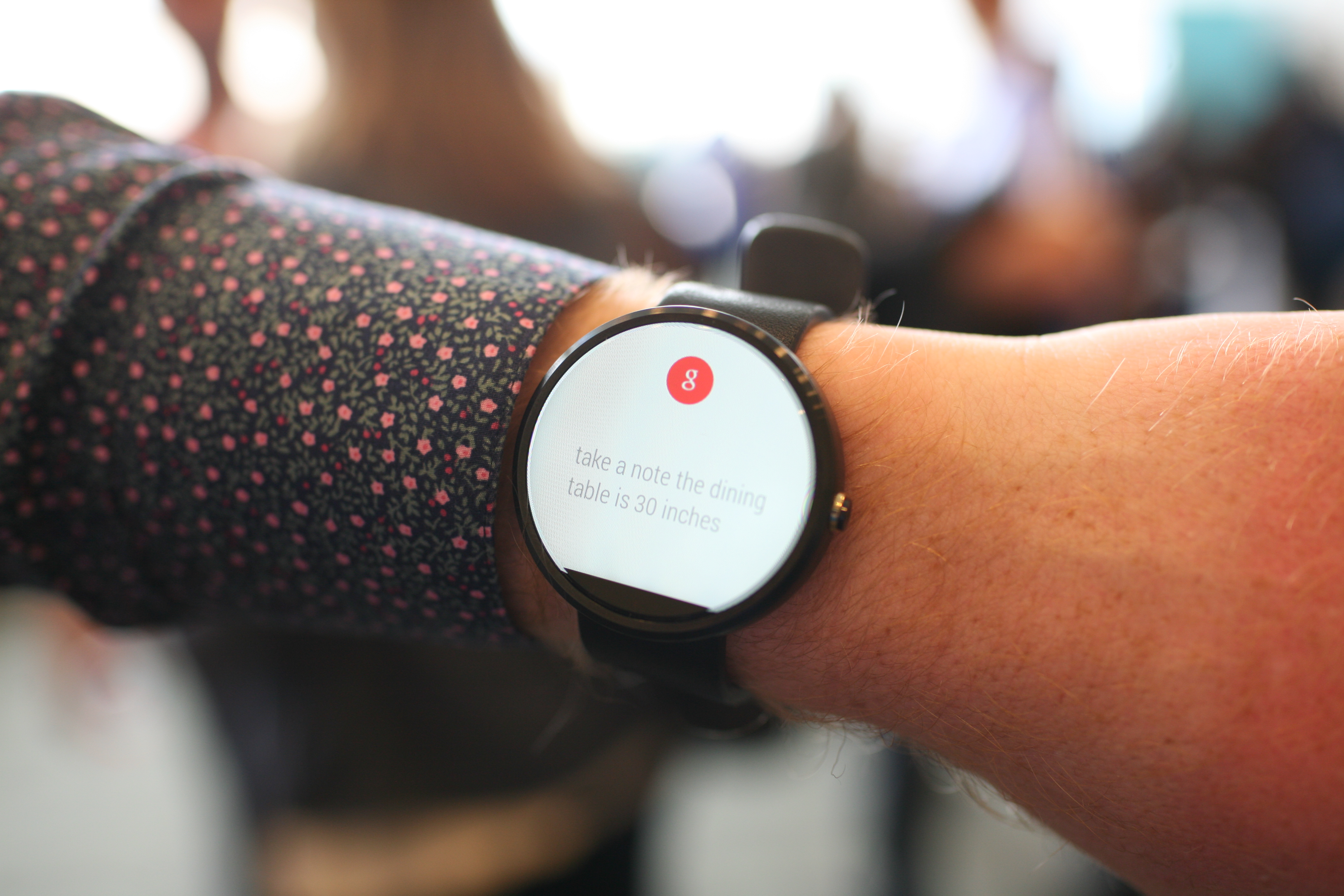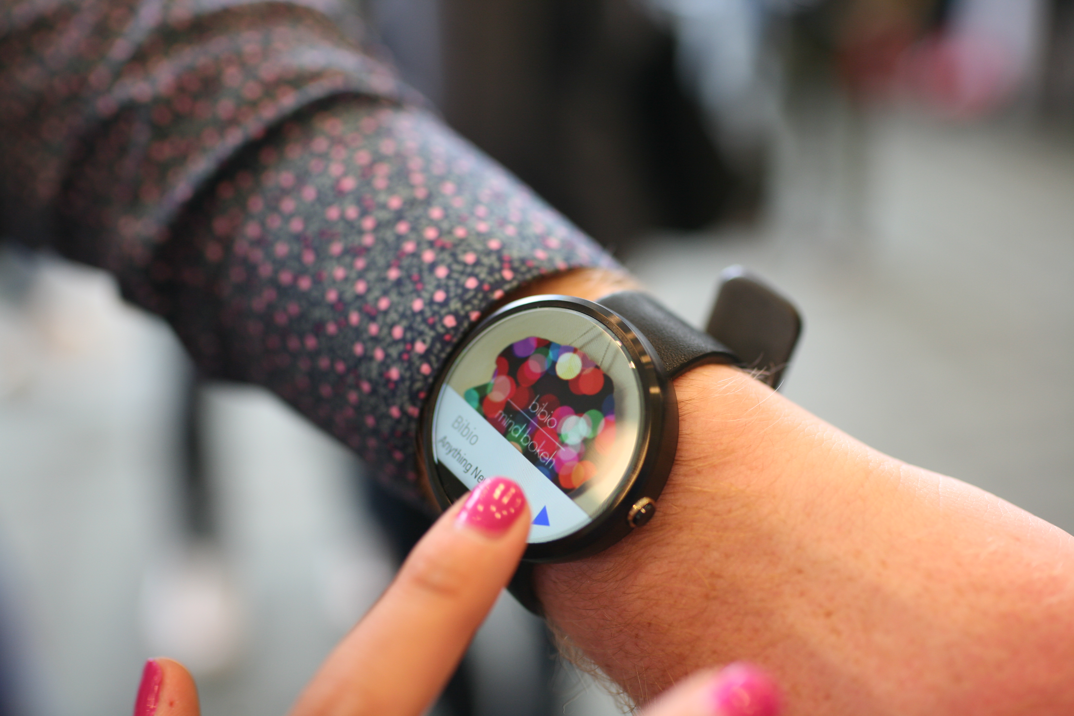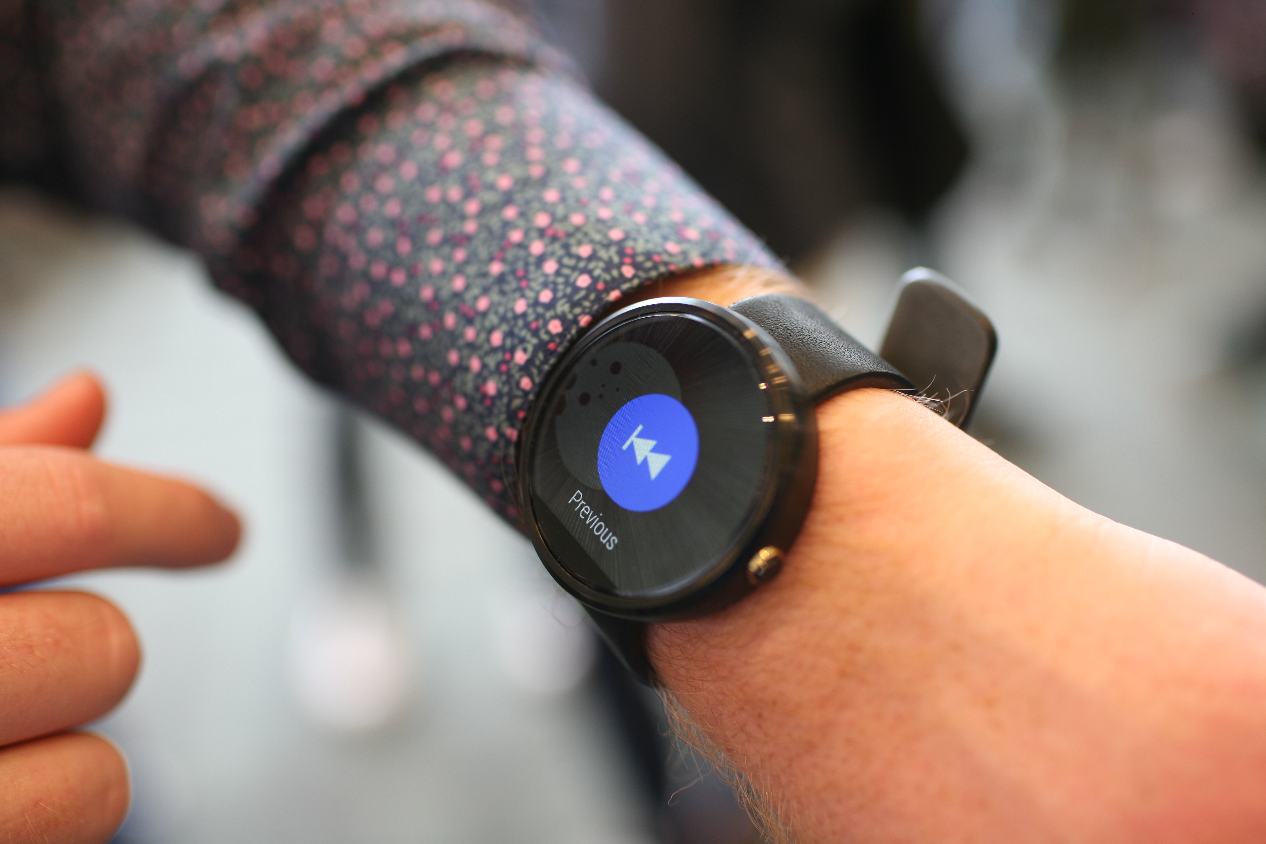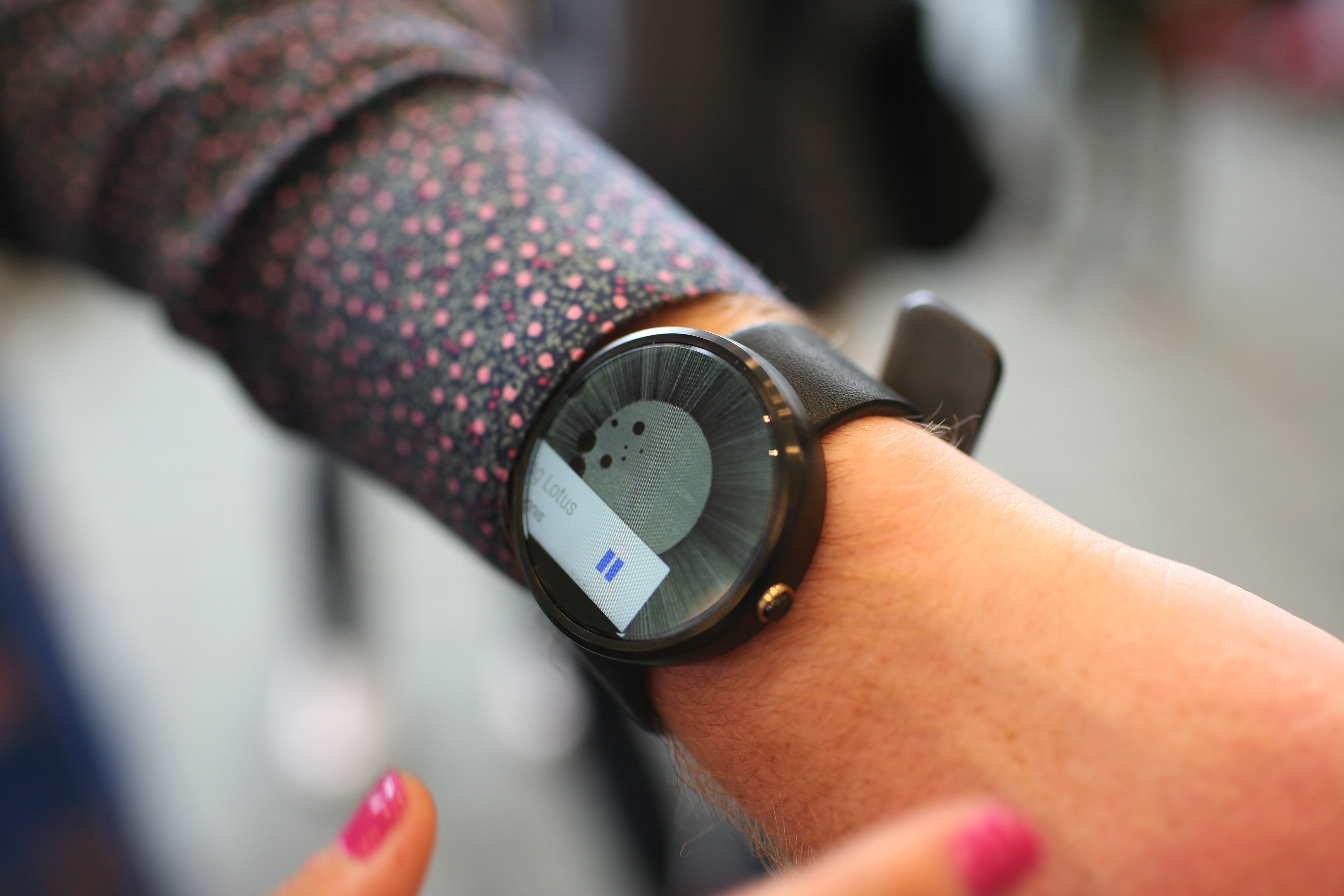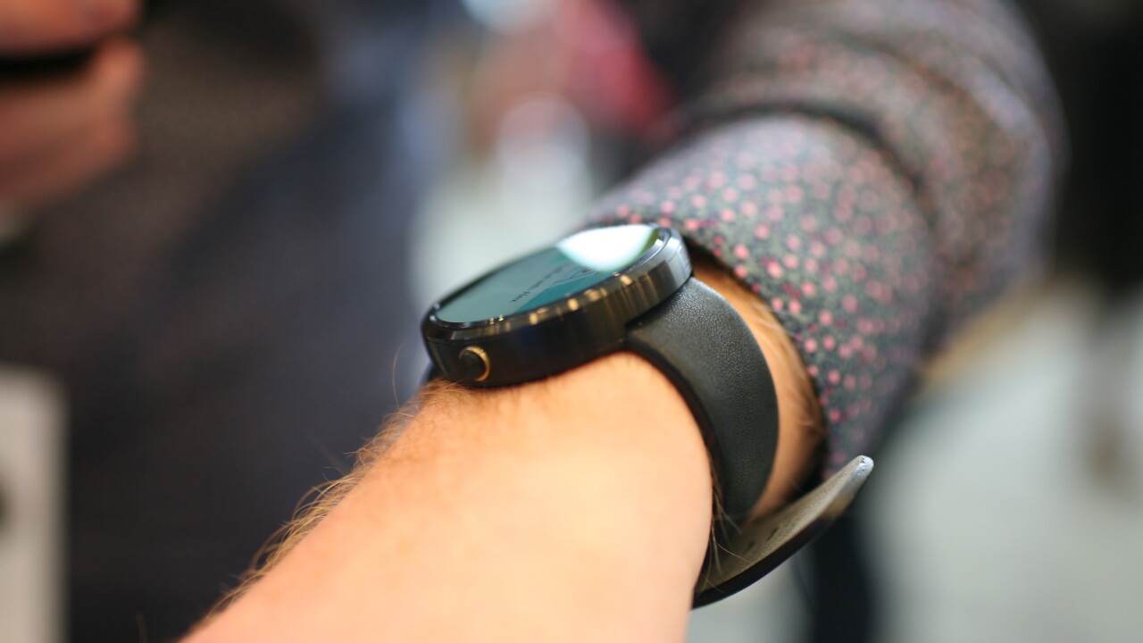
Here at Google I/O today, the company announced that the Moto 360 will be available later this summer, but we managed to find a Moto 360 on the conference floor and spent a few minutes with it.
It’s as beautiful as it looked in the very first promotional shots; the screen on the 360 is stunning, bright and vibrant. It’s actually incredible to use in real life because it looks almost exactly like the promo shots which feels unreal. The circular design/interface makes it seem like something you might actually want to wear and the bulk isn’t as big as we thought it would be.
The Moto 360 isn’t too heavy either, despite its large appearance; it’s about what you might expect from a traditional watch. The interface was only in demo mode, but is quick, snappy and responsive with no perceivable lag, which is an impressive feat for Google. That said, we can’t judge the device fully until it’s final so we’ll publish a full review once we get a real device.
When the default watch interface is on the screen, you might not even know it’s a smartwatch. When we were trying out the Motorola 360, people started gathering around trying to get a look. This is an excitement that was felt in the keynote too; people here really want the Moto 360 but still can’t get it.
I loved the Moto 360 as soon as I tried it on – it’s not like the rest of the smartwatches and wearables that don’t look natural, instead, it just looks like a slightly large watch. It blends in and it looks/feels good. The watch is made out of metal, which was cold to the touch but felt solid and the strap is a normal rubber one you might find on a swatch watch.
Enjoy the below pictures in the meantime; you’ll be able to buy it before you know it.
Read Next: Wrist-on with the Samsung Gear Live Smartwatch: Finally a smartwatch that’s not embarrassing
Get the TNW newsletter
Get the most important tech news in your inbox each week.
