LinkedIn today launched a redesigned inbox to help its users manage and build their professional relationships. The revamped tool will become available to English-speaking members “over the next few weeks” and will roll out to all members around the world next year.
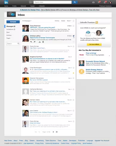
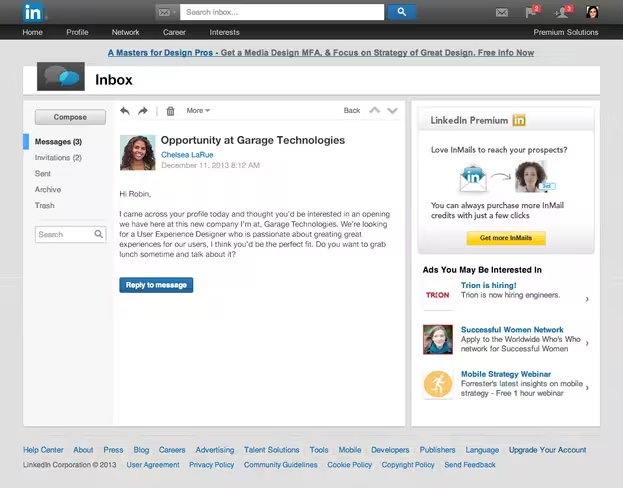
LinkedIn explains the new inbox features a cleaner and streamlined new design with larger pictures, a new centralized navigation on the left side of the inbox and within each message, and a new preview of each message when browsing through your inbox. These changes work together to make it easier to manage your conversations, move between messages and invitations, as well as be able to scan through messages quickly if you don’t have much time.
Without further ado, here’s the new inbox:
And here is an opened message:
Unfortunately, this new design suffers from the same issue as the last one: there is a huge amount of wasted space on the right-hand side. While we understand LinkedIn needs to reserve sections of its site for advertisements, it would be better if there was more horizontal room dedicated to the actual content when in the inbox.
We’re also disappointed there are still two search bars. It’s difficult to understand how this was omitted: both currently appear to do the same thing. Isn’t it enough that the top bar’s text changes to “Search inbox…” when you’re in the inbox. Scrap the second search bar already.
LinkedIn says the inbox is one of the top five destinations on its service. Furthermore, it is also often where new connections and conversations begin, meaning it is critical to business insights and professional opportunities, creating partnerships, hires, and fostering new business.
While this revamp seems to be a step forward, we would have expected more thought to go into it. It’s as if LinkedIn threw on a new coat of paint and added some new features, but never actually went to the drawing board to figure out if the inbox might need to be rebuilt from scratch.
Top Image Credit: mariosundar / Flickr
Get the TNW newsletter
Get the most important tech news in your inbox each week.
